Forum Replies Created
-
AuthorPosts
-
but be careful – my post is nearly one year old. So there must be a new editing with postslider.php to do.
The newest postslider.php has a different way to generate the slide_navigation_arrows . etc. …Even if you are using an older version of Enfold – this is part of the theme for a long time.
Can you check if you set up in Enfold Options page:
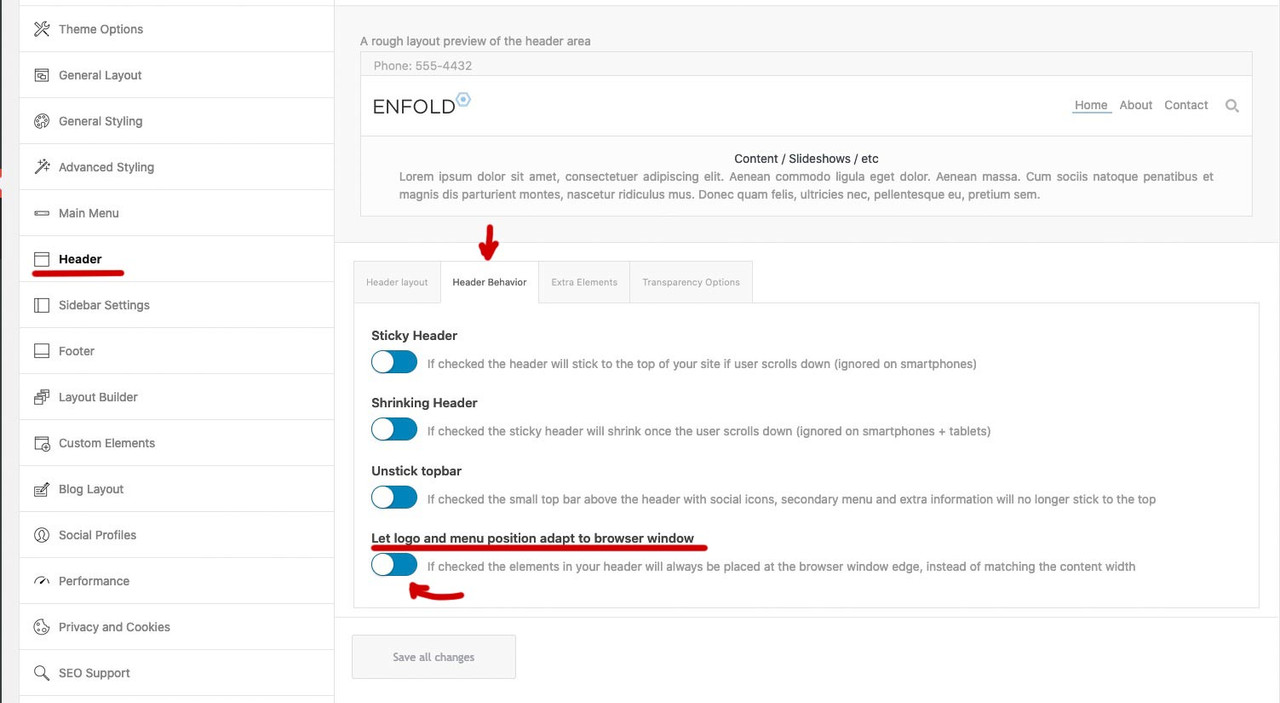
but even then – sometimes it is necessary to set an earlier breakpoint for the menu ( when hamburger replaces text-menu )February 12, 2022 at 7:46 am in reply to: Missing website footer — no header/footer.php file changes #1340240Do you have a child theme in use? Is there a header.php ( footer.php ) inside the child theme folder?
there is no extra column
Did you setup as css a rule for the width of the mega-div?This is only – if we do not use the enfold menu? I did not know this.
Add as an edited copy to your child-theme/shortcodes folder and follow the docu:
https://kriesi.at/documentation/enfold/intro-to-layout-builder/#add-elements-to-albFebruary 10, 2022 at 11:06 am in reply to: Split Masonry Gallery from normal Masonry sort order #1339939To understand your request:
You have a masonry from a specific category ( / taxonomy ) and want to paginate ( or have infinite scroll ) this – and randomize the entries.
You want no duplicates on that.
Now the problem is that you got two different Masonries on the same page and want to influence the orderby specifically to only one of them?Thanks – i have only adjusted the final version in my suggestion above, in case someone pulls out the fix here.
Can be closed
your link to your fix is here: https://pastebin.com/uDHPrFhJWait a bit, I don’t want to get ahead of the dev’s. For my understanding here would be a link rather than the title to insert.
Guess it is this topic here interesting for you:
https://kriesi.at/support/topic/contenturl-or-url-missing-from-rich-snippets/Yes but should it be visible in the frontend? Look:
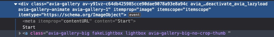
allthough i see in the gallery.php the meta end tag – it is not in the DOM – maybe that is the reason why the content is visible – because it is not inside the meta tag.
but:
“This element must not contain any content, and does not need a closing tag.”
Is it necessary to have here content?
i think it will be enough if that line is:$markup_meta = '<meta itemprop="contentURL" content="'. esc_attr( $post_title ) .'">';Next: if we have here a itemprop=”contentURL” shouldn’t we have then a content=”url-whatever” ? and no title
$post_link = trim( get_the_permalink( get_the_ID() ) ); $markup_meta = '<meta itemprop="contentURL" content="' . esc_attr( $post_link ) . '" />';Wie hast du die Dreisprachigkeit erreicht? Nutzt du WPML? Wie sehen dann dort deine Permalinks aus? Nutzt du eine eigene Domain je Sprache (bzw. Subdomain ) oder nutzt die domain/de; domain/en /etc. pp oder die ?lang=de usw. Variante?
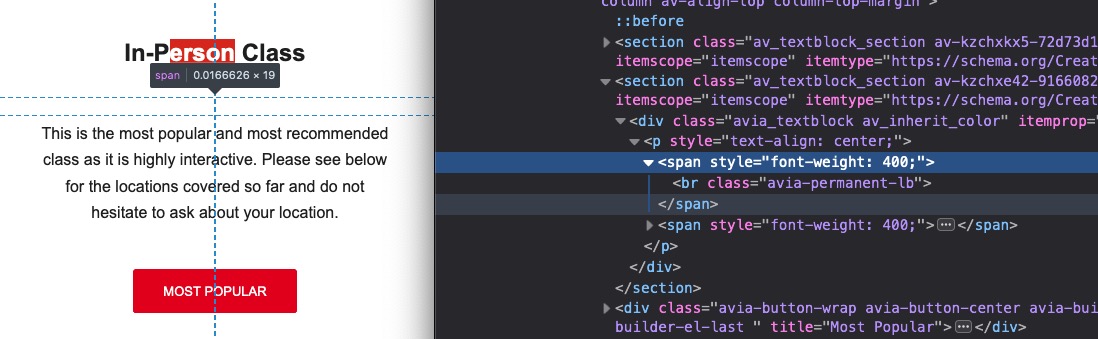
it is ok – but each text block got his own paddings.
but your question was why there is so much space between. The main reason for the bigger distance are the permanent breaks you set yourself.Something to learn for you ( @markus-fischer ) – when a class is directly on another tag ( like the #top (body tag) ) the class comes without space to the tag.
#top.page-id-30 if you want to be more specific to a selector ( like here .container ) you can have in front tags of a parent element.
so – if there are spaces that is the next child in the DOM.so your noted rule:
#top.page-id-30.container {
max-width: 990px;
}
is wrong because the container class belongs to a child element of #top ( grand-child etc. ) to the .page-id-30 – there must be space between.
page-id-30 – is part of the body tag ( #top) and no child – then you must avoid a space right notation would be:#top.page-id-30 .container { max-width: 990px; }why did you put them in two different text-blocks ?
And you put a permanent break yourself into the second text-block:
by the way : In the other topic I advised you to use a custom class. Otherwise, this code will also affect all other grid rows.
@media only screen and (min-width:768px) { .flex_cell.avia-builder-el-first { padding-left: calc(50% - 655px) !important; } .flex_cell.avia-builder-el-first .flex_cell_inner { padding: 30px 50px !important; } }You always have to remember that if it is not to apply globally.
Post ID’s have no additional hyphen. – Page ID’s do have
so if it is a page with ID : 30 the class on the body tag ( #top ) is: page-id-30
it is a post with ID : 30 the class on the body tag ( #top ) is: postid-30you find those classe as mentioned above on the body tag. ( #top )
so there is no space between #top and the class : #top.postid-30 or #top.page-id-30
( that was a small careless mistake by Yigit )it will be :
#top.page-id-30 .container { max-width: 990px; } /*** or if it is a post ***/ #top.postid-30 .container { max-width: 990px; }to keep such word sequences together, I use the so called nonbreaking space html-entity.
Unfortunately, if you put this entity in the space between two words in a heading ALB, it disappears the next time you open/edit it. For this Günter has written here a small plugin which prevents exactly that. Among other things also e.g. the use of less than and greater than characters.
https://kriesi.at/documentation/enfold/intro-to-layout-builder/#using-special-characters
Unfortunately, it provides only 4 special characters in the standard variant.
But you can extend this ” $this->translate = array( ” with further entries. My list looks like this and i shorten the # signs to only one before and after.$this->translate = array( '#lt#' => '<', '#le#' => '≤', '#gt#' => '>', '#ge#' => '≥', '#amp#' => '&', '#91#' => '[', '#93#' => ']', '#quot#' => '"', '#34#' => "'", '#br#' => '<br/>', '#p#' => "<p>", '#shy#' => '', '#nbsp#' => ' ', '#sbsp#' => ' ', '#nbhyp#' => '‑', '#1/2#' => '½', '#1/3#' => '⅓', '#1/4#' => '¼', '#1/5#' => '⅕', '#2/3#' => '⅔', '#3/4#' => '¾', );this line now :
'#nbsp#' => ' ',is usefull.
I entered your heading this way:
Negotiation#nbsp#Techniques for#nbsp#Passionate#nbsp#Leaders who#nbsp#strive#nbsp#to Secure#nbsp#Maximum#nbsp#Valuenow the rest will be a bit of calculation: On my testpage with 1510px default content width ( and custom class for grid-row alb: content-alignment
@media only screen and (min-width:768px) {
  .content-alignment h1.av-special-heading-tag {
    font-size: clamp(24px, 3.5vw, 50px);
    line-height: 1.5em;
    background-color: transparent;
    padding-bottom: 20px
  }

  .content-alignment .avia_textblock {
    font-size: clamp(16px, 2.5vw, 24px);
  }

  .content-alignment .flex_cell.avia-builder-el-first {
      padding-left: calc(50% - 755px) !important;
  }

  .content-alignment .flex_cell.avia-builder-el-first .flex_cell_inner {
      padding: 30px 50px !important;
  }
}

@media only screen and (max-width:767px) {
  .content-alignment h1.av-special-heading-tag {
    font-size: clamp(22px, 6vw, 50px);
    line-height: 1.5em;
    background-color: transparent;
    padding-bottom: 20px
  }

  .content-alignment .avia_textblock {
    font-size: clamp(14px, 5vw, 24px);
  }
}
see result: https://webers-testseite.de/marcus/
next way – is it an option to not choose the 1/2 1/2 grid sizes ?
( but then the calculation of padding must be adjusted )
Grid-Row Element you got on the bottom right corner : “Set Cell Size” to have f.e.: 3/5 2/5first there will be only the chance to give the heading more place to use.
Either you increase the normal content width from 1310px to something differnt – you see on my installation there is a 1510px choosen.
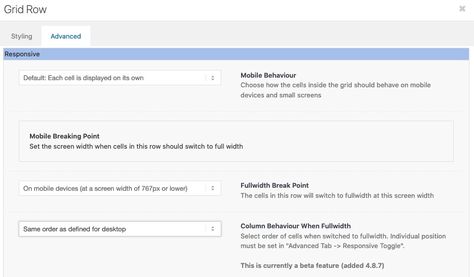
Or you go and set a smaller font-size:.home #av-layout-grid-1 h1.av-special-heading-tag { font-size: 42px; line-height: 58px; background-color: transparent; }On default the order is set to have on responsive case on top the first column ( cell ) – but you can change that on :
“Column behavior when fullwidth”
is it a youtube video ?
is it that what you mean:
https://kriesi.at/support/topic/design-layout/#post-1339077by the way – in between 768px and 990px your cells are set to 100% – but there is a margin-bottom which looks strange in this combination.
Maybe you remove it :@media only screen and (max-width:989px) { .responsive #top #wrap_all .flex_column.av-break-at-tablet, .responsive #top #wrap_all .av-break-at-tablet .flex_cell { margin-bottom:0; } }this is your page? : https://negotiations-masterclass.com/
you see both lines where the text is differs.

So that this rule does not take effect everywhere, I have set a custom class on the grid-row element : special-grid-row
if you remove that for inspecting purpose and insert to quick css:@media only screen and (min-width:768px) { .flex_cell.avia-builder-el-first { padding-left: calc(50% - 655px) !important; } .flex_cell.avia-builder-el-first .flex_cell_inner { padding: 30px 50px !important; } }you will see the result as follows:
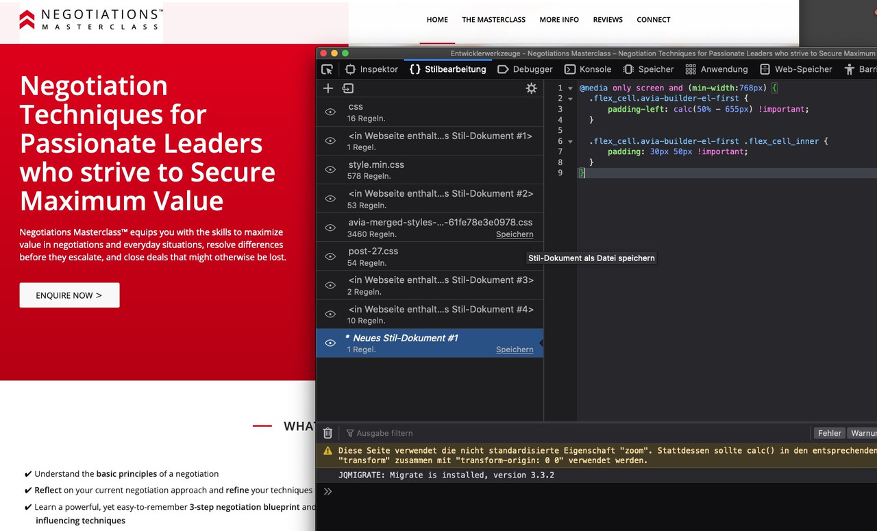
both content texts are now left-aligned in an alignment
By the way – if you like to have the text in your grid-cell be inline with the other content – you can see here a solution:
https://webers-testseite.de/shreinmedia/If you got your text in the right gird-cell you must calculate the padding for that case
don’t forget the custom class on the grid-rowPS – i see you got the standard width 1310px so :
@media only screen and (min-width:768px) { .special-grid-row .flex_cell.avia-builder-el-first { padding-left: calc(50% - 655px) !important; } .special-grid-row .flex_cell.avia-builder-el-first .flex_cell_inner { padding: 30px 50px !important; } }so did you try my solution?
Upload your image – copy that url and replace in my code the url.
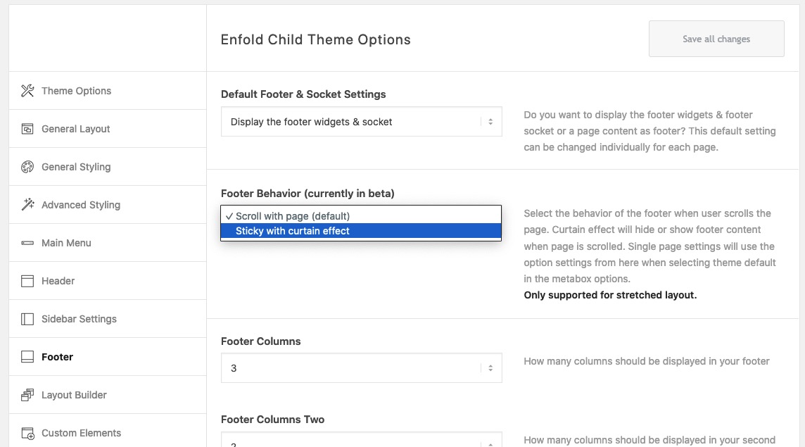
Put this to your quick css:#top #footer::before { content: ""; position: absolute; width: 100%; height: 122px; /*** these two values reflects the image dimensions ***/ top: -122px; /*** these two values reflects the image dimensions ***/ background-image: url(https://webers-testseite.de/wp-content/uploads/grass.png); /*** my example image has a height of 122px - and is seamless ***/ background-repeat: repeat-x; /*** because my image is seamless I can tile here ***/ } #top #footer { overflow: visible !important; }__________________
PS – if you use curtain effect – the selectors will be different.
 February 4, 2022 at 11:35 pm in reply to: Remove the Featured Image from one category of blog posts #1338968
#top.single .category-recipes .big-preview.single-big { display: none; }First of all – do you like to add this image to #footer or to #socket?
Have you both on your installation or only one?
Is it with curtain effect or not?
Do you want that on all pages/posts or only on a specific page?See here on one page of mine: https://webers-testseite.de/impressum/
this is a seamless png file – but it will work with one big png the same way except repeat.#top.page-id-2466 #footer::before { content: ""; position: absolute; width: 100%; height: 122px; background-image: url(https://webers-testseite.de/wp-content/uploads/grass.png); background-repeat: repeat-x; top: -122px; } #top.page-id-2466 #footer { overflow: visible !important; }if you are satisfied with a 1px line – you only need tha alb. Only if you like to change the thickness or the width you can insert that code to quick css field in enfold options – general styling
Take on the alb heading the option on style: heading style elegant with optional icon
now the heading got these two lines on default.you can change the line by :
body .av-special-heading.elegant-centered .av-special-heading-tag .heading-wrap::before,
body .av-special-heading.elegant-centered .av-special-heading-tag .heading-wrap::after {
  border-bottom-width: 3px;
  border-color: red;
  width: 200px ;  /*** what you like ***/
}
the color can be changed in the alb itself if you go to styling – and choose on colors: custom-color – and then set the : Custom Seperator Line Color
-
AuthorPosts