Forum Replies Created
-
AuthorPosts
-
I tried but it won’t work so i need a code for this.
– i do not see what “this” means”
you should be more precise what you like to have – ” tablet and mobile etc” tablet and mobile are not well defined as screen width.
F.e. there are so many iPad versions (
iPad mini 768×102; iPad 800×1080; iPad 11inch 834×1194; iPad 12.9inch 1024×1366 etc. )
then there are different media queries for screen orientations ( portrait or landscape)
then there are different media queries for screen resolutions to differ between Retina Displays to normal one. etc. etc. pp
for example:@media screen and (min-width:600px) and (-webkit-min-device-pixel-ratio: 2), screen and (min-width:600px) and (min-resolution: 192dpi), screen and (min-resolution: 2dppx) { /* an example rule: */ div {background:url( (Email address hidden if logged out) );} }Therefore, I would focus on a few screen widths, e.g., the 767px and 989px used by Enfold.
Incidentally, Enfold also uses various classes on the html tag that can be used to target only mobile devices (avia_mobile) or devices with touch screens (touch-device).By the way: The link provided by Rikard leads to a more detailed page with my above-mentioned notes:
https://www.w3schools.com/css/css3_mediaqueries_ex.aspdo you have set your header to logo top menu below?
What do you mean by ‘devices’ – there are no restrictions regarding different devices in the CSS rules above?
By the way, you should not set this for mobile devices, as it looks terrible (it is not easy to read with these settings).
f.e.:/*Ajout de marges personnalisées dans les sections spécifiques de la page de résultats de recherche*/ @media only screen and (min-width: 768px) { .responsive #top.search #main .container { max-width: 100%; } .responsive #top.search #main .page-heading-container { max-width: 1310px !important; padding-right: 100px !important; padding-left: 100px !important; } .responsive #top.search #main .post-entry { margin-left: 100px !important; margin-right: 100px !important; } }It seems so, Rikard, because the page now looks as desired.
even though I believe that 20px is more like an equidistance. ;)something like this:
.responsive #top.search #main .container { max-width: 100%; } .responsive #top.search #main .page-heading-container { max-width: 1310px !important; margin: 0 auto 50px; padding: 0 50px 50px; } .responsive #top.search #main .post-entry { margin-left: 50px; margin-right: 150px; }you should shift not the button but the p-tag that has that button.
because pseudo class :has is already for most browsers usable we can do:.page-id-15 p.form_element:has(.av-recaptcha-submit) { margin-top: -20px; }or if you are able to give a custom-class to that p-tag use that instead for better browser support.
i can see both images on mobile ( dev tools setting ). So autoplay works on my end here
i did not check if real mobile device shows it.October 12, 2025 at 6:17 pm in reply to: Having trouble with a full width image header that scales responsively #1490080if it is the about/leadership page – there is no background-image at all – not even on mobile!
If you don’t have any content, why use a color section? The easiest option is to use a full-width slider. If you don’t want slider controls, you can adjust the options accordingly.
but my solution with declaring the background-size: cover and set the color-section height to aspect-ratio of your image will work properly.
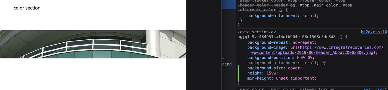
https://webers-testseite.de/hostworks/October 9, 2025 at 11:44 pm in reply to: Having trouble with a full width image header that scales responsively #1489992choose your color-section and set for minimum height option your aspect-ratio in percent.
F.e. your image with 300/2000 means min-height 15%.
As long as your content inside your color-section does not grow bigger than the 15% height. The bg-image will react responsive, If you have set the bg-image is set to cover the background.PS: for small screen you have to get rid of min-height option for color-sections (100px on default)
 October 9, 2025 at 12:29 pm in reply to: How to build 1/2 + 2×2 image grid with text overlays #1489981
and if you like to have then a non full-width grid-row – there are ways to get this …
see: https://webers-testseite.de/grid-row-alb/October 9, 2025 at 8:12 am in reply to: Masonry Blog Posts no longer sorting date correctly #1489978The name “masonry” actually implies the desire to fill the available space as best as possible. Depending on the settings (Flexible Masonry) , this can mean that for some screen widths, entries with large heights are better suited to a different location.
Despite the discontinuation of Sort Order the above setting, Masonry attempts to fill the entire area as well as possible.
This then leads that entries bigger in height, for example, being inserted differently after all.If you try it with the “Perfect Grid” setting, that shouldn’t happen.
that is why i first tried to give you a header solution.
Then you do not need to add that lines manually to every top section in your content. – and if you got a slider or a gird-row on top no extra solutions are necessary. – But there are different Problems – f.e. what to do when first section got a collered background.The separator solution: As part of next section this should not come into conflict with your menu text. Or do you have on other installations an overlapping first section to header area ?
The problem wil be now – what to do if you got a grid-row or a slider on top.Thank goodness for DeepL — I did take French as my third subject in high school, but that was a good 40 years ago ;)
#top .ti-widget .ti-controls .ti-next,
#top .ti-widget .ti-controls .ti-next:after,
#top .ti-widget .ti-controls .ti-prev:after,
#top .ti-widget .ti-controls .ti-prev {
  background: none !important;
  border: none !important;
  outline: none !important;
}

#top .ti-widget .ti-controls .ti-next {
  right: -20px;
}

#top .ti-widget .ti-controls .ti-prev {
  left: -20px;
}

#top .ti-widget .ti-controls > div:after {
  font-size: 52px;
  color: #ebebeb;
}

#top .ti-widget .ti-controls .ti-prev:hover:after,
#top .ti-widget .ti-controls .ti-next:hover:after {
  color: #2c1175 !important;
}
maybe you have allready included some of those rules.
if you like to use it as svg separator you had to use a svg file like that
https://webers-testseite.de/button-row/
copy paste the svg code from there.
Link to the svg: Here_____
Incidentally, you should adjust the fixed header rules for responsive behaviour. ( See it on small screens and scrolling down)on inserting my code inside developer tools (copy&paste) :
there you can see both – mine and your existing jpg solution.
First – a screenshot would be nice to have. Many misunderstandings could have been avoided beforehand if I had known more precisely what needed to be changed.
Next: i’m participant as you are, so if there is a message on private content field – i could not see it.
but where does a link like :
https://storasoder.se/nojesteaterntestsida/richard-obriens-rocky-horror-show-the-legendary-rock-roll-musical/
come from – that is the link you must have set.first remove this from your css
.ti-prev:hover::after,
.ti-next:hover::after {
  color: #FFF !important;
  background-color: var(--enfold-header-color-color);
}
then:
#top .ti-widget .ti-controls .ti-next, #top .ti-widget .ti-controls .ti-next:after, #top .ti-widget .ti-controls .ti-prev:after, #top .ti-widget .ti-controls .ti-prev { background: none !important; border: none !important; outline: none !important; } #top .ti-widget .ti-controls .ti-next { right: -10px; } #top .ti-widget .ti-controls .ti-prev { left: -10px; }or a little more elegant:
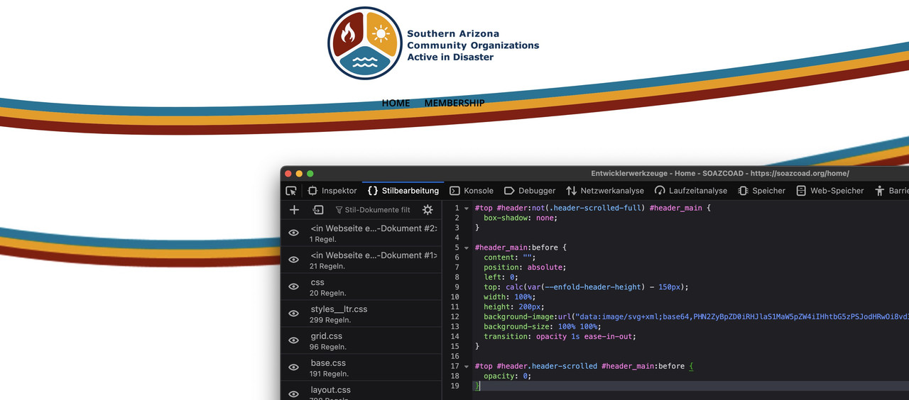
#top #header:not(.header-scrolled-full) #header_main {
  box-shadow: none;
}

#header_main:before {
  content: "";
  position: absolute;
  left: 0;
  top: calc(var(--enfold-header-height) - 150px);
  width: 100%;
  height: 200px;
  background-image:url("data:image/svg+xml;base64,PHN2ZyBpZD0iRHJlaS1MaW5pZW4iIHhtbG5zPSJodHRwOi8vd3d3LnczLm9yZy8yMDAwL3N2ZyIgdmVyc2lvbj0iMS4xIiB2aWV3Qm94PSIwIDAgODAwIDE4MCIgcHJlc2VydmVBc3BlY3RSYXRpbz0ibm9uZSI+CgogICAgPHN0eWxlPgogICAgICAuc3QwIHsKICAgICAgICBmaWxsOiAjOTQxMDA5OwogICAgICB9CgogICAgICAuc3QxIHsKICAgICAgICBmaWxsOiAjZWZhNDBiOwogICAgICB9CgogICAgICAuc3QyIHsKICAgICAgICBmaWxsOiAjMDA4MGEyOwogICAgICB9CiAgICA8L3N0eWxlPgoKICA8cGF0aCBjbGFzcz0ic3QyIiBkPSJNNjE0Ljg4NSw2My44MzVjLTEwNS4xNzksMjUuNTMxLTI2NC44MDQsNTUuOTY1LTQyNy45NTQsNTUuOTY1LTEwMi4xMjcsMC0xNjAuOTctMTcuODkxLTE4Ni45MzEtMjguNTI5djE0Ljk5MWMyNS45NiwxMC42MzcsODQuODA0LDI4LjUyOSwxODYuOTMxLDI4LjUyOSwxNjMuMTUsMCwzMjIuNzc1LTMwLjQzNCw0MjcuOTU0LTU1Ljk2NSw5NS42MjYtMjMuMjEyLDE2NC43ODItNDYuNjc5LDE4NS4xMTUtNTMuODM1di0xNC45OTFjLTIwLjMzMyw3LjE1NS04OS40ODksMzAuNjIyLTE4NS4xMTUsNTMuODM1WiIvPgogIDxwYXRoIGNsYXNzPSJzdDEiIGQ9Ik02MTQuODg1LDc4LjgyNWMtMTA1LjE3OSwyNS41MzEtMjY0LjgwNCw1NS45NjUtNDI3Ljk1NCw1NS45NjUtMTAyLjEyNywwLTE2MC45Ny0xNy44OTEtMTg2LjkzMS0yOC41Mjl2MTQuOTljMjUuOTYsMTAuNjM3LDg0LjgwNCwyOC41MjksMTg2LjkzMSwyOC41MjksMTYzLjE1LDAsMzIyLjc3NS0zMC40MzQsNDI3Ljk1NC01NS45NjUsOTUuNjI2LTIzLjIxMiwxNjQuNzgyLTQ2LjY3OSwxODUuMTE1LTUzLjgzNXYtMTQuOTljLTIwLjMzMyw3LjE1NS04OS40ODksMzAuNjIyLTE4NS4xMTUsNTMuODM1WiIvPgogIDxwYXRoIGNsYXNzPSJzdDAiIGQ9Ik04MDAsMzkuOTgxYy0yMC4zMzMsNy4xNTUtODkuNDg5LDMwLjYyMi0xODUuMTE1LDUzLjgzNS0xMDUuMTc5LDI1LjUzMS0yNjQuODA0LDU1Ljk2NS00MjcuOTU0LDU1Ljk2NS0xMDIuMTI3LDAtMTYwLjk3LTE3Ljg5MS0xODYuOTMxLTI4LjUyOXYxNy4zMjZjMzAuMDc1LDExLjQ0Miw4OS4yMjgsMjcuMjAyLDE4Ni45MzEsMjcuMjAyLDE2NC44MjUsMCwzMjUuODg0LTMwLjcxMiw0MzEuOTcyLTU2LjQ3Niw4OS4wNC0yMS42MjQsMTU1LjM3LTQzLjQ5MiwxODEuMDk4LTUyLjM4MXYtMTYuOTQzWiIvPgo8L3N2Zz4=");
  background-size: 100% 100%;
  transition: opacity 1s ease-in-out;
}

#top #header.header-scrolled #header_main:before {
  opacity: 0;
}
svg with more convex look.
try this
( but it looks better if your header does not have shadow )use next css code instead
play with top position – what fits best for you.
and maybe you set the height of the before pseudo-container to an absolute value ( e.g: height: 120px;) then it will not shrink with the header height.you have choosen for the #av_section_1 a z-index of : 200
so the z-index of the flex_columns had to be bigger. (300) next – hint
do not forget to give the outer flex_columns a background-color of #172738try – and have a look if this fits your needs of “button” look-alike:
#top .avia-content-slider .slide-entry-wrap {
  display: flex !important;
  flex-flow: row wrap;
  justify-content: space-between;
  gap: 30px;

}

#top .avia-content-slider .slide-entry {
  width: unset;
  flex: 1 1 calc(25% - 30px);
  margin: 0 !important;
  display: flex;
  flex-flow: column wrap;
  background-color: #eee;
  padding: 15px
}

@media only screen and (max-width:1049px) {
  #top .avia-content-slider .slide-entry {
    flex: 1 1 calc(50% - 30px);
  }
    #top .avia-content-slider .slide-entry a  {
    margin-left: 0;
  }
}

@media only screen and (max-width:767px) {
  #top .avia-content-slider .slide-entry {
    flex: 1 1 100%;
  }
}

.slide-content {
  margin-bottom: 60px
}

.entry-footer {
  width: 100%;
  position: absolute;
  left: 0;
  bottom: auto;
  top: calc(100% - 60px);
  display: flex;
  justify-content:  space-evenly;
  flex-flow: row wrap;

}

.entry-footer a {
  margin-top: 10px;
  display: inline-block;
  padding: 3px 8px;
  transition: all 1s ease;
}

.entry-footer .read-more-link a {
  background-color: #000;
  color: #FFF !important;
}

.entry-footer a:hover {
  box-shadow: 0 3px 5px #aaa;
  transform: translateY(-5px) scale(1.03);
}

.entry-footer .biljetter a {
  background-color: #bf2e11;
  color: #FFF !important;
}

.entry-footer a path {
  fill: #FFF;
}
and check the responsive behaviour aswell.
so if you only like to link if there are biljetservice links on the images above the titles – then take snippet two from this link
if you take the second snippet it will only have two links if the one goes to your juliusbiijettservice pages.
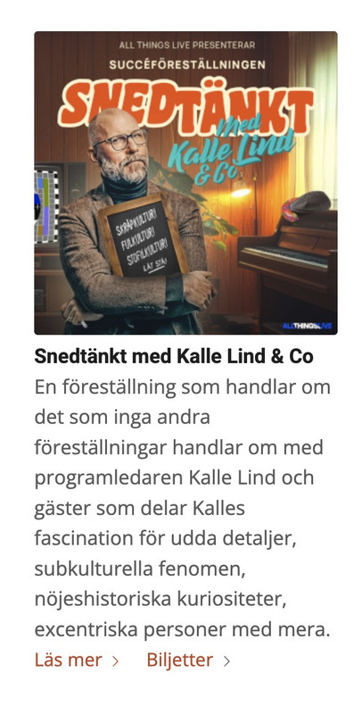
on the first image in your row – (Snedtänkt) there is the one link and on read-more the other link.
Here you have it the way it works:
(click to enlarge the images)
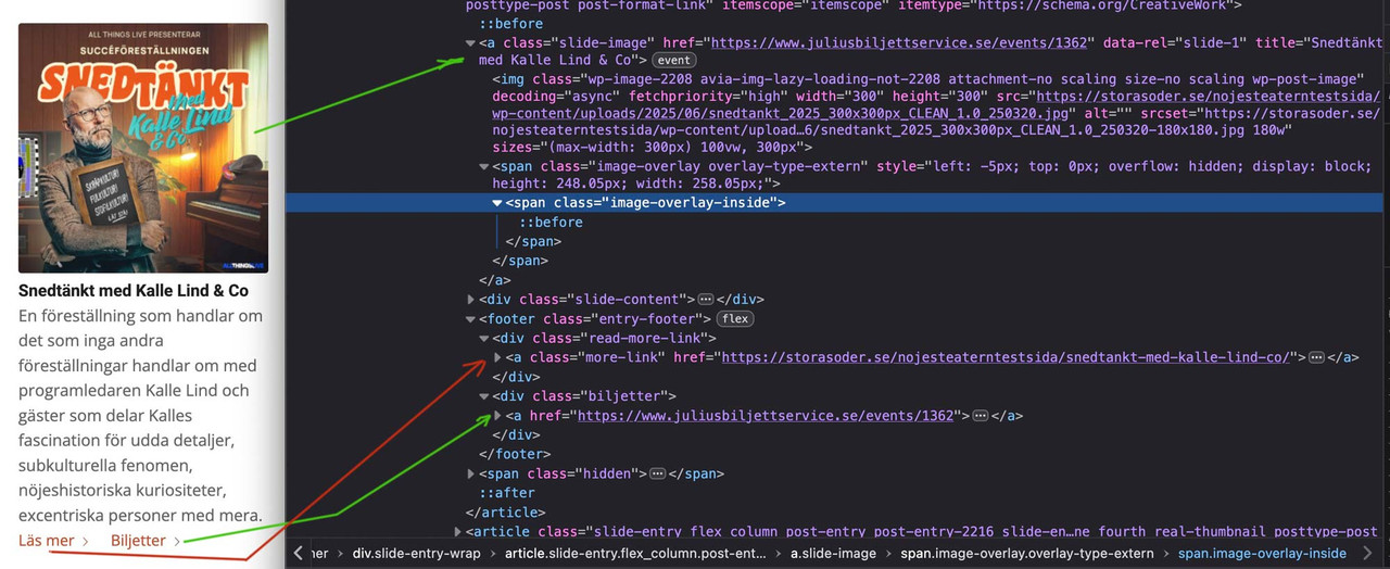
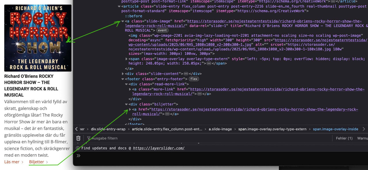
but on your rockyhorror read-more link and image link are the same ! – so i could not transfer it to the second button .
 October 2, 2025 at 3:07 pm in reply to: How to replace H3 with P (or span) in related articles titles #1489770
Since my backend is in German, I always have to double-check how the elements are named in English.
or if you only like to have those buttons if the link goes to a certain string:
function custom_entry_link_if_biljetter_link(){
?>
<script>
(function($){
    $(document).ready(function(){
        const triggerString = "juliusbiljettservice";
        $('.avia-content-slider .slide-entry').each(function() {
            var readMore = $(this).find('.read-more-link'),
                biljetterLink = $(this).find('.slide-image').attr('href');
                if (biljetterLink && biljetterLink.includes(triggerString)) {
                    biljetterButton = $('<div class="biljetter"><a href="'+biljetterLink+'" class="biljett-link">Biljetter<span class="more-link-arrow avia-svg-icon avia-font-svg_entypo-fontello" data-av_svg_icon="right-open-big" data-av_iconset="svg_entypo-fontello"><svg version="1.1" xmlns="http://www.w3.org/2000/svg" width="15" height="32" viewBox="0 0 15 32" preserveAspectRatio="xMidYMid meet" role="graphics-symbol" aria-hidden="true"><path d="M0.416 27.84l11.456-11.84-11.456-11.904q-0.832-0.832 0-1.536 0.832-0.832 1.536 0l12.544 12.608q0.768 0.832 0 1.6l-12.544 12.608q-0.704 0.832-1.536 0-0.832-0.704 0-1.536z"></path></svg></span></a></div>');
                    $(this).closest('.slide-entry').find('.entry-footer').prepend($(biljetterButton));
                }
                $(this).closest('.slide-entry').find('.entry-footer').prepend($(readMore));
        });
    });
})(jQuery);
</script>
<?php
}
add_action('wp_footer', 'custom_entry_link_if_biljetter_link');
in this case only a second link is added if it goes to a page with juliusbiljettservice inside the link
.entry-footer { display: flex; flex-flow: row wrap; gap: 20px; justify-content: flex-start; } .entry-footer a { display: inline-block; padding: 3px 8px; } .entry-footer .read-more-link a { background-color: #000; color: #FFF !important; } .entry-footer .biljetter a { background-color: #bf2e11; color: #FFF !important; } .entry-footer a path { fill: #FFF; }if you have on all Images the link to your biljetter you can do it this way.
for styling the “buttons” you may be able to do this too:
maybe a custom class on those post-sliders would be a good idea – not to influence all post-slidersput this to your child-theme functions.php:
function custom_entry_link(){
?>
<script>
(function($){
    $(document).ready(function(){
        $('.avia-content-slider .slide-entry').each(function() {
            var readMore = $(this).find('.read-more-link'),
                biljetterLink = $(this).find('.slide-image').attr('href'),
                biljetterButton = $('<div class="biljetter"><a href="'+biljetterLink+'" >Biljetter<span class="more-link-arrow avia-svg-icon avia-font-svg_entypo-fontello" data-av_svg_icon="right-open-big" data-av_iconset="svg_entypo-fontello"><svg version="1.1" xmlns="http://www.w3.org/2000/svg" width="15" height="32" viewBox="0 0 15 32" preserveAspectRatio="xMidYMid meet" role="graphics-symbol" aria-hidden="true"><path d="M0.416 27.84l11.456-11.84-11.456-11.904q-0.832-0.832 0-1.536 0.832-0.832 1.536 0l12.544 12.608q0.768 0.832 0 1.6l-12.544 12.608q-0.704 0.832-1.536 0-0.832-0.704 0-1.536z"></path></svg></span></a></div>');
            $(this).closest('.slide-entry').find('.entry-footer').prepend($(biljetterButton));
            $(this).closest('.slide-entry').find('.entry-footer').prepend($(readMore));
        });
    });
})(jQuery);
</script>
<?php
}
add_action('wp_footer', 'custom_entry_link');
with minimal styling:
.entry-footer {
  display: flex;
  flex-flow: row wrap;
  gap: 20px;
  justify-content: flex-start;
}
it looks this way:
you like to do it this way of the first row – but with two buttons : read-more and the link from your featured-image.
(Title and featured image do link to your events – like on the grid beneath the “biljetter” Button)
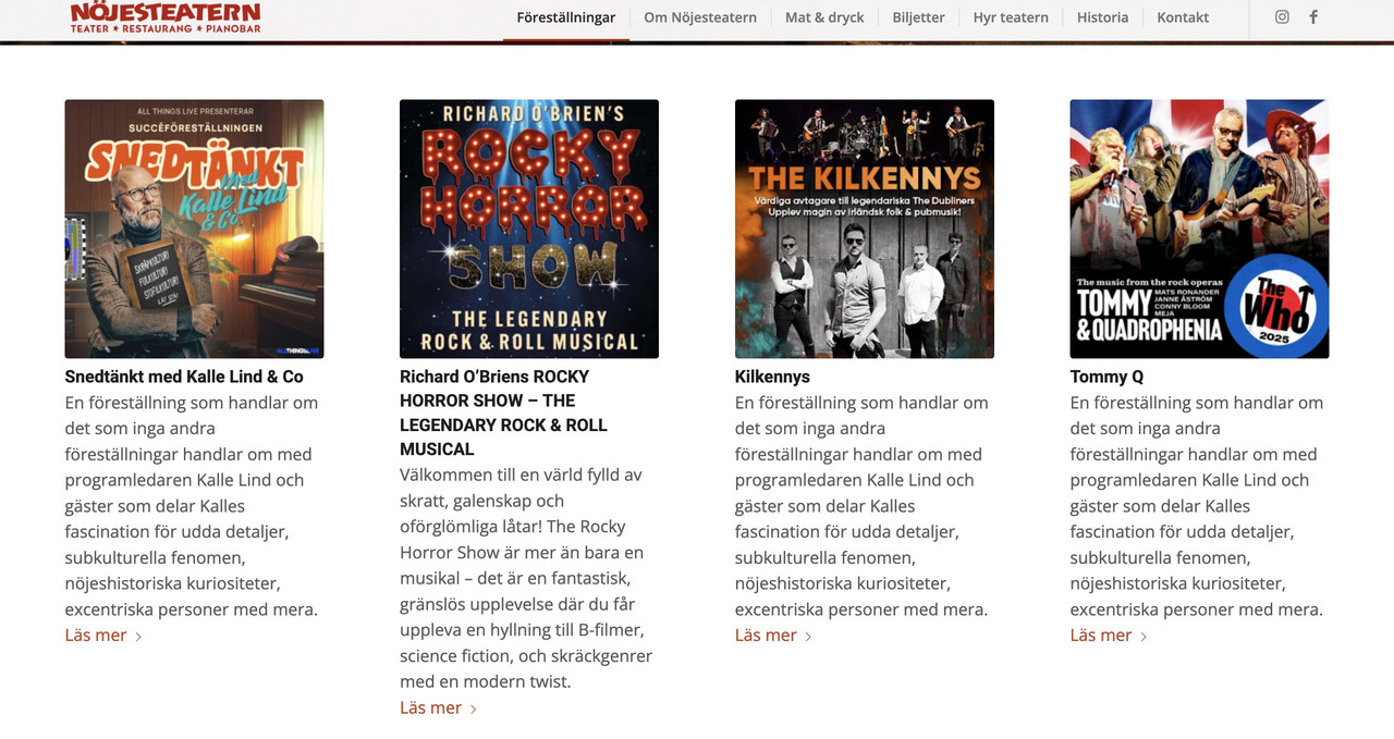
do these buttons have always the same link? or is it an individual link?
October 2, 2025 at 9:42 am in reply to: How to replace H3 with P (or span) in related articles titles #1489746the content-slider element is something different than that what you are using on your page – you are using the post-slider element – so try mikes code
in The DOM these elements got the classes : avia-content-sllider – so that is my mistake that i believe that you are using th content-slider element. -
AuthorPosts