Forum Replies Created
-
AuthorPosts
-
here is an only svg optimizing tool. : https://jakearchibald.github.io/svgomg/
drag and drop your svg into it. Or post the link to your svg here – and i will have a look to the code.PS : but if it is concerning to the touchsystems.com url – there are a lot ( not only the logo ) errors.
-
This reply was modified 3 years, 11 months ago by
Guenni007.
then offtopic Mike : why does the snippet above hamper building a postslider – it works great on blog post alb with grid style. But adding that snippet all postsliders ( even the portfolio sliders are gone )
both – on my webers-testseite.de there is too : postsliders ( of portfolios ) are gone – the are even not in the DOM.
On another 4.9.2.1 installation – the postsliders are there. so i started to look where is the difference. As mentioned above this testpage is for looking if something could be managed or not. One participant here likes to have first on a blog posts alb to have on top the sticky posts – and then the other posts.
If i erase the code above – the postsliders are there again. So my guess was that the snippet above is not only working within the blog post albs in the query, but also in the postslider.hm – no woocommerce no Events on that – but i got this too ! on Enfold 4.9.2.1 the shortcode is seen on debug mode – but on DOM there is no postslider.
i checke what could have influenced the issue – because on another installation – it is correct.
For a memenber here i checked the snippet to show first sticky posts then the rest. this snippet:function sticky_posts_first($query, $params) { $include = array(); $sticky = get_option( 'sticky_posts' ); $args = array( 'post__not_in' => $sticky, 'orderby' => 'modified', // here you can influence the orderby option of the non sticky post to your needs 'order' => 'desc', // the order of the non sticky posts 'numberposts' => -1 // -1 for all - that number is for the non sticky posts ); $posts = get_posts( $args ); foreach($posts as $post) { $include[] = $post->ID; } if ( !is_sticky() ) { $include = array_merge($sticky, $include); }; $query['post__in'] = $include; $query['orderby'] = 'post__in'; return $query; } add_filter('avia_post_slide_query','sticky_posts_first', 10, 2);seems to hamper the postslider shortcode. Because when i delete it from my child-theme functions.php – everything is there again.
Thanks thats it : and my setting to this container is just to give him a overflow: hidden. thats all.
But what i could not understand is – that this container only hampers the lightbox and tab-title to be active if the fixed Frame is choosen. But nevertheless – that is solved.
April 8, 2022 at 10:26 am in reply to: Masonry Gallery images always have a slight zoom effect #1347685this is often the case that a css setting determined via the developer tools works immediately, but eventually the rule must be set to at least important to take effect.
For my part, I try to get rules to show an effect rather through higher specificity. If at all possible I like to avoid setting !important rules.
What usually helps in this context is to add an ID to the rule.
Here you have to be a bit careful because avia-desktop sits at html as a class. Therefore – guess this wil work too:.avia_desktop #top .av-masonry-entry:hover .av-masonry-image-container { -webkit-transform: scale(1); transform: scale(1); }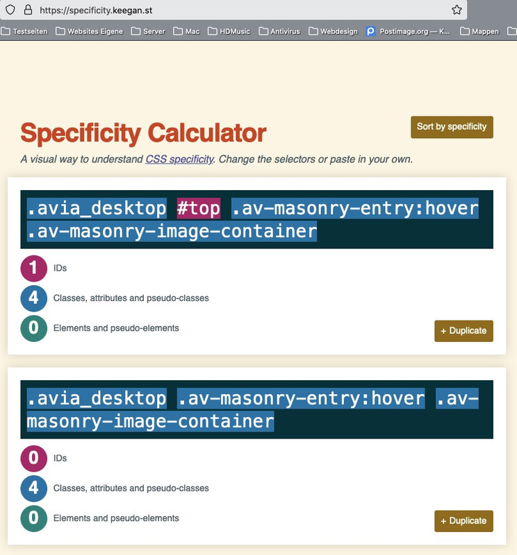
you can change the default heading tag by this snippet in child-theme functions.php:
function customize_slider_headings_default_tag( array $args, $context, array $extra_args = array()){
  if( $context == 'avia_slideshow' ){
    $args['heading'] = 'h1';
  }
  return $args;
}
add_filter( 'avf_customize_heading_settings', 'customize_slider_headings_default_tag', 10, 3 );
Then – all sliders that have set to default heading tag will have h1 titles
you can do that slidewise : open that slider in layout – click on the slide you like to change the heading tag – go to the tab: advanced and choose your tag “Heading Tag (Theme Default is <h2>)”
April 7, 2022 at 12:41 pm in reply to: Masonry Gallery images always have a slight zoom effect #1347550the container is scaled a little:
try in quick css:.avia_desktop .av-masonry-entry:hover .av-masonry-image-container { transform: scale(1) }yes – but only if you have choosen the fixed frame layout.
and yes – on emulation the browsers will do that – but that is not a real touch event emulation.April 6, 2022 at 10:09 pm in reply to: Posts are not kept on top when I display posts in grid layout #1347483btw: hier gibt es übrigens eine kleine Abwandlung wenn die Sachen paginiert werden:
https://kriesi.at/support/topic/sticky-posts-not-displaying-forst/#post-1230187April 6, 2022 at 10:06 pm in reply to: Posts are not kept on top when I display posts in grid layout #1347482that part:
$args = array(
  'post__not_in' => $sticky,
  'orderby' => 'title',   // here you can influence the orderby option of the non sticky post to your needs
  'order'	=> 'asc',    //  the order of the non sticky posts
  'numberposts' => -1  	 // -1 for all - that number is for the non sticky posts
  );
is only for the non sticky posts – and changing the orderby to: ‘title’, ‘rand’, ‘date’, ‘author’, ‘name’, ‘modified’, ‘comment_count’ or ‘menu_order’
does not work ?you do not need to set the custom class ! then all grid-rows were influenced.
Maybe it is necessary to add more selectors to those rules that they overwrite existing ones.
IDs on that will be very helpful – because they have more weight on that f.e.:to differ between the grid-rows with 5 or 6 etc cells you can add the class of them – f.e.:
#top .av-layout-grid-container {
  display: flex;
  flex-flow: row wrap;
  justify-content: space-between;
}

#top .av-layout-grid-container .flex_cell.av_one_fourth {
  flex: 0 1 25%;
  width: unset !important
}

@media only screen and (min-width: 768px) and (max-width: 989px) {
  #top .av-layout-grid-container .flex_cell.av_one_fourth {
    flex: 0 1 50%;
  }
}

@media only screen and (max-width: 767px) {
  #top .av-layout-grid-container .flex_cell.av_one_fourth {
    flex: 1 1 100%;
  }
}
to give better advice it would be helpful to know a link to your site. (Keep in mind though that I’m a participant like you, so I can’t see the private area).
btw: Be careful not to define overlapping areas. It is a good practice to use even numbers for min-width and odd numbers for max-width.
you have twice for 620pxi just changed the code above with an if clause – because it is better to not echo something that does not exist. ;)
PS : there is a little bit of it included now in the columns. If you go to the column alb element and open the first column element in a row – there is on the first tab : Row Settings – Row Screenoptions : there it is if you choose “reverse order” – this will be the row-reverse option.
If you choose “Individually select positon …” you can set each column in that row what position it got when in responsive case.
that is the order value. Linkyes – thats it – there is a good article about flexbox model on: css-tricks
At the core, it is based on declaring a parent container as a flex container. The direct child elements are then the Flex items. These can be assigned various properties. First of all, it is determined at the parent element whether they lie in a row or in a column, whether they wrap when there is a lack of space or not.
Unfortunately, all direct child elements participate in this procedure – even pseudocontainers, for example – which is why I removed them from the footer via display: none.
What you have to learn a little bit then are the shortcuts to the individual properties. So in the flex-flow the definition for column/row and wrap/no wrap is united (besides even how to wrap).
flex on the other hand combines the properties of the items: may grow, may shrink, width of the items.
etc. etc.For a gridrow – i recommend to give the gridrow element itself a custom class – that you can decide if or if not behave like that.
in my case on my test page it is: grid421
See: https://webers-testseite.de/alwin-gridrow/.av-layout-grid-container.grid421 { display: flex; flex-flow: row wrap; justify-content: space-between; } .av-layout-grid-container.grid421 .flex_cell { flex: 0 1 25%; width: unset !important } @media only screen and (min-width: 768px) and (max-width: 989px) { .av-layout-grid-container.grid421 .flex_cell { flex: 0 1 50%; } } @media only screen and (max-width: 767px) { .av-layout-grid-container.grid421 .flex_cell { flex: 1 1 100%; } }April 4, 2022 at 10:14 pm in reply to: Posts are not kept on top when I display posts in grid layout #1347191can you try this in your child-theme functions.php:
function sticky_posts_first($query, $params) {

  $include = array();
  $sticky = get_option( 'sticky_posts' );

  $args = array(
  'post__not_in' => $sticky,
  'orderby' => 'title',   // here you can influence the orderby option of the non sticky post to your needs
  'order'	=> 'asc',    //  the order of the non sticky posts
  'numberposts' => -1  	 // -1 for all - that number is for the non sticky posts
  );
  $posts = get_posts( $args );

  foreach($posts as $post) {
  $include[] = $post->ID;
  }
  if ( !is_sticky() ) {
    $include = array_merge($sticky, $include);
  };

  $query['post__in'] = $include;
  $query['orderby'] = 'post__in';

return $query;
}
add_filter('avia_post_slide_query','sticky_posts_first', 10, 2);
but that is only for the enfold blog posts ALB
PS for those params you can have:
orderby: ‘title’, ‘rand’, ‘date’, ‘author’, ‘name’, ‘modified’, ‘comment_count’, ‘menu_order’
order: ‘ASC’, ‘DESC’is there a link to the concerning page? Because the style of blog is set in enfold on different ways – f.e. if you choose elegant style or business style etc. – or layout grid etc.
Wenn du mit einem Child-Theme arbeitest ist das möglich, indem du dir ein child-theme loop-search.php erstellst.
wenn du das öffnest, siehst du auf Zeile 37 im neuesten Enfold :echo "<span class='search-result-counter {$counterclass}'>{$post_loop_count}</span>";dahinter könnte man platzieren: ( this is edited content here – it is better to avoid placement if there is image )
$searchimage = get_the_post_thumbnail( $the_id, 'square' );
if( ! empty( $searchimage ) ) {
	echo "<a class='slide-image search_image' href='".get_permalink()."'><span class='search-result-image'>{$searchimage}</span></a>";
}
wobei hier square durch andere Image-sizes von Enfold ersetzt werden kann ( large etc.)
Der Rest wäre dann css.
Dann hast du beides – die Nummerierung und ein featured Image.hier wäre die loop-search.php auf Basis von Enfold 4.9.2.1 – : https://pastebin.com/8d1jCDdJ
platziert würde diese ( ich behalte gerne die original Baumstruktur bei ) im child-theme/includes folder
schau mal hier: https://webers-testseite.de/?s=portfolio__________
PS : das wäre auch mit der ajax Suche möglich – ohne ein extra Plugin.
___________PPS:
hier sind mal die image-sizes, die man da setzen kann ( aus functions.php 211ff )widget (36x36), square (180x180), featured (1500x430), featured_large (1500x630), extra_large (1500x1500), portfolio (495x400), portfolio_small (260x185), gallery (845x684), magazine (710x375), masonry (705x705), entry_with_sidebar (845x321), entry_without_sidebar (1210x423),-
This reply was modified 3 years, 11 months ago by
April 4, 2022 at 8:52 pm in reply to: Unschärfe im Logo, trotz hoher Auflösung und korrekter Einstellung #1347187Danke für die Rückmeldung. ;)
i prefer to have first 2 / 2 columns – then in a row – please try in your quick css:
i do not see private content area so you had to play with that min-width value yourself:@media only screen and (min-width:620px) and (max-width: 989px) { #top #footer .container { display: flex !important; flex-flow: row wrap; justify-content: space-between; } #top #footer .container:before, #top #footer .container:after { display: none } #top #footer .container .flex_column { flex: 0 1 45%; margin: 0px !important; width: unset !important } }you can try this in additon to existing codes ( change the values or add – if not there )
#top .av-subnav-menu {
  flex-wrap: wrap;
  padding: 0;
  justify-content: center;
}

@media only screen and (max-width: 767px) {
  .responsive #top #wrap_all .container {
    width: 95%;
    max-width: 95%;
  }
}
on small screens like iphone 5 (320px – it will end in a two line sub-menu:
there is only missing a better media-query setting. It does not work between 620px and 990px
yes with gallery it works this way – but on Ismaels link ( besides the == ) for slideshow it does not work.
thanks – so i had to look inside the function: function shortcode_insert_button() for shortcode!
But then it is for slideshow: av_slideshow ? Please test the snippet yourself – on my end this will not work under 4.9.2.1
This clarifies the question – but still not solved ? …That’s right – I hadn’t considered that. Thanks Günter.
But now to the context. I can find it by opening the corresponding alb and searching above for the if( ! class_exists( ‘xyz’ ) )but on slideshow i had to look into the avia-shortcode-helpers to find the correct context: avia_slideshow the slideshow.php itself got: avia_sc_slideshow
with gallery i had no clue to get the right context neither avia_gallery nor avia_sc_gallery works.
So how to determine the right context.
For gallery images i had to take nikos code without context to work as expected.-
This reply was modified 3 years, 11 months ago by
try to read here : https://kriesi.at/support/topic/how-to-make-the-submenu-sticky-on-mobile/#post-1342985
and see : https://webers-testseite.de/transparent-header/
It is a hardwork because on my opinion there is an unnecessary css setting to !important. This can’t be overwritten from child-theme – except i got all three concerning files of submenu in the child-theme.
But they are in the DOM – only hidden. My solution to look how that container comes to your DOM is better. Just dare to try.
March 30, 2022 at 7:08 pm in reply to: Can the Portfolio grid auto not show the portfolio item of the current page? #1346646that is correct. But you see that on my testpage all is ok.
Did you have on top of your child-theme functions.php that<?phpthis introduction must remain above!
no – Rikard that is an alternative to have that – but offtopic ( for others who like to have this )
Alan wants to get rid of it – but better is to hamper the building of it than to only set it to display: nonesection#footer { display: none; }March 30, 2022 at 6:15 pm in reply to: Can the Portfolio grid auto not show the portfolio item of the current page? #1346637but you are using a child-theme or where did you enter that snippet?
you can see that it is working on my installation : https://webers-testseite.de/portfolio/john-dietz-elektrotechnik/ … and pirol ( i did not change the rest of all portfolios. -
This reply was modified 3 years, 11 months ago by
-
AuthorPosts