Forum Replies Created
-
AuthorPosts
-
sorry that “Link to: ” comes from Enfold – i thought that you had inserted it to the post title
the link comes from enfold itself. You do not need to insert on title input field links.
a p-tag inside a span-tag ? try another span with a custom class.
i tested 2 spans – that will lead to different troubles – because the span.entry-image will be placed inside and not besides entry-title
you can use :
Henri Flu • <i>1912-1944</i><span class="ondertitel">Geliefd huisarts en oorlogsslachtoffer</span>
or
Henri Flu <i><br>1912-1944</i><span class="ondertitel">Geliefd huisarts en oorlogsslachtoffer</span>then you can colorise the i by:
#top .avia-post-nav .entry-title > i {
  color: #ff0;
}
#top .avia-post-nav .entry-image img {
  width: 100%;
  height: 100%;
}
because of “Lösungen” now in german
ich sehe deine Seite nicht (als Participant ) aber versuch mal stattdessen:
#top #wrap_all .avia_mega_div {
    background-color: rgba(255,255,255,0.2);
    backdrop-filter: blur(6px)
}

#top #wrap_all #header .avia_mega_div ul,
#top #wrap_all #header .avia_mega_div ul * {
    background: transparent ;
    color: #000; /**** das war nur um es an meiner Testumgebung umzusetzen ***/
}
die hover styles der menu-punkte bleiben bestehen – was für das navigieren eventuell hilfreich ist.
jedenfalls war es auf meiner Seite so.see f.e. a test-page: https://webers-testseite.de/clippy-2/
( i set a custom ID to the sub-menu: submenu-with-icons )#submenu-with-icons .menu-item a .avia-menu-text:before { font-family: entypo-fontello; display: inline-block; position: relative; color: inherit; margin-right: 10px; line-height: inherit; font-size: 1.3rem; top: 2px; /*** just a correction if font-size is bigger than text ***/ } #submenu-with-icons .menu-item:nth-child(1) a .avia-menu-text:before { content: "\e82a"; } #submenu-with-icons .menu-item:nth-child(2) a .avia-menu-text:before { content: "\e82b"; }well you can insert them by css – just counting the menu-items:
f.e.:
on the left:#av-custom-submenu-1 .menu-item:nth-child(3) a .avia-menu-text:before { content: "\e82b"; font-family: entypo-fontello; display: inline-block; position: relative; color: inherit; margin-right: 10px }on the right:
#av-custom-submenu-1 .menu-item:nth-child(2) a .avia-menu-text:after {
  content: "\e82b";
  font-family: entypo-fontello;
  display:  inline-block;
  position: relative;
  color: inherit;
  margin-left: 10px;
}
in combination with the page id or a custom ID or class on the element is then unique for only that sub-menu
By the way: What causes some inconsistencies is not the loop – that works – but when a post/portfolio has multiple categories.
For example, for a post that has category A, this leads to the next post with category A (but now this has also categories B and C, for example). This is where the decision tree opens up – if no more posts with A are found, then B or C will probably be opened.you can see it here: https://webers-testseite.de/defined-order/
This post only has one category: telemedizin – left and right post-navigation leads to only one post with that category.
But if you open the next one – this now has more than one category – so this post opens different posts etc.The same category post-navigation only makes sense if the posts are always assigned to only one category.
you can see that if there are more than 1 post inside a category – it works:
https://kunst-en-verhalen.rhijnhof.nl/pieta/what makes me wonder is that on your posts with category: oorlogsslachtoffers (only 1) – there should be no post-navigation. ( Do you have in the page title that p-tag ?)
so maybe Ismael could help you with this inside your installationPS : the setting on Enfold > Blog Layout > Single Post Navigation setting is not important if you use the filter from : above
With the help of this filter, you can even handle post-types differently.
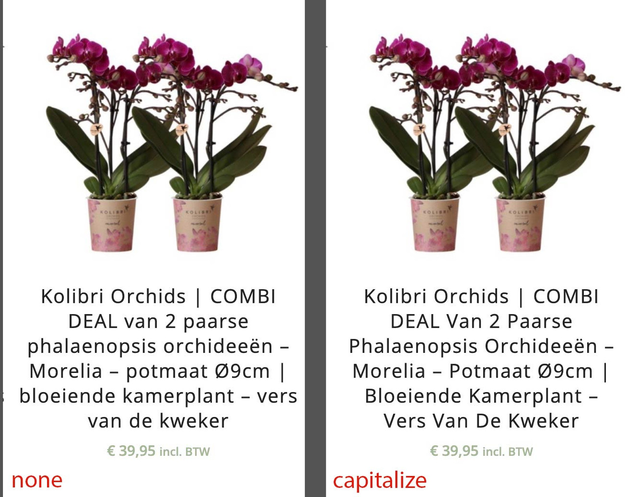
Yes – but capitalize means that every word begins with a big Letter; even connecting words (bindwoorden).
see : https://cssreference.io/property/text-transform/so it depends on what you like to have.
 November 11, 2025 at 8:25 am in reply to: Hamburger menu icon left, logo centered, search icon right #1491160
if it is active again –
try:.html_header_top #top #wrap_all .av_logo_right #header_main .logo { position: relative; left: 50%; right: auto; margin-left: unset; margin-right: unset; transform: translateX(-50%); width: auto; }you see i have centered the logo a little different – so if you find those margin-left and margin-right values in your code remove them.
i set it to unset to overwrite your settings.sadly – if there is the link – i can not see private content (as participant)
so you had to find the selector – and the declaration is then : text-transform: none;f.e.:
#top .template-page .entry-content-wrapper h1,
#top .template-page .entry-content-wrapper h2 {
  text-transform: none;
}
or
#top .products .product h2, #top .products .product h3, #top .products .product h4, #top .products .product h5, #top .products .product h6, #top h2.woocommerce-loop-product__title { text-transform: none; }a function like this to remove the image-sizes enfold likes to have:
function remove_enfold_image_sizes() {
// do NOT remove widget size, is used in backend portfolio items!
// remove_image_size('widget');
  remove_image_size('square');
  remove_image_size('featured');
  remove_image_size('featured_large');
  remove_image_size('portfolio');
  remove_image_size('portfolio_small');
  remove_image_size('gallery');
  remove_image_size('magazine');
  remove_image_size('masonry');
  remove_image_size('entry_without_sidebar');
  remove_image_size('entry_with_sidebar');
  remove_image_size('shop_thumbnail');
  remove_image_size('shop_catalog');
  remove_image_size('shop_single');
  remove_image_size('shop_gallery_thumbnail');
}
add_action('init', 'remove_enfold_image_sizes');
i guess does only influence the calculation of newly uploaded images.
The former uploads are not influenced on that. So these sizes are still in your uploads folder. (have a look by ftp inspection if this is the fact)
the use of Force Regenerate Thumbnails – removes those already calculated image-sizes that are not registered.Did you try to disable temporarly on performance the option : Responsive Images
then refresh all cachings and reenable the option again.
Maybe that will do the job.Next: have you regenerated the thumbnails – best is Force Regenerate Thumbnails plugin for that
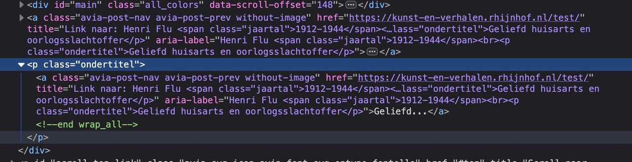
btw: where does the p-tag come from : p.ondertitel
See DOM:
and you have another post inside category: oorlogsslachtoffers ?
i guess not:https://kunst-en-verhalen.rhijnhof.nl/category/oorlogsslachtoffers
what makes me wonder is that if there is only one post inside that category – there should be no post-nav at all.
you see – here it is working with same category:
https://kunst-en-verhalen.rhijnhof.nl/pieta/November 10, 2025 at 5:27 pm in reply to: Boxed content in grid row with fullwidth background #1491127i’m participant as you are – so i do not see any private content area.
so you have to wait for mods here
November 10, 2025 at 5:18 pm in reply to: Hamburger menu icon left, logo centered, search icon right #1491126you have removed the search icon ?
#top .avia-tooltip.avia-tt {
  display: none !important;
}
November 10, 2025 at 2:12 pm in reply to: Hamburger menu icon left, logo centered, search icon right #1491118try:
@media only screen and (min-width:768px) {
  #top div .logo {
    z-index: 101 !important;
  }
  #top .main_menu,
  #top .avia-menu {
    width: 100%;
  }
  #avia-menu #menu-item-search {
    position: absolute;
    right: 0;
    left: auto;
  }
}
November 10, 2025 at 1:51 pm in reply to: Boxed content in grid row with fullwidth background #1491115i’m participant as you are – so i do not see any private content area.
on general layout – Maximum Container Width – this is the value i pull out in the snippet for the setting
$responsive_size = avia_get_option('responsive_size');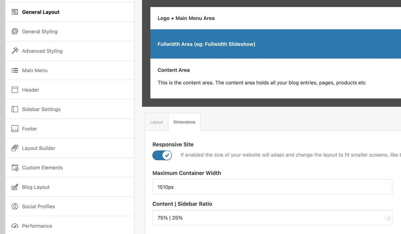
If you have there a 100% width set – then it wil be synchronized in the snippet too.
If that is the case – you have to use the other snippet with the “hard-coded” width and replace th 1310px with your 1400px now:function grid_layout_notfull(){ ?> <script> (function($){ $('.av-layout-grid-container.grid-notfull' ).each(function() { var notfullID = $(this).attr('id'); $(this).hasClass('main_color') ? $(this).wrap('<div class="main_color notfullsize '+notfullID+'"></div>') : ''; $(this).hasClass('alternate_color') ? $(this).wrap( '<div class="alternate_color notfullsize '+notfullID+'"></div>') : ''; }); $('.notfullsize').css({"clear": "both", "width": "100%" , "float": "left" , "position": "static" , "min-height": "100px" }); $('.grid-notfull').css({"max-width": "1400px", "margin": "0 auto" , "padding": "0 50px"}); })(jQuery); </script> <?php } add_action('wp_footer', 'grid_layout_notfull');May I see the page in question?
you are not talking about a custom post type?
if so include this (f.e.: event or tribe_events ) post-type to the arraywith this snippet you do not even need to set the enfold options on post-navigation.
You can set with that filter even to loop:function my_avf_post_nav_settings( array $settings ){ if( true === $settings['is_hierarchical'] ){ $settings['skip_output'] = true; return $settings; } // the post-types inside the array are allowed to have post-navigation if( ! in_array( $settings['type'], array( 'post', 'portfolio' ) ) ){ $settings['skip_output'] = true; return $settings; } $settings['loop_post_nav'] = true; $settings['same_category'] = true; $settings['is_fullwidth'] = false; $settings['skip_output'] = false; return $settings; } add_filter( 'avf_post_nav_settings', 'my_avf_post_nav_settings', 10, 1 );btw. if you set this (is_hierarchical) condition to false – then even pages will have post-navigation
you can start with it by using : “single Author small preview pic (…)”
(maybe from big preview pic it will work too)and then – see link test page: https://webers-testseite.de/blog-2/
scroll down for css rulesNovember 10, 2025 at 7:40 am in reply to: Klick auf Button öffnet Formular in Modal/Lightbox #1491097place your contact form inside a 1/1 container.
give a custom ID to that 1/1 container e.g. my-contactform
give a custom class to that 1/1 container mfp-hide
place a button on your site – with manual link : #my-contactform – and custom class: open-popup-link
(because custom class of the button goes to its wrapper the selector .open-popup-link a will work.btw. in the meantime you do not need this callback .
if you place inside your child-theme functions.php :add_filter( 'avf_default_lightbox_no_scroll', '__return_true' );November 9, 2025 at 9:38 pm in reply to: Boxed content in grid row with fullwidth background #1491078hallo @mofix – you can see here an updated snippet that will pull out the enfold options to determine the content width.
https://kriesi.at/support/topic/non-fullwidth-portfolio-or-grid-row-gets-colored-sides/#post-1491061
November 8, 2025 at 8:23 pm in reply to: Non-fullwidth Portfolio or Grid Row gets colored sides #1491064You’re talking about the grid row element, right?
Edit: sadly you did not post a link to your page – but your screenshot is clear enough – i found your site now.
Because it looks exactly the same when you set a grid-row by css to to be not full-width, I thought you had used this element.____________
So – why don’t you put the portfolio grid inside a 1/1 Container
The Color-Section can have the one background-color – and the 1/1 Container a different one.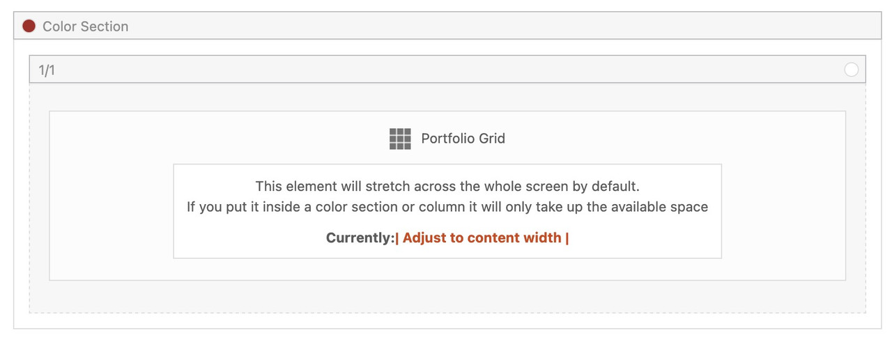
if you then do not want on top and bottom of the 1/1 Container the background-color of the Section just remove padding-top and padding-bottom of 50px.
try first this shorter form – maybe that will work for you.
(do not know if the old filter is still ther avia_ …)
there are more complex snippets – but in almost all installations this will work:function enfold_customization_postnav($settings){ $settings['skip_output'] = false; $settings['same_category'] = true; return $settings; } add_filter('avf_post_nav_settings','enfold_customization_postnav', 10, 1);edit: here is one with more options:
function my_avf_post_nav_settings( array $settings ){
  if( true === $settings['is_hierarchical'] ){
    $settings['skip_output'] = true;
    return $settings;
  }
  if( ! in_array( $settings['type'], array( 'post', 'portfolio' ) ) ){
    $settings['skip_output'] = true;
    return $settings;
  }
  $settings['same_category'] = true;
  $settings['is_fullwidth'] = false;
  $settings['skip_output'] = false;
  return $settings;
}
add_filter( 'avf_post_nav_settings', 'my_avf_post_nav_settings', 10, 1 );
November 8, 2025 at 4:06 pm in reply to: Non-fullwidth Portfolio or Grid Row gets colored sides #1491061a pure css solution is perhaps not possible.
i have my snippet for child-theme functions.php :
function grid_layout_notfull(){
$responsive_size = avia_get_option('responsive_size');
?>
<script>
(function($){
  $('.av-layout-grid-container.grid-notfull' ).each(function() {
    var notfullID = $(this).attr('id');
    $(this).hasClass('main_color') ? $(this).wrap('<div class="main_color notfullsize '+notfullID+'"></div>') : '';
    $(this).hasClass('alternate_color') ? $(this).wrap( '<div class="alternate_color notfullsize '+notfullID+'"></div>') : '';
  });
  $('.notfullsize').css({"clear": "both", "width": "100%" , "float": "left" , "position": "static" , "min-height": "100px" });
  $('.grid-notfull').css({"max-width": "<?php echo $responsive_size; ?>" , "margin": "0 auto" , "padding": "0 50px"});
})(jQuery);
</script>
<?php
}
add_action('wp_footer', 'grid_layout_notfull');
what you had to do: give a custom class to the grid-row element: grid-notfull
see: https://webers-testseite.de/grid-row-alb/the difference between green color-section to following grid-row on my testpage comes from the standard padding of grid-cells of 30px
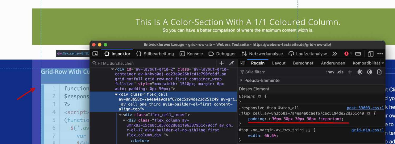
PS: the ID of the grid-row element goes to its wrapper as class.
ok – i think you should use not the nextgen gallery images for that – In that case, you would not have taken advantage of the lightbox, which displays an enlarged version of your images. Instead, use the original uploaded files.
Why not try the Masonry gallery? It offers even more configuration options. – The css code is on my testpage
Assign a custom class to this gallery – and reduce the value for the maximum width – as on blog pages. e.g: 800px
.avia-gallery.your-custom-class {
  max-width: 800px;
  margin: 0 auto;
}
you can decide to show on grid a smaller version of your images – and in light-box to show the full image. On masonry-gallery you can set to have different column-counts on responsive case.
-
AuthorPosts