
Tagged: enfold, mobile, rtl, tab section
-
AuthorPosts
-
August 4, 2017 at 12:15 pm #834305
1. Page http://www.bike2work.co.il/events/bike2work-day-herzliya-0516/ (which was created as part of promoting commuting to work by bicycles) has a Tab section with 7 Tabs (Main, Registration, …).
2. In edit mode everything looks fine.
3. In the published page I can see the tabs (and the page’s content), but when I click a tab, I get a blank page (except after pressin th MAIN Tab – the content is shown again).
4. I left one of the tabs in Hebrew (RTL language) to show another problem: When I click on that tab, nothing happens.
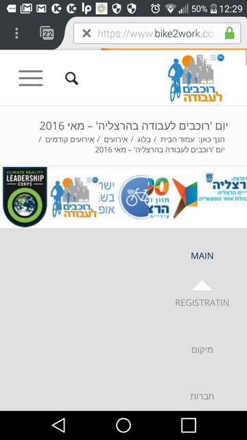
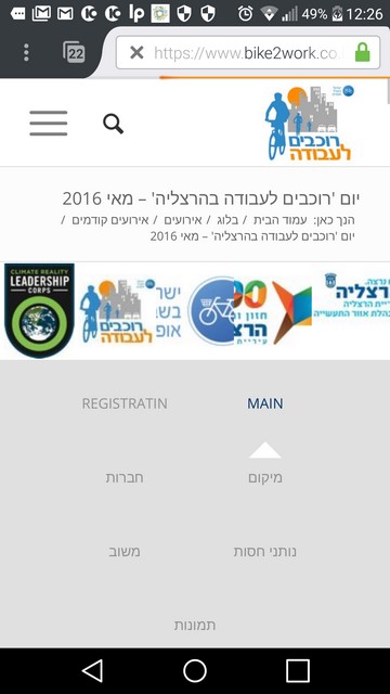
5. In a mobile phone, only three Tabs are visible (of 7), but when I click any of them, all tabs dissapear from the screen.
I’m not a programmer. I have basic knowledge of HTML. If I have to change anything in a CSS file, please give detailed instructions.-
This topic was modified 8 years, 8 months ago by
eransh.
August 4, 2017 at 3:44 pm #834359I would love to find a solution to this as well. I have a website that uses the tab section with images on multiple tabs. They show up great on the computer but does not show up in the mobile version. I’ve search other threads and have not found a solution that works.
Info shared privately. The tabs are in the team section and membership section.
-
This reply was modified 8 years, 8 months ago by
tivo_designs.
August 7, 2017 at 7:24 pm #835562Is there anyone who can help troubleshoot this for me? I turned off the fade in feature which made the images not load in the mobile version. However, the client would like for this feature to be present. Also, the padding seems to be off in the mobile version. Please advise…
Thanks!
August 7, 2017 at 9:26 pm #835608Hi Tivo_designs,
Your last reply might confuse the helpdesk team, as it is not connected to the issue I’ve raised (a specific problem with Tab section). Please open another card for the new issue.
Thanks!August 9, 2017 at 7:46 am #836209Hi,
Thank you for using Enfold.
Please update the theme to the latest version, 4.1.2. This version contains the patch for the tab section issue. Let us know if it helps.
We would like to apologize for the delay. We normally respond within 24 hours but in the wake of the latest theme update, we have received more inquiries than usual. Please be patient while we go through the rest of the queue. Thank you for your understanding.
Best regards,
IsmaelAugust 9, 2017 at 3:39 pm #836453Hi Ismael,
The theme is the most up to date version (4.1.2) and it’s still the same.
No worries on the delay. I would just like to have this issue solved soon. Either a patch through functions.php or Quick CSS. Do you have any suggestions?
Thanks.
August 9, 2017 at 10:23 pm #836659Hi Ismael,
Thanks for your reply.
I’ve updated the theme to version 4.1.2. There is an improvement, but it is still not working well.
The content of the tabs (other than the MAIN tab) is shown only when you scroll down.
For instance, in the Registration tab, you’ll see the registration form only when you scroll down. In the Companies tab you can see participating companies logos, but only when you scroll down.
The same goes to the tab with the Hebrew name (which is Location), however nothing appears after the # sign in the url for the Hebrew tab name.
The mobile website got worth – the menu blends with the site’s logo (at the right hand corner) and the all tabs show for a second and disappear.
Waiting to hear what should be done in order for the problem to be solved.-
This reply was modified 8 years, 8 months ago by
August 10, 2017 at 10:16 am #836871Hi,
Thank you for the update. The tabs are working properly on our end even if the site is set to “rtl”. Please edit the js > shortcodes.js file, remove everything then replace it with the following code.
// https://pastebin.com/dWqzXLDV
Remove browser cache or hard refresh before checking the page. If this is still not working, try to replace the “מיקום” tab with alphabet characters.
Best regards,
IsmaelAugust 11, 2017 at 12:19 pm #837411Hi Ismael,
The problem persists. The content of the tabs (other than the MAIN tab) is shown only when you scroll down.As you’ve instructed, I replaced the code in /public_html/wp-content/themes/enfold/js/shortcodes.js
with the code you put in // https://pastebin.com/dWqzXLDV
I did it using Windows notepad.
I cleared cache (with CCleaner).
I tried it on Firefox, Chrome and Internet explorer.
No change on mobiledevice as well (Android). The tabs on the mobile device are seen for a very short period of time (about 1 second) and then they dissapear.
Best, have a nice weekend
EranAugust 12, 2017 at 5:05 am #837714Hi,
@eransh: Please edit the tab section then set the “Content height” settings to the second option (Auto adjust to content).Best regards,
IsmaelAugust 12, 2017 at 11:32 am #837821Hi @Ismael,
Thanks.
I’ve edited the tab section and set the “Content height” settings to the second option (Auto adjust to content).
This solved the problem on the web browser (including the Hebrew tab name), but not on the mobile device.
On the mobile device, on that split second that I see the tab names before they dissapear (I see a blank space betwwen the logos and the beginning of text), if I press one of them, the proper part is presented (but again, no tabs are shown). I have uploaded two screenshots from the mobile device. The first one shows the tab names (for a split second) and the other one is the same screen where the tab names dissappeared.
https://www.bike2work.co.il/enfold-support/-
This reply was modified 8 years, 8 months ago by
August 14, 2017 at 11:56 am #838575Hi,
Thank you for the update. The tab titles should be inline with each other. Please provide the login credentials to the site so that we can inspect it.
Best regards,
IsmaelAugust 14, 2017 at 7:20 pm #838889This reply has been marked as private.August 15, 2017 at 4:12 pm #839381Hi Eran,
Here is a thread for you to consider
If you need further assistance please let us know.
Best regards,
VictoriaAugust 15, 2017 at 9:34 pm #839588Hi Victoria,
Thank you very much.
I’ve made both changes indicated in the related support ticket (Tab Section – RTL).
This made a great progress towards solving the issue, but not completely. In the private content I put a link to an updated screenshot from my mobile phone. Only 3 tabs are shown, although there are seven tabs (as you can see in the desktop version of the website). Tabs are working fine, but users are not aware that they can swipe to viwe more tabs to press on. I can barely see that there is a “pointer” that points on the selected tab.
Question: How can the “pointer” be more visible to the users, and how can he see that there are more tabs to view, better on the screen without swiping.
Best regards,
Eran

-
This reply was modified 8 years, 8 months ago by
August 16, 2017 at 11:50 am #839830Hi Eran,
Well, the easiest is to add some contrast and make the titles container a bit darker.
.av-tab-section-tab-title-container {
    background-color: rgba(0,0,0,0.12);
}
Let me know how this works for you.
If you need further assistance please let us know.
Best regards,
VictoriaAugust 16, 2017 at 12:17 pm #839845Hi Victoria,
Could you tell me where exactly should I insert the code? I’m not a programmer so I need ‘cut & paste’ instructions.
Is there a way to show all tabs on the same screen without the user need to swipe to see more tabs? Users may be unaware of the tabs that are hidden at the left or right side of that tab bar.
If I insert the code into one of the theme’s files, what would happen in the next release?
Regards,
EranAugust 18, 2017 at 10:29 pm #841055Hi,
Please go to the Theme Options and there, you will see all the options
You can paste the on Custom CSS the code that has been provided from Victoria.Best regards,
BasilisAugust 19, 2017 at 12:26 pm #841263Hi Basilis,
Thanks. I’ve added the code to the Quick CSS and it helped partialy, since the tabs are more noticeable, yet swiping is not “slick”. When you try to swipe to the next tab (on a smartphone), it is sometimes skipped and the content of the next tab is presented.
This arises again the second question I asked in the last post, which I believe is a need: Is there a way to show all tabs on the same screen without the user need to swipe to see more tabs? Users may be unaware of the tabs that are hidden at the left or right side of that tab bar.
Best regards,
EranAugust 22, 2017 at 7:52 am #842344Hi,
This arises again the second question I asked in the last post, which I believe is a need: Is there a way to show all tabs on the same screen without the user need to swipe to see more tabs? Users may be unaware of the tabs that are hidden at the left or right side of that tab bar.
Add a simple Tab element beside the current Tab Section then use the elements’ Screen Options to toggle their display properties. You’ll be hiding the original tab section on mobile and replace it with a simple Tab element for mobile users.
Best regards,
IsmaelAugust 22, 2017 at 10:27 am #842392Hi Ismael,
Thanks for the reply.
Does this mean that I have to duplicate all the content in each of the tabs in the Tab Section to 7 different simple Tab elements? This might be a broblematic task since in two of the tabs there is a Code Element which holds the code for google docs as registration form and feedback form. As much as I can see, you cannot insert a Code Element into a simple Tab Elemet (like you can in a Tab Section).
Do you plan to make changes in a near future version to fix this problem in the Tab Section? I saw in other support cards that this problem was raised by others as well.
Thanks.
EranAugust 24, 2017 at 12:41 pm #843448Hi,
Does this mean that I have to duplicate all the content in each of the tabs in the Tab Section to 7 different simple Tab elements?
Yes, that’s an alternative if you you don’t like how the tab section title is laid out on mobile. Unfortunately, you can’t display all the tab title on the screen without cramping them out. Imagine more than 5 or 7 tab section titles displayed altogether in an iPhone screen on portrait mode. However, if you want the tab section title to stack on top of each other, you can add the following css code but I’m sure it will create its own issues.
@media only screen and (max-width: 768px) {
  .js_active .av-tab-section-tab-title-container {
      width: 100% !important;
      min-width: 100% !important;
  }

  #top .av-section-tab-title {
      width: 100% !important;
  }
}
Best regards,
IsmaelAugust 24, 2017 at 8:48 pm #843688Hi @Ismael,
Thanks for the reply and the code, but it didn’t work. It showed vertically for a second, and disappered. I think that a better solution would be that within the Tab Section, the Tabs would span in several rows. The number of rows will be determined according to the width of tabs names. Will this be a possible enhancement in a future release of Enfold theme?
There are two more issues with the Tab Section:
1) When the tab name is in English, the url ends with the tab’s name (i.e #Main, #Registratin) however when the tab’s name is in Hebrew (as it should, as the website is in Hebrew), the url’s of all the tabs finishes with #-1.
2) in mobile, the swipe is inconsistent. It sometimes doesn’t move the tabs bar, and sometimes it “jumps” over a tab.
Best regards,
Have a wonderful weekend
Eran-
This reply was modified 8 years, 8 months ago by
August 26, 2017 at 5:40 am #844286Hi,
the Tabs would span in several rows. The number of rows will be determined according to the width of tabs names.
Thank you for the suggestion. Could you please provide a screenshot or a mockup? It works in our local installation. The tab titles stack on top of each other. Again, I think the best workaround is to create another simple Tab element in place of the tab section for mobile view. And yes, the tab element accepts custom code so you can move the content of the code block directly to the tab content editor.
You’re probably experiencing these issues due to the custom codes (google docs) and the site being “rtl”. The tab section element is quite new so it requires more adjustments and will most likely break if there are custom codes inside. Did you try it without the custom codes?
Best regards,
IsmaelAugust 26, 2017 at 12:47 pm #844337Hi @Ismael,
I did not try to solve is with separate Tab elements as this is a workaround that I prefer not to do, but use a Tab Section that will handle this case. It’s a good section type. I think the efforts are worthwhile to make it even a better section type.I’ve re-entered the code you’ve provided in the Quick CSS box. The results are shown in the following screenshots:
screenshot #1, Tab names are stacked in one column, but they dissapear after a split second. The blank rows are shown in screenshot #2. In any case, presenting each tab in a separate row (in one column) is not a good solution. The solution is presenting Tab names in several rows, according to the Tab names lengths. In screenshot #3 you can see tab names are presented in several rows (two at each row). I think there is enough space for three tabs, but this is the direction. This screenshot was taken before I entered your last code, but the are presented in this way only for a split second and then become one row that has to be swiped.
Screenshot1 Tab names in one column:
https://www.bike2work.co.il/wp-content/uploads/bike2work-mobile-tab-names-stacked-7rows-26082017-small.jpg
Screenshot2, Tab names dissapear, leaving 7 rows empty.:
https://www.bike2work.co.il/wp-content/uploads/bike2work-mobile-tab-names-blank-7rows-26082017-small.jpg
Screenshot3, Tab names are shown in two columns, 4 rows (but it immediately becomes to a one row that can be swiped):
https://www.bike2work.co.il/wp-content/uploads/bike2work-mobile-tab-names-4rows-26082017-small.jpg
Screenshot 4: Single row tab, that must be swiped on a mobile phone:
https://www.bike2work.co.il/wp-content/uploads/bike2work-mobile-tab-names-1row-26082017-small.jpgUsing custom codes for Google docs: I took out the egistration form code from the ‘code block’ of the Registration tab, but it made no difference. I put them back again.
-
This reply was modified 8 years, 8 months ago by
September 2, 2017 at 5:22 am #847044Hi,
Thank you for the update. I would like to check this again but the login credentials are not working anymore. Could you please provide another login details?
Best regards,
IsmaelSeptember 2, 2017 at 8:35 am #847105Hi Ismael,
Thanks for your reply.
I put the login credentials in the private area.
Best,
EranSeptember 9, 2017 at 6:07 am #849849Hi,
I think it will work better if there are icons in the tab section title. It will look more prominent. We created a test page. ( see private field )
Best regards,
IsmaelSeptember 9, 2017 at 10:28 am #849902Hi @Ismael,
Thanks for the reply. Adding Tab icons is a good ides. I implemented it in the Tab section in question, although couldn’t always find the right icon for the text.This still doesn’t solve the problems I’ve raised:
1) When the tab name is in English, the url ends with the tab’s name (i.e #Main, #Registratin) however when the tab’s name is in Hebrew, the url’s of all the tabs finishes with #-1 meaning that there is a problem in the name placeholder when the tab name is in Hebrew. Maybe there should be different fields for the displayed name and the name placeholder (#…) so that it will accommodate better with RTL languages.
2) In mobile, most tabs are hidden so the user have to swipe in order to make other tabs visible. It is not clear to the user that there are hidden tabs. The Tab section is a cool one, but it has to be revised so it will accomodate mobile devices better.
3) in mobile, the swipe is inconsistent. It sometimes doesn’t move the tabs bar, and sometimes it “jumps” over a tab.Also, I’ve noticed that when in “Edit Tab” > colors, the “Insert button” covers part of the third “Custom background image”. Maybe this happens due to the fact that button should change places when the theme works for RTL languages.
Best regards,
Eran -
This topic was modified 8 years, 8 months ago by
-
AuthorPosts
- The topic ‘Tab Section – pages don't show’ is closed to new replies.