
-
AuthorPosts
-
January 13, 2020 at 12:42 am #1172603
Hi, I am using a full-width menu as a feature. How do I made this sticky on mobile? I also need to change the wording from ‘menu’ to ‘supermarket shop’ and have the font in dark blue
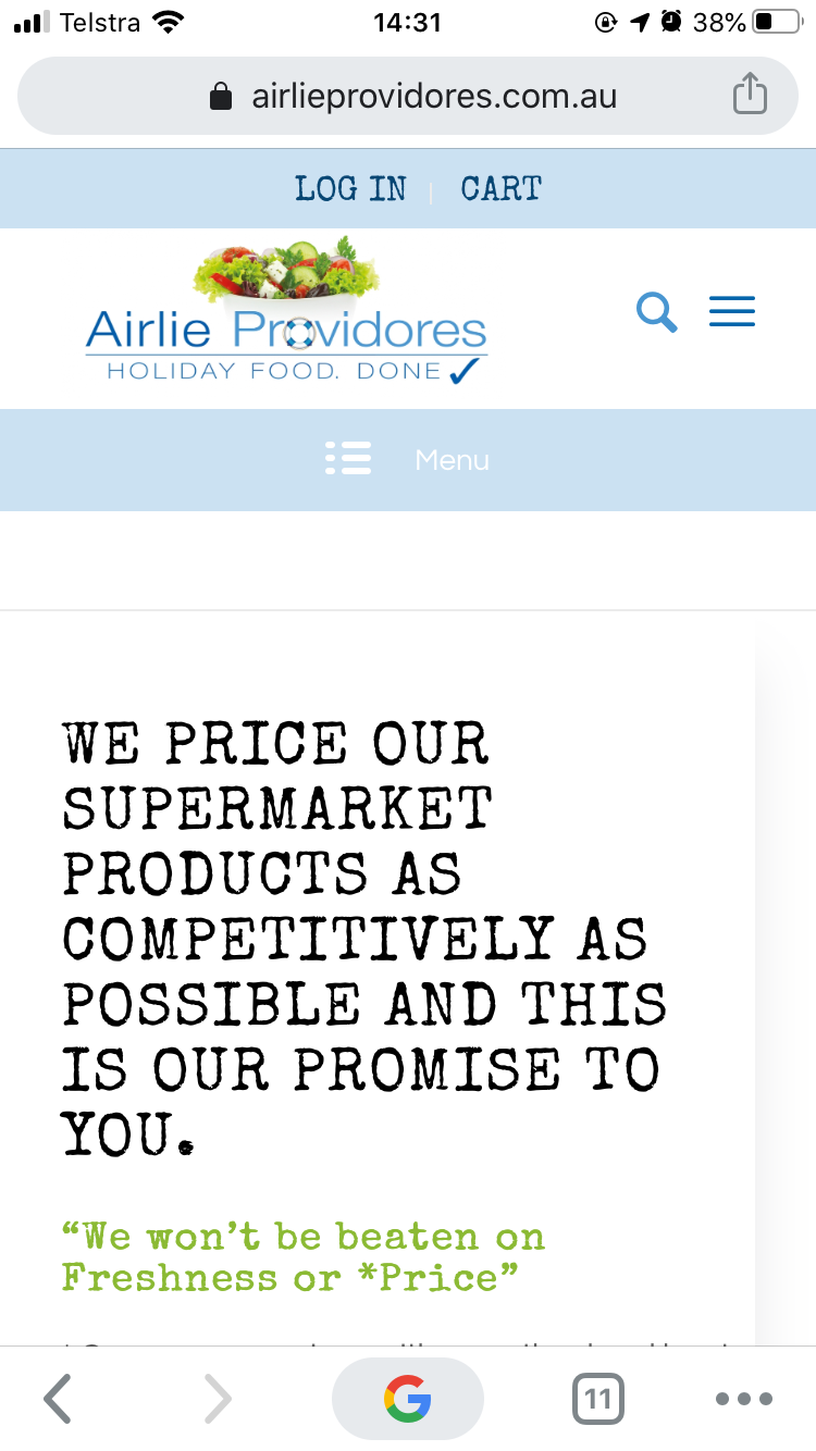
See screenshot
https://airlieprovidores.com.au/wp-content/uploads/2020/01/IMG_1709.pngJanuary 13, 2020 at 6:36 am #1172665Hi adGroupMarketing,
It seems you have already done it using this code:
@media only screen and (max-width:767px) {
  .responsive #top #wrap_all #header {
    position: fixed !important;
  }
}
Let us know if you still need further assistance.
Best regards,
NikkoJanuary 13, 2020 at 8:09 am #1172683It doesn’t stick the sub menu though which is an additional element to this page?
January 14, 2020 at 5:08 pm #1173452Hi adGroupMarketing,
Can you try adding this CSS code:
@media only screen and (max-width:767px) {
.responsive #top.page-id-5629 #sub_menu1 {
    position: fixed !important;
    top: 116px !important;
  }
}
As for replacing menu for ‘Supermarket Shop’, we suggest using a child theme first since any modification will be lost in the parent theme during a theme update, here’s the link where you can download and find instructions on how to use the child theme: https://kriesi.at/documentation/enfold/child-theme/
Then override the fullwidth submenu, by following the instructions in: https://kriesi.at/documentation/enfold/intro-to-layout-builder/#add-elements-to-alb
Next copy enfold > templatebuilder > avia-shortcodes > menu folder to the shortcodes folder of the child theme, then modify menu.php (enfold-child > shortcodes > menu > menu.php), in line 588 (Enfold 4.7.1) you will find this code:$mobile_button = $mobile == 'active' ? "<a href='#' class='mobile_menu_toggle' " . av_icon_string('mobile_menu') . "><span class='av-current-placeholder'>" . __( 'Menu', 'avia_framework' ) . '</span></a>' : '';replace Menu with Supermarket Shop.
Hope this helps.Best regards,
Nikko -
AuthorPosts
- You must be logged in to reply to this topic.