
-
AuthorPosts
-
September 9, 2020 at 6:02 pm #1244672
Hey, I would like to change my header in mobile version and distribute the elements as I show in the image.
I have tried what it says in this thread, but the logo loses its hyperlink and the distribution is not exact to what I looking for.And I would like to add the icon of “my account” ONLY in mobile, since in desktop view I have “sign up” and “login” set.
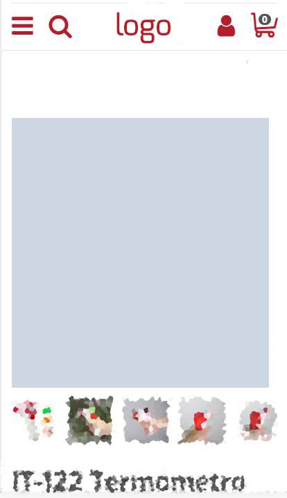
Thanks.
September 10, 2020 at 9:57 am #1244811Hey davodoner,
The logo link will work again with this code:
@media only screen and (max-width: 479px) {
    .responsive.html_bottom_nav_header.html_cart_at_menu #top #wrap_all .main_menu {
        width: 32%;
    }
}
To be able to add the account button next to the cart you’ll need to modify the function avia_woocommerce_cart_dropdown() in the files
/config-woocommerce/config.php
/config-woocommerce/config-356.phpBest regards,
VictoriaSeptember 10, 2020 at 10:53 am #1244854Hey Victoria, that work perfectly thanks so much!
Do you know that I have to add in /config-woocommerce/config.php and /config-woocommerce/config-356.php to be able to show the icon of “my account”?
September 12, 2020 at 6:01 pm #1245406Can you help me Victoria?
September 14, 2020 at 12:08 pm #1245727Hi,
Thank you for the update.
Have you tried adding the account icon or image as widget? We can then declare a css media query so that the icon is only visible on mobile view. Please check the following documentation for more info.
// https://kriesi.at/documentation/enfold/header/#adding-a-header-widget-area
Aside from using a widget, we could also use the ava_main_header hook in the functions.php file to insert additional content or element inside the main header container.
Example:
add_action('ava_main_header', function() {
    echo "account icon";
}, 10, 1);
Best regards,
IsmaelSeptember 14, 2020 at 3:13 pm #1245773Hi Ismael, thanks! I have managed to use the widget but not in the place I want, I would like to add the /uf007 icon next to the icon cart in mobile,
Can you help me? Thanks!
-
This reply was modified 5 years, 7 months ago by
davodoner.
September 16, 2020 at 5:45 am #1246155Hi,
Thank you for the update.
We could use this css code to center align the logo, move the mobile menu and search icon to the left and keep the account button beside the cart icon on mobile view same as the screenshot above.
@media only screen and (max-width: 767px) {
    .responsive #top .logo {
	width: 100%;
    }

    .responsive .logo img {
	left: 50%;
	transform: translateX(-50%);
    }

    .responsive.html_bottom_nav_header.html_cart_at_menu #top #wrap_all .main_menu {
	right: auto;
	z-index: 102;
	left: 0;
	top: 0;
    }
}
Best regards,
IsmaelSeptember 16, 2020 at 10:24 am #1246245Thanks Ismael, but now the logo covers the menu and the magnifying glass in my mobile version,
Do you know how I can correct it? I also can’t get an icon to show on my widget: /
Sorry for the disturbances
September 16, 2020 at 4:11 pm #1246367Now the search and the menu do not work on the mobile :/
September 18, 2020 at 8:16 am #1246692Hi,
Sorry about that. We forgot to check the mobile menu and search icon after moving it to the left of the sidebar. To make them clickable again, please increase the z-index value from 102 to 200 or higher from this css code.
 .responsive.html_bottom_nav_header.html_cart_at_menu #top #wrap_all .main_menu {
	right: auto;
	z-index: 102;
	left: 0;
	top: 0;
}
This should be:
 .responsive.html_bottom_nav_header.html_cart_at_menu #top #wrap_all .main_menu {
	right: auto;
	z-index: 200;
	left: 0;
	top: 0;
    }
We might have to increase the z-index of the widget and the cart icon as well.
.responsive #top .cart_dropdown {
	z-index: 200 !important;
}

.responsive #top #header .widget {
        z-index: 201 !important;
}
Best regards,
IsmaelDecember 14, 2020 at 12:09 am #1266963This is exactly what I want too, I asked this in another post but got no response … Here I can’t find the solutions that work in what you say
I wonder why the theme enfold can’t change the location of the Hamburger, I just want it on the left, and add an icon for “my account”. It’s not great I can’t do that. ..-
This reply was modified 5 years, 4 months ago by
stef93500.
December 15, 2020 at 4:43 am #1267345Hi,
@stef93500: That should be possible. Please open a new thread and post the site or page URL in the private field so that we can check the current layout of header and provide the necessary modifications. We will close this one for now.Best regards,
Ismael -
This reply was modified 5 years, 7 months ago by
-
AuthorPosts
- The topic ‘Logo center on mobile’ is closed to new replies.