
Tagged: Gridrow
-
AuthorPosts
-
March 6, 2021 at 10:11 am #1286030
Hi,
attempting a fullwidth color section with 50% text & 50% image that’s responsive. Image dimensions: 1600 x 1455.
CSS
/* Color section container width */
#panel-4 .container {
  width: 100% !important;
  min-width: 100%;
  max-width: 100%;
  padding: 0;
  margin: 0;
}
The image part just isnt working. Please see example below in Private Content.
Thank you and best wishes.
-
This topic was modified 4 years, 4 months ago by
Hidealoo. Reason: added image dimensions
March 8, 2021 at 4:11 am #1286271Hey Webmaster,
Please try to use a Grid Row element, instead of a Color Section. The section with the panel-4 id looks good on my end though, so maybe you found a solution already?
Best regards,
RikardMarch 8, 2021 at 9:46 am #1286356Hello,
and thank you for your reply.
The main problem with the Color Section was that if I inserted a background image it cleared my CSS, mainly “background-size: cover”, so didn’t work the way I wanted. Plus the CSS was getting rather messy and complicated.
As you can see, I managed to get the Grid Row to work in desktop mode, many thanks for that tip. The Grid Row doesn’t work when viewed on a mobile device, as the image is not full height as in desktop view..
The only difference in functionality between the Color Section and Grid Row, is that the Grid Row has no Scroll Down Arrow option. Can the arrow be added to the Grid Row?
Thank you and stay safe.
-
This reply was modified 4 years, 4 months ago by
March 12, 2021 at 8:00 am #1287601Hi,
Sorry for the late reply. First off, could you try updating the theme to the latest version (4.8.1) to see if that helps please? https://kriesi.at/documentation/enfold/how-to-install-enfold-theme/#theme-update.
Best regards,
RikardMarch 14, 2021 at 1:34 pm #1288097Just noticed that the support has lapsed. Can we pay for support or is it a case of re-purchasing the theme?
Thanks.
March 15, 2021 at 7:04 am #1288192Hi Hidealoo,
You can renew support for the theme.
Here’s an article that shows how to renew support for the theme: https://www.getbowtied.com/documentation/common-issues-and-faqs/how-to-renew-support-for-your-wordpress-themes-on-themeforest/
Hope it helps.Best regards,
NikkoMarch 15, 2021 at 5:55 pm #1288358Thank you, will do :)
Stay safe.
March 16, 2021 at 4:07 am #1288415Hi Hidealoo,
You’re welcome and stay safe as well :)
Best regards,
NikkoMay 3, 2021 at 9:57 pm #1298095This reply has been marked as private.May 4, 2021 at 3:07 pm #1298300Hi Hidealoo,
We’re happy to hear that :)
As for the Background Images, its height is dependent on other elements so when it’s in mobile it does not have a height unless a minimum height is set.
The workaround for this is:
1. Add an image inside the grid row cell (the image should be similar to the background image).
2. Edit the image element, go to Advanced > Responsive > Element Visibility then check Hide on large screens and Hide on medium sized screens.
Hope this helps.Best regards,
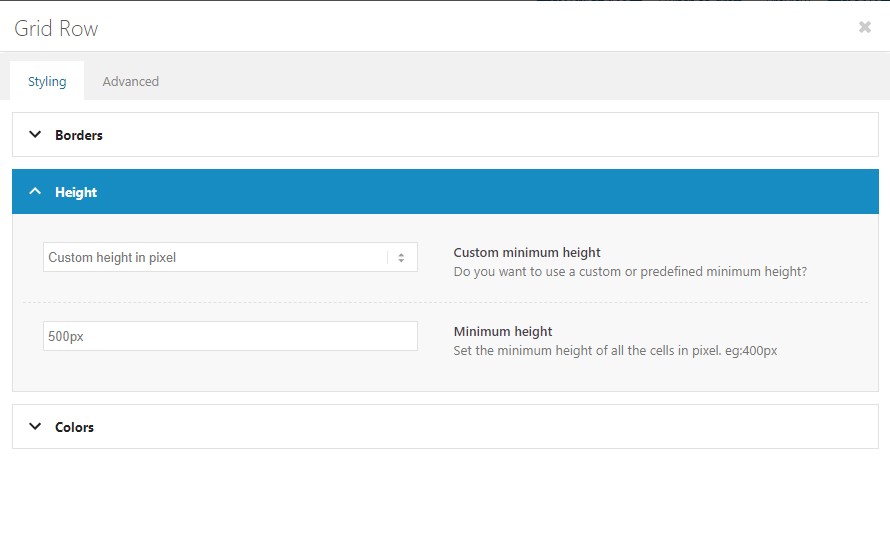
NikkoMay 4, 2021 at 4:50 pm #1298342I found that this method worked to display the images on a mobile device.
Grid Row -> Styling -> Height -> Minimum height -> 0 (default)
I changed to 500px and now the Background images appear as expected on the mobile device.
Thank you for your help. Please can you close the Ticket?
Stay safe.
May 4, 2021 at 10:56 pm #1298377Hi Hidealoo,
We’re glad to hear that :)
Thanks for using Enfold and have a great day!Best regards,
Nikko -
This topic was modified 4 years, 4 months ago by
-
AuthorPosts
- The topic ‘Fullwidth Color Section with Image Not Behaving.’ is closed to new replies.