
-
AuthorPosts
-
March 13, 2019 at 12:14 pm #1078242
Dear Support Team,
I am editing a website for a client where I have the footer as a page element: http://neu.yoga-in-der-valley.de/
For reasons of symmetry I have provided the column with the address (left) in the design with a padding-left of 120px. This looks very nice on the computer. However, on the phone I then have a distorted appearance (see screenshot cell phone: http://yoga-in-der-valley.de/support/footer/footer.png) Is there a way that I padding on the phone / tablet -left can suppress?
Thank you for your work
Best regards DianaMarch 15, 2019 at 12:49 pm #1079102Hey Diana,
Please try the following in Quick CSS under Enfold->General Styling:
@media only screen and (max-width: 767px) {
#av_section_5 .flex_column_div {
  padding-left:0 !important;
}
}
Best regards,
RikardMarch 25, 2019 at 9:25 am #1082583Hey Rikard,
this script works perfectly! Now it s also perfect on the mobile phone!
Thanks a lot!
best regards
DianaMarch 25, 2019 at 9:57 am #1082590Hello Rikard,
now I was a bit premature. Yes it works great on the HOME page. For the other pages, it was not displayed correctly, since the footer seems to always be in a different av section. So I have implemented this definition for each page via css. And it works on most pages only with LEHRER and KONTAKT the footer is not displayed correctly:
> LEHRER: wrong ad on the mobile phone: http://neu.yoga-in-der-valley.de/lehrer/ : see screenshot: http://yoga-in-der-valley.de/support/footer2/footer_lehrer.png
Here arises between the logo and the contact data a huge white field. The script I inserted in css for this page is:
@media only screen and (max-width: 767px) {
.page-id-399 # av_section_4 .flex_column_div {
padding-left: 0! important;
}
}> KONTAKT: wrong ad on the mobile phone: http://neu.yoga-in-der-valley.de/kontakt/
see screenshot: http://yoga-in-der-valley.de/support/footer2/footer_kontakt.png
Here, in the first column between the title and the address, a huge white field is createdWhat else can I change in order to display the footer correctly on these two pages?
Thank you for the editing.
Best regards DianaMarch 29, 2019 at 2:02 am #1084367Hi,
You should configure the Screen Options of the separator/whitespace element inside the third 1/3 column so that it’s only visible on desktop or tablet view or both. Set it so it’s hidden on mobile view.
Best regards,
IsmaelApril 1, 2019 at 9:05 am #1085355Hi Ismael,
I have now switched the whitespace for small screens (tablet portrait and smartphone) invisible.
however, this did not solve my problem.
There is still a white field visible on the two pages “LEHRER” and “KONTAKT”. This problem exists only on these two pages mentioned, on all other pages it is displayed correctly, which surprises me very much.LEHRER page: wrong on the mobile phone: http://neu.yoga-in-der-valley.de/lehrer/ see screenshot: http://yoga-in-der-valley.de/support/footer2/footer_lehrer .png Here is the white field between logo and contact details (name, telephone)
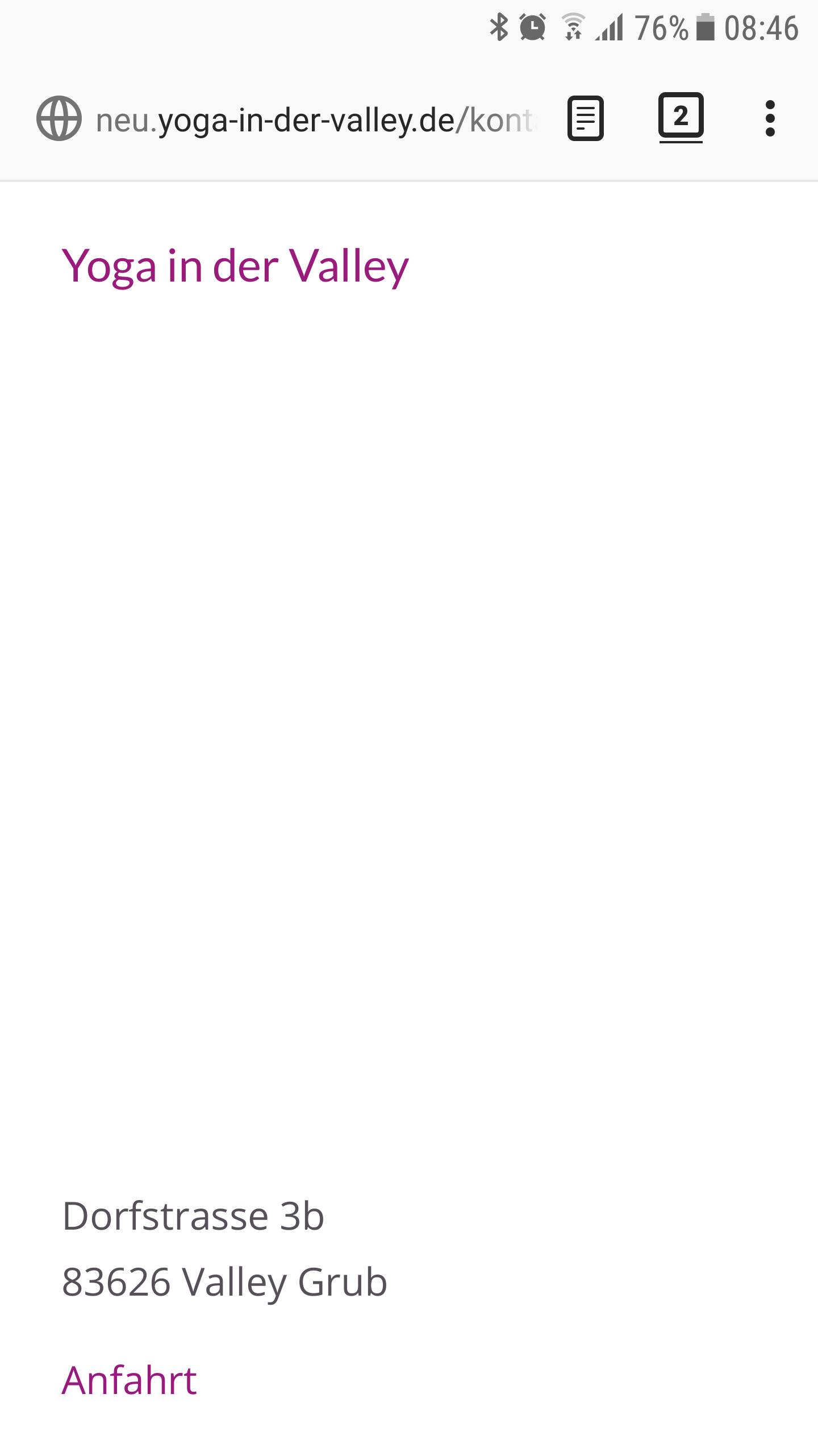
Page KONTAKT: wrong on the mobile phone: http://neu.yoga-in-der-valley.de/kontakt/ see screenshot: http://yoga-in-der-valley.de/support/footer2/footer_kontakt .png
Here it is even more surprising, because the white field arises between the logo name “Yoga in the Valley” and the address?What can this be?
Thank you for your work.
Best regards DIana SteibApril 2, 2019 at 12:17 am #1085754Hi,
Thanks for the update.
The remaining white space or gap is created by this css code.
.page-id-399 .avia-builder-el-6 {
    height: 400px !important;
    min-height: 400px !important;
}
You have to adjust height value.
Best regards,
IsmaelApril 4, 2019 at 10:39 am #1086962Dear Ismael.
yes it is correct that when I use the mentioned script:
.page-id-399 .avia-builder-el-6 {
height: 400px! important;
min-height: 400px! important;
}
removed from the css, the footer is then displayed correctly. However, I then have another problem on the page: In the mobile view, the first image (portrait) in the upper grid row on the view on the phone is no longer displayed in full size: see screenshot: https: // yoga -in-der-valley.de/support/lehrer/Screenshot_20190404-085759.pngSo I reinserted the code and wondered how it should modify, that the image is displayed correctly and the footer works at the same time! Can you help me? Footer problem see screenshot: https://yoga-in-der-valley.de/support/footer2/footer_lehrer.png
The other problem on the KONTAKT page is not solved yet. How can I proceed here?
wrong on the mobile phone: https://yoga-in-der-valley.de/kontakt/ see screenshot: https://yoga-in-der-valley.de/support/footer2/footer_kontakt.png
Here it is even more surprising, because the white field arises between the logo name “Yoga in the Valley” and the address?Please note the new LOGIN data under PRIVATE AREA. The website is now online and the links have changed.
many Greetings
Diana SteibApril 8, 2019 at 2:39 am #1088087Hi,
You should replace the “avia-builder-el-6” selector with a custom css class that is specified manually.
Turn on the custom css class as instructed in the documentation, add a custom css class attribute to the image element and then use that in place of the generic selector “avia-builder-el-6”.
.page-id-399 .custom-css-class {
     height: 400px! important;
     min-height: 400px! important;
}
Replace “custom-css-class” with what it is that was specified in the custom css class field.
Best regards,
Ismael -
AuthorPosts
- You must be logged in to reply to this topic.