Hi,
As I understand, you see this:

and would like this:

Try this CSS in your Enfold Theme Options ▸ General Styling ▸ Quick CSS field:
@media only screen and (max-width: 767px) {
	.page-id-4540 .av_one_fifth.avia-builder-el-59,.av_one_fifth.avia-builder-el-66 {
		display: none;
	}
    .responsive #top.page-id-4540 #wrap_all .content .entry-content-wrapper .flex_column.av_one_fifth {
        width: 33%;
    }
}
After applying the css, please clear your browser cache and check.
Best regards,
Mike
Hi Ismael,
I had to remove the script from the css again. It had the effect that the text was no longer truncated in the mobile version, but at the same time I just noticed that the tab no longer works in the desktop version either > so I removed it again.
Now the view is just as wrong as it was at the beginning.
Is there another solution? Why is the tab element causing such problems in the mobile version?
Best regards, Diana
Hey schweg33,
Try this CSS in your Enfold Theme Options ▸ General Styling ▸ Quick CSS field:
.tribe-common--breakpoint-medium.tribe-events .tribe-events-l-container {
    padding-top: 0;
}
After applying the css, please clear your browser cache and check.
Best regards,
Mike
Hey Tanja,
Try this CSS in your Enfold Theme Options ▸ General Styling ▸ Quick CSS field:
#top.home .alternate_color .homepgservicestable.avia-data-table.avia_pricing_minimal td {
	color: #fff;
	border-color: transparent;
	font-size: 2em;
}
Best regards,
Mike
Hi,
Thanks for the update. Please let us know if you should need any further help on the topic, or if we can close it.
Best regards,
Rikard
Hey Martin,
Your best solution will be to create two slideshows with portrait sized images for mobile, using your desktop landscape images for mobile will typically not look good on mobile. If you still want to try, try this css and adjust to suit:
@media only screen and (max-width: 450px) {
.avia-slideshow {
  width: 300% !important;
  position: relative !important;
  left: calc(-90vw) !important;
}
}
Best regards,
Mike
remove the flex settings given to you by docu.
maybe test these settings first on dev tools insertion:
try:
/*** Naming of the Grid Areas ***/
#header_main #media_image-3 { grid-area: area1; }
#header_main #media_image-4 { grid-area: area2; }
#header_main #text-3 { grid-area: area3; text-align: right }
#header_main div.av-logo-container { grid-area: area4; display: grid; justify-content: center }

#header_main {
  margin: 0;
  display: grid;
  gap: 20px 40px;
  grid-auto-flow: row;
  grid-template-columns: 1fr 1fr 1fr;
  grid-template-areas:
    "area1 area2 area3"
    "area4 area4 area4";
  justify-content: stretch;
  align-items: center;
}

#header_main > div {
  justify-self: center;
  align-self: center;
  padding: 0 30px;
}

@media only screen and (max-width: 1119px) {
  #header_main {
    grid-template-columns: 1fr 1fr;
    grid-template-rows: 0.5fr 1fr auto ;
    grid-template-areas:
      "area2 area2"
      "area1 area3"
      "area4 area4";
  }
  #header_main #media_image-4 { transform:scale(1.2) }
}

@media only screen and (max-width: 989px) {
  #header_main {
    grid-template-columns: 1fr 1fr 1fr 1fr;
    grid-template-rows: 0.3fr 1fr;
    grid-template-areas:
      "area2 area2 area2 area4"
      "area1 area1 area3 area3";
  }

  #header_main #media_image-3 { transform:scale(0.8) }
  #header_main #text-3 { transform:scale(0.8); padding: 0;}
  #header_main div.av-logo-container {display: grid; justify-content: center; background-color: transparent }

  #header_main div.av-logo-container {
    display:  block ;
  }

  #header_main .av-main-nav-wrap {
    float: right;
    padding-right: 50px;
  }

  #top #av-burger-menu-ul {
    padding-top: 120px !important;
  }
}

@media only screen and (max-width: 767px) {
  .responsive #top #wrap_all .main_menu {
    position: relative;
  }
  #header_main #media_image-4 { transform:scale(1); justify-self: start; padding-left: 50px }
  .responsive #top .logo {display: none;}
}
-
This reply was modified 1 year, 1 month ago by
 Guenni007.
-
This reply was modified 1 year, 1 month ago by Guenni007.
https://kriesi.at/support/topic/events-with-an-expiration-date/#post-1476465
Calendar plugins are real divas among the custom post types. I prefer the one above – but I don’t yet have a client who needs to manage bookings with it.
you can customise the formatting of the output via shortcodes in the extensive settings, for example, and give the whole thing an Enfold look by using there tags and classes.
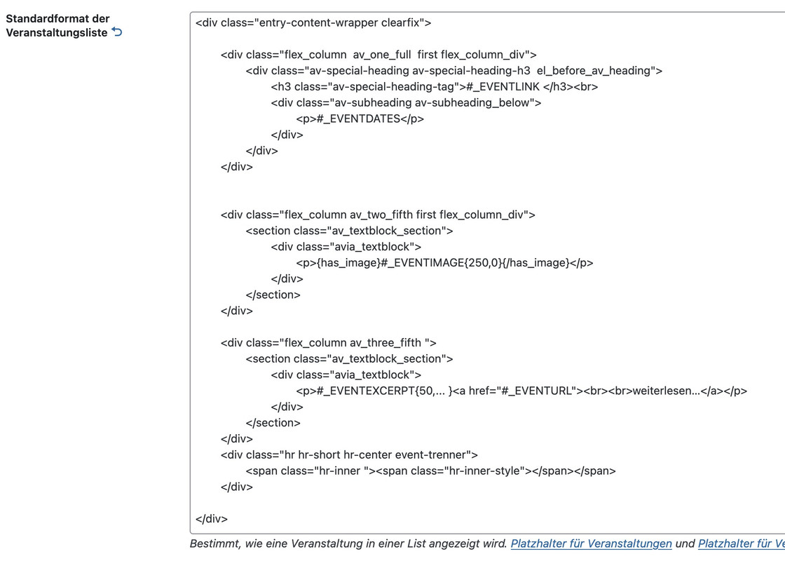
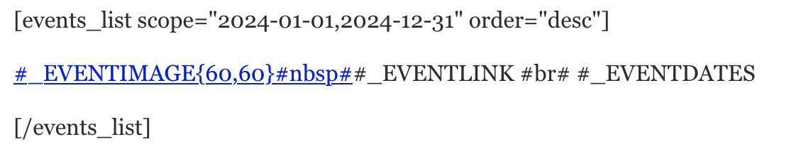
You can also use the shortcodes ⇗ to create your own backend outputs of lists, e.g. an event list between two dates:
You can often get help from the author himself in the support section.
But to expect that installing one of these plugins will make everything work the way you want it to is a bit unrealistic.
Hi there,
Yes i think the desktop layout is now fine thank you, if the top right text could right align justify like the current https://www.charminsterdental.co.uk/ that would be great but if not i think it is okay.
With the mobile if it could have the same elements within the header as per the current https://www.charminsterdental.co.uk/ site
so phone number and email and logo and burger menu
I have a screenshot of both sites side by side to show the mobile layout differences issue
https://charminsterdental-co-uk.purplecloudstaging.com/wp-content/uploads/2025/02/site.jpg

thanks a lot,
Chris
Hey,
I am using the creative agency template. I really like the diagonal shapes, but I wonder if it is possible to set a bottom border under the diagonal shape, which is diagonal, too?
I also have the problem, that I am not able to create a diagonal shape at my partner section and on top of the 3 services.
Thanks a lot for your help.
Elén
So if this not possible, how they are doing it:
https://www.chamaeleon-reisen.de
(the slider consists of lots of mp4-Videos autoplaying)
Hallo,
ich habe immer wieder ein Problem mit der Slideshow (volle Breite), wenn man die Seite auf dem Handy anschaut. Und ich wollte fragen ob es einen Tipp gibt, wo eine Slideshow gut auf dem Handy und dem Desktop aussieht und man nicht zwei Slideshows anlegen muss.
Z.B. die Seite https://hochzeitsauto-leipzig.com, auf dem Desktop ist es der schöne breite Header mit den Autos. Auf dem Handy (hochformat) könnte sie höher sein, die Darstellung ist also zu klein.
So hätte ich es gern: https://miximo.de – auf dem Desktop schön breit, auf dem Handy ca. 50% des Bildschirmes. Das bekomme ich aber nur hin, wenn ich zwei Slideshows anlege, eine bis zur Handygröße und eine ab der Handygröße. Und das möchte ich vermeiden, da es der doppelte Pflegeaufwand ist.
Gibt es Ideen oder Tipps zu diesem Problem?
viele Grüße,
Martin
———————————–
Hello,
I keep having a problem with the slideshow (full width) when you look at the page on your mobile phone. And I wanted to ask if there is a tip on how to make a slideshow look good on your mobile phone and desktop and not have to create two slideshows.
For example, the page https://hochzeitsauto-leipzig.com, on the desktop it is the nice wide header with the cars. On the mobile phone (portrait format) it could be higher, so the display is too small.
This is how I would like it: https://miximo.de – nice and wide on the desktop, about 50% of the screen on the mobile phone. But I can only do that if I create two slideshows, one up to the mobile phone size and one from the mobile phone size. And I want to avoid that because it is twice the amount of maintenance.
Are there any ideas or tips for this problem?
best regards,
Martin
and that filter is set like described on my post:
There is now a filter for this which you can set in the child-theme functions.php.
and this will not hamper anchor links.
on the page you linked above – i can see the id=”kontaktfooter” but found no link inside the DOM : href=”#kontaktfooter” neither on desktop view nor on mobile view.
by the way: if you link to the kontakt page: https://augemusic.at/kontakt/
you can choose inside editor that you only show the socket and not show the footer. – Why – then you will not see two kontakt forms.
Hi, thanks,
no i added the skripts through copy paste into css and php.
Yes you can deactivate temporarily if it help.
Tthe lightbox skript was this:
add_filter( 'avf_default_lightbox_no_scroll', '__return_true' );
from here: https://kriesi.at/support/topic/galery-looks-strange-lightbox-much-too-big/#post-1476130
Good morning everyone, first of all I would like to inform you that I have purchased your regular licence but it does not accept the token for my current site which is on a sub-domain for some tests and for which I would like to receive assistance before final publication. Perhaps you do not accept the token for this subdomain?
I am pleased to request your support in solving some problems with my site:
1. If I import the wall theme data to the child, not all of it is imported, even when managing the settings in the performance section as per the manual
2. I have called up a custom font for h1,h2,h3,h4,h5,h6 and menu, which works with all browsers except safari
3. I created the FULL WIGHT services section in the home, but in tables and smatphones it unfortunately does not respect the correct left and right margins
4. I would like to be able to manage the top and bottom margins of the widjets in the footer independently, to differentiate them on tables and smartphones
Thank you
Hi,
Thank you for the info.
Please add this css code to hide the first and last column, and adjust the margin of the first social icon.
@media only screen and (max-width: 767px) {

  /* Add your Mobile Styles here */
  #top .av-m6kbbque-4b40b977ee353112ec1ad0bec763ce3e .entry-content-wrapper .flex_column:nth-child(3),
  #top .av-m6kbbque-4b40b977ee353112ec1ad0bec763ce3e .entry-content-wrapper .flex_column:nth-child(7) {
    display: none;
  }

  #top .av-m6kbbque-4b40b977ee353112ec1ad0bec763ce3e .entry-content-wrapper .flex_column:nth-child(4) {
    margin-left: 7% !important;
  }
}
You may need toggle or temporarily disable the Enfold > Performance > File Compression settings afterward.
Best regards,
Ismael
Hey lara666,
Thank you for the inquiry.
You can use this css code to adjust the style of the featured image slider title:
#top .avia-featureimage-slideshow.av-m6tyn82g-131d78d88d19991cbc6ff96d197c2974 .avia-caption-title * {
    font-weight: 400;
    text-decoration: none;
    font-size: 20px;
}
You may need to toggle or temporarily disable the Enfold > Performance > File Compression settings after adding the code.
Best regards,
Ismael
Hi!
We’ve added the css rule that we posted above: https://kriesi.at/support/topic/text-blocks-pc-same-height/#post-1476285
If you don’t need to apply this on mobile view, you can remove this css code:
@media only screen and (max-width: 1300px) {
  #top .av-6xdhph-d676d236253fe9da7b5542127b7590e9 .flex_column .av_textblock_section > div > div {
    min-height: 600px !important;
  }
}
Regards,
Ismael
Hey cygrafix1,
Thank you for the inquiry.
Looks like you’ve already found a solution for this.
#top #wrap_all .av-social-link-linkedin:hover a, #top #wrap_all .av-social-link-linkedin a:focus {
    color: #fff;
    background-color: #419cca;
}
Let us know if you need more assistance.
Best regards,
Ismael
Hi,
Thank you for the inquiry.
You can adjust the padding between the menu items. Please include this inside the css media query that we created for mobile view:
#top #menu-dialektwoerter > li {
    padding: 2px 0;
    display: inline-block;
}

#top #menu-dialektwoerter {
    padding: 10px 0;
}

#top .av-m1yjw3j3-8de8ef07635f179e0beedc245c4c38a7 {
    width: 40px;
}
Best regards,
Ismael
Hi,
Thank you for the update.
It seems to be working correctly on our end. If you want this applied to every page, you can use this css code instead:
#top .container .av-masonry .av-masonry-container {
    padding-left: 12.5%;
}
Another option is to apply a custom css class to the Masonry elements where you need these adjustments and edit the css rule accordingly.
— https://kriesi.at/documentation/enfold/add-custom-css/
Best regards,
Ismael
Hey michaelf245,
Thank you for the inquiry.
You can add this css code to move the mega menu container upwards and prevent the bottom items from being cut off.
.html_header_left #header .avia_mega_div {
    margin-top: -200px;
}
Let us know the result.
Best regards,
Ismael
Hi there,
Is it possible to have a black logo for the header in mobile view (while keeping the desktop view with a white logo and transparent header)? Additionally, can the burger menu have a solid white background instead of being transparent, with a font color of #969696?
Please check the private area for the link to the mobile view header.
Thank you so much.
-
This topic was modified 1 year, 1 month ago by
 lara666. Reason: Misunderstood menu
$item_categories = get_the_terms( $the_id, $params['taxonomy'] );

			if( is_object( $item_categories ) || is_array( $item_categories ) )
			{
				foreach( $item_categories as $cat )
				{
					//fix for cyrillic, etc. characters - isotope does not support the % char
					$cat['slug'] = str_replace('%', '', $cat['slug'] );

					$sort_classes .= $cat['slug'] . '_sort ';
				}
			}
becomes
$item_categories = get_the_terms( $the_id, $params['taxonomy'] );

			if( is_object( $item_categories ) || is_array( $item_categories ) )
			{
				foreach( $item_categories as $cat )
				{
					//fix for cyrillic, etc. characters - isotope does not support the % char
					$cat->slug = str_replace('%', '', $cat->slug );

					$sort_classes .= $cat->slug . '_sort ';
				}
			}
Since they are objects, not arrays. I usually have custom post types and custom taxonomies. These are going through custom taxonomies in my current example.
-
This reply was modified 1 year, 1 month ago by
 christiemade.
-
This reply was modified 1 year, 1 month ago by christiemade.
I’m surprised I couldn’t find anything else about this on the forum as it’s happening to me on all my sites that use the portfolio… and it takes down the site completely.
In /themes/enfold/config-templatebuilder/avia-shortcodes/portfolio/portfolio.php on line 1312 inside the function sort_cat_string, the WordPress function get_the_terms() is called. get_the_terms returns OBJECTS (See: https://developer.wordpress.org/reference/functions/get_the_terms/) But the code in this function assumes it’s returning arrays, leading to Fatal errors.
I’d love to see a fix to this get integrated so I can stop manually patching it! :)
3. Sorry to combine this but can you also get me CSS code for less white space at the top and bottom of the AI logo? There is just too much.
thank you!!
-
This reply was modified 1 year, 1 month ago by
 bemodesign.
Hi bartmannsebastian,
Thanks for the update. Please let us know if you should need any further help on the topic, or if we can close it.
@DanielBenavides Please open a new thread and include WordPress admin login details in private, so that we can have a closer look at your site.
Best regards,
Rikard
Hi,
Great, I’m glad to hear that you got things working. Please let us know if you should need any further help on the topic, or if we can close it.
Best regards,
Rikard