-
AuthorSearch Results
-
February 25, 2025 at 6:04 pm #1477926
In reply to: Make h1 class=”main-title lowercase?
Hi,
Try this:#top #wrap_all #main h1.main-title.entry-title a { text-transform: none; }Best regards,
MikeFebruary 25, 2025 at 5:32 pm #1477921In reply to: unusual layout – an Günni
Ich war jetzt gar nicht mal am Rechner seit meiner Nachricht um 13:07. Also hier nochmal:
Ok danke, das hat funktioniert in der Desktop Ansicht.
Mobil sieht es leider ganz furchtbar aus.
1. Das Logo ist da nicht mittig
2. der Text oben abgeschnitten.
3.Ausserdem soll die Lupe weg.
4. Das logo soll ganz unter dem Widget und dem Burger stehen. Siehe Bild von gestern.Desktop
1. Kannst du mir bitte noch helfen, die Farben für das Menü einzustellen? Soll türkis werden auf rollover Irgendwie habe ich alle Einstellungen unter General styling durch und nichts ist passiert. Im Footer funktionieren die Farben.
2. Ausserdem ist da jetzt so ein schwarzer Balken entstanden wenn nicht genug content auf einer Seite ist wie hier. https://pranayama-integral.com/integraler-ansatz/ Habe sticky footer eingestellt.LG
PeteFebruary 25, 2025 at 1:07 pm #1477894In reply to: unusual layout – an Günni
Ok das hat funktioniert auf Desktop Ansicht. Vielen Dank. Mobil sieht es leider ganz furchtbar aus.
Das Logo ist da nicht mittig und der Text oben abgeschnitten. Ausserdem soll das Search icon weg. In der mobilen Version soll das logo ganz unter dem Widget und dem Burger stehen. Siehe bild von gestern.Kannst du mir bitte noch helfen, die Farben für das Manü einzustellen? Soll türkis werden auf rollover Irgendwie habe ich alle Einstellungen unter General styling durch und nichts ist passiert. Im Footer funktionieren die Farben.
Ausserdem ist da jetzt so ein schwarzer Balken entstanden wenn nicht genug content auf einer Seite ist wie hier. https://pranayama-integral.com/integraler-ansatz/
Habe sticky footer eingestellt.LG
PeteFebruary 25, 2025 at 12:22 pm #1477892In reply to: unusual layout – an Günni
padding-top für #main musst du dann noch responsive anpassen. Und das immer in Bezug auf .logo img ( max-height) damit kannst du die Logo Größe steuern.
February 25, 2025 at 12:16 pm #1477891In reply to: unusual layout – an Günni
der Grund warum das Logo nicht mittig ist, ist das die flex items auf auto weite stehen.
Man muss also das Widget und die Navigation auf gleich Weite setzen.
Diesen absoluten Wert muss man dann aber im Responsiven Fall ( bei dir unterhalb 1000px) neu setzen, da der Hamburger dann die kleinere Version ist.Bitte schaue ob du diese Selektoren bereits verwendet hast – und ändere dann die Werte wenn Sie vorhanden sind bzw. setze die neuen Properties hinzu.
#top #header #header_main .container.av-logo-container .inner-container {
  height: inherit;
  position: relative !important;
  flex-wrap: wrap;
  padding: 20px 0;
  justify-content: space-between;
}

#top #header #header_main .container.av-logo-container .inner-container nav,
#top #header #header_main .container.av-logo-container .inner-container > div {
  flex: 1 1 240px;
}

.responsive #top #header #header_main .inner-container .logo {
  order: 2;
  flex-basis: auto;
  min-width: 160px;
  max-width: 240px;
  z-index: 9;
}

.responsive #top #header #header_main .inner-container .main_menu  {
  justify-content:  flex-end
}

.av-main-nav > li .avia-menu-text {
  float: right !important;
}

@media only screen and (max-width: 1000px) {
  #top #header #header_main .container.av-logo-container .inner-container nav,
  #top #header #header_main .container.av-logo-container .inner-container > div {
    flex: 1 1 100px;
  }
    #top #header #header_main .container.av-logo-container .inner-container .logo {
    flex: 1 1 40%;
    overflow: visible !important;
  }

  #top #header #header_main .container.av-logo-container .inner-container .logo a {
    overflow: visible !important;
  }

  #top #header #header_main .container.av-logo-container .inner-container .logo a img {
    max-height: 130px
  }
}
February 25, 2025 at 11:37 am #1477888In reply to: unusual layout – an Günni
ich sehe das Logo soweit mittig – auch in der mobilen Ansicht. Aber ich schaue mal genauer drauf.
das Paddding kommt vom Flex Container – setze da einfach nur oben/unten padding:
#top #header #header_main .container.av-logo-container .inner-container {
  height: inherit;
  position: relative !important;
  flex-wrap: wrap;
  padding: 20px 0;
  justify-content: space-between;
}
February 25, 2025 at 10:22 am #1477874In reply to: How to add Instagram in sidebar widget?
Hi,
Thanks for the update. Please let us know if you should need any further help on the topic, or if we can close it.
Best regards,
RikardFebruary 25, 2025 at 10:00 am #1477868In reply to: Sub menu width with description
Very good, everything works great, in the end I did not put the description in the link, but now if I try to access the section via desktop the link works, whereas from mobile nothing happens. I’ll leave you the screens of how I set up all the links in the SERVICES item within my configuration.
Thank you
February 25, 2025 at 6:41 am #1477856In reply to: Portfolio items order
Hey lara666,
Thank you for the inquiry.
This is not possible by default, but you can follow the instructions in this thread: https://kriesi.at/support/topic/masonry-not-displaying-cover-pictures/#post-1439624.
The solution is for the Masonry element, but it should work the same way for the Portfolio Grid.
Best regards,
IsmaelFebruary 25, 2025 at 6:03 am #1477851In reply to: Partner/Logo Element css issue
Hi,
That is the default responsive behavior of the logo slider.
Did you add this css code?
.avia-content-slider .slide-entry-wrap {
    width: 50%;
    margin-bottom: 40px !important;
    margin-left: 0% !important;
}
If you need to display all 6 items in a single line on mobile view, remove the css code above, then add this modification.
@media only screen and (max-width: 767px) {

  /* Add your Mobile Styles here */
  .responsive #top #wrap_all .av-m7fed3ye-e22188c7085edf49c8bc53cd4bd6adde .flex_column.slide-entry {
    clear: none;
    width: 16%;
    float: left;
  }
}
Best regards,
IsmaelFebruary 25, 2025 at 4:54 am #1477837In reply to: Partner/Logo Element css issue
Hey manchust,
Thank you for the inquiry.
If you want to display a different number of items, you may need to add another post slider specifically configured for mobile view, then toggle the elements’ visibility for different screen sizes in the Advanced > Responsive > Element Visibility settings. With this setup, you’ll have one post slider for desktop and another for mobile view.
Best regards,
IsmaelFebruary 24, 2025 at 8:53 pm #1477811In reply to: unusual layout – an Günni
Ok danke Günni, das hat soweit geklappt. Siehe hier: https://pranayama-integral.com/start/
Probleme wo ich noch Hilfe brauche:
1. in der Mobilen Ansicht ist das Logo nicht in der Mitte. Wie kann ich es in die Mitte bringen?
2. da ist irgendeine Art von Padding an der linken Seite des Widgets. Wie kann das weg? Beides auf Desktop und Mobil
3. Das Logo soll größer.
4. In der Desktop Ansicht wird das Logo abgeschnitten wenn man das Fenster zusammenschiebt.
5. irgendwie kriege ich es nicht hin die Farbe der Links im Menü bei rollover auf türkis umzustellen.
6. Das Lupensymbol soll weg. Wo geht das nochmal?Soweit erstmal
LG
PeteFebruary 24, 2025 at 6:51 pm #1477805In reply to: mfp-hide pop up
Hi, I updated the functions.php as stated above, please go back in to see if you can get the modal to work, thank you.
When the code below is removed from functions, the eror goes away, this snippet is old, I’m sure it needs and update. Thank you
////////////////////////////////////////////////Add Avia Builder to Custom Post Types
add_filter(‘avf_builder_boxes’, ‘add_builder_to_posttype’);function add_builder_to_posttype($metabox)
{
foreach($metabox as &$meta)
{
if($meta[‘id’] == ‘avia_builder’ || $meta[‘id’] == ‘layout’)
{
$meta[‘page’][] = ‘makeitbeef’; /*instead add the name of the custom post type here*/
$meta[‘page’][] = ‘cbnews’; /*instead add the name of the custom post type here*/
}
}return $metabox;
}function custom_tab_section_script() { ?>
<script>
window.onload = function() {
if (window.location.hash) {
var hash = window.location.hash.substring(1);
var targetElement = document.getElementById(hash);
if (targetElement) {
setTimeout(function() {
var offset = targetElement.offsetTop;
window.scrollTo({
top: offset,
behavior: “smooth”
});
}, 1000);
}
}
};
</script>
<?php
}
add_action(‘wp_footer’, ‘custom_tab_section_script’, 99);February 24, 2025 at 5:43 pm #1477802In reply to: Mobile version Tablet landcape not working well
Hi,
For the second issue try this css:@media only screen and (max-width: 1366px) { .responsive #top #wrap_all .flex_column.av-break-at-tablet, .responsive #top #wrap_all .av-break-at-tablet .flex_cell { margin: 0; margin-bottom: 20px; width: 100% !important; display: block; } #angebote .av-flex-placeholder { display: none; } }note that the media query is set to 1366px as I assume that is your iPad width, you can check your screen resolution here and adjust the css to suit.
Best regards,
MikeFebruary 24, 2025 at 4:57 pm #1477795Hi,
Thanks for the update. Please let us know if you should need any further help on the topic, or if we can close it.
Best regards,
RikardFebruary 24, 2025 at 4:53 pm #1477793In reply to: Enfold Version: 3.3.2 veraltet
Hey Nadine,
The update to 7.0 has to be done manually from the version you are running, please refer to my replies in this thread: https://kriesi.at/support/topic/enfold-4-5-theme-update-update-failed-download-failed-a-valid-url-was-not-pro/#post-1021541
You can either update manually via FTP: https://kriesi.at/documentation/enfold/how-to-install-enfold-theme/#theme-update, or upload the theme as if it was new under Appearance->Themes->Add New Theme.
If that doesn’t work then please try to delete the whole theme folder, then replace it with the new version. Make sure that you have backups of the site before starting updating.
Also please read this after you have updated: https://kriesi.at/documentation/enfold/theme-registration/Best regards,
RikardFebruary 24, 2025 at 1:38 pm #1477776In reply to: unusual layout – an Günni
your sketch on the bottom is the non responsive case :
left a widget area – then logo – then main menu on the right ? and then under all that the page content?https://kriesi.at/documentation/enfold/example-of-widget-left-logo-center-menu-right/
setting the nav to:
#top #header .av-main-nav {
  display: flex;
  flex-flow: column nowrap;
}

#top #header_main > .container,
#top #header_main > .container .main_menu .av-main-nav > li > a,
#top #header_main #menu-item-shop .cart_dropdown_link {
  height: 30px;
  line-height: 30px;
}
will put your list-items under each other.
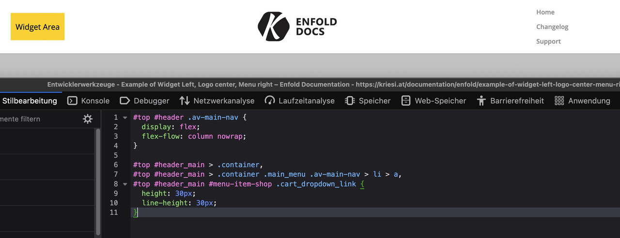
BUT: Can you really recommend something like this?
February 24, 2025 at 12:51 pm #1477773Topic: unusual layout – an Günni
in forum Enfoldausgesonnen
ParticipantHi there,
my client wants an unusual Layout. I cannot think of another option but to disable the default header completely and build my own. What do you suggest?
He wants to put the logo in the middle and then links on the right and on the left, listed underneath one another. See sketch attached. Above is the mobile version, below desktop. https://www.imghippo.com/i/cvE3181XU.jpeg
So please:
1. Please let me know how to eachother disable the header menu completely and build my own custom header and template
2. or how else could I put his plan in actionBest
PeteFebruary 24, 2025 at 11:53 am #1477769Topic: no underline in footer
in forum EnfoldMunford
ParticipantHi
I am trying to hide the link underlines in my footer with this code I found but it’s not working.#top a { text-decoration: underline; } #top #header a, #top #footer a, #top #socket a, #top a.avia-button, #top a.more-link, #top #js_sort_items { text-decoration: none!important; }Can you help with this?
thanks
NancyFebruary 24, 2025 at 9:40 am #1477758In reply to: Change FontIcon on Archive Page
hey ismael : i guess i will better post a new topic – there was that filter avf_default_icons – but because of that new handling of font-icons there has been changed alot. : https://kriesi.at/support/topic/how-to-replace-standard-icons/
February 24, 2025 at 7:51 am #1477752In reply to: Special block management
Hi,
Thank you for the update.
If you want to limit the width of the grid layout, go to the Advanced > Developer Settings panel, apply the value “av-grid-constrain-width” in the Custom CSS Class field, and then add this css code:
#top .av-grid-constrain-width {
    max-width: 70%;
    margin: 0 auto;
}
Adjust the max-width value as needed.
Best regards,
IsmaelFebruary 24, 2025 at 6:34 am #1477744In reply to: Content slider
Hi,
would it be possible to apply this only to the content slider on the home page?
Yes, this is possible. Please edit the Content Slider element, go to Advanced > Developer Settings, and enter “av-content-slider-nav-bottom” in the Custom CSS Class field. Then, replace the css code with:
#top .av-content-slider-nav-bottom .avia-smallarrow-slider-heading {
    position: absolute;
    bottom: -50px;
}
— https://kriesi.at/documentation/enfold/add-custom-css
Best regards,
IsmaelFebruary 24, 2025 at 6:22 am #1477740In reply to: Video in Color Section
Hi,
Thank you for the update.
The video should cover the entire slider when this option (Stretch the video…) is enabled. Please try this css code:
#top .av-element-cover video {
    object-fit: cover;
}
This should result to: https://imgur.com/2Kl21jz
We tried logging in to the site but the account above is no longer valid.
Best regards,
IsmaelFebruary 24, 2025 at 6:11 am #1477738Topic: WP Accessibility
in forum Enfolddondela
ParticipantDear Mike,
i followed your instruction to make my staging-site accessible: https://kriesi.at/support/topic/accessibility-5/
i installed the plugin WP Accessibility
But my tab-navigation doesn´t work. It doesn’t skip through the menu or the content. It just skips between the url-bar and the search-icon.What am i doing wrong?
Thanks for any help!
dondelaFebruary 24, 2025 at 5:44 am #1477736In reply to: How to remove space between gallery and video?
Hey Jak73,
Thank you for the inquiry.
You can add this css code to remove the space above the video:
.avia-video.av-m7hoi823-5fffa067e0538a32526d7bf7eec640c7 .mejs-container {
    background-color: transparent !important;
    box-shadow: none !important;
    border: none !important;
}

.avia-video.av-m7hoi823-5fffa067e0538a32526d7bf7eec640c7 video {
    background-color: transparent;
}

.avia-video.av-m7hoi823-5fffa067e0538a32526d7bf7eec640c7 {
    padding-bottom: 50%;
    background: transparent;
    border: 0 !important;
    margin-top: -20px;
}
Best regards,
IsmaelFebruary 24, 2025 at 2:43 am #1477730In reply to: Content slider
Hi Ismael,
Apologies, but would it be possible to apply this only to the content slider on the home page? I have another content slider on a different page that still needs the arrows at the top.
February 23, 2025 at 8:13 pm #1477716Hi,
Thanks for that. I’m still not sure that I fully understand your intentions though, since the site you linked to has a background image on desktop resolutions, and only a text link on lower resolutions. Are you looking to set a background image to the header? If so, then that can be set under Enfold->General Styling->Logo Area.
Best regards,
RikardFebruary 23, 2025 at 3:33 pm #1477709In reply to: Logo not is not center with menu on desktop
Hi,
these images are from desktop:


What browser, OS are you using?
please include a admin login in the Private Content area so we can examine further.Best regards,
MikeFebruary 23, 2025 at 3:29 pm #1477707In reply to: Logo not is not center with menu on desktop
Hi Mike,
true on iPads and mobile everything is Fine, the desktop version is the troubling one.
I tried all the caching stuff. But still.
KR
TanjuFebruary 23, 2025 at 2:22 pm #1477703In reply to: Sub menu width with description
Hi,
Check that your Menu Screen elements ▸ CSS classs is checked, then add the custom class “nolinkstyle”, the manually add the link:

then add this css to your Quick CSS:#top #header .avia_mega_div .sub-menu .avia_mega_text_block.nolinkstyle a { text-decoration: none; color: #000; } .header_color .main_menu .menu ul li.nolinkstyle a:hover { background-color: unset; }Best regards,
Mike -
AuthorSearch Results
-
Search Results
-
Topic: unusual layout – an Günni
Hi there,
my client wants an unusual Layout. I cannot think of another option but to disable the default header completely and build my own. What do you suggest?
He wants to put the logo in the middle and then links on the right and on the left, listed underneath one another. See sketch attached. Above is the mobile version, below desktop. https://www.imghippo.com/i/cvE3181XU.jpeg
So please:
1. Please let me know how to eachother disable the header menu completely and build my own custom header and template
2. or how else could I put his plan in actionBest
PeteTopic: no underline in footer
Hi
I am trying to hide the link underlines in my footer with this code I found but it’s not working.#top a { text-decoration: underline; } #top #header a, #top #footer a, #top #socket a, #top a.avia-button, #top a.more-link, #top #js_sort_items { text-decoration: none!important; }Can you help with this?
thanks
NancyTopic: WP Accessibility
Dear Mike,
i followed your instruction to make my staging-site accessible: https://kriesi.at/support/topic/accessibility-5/
i installed the plugin WP Accessibility
But my tab-navigation doesn´t work. It doesn’t skip through the menu or the content. It just skips between the url-bar and the search-icon.What am i doing wrong?
Thanks for any help!
dondela