Hi,
It looks like you had a duplicate thread for the overlay icon, check here.
Best regards,
Mike
Hi,
we can close this topic.
The Plugin ist simple not compatible with Enfold (according the developer).
Thank you!
Regards
Mat
Hey Martin,
To add a red border to items that you tab to, you can add this css:
a:focus,button:focus {
  border:1px solid red !important;
}
adjust the color and size to suit.
Your accessibility plugin is at the bottom of the page in the DOM, so you would need to tab the whole page to get to it, perhaps the plugin settings has an option to move it to the top of the DOM? The plugin button also has a tabindex of -1 so you can’t tab to it, check the plugin settings.
If you can’t change these in the settings, try adding this code to the end of your child theme functions.php file in Appearance ▸ Editor:
function custom_script() { ?>
  <script>
document.addEventListener('DOMContentLoaded', function() {
	const accessibilityButton = document.querySelector('#accessibility-trigger-button');
    const messageBar = document.querySelector('#accessibility-button');
    const body = document.querySelector('body#top');
    body.prepend(messageBar);
    accessibilityButton.setAttribute('tabindex', '1');
});
</script>
  <?php
}
add_action( 'wp_footer', 'custom_script', 99 );
Please ensure to copy the code from the forum and not an email notification so the symbols are not converted.
This javascript will move the accessibility-button in the DOM to the top of the page so it is the first tab, the icon will still show at the bottom of the page, it will also change the tabindex so you can tab to it. With the css above to add a red border, the first tab will show this:

and then if you hit the enter key it will open:

Best regards,
Mike
Hi,
Change this css:
#av-burger-menu-ul li.av-show-submenu > .sub-menu > li > a > .avia-menu-text {
	color: yellow;
}
to this:
#av-burger-menu-ul li.av-show-submenu > .sub-menu > li > a > .avia-menu-text {
	color: yellow;
	font-size: 20px;
	line-height: 20px;
}
then add this css:
.html_av-overlay-full #top #wrap_all #av-burger-menu-ul li.av-show-submenu li {
    line-height: 20px;
}

adjust to suit.
Please ensure to copy the code from the forum and not an email notification so the symbols are not converted.
Best regards,
Mike
hail brave new AI world
New snippet
see in Action here: https://webers-testseite.de/impressum/
it is a draggable Window:
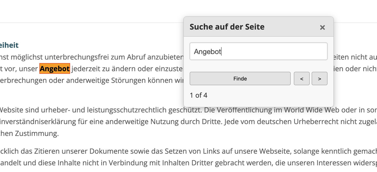
this is for child-theme functions.php:
see code here on paste bin: https://pastebin.com/zc4fvX1w
because of a innerHtml (lines 158-176) it is not possible to post it here – (maybe mod knows how)

and here is the style for quick css
/* --- Draggable Search Window --- */
#gcmSearchUIContainer { /* Changed ID for clarity */
  position: fixed;
  top: 100px; /* Initial position from the top */
  left: 50%;  /* Start horizontally centered */
  transform: translateX(-50%); /* Adjust for true centering */
  width: 380px; /* A suitable width for a small window */
  background-color: #f9f9f9;
  border: 1px solid #ccc;
  border-radius: 8px;
  box-shadow: 0 5px 15px rgba(0,0,0,0.25);
  z-index: 100001; /* Ensure it's on top, slightly higher than before if needed */
  overflow: hidden; /* To contain rounded corners with header */
}

#gcmSearchUIContainer.hidden {
  display: none;
}

#gcmSearchUIHeader {
  padding: 10px 15px;
  background-color: #e8e8e8;
  border-bottom: 1px solid #ccc;
  cursor: move; /* Indicates this area is draggable */
  border-top-left-radius: 8px; /* Match container's radius */
  border-top-right-radius: 8px; /* Match container's radius */
  display: flex;
  justify-content: space-between;
  align-items: center;
}

#gcmSearchUIHeader .gcm-title {
  font-weight: bold;
  font-size: 1.1em;
  color: #333;
}

#gcmSearchUIHeader #gcmCloseSearchBtnDraggable { /* Specific ID for close button in this context */
  background: none;
  border: none;
  font-size: 1.3em;
  font-weight: bold;
  color: #777;
  cursor: pointer;
  padding: 0 5px;
}
#gcmSearchUIHeader #gcmCloseSearchBtnDraggable:hover {
  color: #000;
}

#gcmSearchUIBody {
  padding: 15px;
  display: flex;
  flex-direction: column; /* Stack elements vertically */
  gap: 10px; /* Space between elements in the body */
}

#gcmSearchUIBody #gcmSearchInputDraggable { /* Specific ID for input */
  width: 100%;
  padding: 10px;
  border: 1px solid #ccc;
  border-radius: 4px;
  box-sizing: border-box;
}

#gcmSearchUIBody .gcm-controls-row {
  display: flex;
  justify-content: space-between; /* Space out controls */
  align-items: center;
  gap: 8px; /* Space between buttons in a row */
}

#gcmSearchUIBody .gcm-navigation {
    display: flex;
    gap: 5px;
}

#gcmSearchUIBody button {
  padding: 8px 12px;
  border: 1px solid #aaa;
  border-radius: 4px;
  background-color: #e7e7e7;
  cursor: pointer;
  min-width: 40px; /* For Next/Prev buttons */
  text-align: center;
}

#gcmSearchUIBody button:hover {
  background-color: #d7d7d7;
}

#gcmSearchUIBody #gcmSearchBtnDraggable { /* Specific ID */
    flex-grow: 1; /* Allow Find button to take more space if needed */
}

#gcmSearchUIBody .gcm-results-count-draggable { /* Specific ID */
  font-size: 0.95em;
  color: #333;
  white-space: nowrap; /* Prevent wrapping */
}

/* --- Highlighting Styles (remain the same) --- */
.custom-highlight {
  background-color: yellow;
  color: black;
  font-weight: bold;
}

.custom-highlight.current-custom-highlight {
  background-color: orange;
  outline: 1px solid red;
}
Do not forget to remove the leading php on that downloaded snippet before you insert it to your child-theme functions.php
Download: https://pastebin.com/dl/zc4fvX1w
shure – see: https://kriesi.at/support/topic/enfold-upcoming-fixes/
fixed: ALB Audio Player cannot edit playlist when bundled Layerslider is deactivated
hello everyone
i have an idea
when i press Ctrl + F the field to search the text on a page appears at the top.
is it possible to enter this command (Ctrl + F ) in the content in a line in html so that I can open this command with a mouse click.
Thanks for your info
best regards
Franz
I’ve recently updated to the latest version in hopes of fixing this but with no luck.
So BlockUI iw blocking the payment section on my site.
<div class="blockUI blockOverlay" style="z-index: 1000; border: none; margin: 0px; padding: 0px; width: 100%; height: 100%; top: 0px; left: 0px; background: rgb(255, 255, 255); opacity: 0.6; cursor: default; position: absolute;"></div>
I do have these errors on the site, which has been there for a bit.
avia-js.min.js?ver=7.1:1 Uncaught TypeError: Cannot set properties of undefined (setting 'applyFilters')
    at aviaJSHelpers.wpHooks (avia-js.min.js?ver=7.1:1:392)
    at new aviaJSHelpers (avia-js.min.js?ver=7.1:1:113)
    at avia-js.min.js?ver=7.1:1:618
    at avia-js.min.js?ver=7.1:1:1321
wpHooks @ avia-js.min.js?ver=7.1:1
aviaJSHelpers @ avia-js.min.js?ver=7.1:1
(anonymous) @ avia-js.min.js?ver=7.1:1
(anonymous) @ avia-js.min.js?ver=7.1:1

lottie_animation.min.js?ver=7.1:1 Uncaught TypeError: Cannot read properties of undefined (reading 'register')
    at lottie_animation.min.js?ver=7.1:1:2783
    at lottie_animation.min.js?ver=7.1:1:2866
(anonymous) @ lottie_animation.min.js?ver=7.1:1
(anonymous) @ lottie_animation.min.js?ver=7.1:1

avia-snippet-fold-unfold.min.js?ver=7.1:1 Uncaught TypeError: Cannot read properties of undefined (reading 'register')
    at avia-snippet-fold-unfold.min.js?ver=7.1:1:5124
    at avia-snippet-fold-unfold.min.js?ver=7.1:1:5204
(anonymous) @ avia-snippet-fold-unfold.min.js?ver=7.1:1
(anonymous) @ avia-snippet-fold-unfold.min.js?ver=7.1:1
I assume its just a buildup of crap over time as we have had our site “revamped” a couple times. I put a login info in the private section
-
This topic was modified 10 months, 2 weeks ago by
 holidayprint.
I know I am reaching here and there may not be a solution. I have 300+ pages in my website. Is there any way to identify which pages I have icons on without going through the torture of page by page?
They seemed to have stopped working. Switching them is extremely time consuming.
thank you
Hey 34oldcat29,
The update to 7.1 has to be done manually from the version you are running, please refer to my replies in this thread: https://kriesi.at/support/topic/enfold-4-5-theme-update-update-failed-download-failed-a-valid-url-was-not-pro/#post-1021541
You can either update manually via FTP: https://kriesi.at/documentation/enfold/how-to-install-enfold-theme/#theme-update, or upload the theme as if it was new under Appearance->Themes->Add New Theme.
If that doesn’t work then please try to delete the whole theme folder, then replace it with the new version. Make sure that you have backups of the site before starting updating.
Also please read this after you have updated: https://kriesi.at/documentation/enfold/
Best regards,
Rikard
Yes, I also recognised that from many of the buttons.
temporarily until the problem is fixed:
#top .avia-button .avia_loading_icon {
  display: none !important;
}
Hi Ismael,
Perfect! We will add this code.
There is a responsiveness issue on the website. When three elements are placed side-by-side on a desktop, they do not display correctly on mobile devices. Please see the screenshots.


Best,
Kasia
Hello,
I installed the demo-page “Enfold One-Page Restaurant Demo” and started to edit it.
Is it a known issue that after clicking the button to jump to the anchor and then manually scrolling back up, the button still shows the loading animation?
Also the Demo-Pages are showing these problem.
You can find my page here.
I already had various other themes installed on my development environment. Is this related?
At the moment all other plugins are deleted.
Thank you
Tobi
-
This topic was modified 10 months, 2 weeks ago by
 rechner1.
Hi,
Thank you for the update.
You can add this code in the Enfold > General Styling > Quick CSS field to adjust the position of the onsale or promo badge.
#top .onsale {
    top: -29px;
    right: 8px;
    left: auto;
}
View post on imgur.com
Best regards,
Ismael
Hi,
To adjust the size and position of the slider arrows, try to add this css code:
#top .avia-smallarrow-slider .avia-slideshow-arrows a {
  opacity: 0;
  margin: 0;
  width: 50px !important;
  height: 50px !important;
  line-height: 50px !important;
  font-size: 20px !important;
  top: 0;
}

#top .avia-smallarrow-slider .avia-slideshow-arrows a.avia-svg-icon svg:first-child, #top .avia-smallarrow-slider .avia-slideshow-arrows a.avia-svg-icon img[is-svg-img="true"] {
  height: 20px;
  width: auto;
  margin-top: 15px;
}

#top .avia-smallarrow-slider .avia-slideshow-arrows {
  position: relative;
  width: 120px;
  top: 20px;
  left: auto;
  height: 24px;
  right: 10px;
}
If you’re trying to disable the image overlay, add this code:
.image-overlay, .image-overlay .image-overlay-inside {
    display: none !important;
}
Best regards,
Ismael
Hi,
We may need to adjust the maximum width of the nav menu itself and the left/right margin of the elements in the top header including the logo and the custom header widgets.
/*
Desktop Styles
================================================== */
/* Note: Add new css to the media query below that you want to only effect the desktop view of your site */

@media only screen and (min-width: 768px) {

  /* Add your Desktop Styles here */
  .responsive #top #header #header_main .inner-container .main_menu {
    order: 5;
    flex-basis: 100%;
    align-items: center !important;
    align-self: center !important;
    justify-content: center !important;
    height: inherit !important;
    margin-bottom: 0px;
  }

  .responsive #top #header #header_main .inner-container .main_menu .avia-menu {
    max-width: 1340px;
  }

  .responsive #top #header #header_main .inner-container .logo {
    margin-left: calc(50% - 570px);
  }

  .responsive #top #header #header_main .inner-container .widget:nth-child(5) {
    margin-right: calc(50% - 640px);
  }
}
View post on imgur.com
Best regards,
Ismael
Hey Launebaer1981,
Thank you for the inquiry.
The following thread should help: https://kriesi.at/support/topic/importing-lots-of-data-to-scf-custom-posts-all-having-same-template/#post-1473810
You may need to update the custom layout ID in _aviaLayoutBuilderCleanData and make sure the post type slug is correct. Also, remove this line to prevent the header from being set to transparent.
update_post_meta($post_id, 'header_transparency', 'header_transparent header_hidden');
Best regards,
Ismael
Oh, I’m sorry I forgot the link. It’s the caption in the slider at the top of this page. Also, I’ve tried to use the Extra Bold of Open Sans in the header under the slider, and that isn’t taking either.
Thanks!
See first if this is a nearby solution: https://enfold.webers-webdesign.de/
ok – here is a quick solution (with AI support).
Enfold has the hook where you can insert something directly after the body opening tag. So put this to your child-theme functions.php:
function ava_custom_jalousie_loader() {
?>
<script type="text/javascript">
	window.addEventListener('load', function() {
		document.body.classList.add('loaded');
	});
</script>
<?php
}
add_action( 'wp_footer', 'ava_custom_jalousie_loader' );

add_action('ava_after_body_opening_tag', function() {
  echo '<div id="preloader-wrapper">';
    echo '<div id="jalousie-preloader">';
		echo '<div class="jalousie-slat"></div>';
		echo '<div class="jalousie-slat"></div>';
		echo '<div class="jalousie-slat"></div>';
		echo '<div class="jalousie-slat"></div>';
		echo '<div class="jalousie-slat"></div>';
		echo '<div class="jalousie-slat"></div>';
		echo '<div class="jalousie-slat"></div>';
		echo '<div class="jalousie-slat"></div>';
    echo '</div>';
  echo '</div>';
});
if you want less amount of jalousie-slat – remove some divs
now the css:
#preloader-wrapper {
    position: fixed;
    top: 0;
    left: 0;
    width: 100%;
    height: 100%;
    z-index: 99999;
    perspective: 1000px;
    overflow: hidden;
}

#jalousie-preloader {
    position: absolute;
    top: 0;
    left: 0;
    width: 100%;
    height: 100%;
    display: flex;
    flex-direction: column;
    background-color: transparent;
    transform-style: preserve-3d;
}

.jalousie-slat {
    width: 140%;
    position: relative;
    left: -20%;
    flex-grow: 1;
    background-color: #222222;  /* === change to your color you like === */
    transform-origin: 50% 50%;
    transition: transform 0.8s linear, opacity 0.4s linear 0.4s;
    backface-visibility: hidden;
    transform: rotateX(0deg);
    opacity: 1;
    box-sizing: border-box;
}

body.loaded #preloader-wrapper {
    opacity: 0;
    visibility: hidden;
    transition: opacity 0.3s 0.8s, visibility 0.3s 0.8s;
}

body.loaded #jalousie-preloader .jalousie-slat {
    transform: rotateX(90deg) scaleY(0.01);
    opacity: 0;
}
Hi, i just noticed that 2 pictures are just shown on mobile phone an d desktop but not on the ipad.
Any idea?
Many gerads rixi
Hi Ismael,
The search element inclusion in the header worked out great. The full width menu shadow however didn’t turned out right, please see the shared link once more. The CSS snippet basically made the page full with (which indeed push the shadow from edge to edge. However I do would like to keep the container 1340px width and not force the website full screen.
If you zoom out on the page you can see that the full width effect is kept. Is there a way to keep the website within the 1340px container but do keep the menu bar background effect (top shadow) full width? I will drop another Enfold project where this is the case (no custom header however)
Kind Regards,
S
Hi,
Try adding this css code to adjust the padding of the black section.
/*
Mobile Styles
================================================== */
/* Note: Add new css to the media query below that you want to only effect the Mobile and Tablet Portrait view */

@media only screen and (max-width: 767px) {

  /* Add your Mobile Styles here */
  #top #main #av_section_2.avia-section .template-page {
    padding: 20px 0;
  }
}
View post on imgur.com
Best regards,
Ismael
you did not really specify what effect is meant. The effect of the letters on top and how they appear?
those heading letter animations will all work with splitting the words to single chars – and then animate each char.
This little snippet tries to show you how you can split an enfold heading ( give a trigger class to the heading element f.e.: single-letters) and put this to your child-theme functions.php:
function words_to_single_chars(){
?>
<script>
  var textWrapper = document.querySelectorAll('.single-letters .av-special-heading-tag'), i;
  for (i = 0; i < textWrapper.length; ++i) {
    textWrapper[i].innerHTML = textWrapper[i].textContent.replace(/\S/g, "<span class='char'>$&</span>");
  }
</script>
<?php
}
add_action('wp_footer', 'words_to_single_chars');
see a working example on : https://webers-testseite.de/impressum/
if you look to the DOM you will see each letter inside a span tag like: <span class="char">I</span>
___________
;)
by the way: This is a very interesting site, which certainly comes without layout modules and requires a high level of programming knowledge. The web design studio responsible for it: https://dgrees.studio can certainly offer you a similar design for your site, but probably not quite at the cost of a selfmade framework solution.
Hi,
Try to use this css code to adjust the font size of the menu items inside the nav widget:
#top .widget_nav_menu li {
    font-size: 16px;
}
Best regards,
Ismael
Hey JennyGr,
Thank you for the inquiry.
You can use this css code to adjust the styte of the header and the breadcrumbs container on mobile view:
/*
Mobile Styles
================================================== */
/* Note: Add new css to the media query below that you want to only effect the Mobile and Tablet Portrait view */

@media only screen and (max-width: 767px) {

  /* Add your Mobile Styles here */
  .responsive #top #wrap_all .av-logo-container .widget {
    display: none;
  }

  #top #wrap_all .title_container .main-title {
    display: none;
  }

  .responsive .title_container .main-title+.breadcrumb {
    top: 10px;
    left: 0px;
  }

  .responsive #header_meta .sub_menu>ul>li {
    display: none;
  }

  .responsive #header_meta .sub_menu>ul>li:last-child {
    display: block;
  }
}
Best regards,
Ismael
Ok t hank you. The mobile sizing is perfect at 55% – so I just edited the code to 55vw to match that and it worked. thanks for your help.
However the gap the black color section that sits under the main banner and the text section under the black color section – how can I reduce that big gap on monile – looks fine on desktop. How can I fix that?
Hey William,
Thank you for the inquiry.
Try to add this css code to decrease the default top margin of the flex column table container and make the spaces consistent on mobile view.
#top .flex_column_table.av-equal-height-column-flextable:not(:first-child) {
    margin-top: 6px;
}

/*
Mobile Styles
================================================== */
/* Note: Add new css to the media query below that you want to only effect the Mobile and Tablet Portrait view */

@media only screen and (max-width: 767px) {

  /* Add your Mobile Styles here */
  .responsive #top .container .av-content-small,
  .responsive #top #wrap_all .flex_column,
  .responsive #top #wrap_all .av-flex-cells .no_margin {
    margin-bottom: 8px;
  }

  #top .flex_column_table.av-equal-height-column-flextable:not(:first-child) {
    margin-top: 0;
  }
}
View post on imgur.com
Best regards,
Ismael
I don’t know why, but all of a sudden my import layer from layerslider stopped working, it just keeps loading and nothing happens..
I’ve already reinstalled the theme with layerslider, disabled all plugins and cleared the localstorage but it still does not load…
Im builing my site with a lot of these advanced layersliders and this function is really helpful for me.. can someone help me?
-
This topic was modified 10 months, 2 weeks ago by
 arsprengel.
Thank you. When I tried that on the test version it works but when I go to the live page and use the 44% responsive setting which is what gives me the exact size I want on mobile and try and adjust the height calc nothing changes on the Desktop view.
Also it seems to have created more of a gap now under the black color section that sits under the main banner and the text section under the black color section – how can I reduce that big gap on monile – looks fine on desktop.