actually no I cant.. some of the thumbs get chopped off.. is there any way to set width:auto instead of 591px and still have the alignment?
The issue being that fix was in place to stop thumbs resizing bigger than you want according to the column page…
btw I made no template adjustments.. the test page showed the column layout in adv builder.. also you are cropping the image thumbs on your first pic !
Hi,
Please try this
@media all and (device-width: 768px) and (device-height: 1024px) and (orientation:portrait) {

/* your css rules for ipad portrait */

}

@media all and (device-width: 768px) and (device-height: 1024px) and (orientation:landscape) {

/* your css rules for ipad landscape */

}
there is also this one which includes ipad mini
/* All iPads Portrait & iPad Mini Landscape */

@media only screen and ((width:768px) and (resolution:132dpi or resolution:263px)) or ((width:1024px) and (resolution: 163dpi)) {


}


/* Only iPad 1 & 2 Portrait & iPad Mini Landscape */

@media only screen and ((width:768px) and (resolution:132dpi)) or ((width:1024px) and (resolution: 163dpi)) {


}
This website provide a lot of variations for ipad and ipad mini for different versions of ipad http://www.stephentgilbert.com/mediaqueries/#iPad
Reference:
http://stackoverflow.com/a/9504571/1245478
http://css-tricks.com/forums/topic/target-ipad-ipad-only/
http://i-skool.co.uk/mobile-development/how-to-target-ipad-mini-in-css-media-queries/
Thanks,
Nick
Sorted. For others, god knows how i did it:
body#top.single.single-post .breadcrumb  {

visibility: visible;

background-color: #FFFFFF;

}

body#top.single.single-post .title_container {

background-image: url(https://www.thenaturalpharmacie.co.uk/hidden/wp-content/uploads/2013/08/header-fennel.jpg);

background-repeat: repeat-y;

background-position: left top;

background-color: #759abd;

}


body#top.blog.logged-in.stretched.open_sans div#wrap_all div#main div.stretch_full.container_wrap.alternate_color.light_bg_color.title_container {

background-image: url(https://www.thenaturalpharmacie.co.uk/hidden/wp-content/uploads/2013/08/header-fennel.jpg);

background-repeat: repeat-y;

background-position: left top;

background-color: #759abd;

}

body#top.blog.logged-in.stretched.open_sans div#wrap_all div#main div.stretch_full.container_wrap.alternate_color.light_bg_color .breadcrumb {

visibility: visible;

background-color: #FFFFFF;

}
Hi,
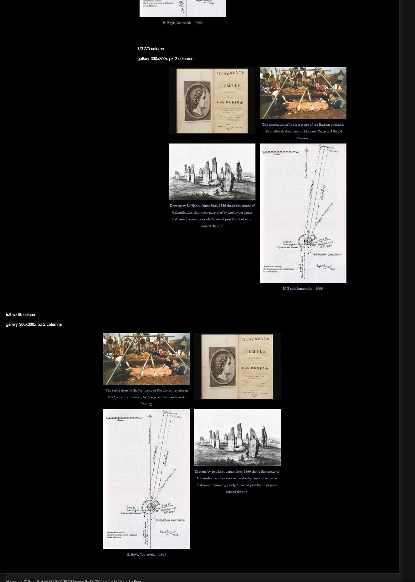
I have a feeling you made some edit to the template files that is messing up the entire page. Because I took 3 of your photos and made a gallery with them. I am not seeing the problems you are experiencing. and everything looks nice and neat as you can see http://i.imgur.com/EvnraaY.jpg
Try this css to center the text
#top #wrap_all .avia-gallery-1 .avia-gallery-thumb a {

text-align: center;

}

#top div .avia-gallery {

text-align: center;

}
Now try this
.avia-gallery-thumb {

margin: 0 auto;

width: 591px;

}


#top div .avia-gallery img {

width: 100%;

float: left;

}

#top .avia-gallery .avia-gallery-thumb a {

float: right;

}
With this css, I got your page to look like this http://i.imgur.com/A6yYN84.jpg .
Also please try to use images with a consistent height as the thumbnail, people can click on that image and see the full version.
Thanks,
Nick
Hi Dude
That’s great. Got it to work on iphone.
However, after following your “media query custom css”, just cant get an ipad to act like the desktop resolution. (See below and scroll, logo shrinks small & not vital, naviagtion decreases in height. Happy for a work around.)
http://www.thenaturalpharmacie.co.uk/hidden/about/our-approach/
Thanks again
Rich
 kc
kcParticipant
Hi,
is it possible to get a video on the top of a startpage (like the layerslider in fullsize), the video must have an autostart when the site go open?
for example maybe this video here http://videohive.net/item/my-rustic-gallery/5126069 WT.ac=new_item&WT.seg_1=new_item&WT.z_author=Chechogm20
thanks for your answers.
Carsten
Hey!
You can easily activate/add the error border with following css code
#top #wrap_all .error .select {<br />
border: 1px solid #DF653E;<br />
}
I’d insert it into the quick css field. We’ll also include this code in the next theme update.
Regarding the other issues – we’ll keep them in mind but tbh we’ve no plans to re-write the contact form code right now and it will probably stay like this. The contact form element is intended for simply forms and not for booking forms.I’d also suggest to try advanced contact form plugins like Gravity Forms or Formidable Pro which both work well with our theme.
Regards,
Peter
Thanks I try to do my best with photography :-)
Your CSS works :-) but is there a way to have the photo centered vertically? At the moment its at the top.
Hi!
You can try following css code
@media only screen and (max-width: 767px){

.responsive.social_header .phone-info {

float: right;

margin-top: -21px;

}


.responsive #header .social_bookmarks {

float: left;

width: auto;

}


}
Regards,
Peter
I only noticed a small glitch if the screen re-sizes to 768px (then the breadcrumb shifts down and overlaps the title). You can fix it with following code
@media only screen and (max-width: 767px)

{

.responsive .title_container .breadcrumb {

top: -115px;

}

}
Hi,
Add this on your custom.css or Quick CSS
body#top sup {

vertical-align: top;

}
Regards,
Ismael
Hi,
Please add this on your custom.css or Quick CSS
@media only screen and (max-width: 767px) {

/* Add your Mobile Styles here */

#header_meta {

display: none;

}


}
Regards,
Ismael
Hi!
Which header layout are you using?
Regards,
Peter
Hi!
Please try following code
#top #searchform #searchsubmit {

width: 66px;

top: 21px;

}
Regards,
Peter
Hi,
Please add this on your custom.css or Quick CSS
.avia-gallery-big.fakeLightbox.lightbox {

height: 518px !important;

padding-top: 10px !important;

}
Please remove browser cache then reload the page. Check: http://chriswardphotography.net/galleries/fashion-and-portraits/
You got a nice collection of photographs there. Excellent job! :)
Regards,
Ismael
Please insert following css code into the quick css field
.input-text, #top input[type="text"], #top input[type="input"], #top input[type="password"], #top input[type="email"], #top input[type="number"], #top input[type="url"], #top input[type="tel"], #top input[type="search"], #top textarea, #top select {

width: auto;

}
Hi
As i ‘ve just seen in another topic, that it is apparently not possible to do revisions of portfolio items in the enfold theme.
At least not when they are built whit the visual editor.
1. Or does someone know a way to do revisions?
2. Can i duplicate (clone) a portfolio, when i want to create lots of portfolios with the same layout?
Thanks for your answers
Search button is pushed too far off to the right in the widget area.
http://www.womensclosetexchange.net/the-store-2/
I have tried to change the css to shorten the search box so the search button will fit but that did not work. Here is the code I used, where did I go wrong. I changed the min and max widths
#top #searchsubmit, .ajax_load {
border-radius: 0 0 0 0;
height: 39px;
line-height: 40px;
margin: 0;
min-width: 30px;
padding: 0;
position: absolute;
right: 0;
top: 0;
width: 35px;
z-index: 2;
}
Hi,
From what I see, your text captions are identical to the tooltips. So you want the text to show up static under each image, and then to have the identical text popup in a tooltip on hover on top of the image?
Please try changing the code you pasted above
$thumbs .= " <a href='".$link[0]."' title='".$description."'><img src='".$img[0]."' title='".$title."' alt='".$alt."' /><span class='avia-gallery-caption>{$caption}</span</a>";
to look like
$thumbs .= " <a href='".$link[0]."' title='".$description."'><img src='".$img[0]."' title='".$title."' alt='".$alt."' /><br /><span class='avia-gallery-caption>{$caption}</span</a>";
Thanks,
Nick
I need to remove / not display the very top header ONLY on mobile/responsive (the one with social icons and small info text only)… It really looks bad above the logo on mobile… but looks great on desktop…
Regards,
Mark L. Lee
That is awesome… thanks… Much easier to get stuff to widgets.. and save the work…
Mark Lee
Glad Ismael could help :)
Let us know if you have any other questions or issues.
Regards,
Devin
Hi,
You can switch the Advance Layout Editor(ALE ) to debug mode. This way, you’ll access to the actual shortcode while working on the ALE. Edit functions.php, find this code:
if(isset($avia_config['use_child_theme_functions_only'])) return;
Below, add this code:
//set builder mode to debug

add_action('avia_builder_mode', "builder_set_debug");

function builder_set_debug()

{

return "debug";

}


add_theme_support('avia_template_builder_custom_css');
You’ll see the actual element shortcode below the ALE.
Regards,
Ismael
Hi rapinion,
Our queue system goes by oldest post to newest so each time you self respond it actually pushes the topic to the end. I would have responded yesterday but this last post pushed it until I’m just getting to this point now.
It doesn’t look like any of your images have had their thumbnails created. Run the plugin mentioned above completely now that the content is live so that the images have their thumbnails created for all of the theme uses: http://wordpress.org/plugins/regenerate-thumbnails/
Regards,
Devin
Hi LouisLeedham,
Try adding the following CSS to your Quick CSS (located under the Styling Tab in the theme options) or the custom.css file in the css folder of your theme files:
#top.page-id-1167 .main_color .input-text,

#top.page-id-1167 .main_color input[type='text'],

#top.page-id-1167 .main_color input[type='input'],

#top.page-id-1167 .main_color input[type='password'],

#top.page-id-1167 .main_color input[type='email'],

#top.page-id-1167 .main_color input[type='number'],

#top.page-id-1167 .main_color input[type='url'],

#top.page-id-1167 .main_color input[type='tel'],

#top.page-id-1167 .main_color input[type='search'],

#top.page-id-1167 .main_color textarea,

#top.page-id-1167 .main_color select {

background-color: #37589B;

border-color: #888;

color: #fff;

}
I’ve added in all of the form field selectors that you could need and made each initial selector target that specific page ID. So if you wanted this to work on another page you would just need to change the page-id-#### selector in the css above.
Modify the color codes for each property value as needed.
Regards,
Devin
Hey guys
I custom designed my home page. I used a full width easy slider on the top. Up until today it was working perfectly and I had no issues with auto rotation and the time I had chosen. For some reason now the slider isn’t rotating or if it starts it gets stuck on the 2nd image and never moves. help please
http://www.drakeeats.com
I have read through the 3.6 upgrade thread at https://kriesi.at/support/topic/wordpress-36#post-129724
I just want to make sure I understand it correctly. To successfully do the 3.6 upgrade I need to:
1. Re-download the Enfold file from themeforest.
2. Connect to my site via FTP
3. Consult the change log at the URL listed above and FTP all the folders listed therein into my site.
Please let me know if there is something I’m not understanding or something else that needs to be done.
Hi calexander,
We encountered similar problems, but there is a solution found here: (About half way down the page)
https://kriesi.at/support/topic/link-en-shortcodes-problems
The topic is for another theme but it seemed to do the trick.
You need to add a ‘class’ to your URL for it to work normally. Example:
‘a class=”noLightbox”‘
Hope that helps,
HI, I have a problem with easy slider too. Running 3.6 and 1.9.1 enfold. The slider stops after the second picture, but there are 4 pictures. I´am using Chrome. Testing IE the slider works.