-
Search Results
-
Topic: isotope with other plugins
I’m trying to use a 3rd party plugin – qtip2/craigsworks. I’m getting a jquery conflict with isotope. Could have something to do with imagesLoaded. Thinking I could detach isotope script from avia.js and only run it when needed.- this as I only need the Qtip plugin on a couple of pages.
Besides the portfolio stuff are there any front-end components using isotope in Enfold?
CheersTopic: Tab Color
I have spent the last 4 hours trying to change the color of the tab (not the container but the background part of the tab title) using every possible combination of custom css I can find on here but nothing works. In fact, no custom css for the tabs works except for the size option, this is my last attempt:
.tab {font-size:14px !important;}
.js_active .tab_titles .tab {
background-color: #0c962b !important;
}I also tried the information on this link: https://kriesi.at/support/topic/change-tab-colors-hover-text/
Nothing seems to make any effect. So, can someone please tell me the correct css to change the following:
Background of the tab title for active and inactive tabs
Color of the font for the title for inactive and active tabs
background color of the tab content box (where the content is actually added)Also, I am not a fan of the new support layout:-( Searching takes so much longer when each message is threaded in this way – and, it seems all of my favourites have been removed.
Thanks
Andrew
Hi,
I embedded a video from Mediathek into my Layerslider with the following code:
<iframe width=”720px” height=”404″ src=”//balance-circle.de//bc-data/uploads/Marc-Sportlife.mp4″ frameborder=”0″ allowfullscreen></iframe>
All looks fine till I change the Top and Left Values to bring it in the right position. If I change them, all the layers in the background are slip up. Also if I use the padding values…
Is there a better way to embed the video? Don´t´want to upload it on Youtube or Vimeo. It´s just an example to show it to a client
Hi.
I just updated to the latest version and now a big part of my website is in german.
In the admincp, I see Portfolio Einträge and a couple of other changes. On the 404 page everything is changed to german.
“Es konnte leider nichts gefunden werden”
“Um die besten Suchergebnisse zu bekommen beachten Sie bitte folgende Hinweise:
Überprüfen Sie die Rechtschreibung immer sorgfältig.
Probieren Sie auch ähnliche Suchbegriffe, z.B. Notebook anstatt Laptop
Versuchen Sie mehr als einen Suchbegriff zu verwenden”Even the widgets are in german.
Topic: Add to Header
Hi:
Link to my site: http://acrossrealestate.com/
This is only going to be a 1-page site, so I didn’t need and removed the Search box and Menu from the Header Right area.
How can I, instead, add the Business Phone number and maybe social icons to the right of logo?
Also, how can I add my own icon instead of using one of your Social Icon Links (top left)
Thank you,
eleinaI just updated to Enfold 2.2 and now the logo will display until the entire page has loaded and then it goes white. If you scroll to the bottom and back to the top the logo will show (sometimes) and other times it will appear to flash?
http://www.robbshirey.com
Let me know if there’s something I’ve done.
btw… love this theme and all of the updates you are adding!! Great work!
Hello again,
My previous thread was closed so I will be creating this new one.
The recent update has just been release (september 18th 2013) and I still don’t get the update in wp-admin using Enfold Child Theme.
I have double checked my Themeforest username and also my API – They are both correct.
How come I do not see the update?
Hi I have added a larger logo to the header and changed style.css in the child theme by adding this code:
/*default header: main logo and main menu height. increase max value if you want to use a bigger logo*/
#header_main .container, .main_menu ul:first-child > li a{ height:150px; line-height: 88px; }
.fixed_header #main{ padding-top:150px; } /* padding of the main container should be equal height as the header height above*/This works fine in most browsers but the logo does not resize in IE8 when you scrawl down. The menu resizes as it should but the logo stays the same size which makes it being cut off.
How can I fix this issue because more then half of the current site visitors are using IE8.
Thank you,
Wordpress Installation:
Enfold version: 2.1
WooCommerce Version: 2.0.14
Wordpress Version: 3.6Hello,
I am having trouble customizing the front page of my WooCommerce installation on my Enfold site. This is the page I am working with: http://198.252.65.103/shop/. Effectively, what I am trying to do is use the Avia Layout Builder to insert some content at the top of the page (as displayed) and then have the WooCommerce layered navigation append below that.
For some reason, the formatting is getting all screwy only when I use a Layout Element within the Avia builder (so 1/1, 2/2, 1/3, etc). If I just place a couple text blocks, the navigation works fine. However, as you can see we want to put some imagery beside our blocks so we need to figure out what we’re doing wrong or if it can be fixed.
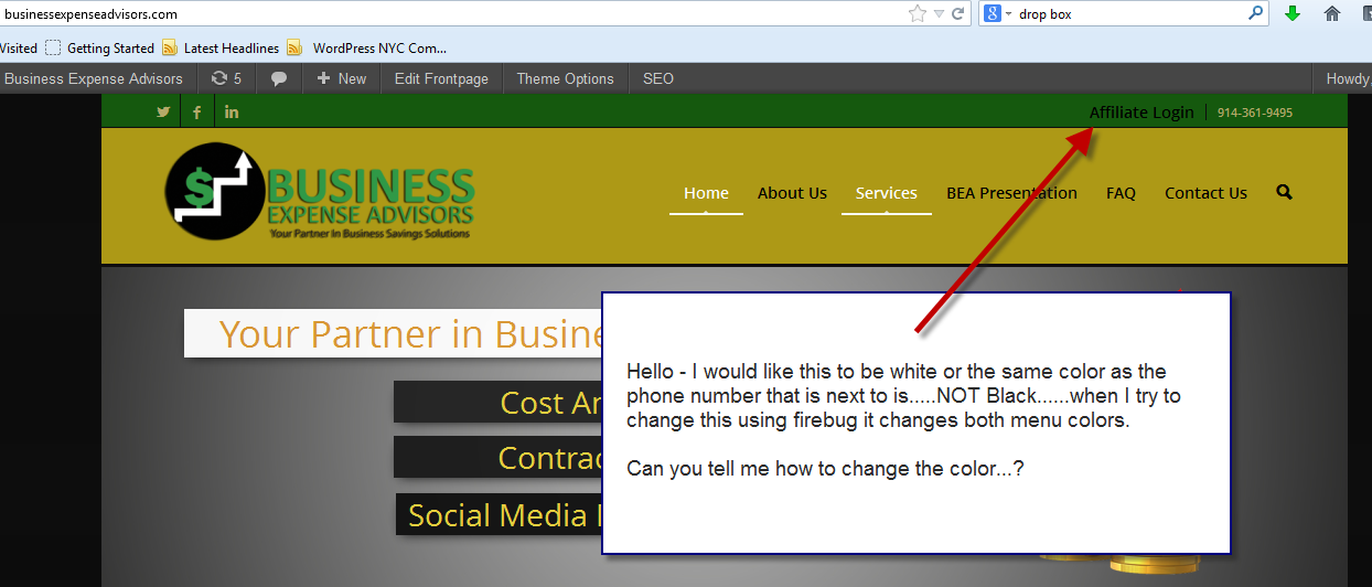
Topic: Top menu font color
Hello – I would like the color for the Affiliate Login (top menu) to be white or the same color as the telephone number (on the same line) . When I try to change the color in firebug it changes both menus.
Can you tell me how to change this color…..see screen shot.
http://businessexpenseadvisors.com/
Topic: Addthis Hide from homepage
Hello,
I have added an addthis vertical bar as per the instructions here:
https://kriesi.at/support/topic/placing-addthis-social-icons-into-the-header/
I am using the new addthis smart layer option with the following code:
<!– AddThis Smart Layers BEGIN –>
<!– Go to http://www.addthis.com/get/smart-layers to customize –>
<script type=”text/javascript” src=”//s7.addthis.com/js/300/addthis_widget.js#accoutcode”></script>
<script type=”text/javascript”>
addthis.layers({
‘theme’ : ‘light’,
‘share’ : {
‘position’ : ‘left’,
‘numPreferredServices’ : 4
}
});
</script>
<!– AddThis Smart Layers END –>However, it really doesn’t look great on the slider on the homepage so do you know of anyway to hide it from the homepage? I have searched the net but can’t find anything that would help.,
Thanks
Andrew
Viewing 30 results - 139,441 through 139,470 (of 142,823 total)
