You have this:
.main_menu {
padding-top: 5px;
}
Which adds the padding on the menu even when its scrolled. The quick fix is to just add this css after it to remove the padding when its scrolled:
.header-scrolled .main_menu {
padding-top: 0px;
}
For the iPad hover, not that I know of. Its a browser function to mimic mouse overs.
I’ve added icons in the past adding custom-classes for menu items in WordPress and then through css
ul#menu-navigation li:before {position: absolute; font-family: ‘entypo-fontello’; padding-left: 0.7em; width: 1.4em;}
and then
li.the-custom-class-menu-item:before{content: ‘⌂’;”}
it doesn’t seem to work anymore, any best practice ?
should we repurpose the <span class=”avia-bullet”></span>
Hello Dingers90!
That might be possible with some custom css to place the video on top of a LayerSlider but it would need to be done by a freelance developer as its quite a bit beyond what we can assist with via support.
Best regards,
Devin
Hello!
Please post the link to your website @ygshim
This topics creator wanted to remove mobile menu, so that CSS code will not work for you :)
Best regards,
Yigit
Hi!
Jeigu turi 3 1/3, prasau ikelk sita koda i Quick CSS
.js_active .top_tab .tab { padding: 12px 60px 14px 61px; }
Regards,
Yigit
Hello hypotheeksupport!
Please refer to this topic https://kriesi.at/support/topic/icons-missing/
Cheers!
Yigit
-
This reply was modified 11 years, 9 months ago by
 Yigit.
Dear all,
a very generic question how to use the template.
Most of the time I have content that is organized hierarchical by region and subregion, e.g.
a) Toscana
– a1 Florence
– a2 Pisa
– a3 Siena
– …
b) Bretagne
– b1…
I want to have an article
…/toscana/
with some subpages like
…/toscana/florence/
…/toscana/pias/
…
or
…/toscana/florence.php
…/toscana/pisa.php
…
Those pages should somewhat be capsuled within the region.
And of course the navigation should also be possible in a hierarchical way
a) top navigation on landing page is about the regions
– toscana
– bretagne
– …
b) within the regions (toscana / bretagne,…) of course the users should just have the possibility to navigate within the regions cities (florence, pisa, …) and up the hierarchy
What usage of the enfold-template would you suggest to implement a site like that?
Thank you very much in advance!
:-)
astrosoft
-
This topic was modified 11 years, 9 months ago by
 astrosoft.
Hi Ismael.
I test the custom css code you provide. it displayed fine only on product page. (top right position)
On category products page is displayed in the middle – right position on the products images.
Ok this is controlled with : top: -220px;
I tried with different values. like : top: -320px;
I can get displayed on top with this trick but then i lose the badge on similar products images which are displayed on bottom of single product page.
By the way why it doesnt displayed like this image : 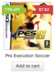
I experience the same misbehaviour of the top menu on IE. The above hints don’t provide a solution to me.
Btw. i run WP 3.6.1, Enfold 2.3
-
This reply was modified 11 years, 9 months ago by
 jorche.
The scroll to the top button is a great feature in Enfold but I believe it will be a point of frustration for many of my readers. I’ve noticed that the button stays in the same size and in the same location even when on a mobile device and I can imagine it is easy to bump sitting out more in the middle of the screen on devices with smaller screens such as iPhones.
Is it possible to move the location of the scroll button to the very edge of the window? Meaning it is always at the very bottom left corner of the screen instead of slightly out?
Thanks!
I think the title says it all. Initially the images were resizing dynamically/responsively when the window was resized, but I wanted to keep/force the height & width to stay the same until the layout jumped into “mobile” mode.
This is the original thread, that has been closed since the forums were updated : https://kriesi.at/support/topic/unwanted-space-below-image-with-link/
The height issue I was able to fix with an !important tag, but I’m still trying to figure out the horizontal squishing.
Please look at the site http://bit.ly/12D6erM and shrink the browser horizontally and you’ll see what I mean with the “share” and “new” button/images.
Thanks, but I look for a solution like Dude had posted it here:
https://kriesi.at/support/topic/move-search-icon-next-to-social-media-icons/#post-127113
Unfortunately since the rewrite of the theme files with v2.3.1, this code does not work any more, it results in an “array” error.
-
This reply was modified 11 years, 9 months ago by
 BeeCee.
Hi!
Maybe the is_bbpress() conditional doesn’t work in your case. You can try the conditionals from here: http://bbpress.org/forums/topic/bbpress-2-0-conditional-tags/
i.e. replace is_bbpress() with (is_post_type_archive(‘forum’) || is_singular(array( ‘forum’, ‘topic’, ‘reply’)))
Best regards,
Peter
Hello!
I didn’t find the original thread but since Enfold 2.0 it shouldn’t be necessary to fiddle around with css to hide/show certain menu items on different pages. I added a “conditional menu” feature to the theme: https://kriesi.at/support/topic/enfold-conditional-menu/ which allows you to define conditions which determine when a menu item should be displayed or should be hidden. You just need to select the “Show” or “Hide”, then select “Page” and insert your blog page id into the text field: http://www.clipular.com/c?6747199274745856=o1wyIbrrbgLc76ITDPikF4Wvu7E&f=.png
If you want to show a menu item just on the blog page select “Show” – “Page” and insert the blog page id. If you want to hide a menu item just on the blog page use “Hide” – “Page” and insert the blog page id. You can also insert several page ids – separate them with a comma.
Best regards,
Peter
Hey!
You can change the style of the sale tag using this on your custom.css or Quick CSS:
#top .onsale {
position: absolute;
background: rgba(0, 0, 0, 0.8);
z-index: 10;
color: #FFF;
background: #7E9A47;
top: -220px;
right: 0;
left: auto;
margin: 0;
min-width: 40px;
}

span.onsale {
min-height: 32px;
padding: 4px;
font-size: 12px;
text-align: center;
line-height: 32px;
-webkit-border-radius: 0;
-moz-border-radius: 20px;
border-radius: 0;
}
Cheers!
Ismael
Hi stunna42!
Please add this on your custom.css or Quick CSS:
.search .post-meta-infos {
position: relative;
left: 20px;
}

.search h2.post-title.entry-title {
padding-left: 60px;
}

.search-result-counter {
position: relative;
left: 0;
top: 1px;
box-shadow: 0px 0px 1px 0px rgba(0, 0, 0, 0.2);
height: 44px;
line-height: 24px;
padding: 10px;
text-align: center;
border-radius: 100px;
width: 44px;
float: left;
}
Best regards,
Ismael
Hey zerozendesign!
You can use shortcodes in the layerslider html field. They just won’t show up on the slider preview page but they will show up on the frontend/website. However I noticed that most shortcodes won’t scale properly if you re-size the slider – thus you may break the responsive layout of the website if you embed forms or big buttons with the shortcodes into the slider.
You can remove the hover effect with following css code – insert it into the quick css field
#top .ls-wp-container .ls-layer a, #top .ls-wp-container .ls-layer a:hover {
text-decoration: none;
}
Regards,
Peter
Ich hatte das selbe Problem durch die automatische Update Funktion über das WordPress Dashboard.
https://kriesi.at/support/topic/update-2-3-alles-ist-weg/
Ich habe das Enfold Update dann noch mal per FTP hochgeladen. Danach war zum Glück alles wieder da.
mit bestem Gruß
Nicole
Hey colorit2!
You can add this on your custom.css or Quick CSS:
#top #menu-item-search {
top: -75px;
}

#header_main {
position: relative;
z-index: 9999;
}
Cheers!
Ismael
Hello!
Ok, irgendwo in deinem Website Code befindet sich:
#hc_template_wrapper7079 p strong {
color: #ffffff !important;
}
welcher die default main color mit important berschreibt. Füge einfach folgenden Code in das Quick CSS Feld ein:
#top #hc_template_wrapper7079 p strong {
color: #c3512f !important;
}
oder suche den Code oben und ersetze ffffff gegen c3512f.
Best regards,
Peter
Hello andreanapier1985!
The responsive stops on mobile view if I’m correct. Please add this on your custom.css or Quick CSS:
@media only screen and (max-width: 767px) {
#wrapper {
width: 460px;
margin: 0 auto;
}

.opl-canvas {
overflow: hidden;
width: 500px;
}
}
Cheers!
Ismael
Hello!
Ok, please revert the change and try following css code
.js_active .portfolio-preview-content .tab_content {
clear: none;
}
You can get rid if the caption link with following css code
#top .portfolio-preview-image .avia-gallery-caption { display: none; }
3) You can actually switch the thumbnail size in the portfolio option window: http://www.clipular.com/c?6068435528187904=W6HGVd_YZ5RBxt5NcgmpbZqIMRE&f=.png
You need to select a thumbnail size which is applied to all images – i.e. if an image does not reach the thumbnail height or width wordpress will not re-size it and you’ll see an uneven grid.
Cheers!
Peter
btw, could you please help take a look at my questions at https://kriesi.at/support/topic/how-to-use-character-map-in-v2-3/ ? The charcodes I use on the site are not displaying anymore after upgrading to v2.3.
Also, how can I change the default social icons? Now the icons we need are available but I don’t know how to add them to the top nav bar since they are not on the drop down list in the “header” settings.
Thanks!
Since this issue breaks our website, I needed to revert to v2.2. The header drop-down menu seems half-transparent, and that might seem to cause the issue. Is there any CSS fix?
Hello!
This will probably work for IE:
 .iconbox_content h3 span a span {
position: relative\9;
top: -20px\9;
}
Cheers!
Ismael
Hey DarrenJessee!
Just add this on your custom.css or Quick CSS:
@media only screen and (max-width: 767px) {
.responsive .template-blog .blog-meta,
		.responsive .post_author_timeline,
		.responsive #top #main .sidebar {display: block !important; }
}
Best regards,
Ismael
Hello,
Is there a quick method for disabling media queries below a certain resolution?
I’d like to use the ‘responsive layout large 1210px’ setting and keep media queries functional for desktops/tablets, but remove/disable the mobile resolutions.
I’m using a child theme and wander if there’s a simple way to do this (without having to make many edits to the parent theme css/markup, which would be hard to maintain when updating)
Thanks for your help!
Fixed it! You can close this topic. For anyone else that might stumble on this thread, I added a z-index property set greater than 1 to the following ID and CLASS. Weird part is, I would have bet thousands that I checked these before (I tried adding z-index properties to every ID and CLASS that seemed to make sense.) Cheers!!
#header_main_alternate,
.header_color .main_menu ul {
z-index: 2;
}
I know this issue is rather specific to this particular site/layout – but I do think it could help anyone that finds themselves in a similar customizing situation, so I figured I’d post my findings FFR.
NOTE to SELF : Thanx Mike! You’re welcome Mike. Way to go!! You’re the best! No, YOU are!!! </schizo-sarcasm>
:)
Hey Nick!
The update is already available and if you have entered your username and api key in your backend at enfold->updates it will show up automatically within the next 12 hours.
If you want to manually trigger the theme check process simply go to your dashboard->updates page
Regards,
Kriesi
PS: The topic had two main problems. icons not appearing (easily fixed by deleting your browser cache) and the problem with the av_font_icon shortcode. (fixed with version 2.3.1) so I am closing it for now. If you experience any problems that are not fixed by one of these solutions please create your own thread with link to your installation ;)
Hi,
Looks like this topic gained a lot of traction quickly.
And if I’m reading it right, I should be on the lookout for an update? Will that show up in my WP dashboard, or do I need to login to ThemeForest and re-download the theme files?
Thanks for all your help!