Viewing 30 results - 1,321 through 1,350 (of 142,938 total)
  • Author
    Search Results
  • #1486302

    In reply to: Focusable elements

    take a look at the rules for the hover state and apply them to the focus-visible state.

    f.e.: on that page here – the first button on top: https://kriesi.at/themes/enfold-overview/
    Add inside dev tools the css to see what i mean.

    .avia-button.avia-color-light:focus-visible {
      opacity: 0.7;
      transition: all 0.4s ease-in-out;
    }
    
    .av-icon-on-hover:focus-visible .avia_button_icon {
      width: 1.5em;
      opacity: 1;
    }

    the focus-visible state ( or focus-within too ) do not influence a clicked or hover state.
    This means that normal navigation is not affected, contrary to the focus state.

    #1486301

    Hi,

    Thank you for the update.

    1.) Try adjusting the top margin of the button layer.

    2.) Apply a minimum height to one of the main layers, or go to Project Settings > Layout > Layout Settings > Canvas Height and adjust the value.

    3.) Apply a Custom CSS Class name to the element and replace the generic selector with it. You can follow this guide: https://kriesi.at/documentation/enfold/add-custom-css/#enable-custom-css-class-name-support

    If you have any additional questions at this time we kindly ask that you open them up in a separate thread. The longer threads get in the forum, they become more difficult to support as they tend to drift off topic and they also make it troublesome for users trying to search for solutions. Keeping threads relevant to their original inquiry ensures that we can keep better track of what has been resolved and that users can more effectively find answers to similar issues they might be experiencing.

    Thanks!

    Best regards,
    Ismael

    #1486284

    In reply to: Logo as SVG

    but that comes from layout.css – no custom css at all:

    #top .logo img.alternate {
      opacity: 0;
    }
    
    #top .av_header_transparency .logo a > img {
      opacity: 0;
    }
    
    #top .av_header_transparency .logo img.alternate {
      opacity: 1;
    }
    
    #1486279

    In reply to: Logo as SVG

    Thank you for giving it a try. Very interesting. In my installations there is the following CSS:

    @media only screen and (max-width: 989px) {
      .responsive.html_mobile_menu_tablet #top .av_header_transparency.av_alternate_logo_active .logo a > img, .responsive.html_mobile_menu_tablet #top .av_header_transparency.av_alternate_logo_active .logo a > svg {
        opacity: 1;
      }
    }
    @media only screen and (max-width: 989px) {
      .responsive.html_mobile_menu_tablet #top .av_header_transparency .logo img.alternate, .responsive.html_mobile_menu_tablet #top .av_header_transparency .logo .subtext.avia-svg-logo-sub {
        display: none;
      }
    }

    Don’t know where it comes from. The first shows the normal logo, the second hides the alternate version below 990px. That’s exactly the error.

    In your installation it is like that:

    #top .av_header_transparency.av_alternate_logo_active .logo a > img, #top .av_header_transparency.av_alternate_logo_active .logo a > svg {
      opacity: 0;
    }
    
    .av_header_transparency .logo img.alternate, .av_header_transparency .logo .subtext.avia-svg-logo-sub svg {
      opacity: 1;
    }

    No query whatsoever. But the CSS above is not from me. It has to be from Enfold.

    Your test is: Logo in backend, alternate logo in backend, code from above in functions, page set to “transparent header” – correct?

    #1486275

    Hey irene,

    Could you try to update to the latest version (7.1.1) to see if that helps please? The update to 7.1.1 has to be done manually from the version you are running, please refer to my replies in this thread: https://kriesi.at/support/topic/enfold-4-5-theme-update-update-failed-download-failed-a-valid-url-was-not-pro/#post-1021541
    You can either update manually via FTP: https://kriesi.at/documentation/enfold/how-to-install-enfold-theme/#theme-update, or upload the theme as if it was new under Appearance->Themes->Add New Theme.
    If that doesn’t work then please try to delete the whole theme folder, then replace it with the new version. Make sure that you have backups of the site before starting updating.
    Also please read this after you have updated: https://kriesi.at/documentation/enfold/theme-registration/

    Best regards,
    Rikard

    #1486266

    In reply to: Logo as SVG

    by the way: that snippet from your first post – does not work on my testinstallation ( Enfold 7.1.1). I do allways have inline svg.

    As far as i know the avia-snippet-sticky-header does only rule the shrink amount , header height. (Two classes are toggled on scrolling)
    On mobile devices the shrinking is set to off by that line i mentioned.

    #1486243

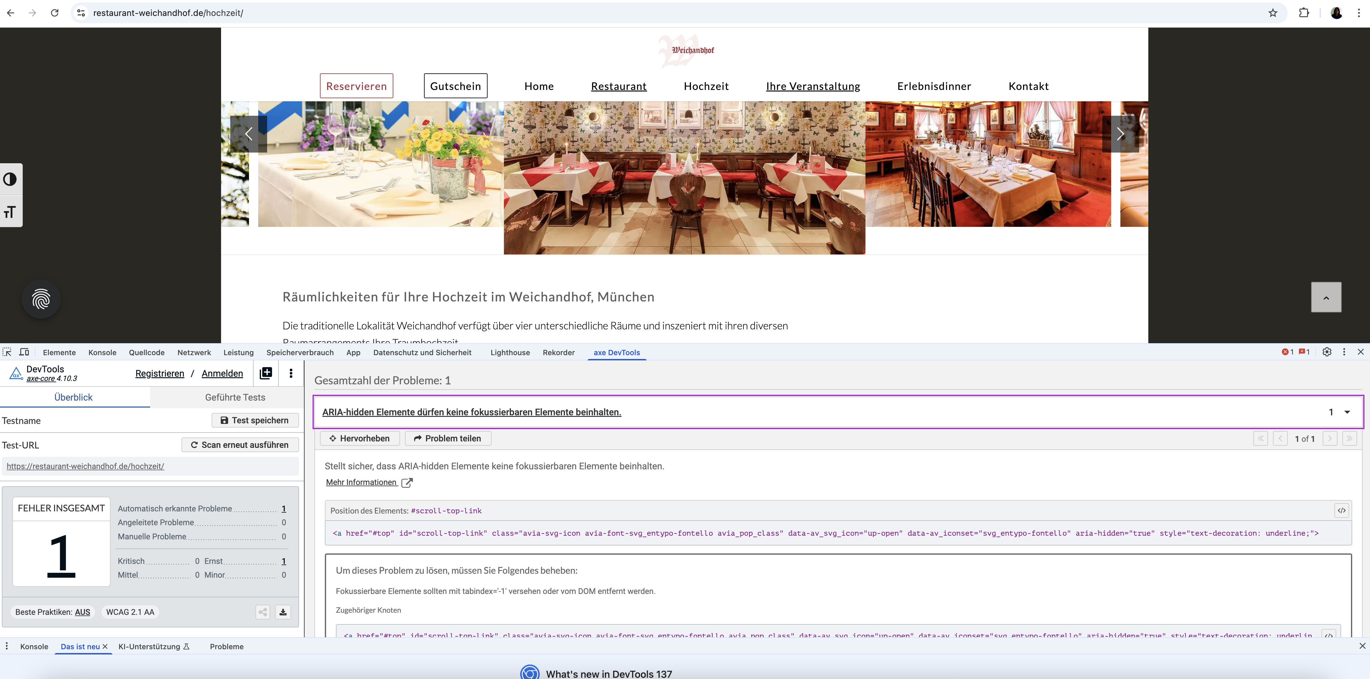
    Topic: Focusable elements

    in forum Enfold
    Biggy
    Participant

    Hi,
    the topic of accessibility is currently on our minds. We actually have it well under control, and the Enfold theme is exemplary in this regard. Currently, we’re working on focusable elements, such as buttons that indicate the action behind them when hovered over. If you only use the keyboard, this change in the button color isn’t visible. This leads to complaints. Do you have any ideas how to solve this? This also applies to links or searches…basically, every interaction!

    Regards

    #1486216

    Hi,


    @oestersund
    did you try the solution that I posted? I tested it on your site and it works.
    I also included the steps on how to add it to your site.

    Best regards,
    Mike

    #1486214

    In reply to: Nav obscuring logo

    try :

    @media only screen and (max-width: 1319px) {
        #top #header .av-main-nav > li.menu-item  {
            display: none!important;
        }
        #top #header .av-burger-menu-main {
            cursor: pointer;
            display: block!important;
        }
    }
    

    PS : why “Connection denied by IP2Location Country Blocker” for Germany ?

    #1486212

    Topic: Nav obscuring logo

    in forum Enfold
    mikejuly
    Participant

    Hello and thanks for checking out my post.

    For context, this is what I am dealing with: https://moxiemeninc.com/emerald-nav.pdf

    I’ve made adjustments to the CSS but all it does is make the nav completely disappear. I need the hamburger to show up around the 1320 px mark. Here is the code I used:

    @media only screen and (max-width: 1320px) {
    #avia-menu {
    display: none !important;
    }

    .av-burger-menu-main {
    display: block !important;
    }
    }

    I also tried this:

    @media only screen and (max-width: 1350px) {
    /* SHOW the burger toggle */
    .av-burger-menu-main {
    display: block !important;
    visibility: visible !important;
    opacity: 1 !important;
    height: auto !important;
    }

    /* HIDE the desktop menu */
    .av-main-nav-wrap,
    #avia-menu {
    display: none !important;
    visibility: hidden !important;
    opacity: 0 !important;
    height: 0 !important;
    overflow: hidden !important;
    }

    /* ENSURE the mobile menu container shows when open */
    #mobile-advanced {
    display: block !important;
    visibility: visible !important;
    opacity: 1 !important;
    height: auto !important;
    overflow: visible !important;
    }
    }

    I also tried updating the pho file with the following code:

    add_filter( ‘avf_responsive_size’, ‘set_custom_menu_breakpoint’ );
    function set_custom_menu_breakpoint( $width ) {
    return 1320; // no quotes, no ‘px’
    }

    But I’ve had no success. Thanks in advance for any advice you can dispense.

    #1486191

    In reply to: Logo as SVG

    Hi Mike, as I said: It is not about the small round one. Everything finde with that. And it is not about a transparent background either. The logo in the header is different for the mobile versions and the desktop version. For the desktop version (above 990px) the logo is white (as defined in the theme’s transparency settings) and for the mobile/smaller versions it is blue – that is the normal logo, not the one defined in the theme’s transparency settings. Now my question is: Why? Is anything of the transparency logic defined in avia-sticky-header.js? Than this could be the reason, because I altered the avia-sticky-header.js

    #1486190

    did you see my test page:
    https://webers-testseite.de/8col-flex/
    the colum on the right side – has a -100% – this is as if it is fixed a -150% will have that effect you described.

    I change it for now to 150% in that function: link

    short version with no comments and only with the changing of desktop parallax speed:
    ( Do not forget to set the custom ID: myID1 to the column )

    function my_custom_all_parallax_settings_preserving_others() {
    ?>
    <script>
    window.addEventListener("DOMContentLoaded", function () {
        const container = document.getElementById('myID1');
        if (container) {
            const currentParallaxData = container.getAttribute('data-parallax');
            let parallaxObject = {};
            try {
                parallaxObject = JSON.parse(currentParallaxData || '{}');
            } catch (e) {
                console.error('Error parsing existing data-parallax attribute:', e);
                parallaxObject = {};
            }
            const changesToApply = {
                "av-desktop-parallax": "bottom_top", // Desktop 
                "av-desktop-parallax_speed": "-150",  // Desktop: Speed
            };
            Object.assign(parallaxObject, changesToApply);
            const newParallaxData = JSON.stringify(parallaxObject);
            container.setAttribute('data-parallax', newParallaxData);
        } 
    });
    </script>
    <?php
    }
    add_action('wp_footer', 'my_custom_all_parallax_settings_preserving_others');
    #1486188

    it is because the padding of 1.5em on .av-image-caption-overlay-center is too big for those small images.

    try:

    #top .av-image-caption-overlay-center {
      padding: .5em;
    }

    or in additon: bring those image to grow:

    .avia-image-container.avia-align-center .avia-image-container-inner,
    .avia-image-overlay-wrap a.avia_image img {
      width: 100% !important;
    }
    
    #1486175

    few more changes

    1- how do I move the “VIEW SERVICES” button down a little on mobile
    2- how do I make the entire slider taller
    3- I moved the slider to my homepage https://easyflyers.com/ – can you provide the correct class to replace “.avia-section.av-wxcp-c90200cb46284bf3caa8c1c1fbba7cb6 .avia-divider-svg-top svg”. thanks

    #1486174

    In reply to: Add popup to a button

    Hey Silvia,
    Try this thread, please read the whole thread.

    Best regards,
    Mike

    kurson
    Participant

    Hi.

    I am using the plugin WP Google Reviews Slider Global PHP Snippet.

    This is used in conjunction with WPCode Lite Snippet and a global php snippet to display the shortcode on every page right above the footer.

    The Google Reviews display fully on a desktop.

    Note: there is an Inconsistent Mobile Mode Load issue where on some pages it loads on a phone at the bottom of the page as it should:

    Examples:

    https://blgenvironmental.com/
    https://blgenvironmental.com/free-consultation/

    But not on other pages and instead I see the space where it should display as a big long white space:

    Examples:

    https://blgenvironmental.com/residential/
    https://blgenvironmental.com/gallery/

    This inconsistency was tesed on both a Samsung Galaxy s24 and Iphone SE.

    Can you please investigate and do you know why there is an inconsistency?

    I agree. It looks fine on a Samsung Galaxy s24. It is in the dashboard on a desktop in mobile mode under Appearances…Customize….Additional CSS where I test all 3 modes that the layout is as reported.

    The most important thing is how it looks on a phone itself.

    #1486163
    TB-MTL-marketing
    Participant

    Hello,

    Hope you are doing well.

    We have the same reoccuring issue that we’ve had in the past with threads we’ve opened. Many elements keep not loading across the website and only reappear on reload, and not always fully.

    We’ve cleared the cache on Object Cache Pro. We’ve also added Enfold theme as an exclusion for the Async plug-in. I don’t know if there could be issues such as conflicts between Async and Autoptimize. We’ve also set exclusions between them.

    The issue happens more and more often and at times it seems like the whole page doesn’t load until the reload. We’ve disabled lazy load on Enfold, but have it on Autoptimize because we don’t see the option to turn it off.

    Is there anything we can do?

    Thank you in advance,
    Vlad

    Hi Ismael,

    thanks for your support. I have noticed, that you put your code within the “quick CSS” box inside theme settings.
    Did you realize, that I had already a lot of code within Custom CSS area of the WP Customizer? I am not sure, if those two areas for CSS work well together or if any of the code is rendered earlier.
    What would you recommend?

    And another hint for your team: if there has to be such a large amount of CSS code to make the horizontal gallery look good in all kind of displays, then this element is NOT RESPONSIVE out of the box.

    This is the whole CSS code, which I had to write for my horizontal gallery:
    ####################################

    @media only screen and (max-width: 489px) {
    /* Add your Mobile Styles here */
    .responsive .av-horizontal-gallery-inner {
    min-height: 120px;
    }
    .responsive .av-horizontal-gallery-img {
    transform: none;
    top: 0;
    }
    }
    @media only screen and (min-width: 490px) and (max-width: 767px) {
    /* Add your Mobile to Tablet Styles here */
    .responsive .av-horizontal-gallery-inner {
    min-height: 580px;
    }
    .responsive .av-horizontal-gallery-img {
    transform: none;
    top: 0;
    }
    }
    #presse .av-horizontal-gallery {
    padding-bottom: 350px;
    }
    #presse .presse-galerie .av-image-copyright {
    left: 50%;
    transform: translateX(-50%);
    position: absolute;
    padding-top: 50px;
    }
    }
    @media only screen and (min-width: 768px) {
    /* Add your Tablet Styles here */

    #presse .av-horizontal-gallery {
    padding-bottom: 100px;
    }
    #presse .presse-galerie .av-image-copyright {
    bottom: 0;
    left: 50%;
    transform: translateX(-50%);
    position: absolute;
    padding-top: 0;
    }
    #presse .presse-galerie .av-horizontal-gallery-wrap {
    overflow: visible;
    padding-bottom: 30px;
    }
    }
    @media only screen and (min-width: 767px) {
    /* Add your Tablet Styles here */
    #presse .av-horizontal-gallery {
    padding-bottom: 100px;
    }
    #presse .presse-galerie .av-image-copyright {
    bottom: 0;
    left: 50%;
    transform: translateX(-50%);
    position: absolute;
    padding-top: 0;
    }
    #presse .presse-galerie .av-horizontal-gallery-wrap {
    overflow: visible;
    padding-bottom: 40px;
    }
    }
    ################################

    And it is not a guaranty, that this works on every screen and/or browser… I am really getting a headache because of this horizontal gallery and I do not understand, why your theme coding and configuration settings do not provide this capability as a standard.

    If I had knew this before buying, I wouldn’t have. Sorry to say that. But I am not good in coding, so this is why I am using themes and plugins. All this coding and contact with support takes very much time, that I do not get paid.

    Please use my comments on this topic for a feature request!!

    Best regards
    Bettina

    kinnear
    Participant

    Hi, I used the Enfold Medical template, and the slider image is mostly covered up on a mobile (small screen). I unticked the option to display it, and half of the first content box is missing (the top half). So either way, it looks dreadful. I checked the medial template on my phone to see if the same issue happened for you, and I noticed the box was further down, so more of the slider image was visible. How can I do that for my website?

    Cheers Kinnear

    #1486133

    Hi,

    Try to edit the Contact Form element and set the Styling > Form Color Scheme to Dark Transparent. You can also replace the previous css with this:

    #top #wrap_all .main_color .button, .main_color #submit, #top #wrap_all .contact-form :is([type=submit], button:not([type=reset])) {
        align-items: center;
        display: inline-flex;
        gap: .5em;
        justify-content: center;
        border-radius: 100px;
        color: rgba(0, 0, 0, 0.6);
        border: 1px solid rgba(0, 0, 0, 0.6);
        background: 0 0;
        font-size: 14px;
        border-style: solid;
        border-width: 1px;
        transition: all 0.4s ease-in-out;
        padding: 9px 10px 7px;
        width: 80px;
    }

    Best regards,
    Ismael

    Hi,

    Thank you for the update.

    We edited the Horizontal Gallery element and set Stil > Galerie > Bildgröße to “No scaling” to display the original size, then added this css code to adjust the minimum height of the gallery.

    @media only screen and (max-width: 768px) {
    
      /* Add your Mobile Styles here */
      .responsive .av-horizontal-gallery-inner {
         min-height: 500px !important;
      }
    
       .responsive .av-horizontal-gallery-img {
          transform: none;
          top: 0;
       }
    }
    

    View post on imgur.com

    Best regards,
    Ismael

    #1486129

    as i understood him it is the column not the section – so my way was to give the ID to the column.
    The column has the parallax attribute. And i think he is talking about the parallax effect on element itself – not the background-image of the column. there is no option for that on columns.

    I tested it on an existing testpage of mine ( so the codes there have nothing to do with the solution here ). but see the right column with that image.

    https://webers-testseite.de/8col-flex/
    see what happens when hamburger is active – the direction is then the other way round (+50)

    my fault is that i do not preserve the rest of the existing settings – here a corrected code:

    function my_custom_all_parallax_settings_preserving_others() {
    ?>
    <script>
    window.addEventListener("DOMContentLoaded", function () {
        const container = document.getElementById('myID1');
    
        if (container) {
            // 1. Get the current value of the data-parallax attribute
            const currentParallaxData = container.getAttribute('data-parallax');
    
            // 2. Parse the string into a JavaScript object
            let parallaxObject = {};
            try {
                // Attempt to parse existing data. If it's empty or invalid, start with an empty object.
                parallaxObject = JSON.parse(currentParallaxData || '{}');
            } catch (e) {
                console.error('Error parsing existing data-parallax attribute:', e);
                // If parsing fails, ensure parallaxObject is an empty object to avoid errors
                parallaxObject = {};
            }
    
            // 3. Define the changes you want to apply.
            //    Only the properties listed here will be updated or added.
            //    Existing properties not listed here will be preserved.
            const changesToApply = {
                "parallax": "bottom_top",       // Standard Parallax 
                "parallax_speed": "-150",       // Standard Parallax Speed
    
                "av-desktop-parallax": "bottom_top", // Desktop 
                "av-desktop-parallax_speed": "-100",  // Desktop: Speed
    
                "av-medium-parallax": "bottom_top",  // Medium Tablet
                "av-medium-parallax_speed": "50",   // Medium Tablet Speed
    
                "av-small-parallax": "no_parallax", // Parallax off
                "av-small-parallax_speed": "no_parallax", // no speed needed
    
                "av-mini-parallax": "no_parallax", // Mobil Parallax 
                "av-mini-parallax_speed": "no_parallax" // No Speed needed
                // Do NOT include "parallax-container" here, as we want to preserve its original value
            };
    
            // 4. Merge the changes into the existing parallaxObject.
            //    Object.assign() overwrites existing properties and adds new ones.
            //    Properties in 'parallaxObject' that are NOT in 'changesToApply' will remain untouched.
            Object.assign(parallaxObject, changesToApply);
    
            // 5. Convert the modified object back into a JSON string
            const newParallaxData = JSON.stringify(parallaxObject);
    
            // 6. Set the new value of the data-parallax attribute
            container.setAttribute('data-parallax', newParallaxData);
    
            console.log('Data attribute for parallax settings updated successfully!');
            console.log('New data-parallax value:', container.getAttribute('data-parallax'));
        } else {
            console.error('Container with ID "myID1" not found.');
        }
    });
    </script>
    <?php
    }
    add_action('wp_footer', 'my_custom_all_parallax_settings_preserving_others');

    btw: on 3. read that comment:

            // 3. Define the changes you want to apply.
            //    Only the properties listed here will be updated or added.
            //    Existing properties not listed here will be preserved.

    so if you only want to influence the desktop parallax speed then only change it in the code above and do not mention the other settings there

    #1486127

    Hi Ismael,

    Thanks so much, that worked perfectly!

    While we’re on the topic of buttons, I have another page where I’d like to keep the existing Form Color Scheme but change the button to a dark transparent style, like on the other pages. However, I can’t see an option for this in the Contact Form settings, could you please advise?

    #1486123

    Hi,

    Please remove the previous modification and replace it with the following css code, then make sure to purge the cache or clear your browser history afterward.

    #top #wrap_all .contact-form :is([type=submit], button:not([type=reset])) {
        align-items: center;
        display: inline-flex;
        gap: .5em;
        justify-content: center;
        border-radius: 100px;
        color: rgba(0, 0, 0, 0.6);
        border: 1px solid rgba(0, 0, 0, 0.6);
        background: 0 0;
        font-size: 14px;
        border-style: solid;
        border-width: 1px;
        transition: all 0.4s ease-in-out;
        padding: 9px 10px 7px;
        width: 80px;
    }

    Best regards,
    Ismael

    kurson
    Participant

    HI.

    I have a layout for the home page that looks perfect in Desktop mode but compressed in Tablet mode and looks terrible in mobile mode. The Margins or padding left and right for the rows that begin with: Working With Us is Easy and Hi. I’m Robert are the rows in question.

    Note: The row beginning with: Do Your Outdoor Areas Need a Makeover? looks very nice in all modes. I worked with Chat GPT in Appearance…Customize…CSS to resolve the layout issues for this row. Chat GPT seems unable to resolve the other two rows,

    Please review this screenshot video: https://www.awesomescreenshot.com/video/41493405?key=78aeb216a83b4cc7d4c8017d672fef92

    It presents the problem at hand.

    I would appreciate it if you could please advise me on how to fix the problems with the layout with these columns on the home page.

    #1486115
    kalla77
    Participant

    Hi
    here is a severe issue: “Taxonomy tags of masonry element incomplete”

    1: Open gwup.org
    2: Scroll down until “Vollständige Artikel”
    3: Find this list of filterable tags (taxonomy) – it is NOT COMPLETE
    4: Click on the button” “Mehr laden”
    5: NOW you see the complete list.

    See video here:
    [video src="https://www.gwup.org/temporaer/taxonomy-issue.mp4" /]

    This is a severe issue.
    Please tell us how to fix it!

    Here is the code:

    [av_masonry_entries link='category,2780,2781,2779,2782,2793,2797,2783,2784,2798,2799,2800,2801,2785,2786,2787,2788,2802,2792,2789,2803,2804,2805,2790' term_rel='' wc_prod_visible='' wc_prod_hidden='hide' wc_prod_featured='' prod_order_by='' prod_order='' date_filter='' date_filter_start='' date_filter_end='' date_filter_format='yy/mm/dd' period_filter_unit_1='1' period_filter_unit_2='year' page_element_filter='skip_current' sort='yes-tax' query_orderby='date' query_order='DESC' caption_elements='title excerpt' caption_styling='' caption_display='on-hover' img_copyright='' size='fixed masonry' orientation='' image_size='masonry' gap='large' columns='4' av-desktop-columns='' av-medium-columns='' av-small-columns='' av-mini-columns='' items='12' paginate='load_more' color='custom' custom_bg='' img_copyright_font='' av-desktop-font-img_copyright_font='' av-medium-font-img_copyright_font='' av-small-font-img_copyright_font='' av-mini-font-img_copyright_font='' img_copyright_color='' img_copyright_bg='' animation='active' animation_duration='' animation_custom_bg_color='' animation_custom_bg_color_multi_list='' animation_z_index_curtain='100' overlay_fx='active' img_scrset='' lazy_loading='disabled' av-small-hide='aviaTBav-small-hide' av-mini-hide='aviaTBav-mini-hide' alb_description='' id='' custom_class='' template_class='' av_uid='av-m7i3btdw' sc_version='1.0']

    [av_masonry_entries link='category,2780,2781,2779,2782,2793,2797,2783,2784,2798,2799,2800,2801,2785,2786,2787,2788,2802,2792,2789,2803,2804,2805,2790' term_rel='' wc_prod_visible='' wc_prod_hidden='hide' wc_prod_featured='' prod_order_by='' prod_order='' date_filter='' date_filter_start='' date_filter_end='' date_filter_format='yy/mm/dd' period_filter_unit_1='1' period_filter_unit_2='year' page_element_filter='skip_current' sort='yes-tax' query_orderby='date' query_order='DESC' caption_elements='title excerpt' caption_styling='' caption_display='on-hover' img_copyright='' size='fixed masonry' orientation='' image_size='masonry' gap='large' columns='4' av-desktop-columns='' av-medium-columns='' av-small-columns='' av-mini-columns='' items='3' paginate='load_more' color='custom' custom_bg='' img_copyright_font='' av-desktop-font-img_copyright_font='' av-medium-font-img_copyright_font='' av-small-font-img_copyright_font='' av-mini-font-img_copyright_font='' img_copyright_color='' img_copyright_bg='' animation='active' animation_duration='' animation_custom_bg_color='' animation_custom_bg_color_multi_list='' animation_z_index_curtain='100' overlay_fx='active' img_scrset='' lazy_loading='disabled' av-desktop-hide='aviaTBav-desktop-hide' av-medium-hide='aviaTBav-medium-hide' alb_description='' id='' custom_class='' template_class='' av_uid='av-m7rio00o' sc_version='1.0']

    mfg
    Andrè

    Hi,
    The plugin Header Footer Code Manager is limited and only allows HTML & JS, where WPCode allows these and PHP & CSS, in the past I tested both and found WPCode, the free version, to be much better considering that most snippets are PHP. I would recommend replacing Header Footer Code Manager with WPCode, or use a child theme.
    But since your AXE & WAVE is not reporting the change to aria-hidden correctly I don’t think that we can create a solution that will help. If you watch the DOM in the browser you will see that the aria-hidden does change on scroll. We could set the aria-hidden to false always, but then on page load you would see an error, instead of after scroll. I would hope that a real screen reader would report this correctly and recognize changes to the DOM in real time, unlike the testing tools, otherwise you may need to disable this Scroll-to-Top feature.
    To request the Dev Team to review this, please open a new Github Feature Request to place a request and follow it as the Dev Team reviews it.

    Best regards,
    Mike

    Dear Mike,

    Thank you so much for your quick help and solution suggestion. I wanted to let you know that AXE is actually a free browser extension (available for Chrome) and very easy to install and use. I tested your code after clearing the cache and restarting everything, but unfortunately, AXE still reports the same error (see screenshot at https://restaurant-weichandhof.de/support/axe.png).

    Also, this seems to be a global issue. I am currently working on making seven websites accessible, all built with Enfold, and this Scroll-to-Top-Button problem appears across all of them. It would be great to have a solution that I could apply universally or ideally have this fixed directly in the theme itself.

    I would also prefer not to use an additional plugin (like WPCode) or keep this code in the functions.php file, as I would lose the changes with the next theme update. Could you perhaps suggest a solution that works via the existing Header Footer Code Manager plugin, or maybe there is another way to solve this via theme settings or CSS/JS?

    Thank you so much again for your support!

    Best regards,
    Diana

    #1486105

    Hi,
    Thanks for your help Guenni007, but in my test it seems that only targeting the ID “#av_section_1” didn’t help, I tried adjusting to const container = document.querySelector('#av_section_1 .av-parallax-object'); to target the text in the parallax but as you pointed out it was jerky for the speed needed.
    With trial and error and AI I found that this javascript & css works well for desktop & mobile and smooths out most all the jerk from the text and background image.
    Try adding this code to the end of your child theme functions.php file in Appearance ▸ Editor:

    function move_text_in_parallax_down_on_scroll() { ?>
      <script>
      document.addEventListener("DOMContentLoaded", function () {
      const el = document.querySelector("#av_section_1 .av-parallax-object");
      const bg = document.querySelector("#av_section_1 .av-parallax");
    
      if (!el || !bg) return;
    
      const isMobile = window.innerWidth < 768;
    
      const textSpeed = isMobile ? 0.9 : 0.7;
      const bgSpeed = isMobile ? 0.3 : 0.2;
    
      let currentYText = 0;
      let currentYBg = 0;
    
      const updateParallax = () => {
        const scrollY = window.scrollY || window.pageYOffset;
    
        // Text transform
        const targetYText = scrollY * textSpeed;
        currentYText += (targetYText - currentYText) * 0.05;
        el.style.transform = translateY(${currentYText}px);
    
        // Background transform
        const targetYBg = scrollY * bgSpeed;
        currentYBg += (targetYBg - currentYBg) * 0.05;
        bg.style.transform = translateY(${currentYBg}px); // GPU accelerated
    
        requestAnimationFrame(updateParallax);
      };
    
      requestAnimationFrame(updateParallax);
    });
      </script>
      <style>
      #av_section_1 .av-parallax-object {
      position: relative;
      top: 0;
      left: 0;
      will-change: transform;
      backface-visibility: hidden;
      transform: translateZ(0);
    }
    #av_section_1 {
      position: relative;
      overflow: hidden;
    }
    #av_section_1 .av-parallax {
      background-attachment: scroll !important; /* disables fixed scroll handling */
      background-position: center center !important;
      transform: none !important;
      will-change: auto !important;
    }  
      </style>
      <?php
    }
    add_action( 'wp_footer', 'move_text_in_parallax_down_on_scroll', 99 );

    If you are not using a child theme you could use the WP Code plugin then add a new snippet, in the top right corner use the PHP snippet as the code type:
    use wpcode php snippet and activate
    and ensure that it is activated, then add the above code and save.

    Best regards,
    Mike

Viewing 30 results - 1,321 through 1,350 (of 142,938 total)