-
Search Results
-
Good afternoon.
On my client’s shop page (http://mrsjosephwood.com/store/), using WooCommerce, any products with the same category have a messed up “related products” section (see first image link).
Note: I hid the sections that’s messed up for now using
#av_section_1 {display: none !important;}I’ve narrowed the issue down to the code I’m using to replace the title bar area with a background image. There are two pieces of code below: when I comment out the first, the second defaults. When I comment both out, the related products display fine (see second image link).
However, I need to be able to use the image for the background at the top of the page.
Any idea what I’m doing wrong?
.single-product .alternate_color {
background: transparent url(https://mrsjosephwood.com/wp-content/uploads/title-bar-store.png) center center no-repeat;
height: 67px;
margin: -2px 0 0 0;
text-align: center;
}
.page-id-149135 .alternate_color, .single .alternate_color, .archive .alternate_color, .tag .alternate_color { background: transparent url(https://mrsjosephwood.com/wp-content/uploads/title-bar-blog.png) center center no-repeat; height: 67px; margin: -2px 0 0 0; text-align: center; }(Right-click and open links in new tab.)
https://www.dropbox.com/s/zev312bc6z4ji32/shop-error.jpg
https://www.dropbox.com/s/um345kgcw40jkr0/shop-error-code-commented-out.jpgHi,
I have my website not displaying correctly on Safari, like the slylesheet is missing.
The website is delphiconsulting.it.
I installed BWM and WP Supercache, it works fine on Firefox and Chrome, but I get a mess in Safari.
I also tried to follow this discussion, but nothing changed:
https://kriesi.at/support/topic/theme-broken-in-safari/
so I deactivate them and then activated again, but it did not work.
Thank you for help.
Gianni CeccanoTopic: Masonry Detail Order
I love your theme! There is one thing that I’d like to change and I cannot figure out how to do it.
I have my gallery set up using Masonry Gallery at:
http://www.audreymortmanartist.com/gallery/When you click the painting in the top left hand corner of the grid it pops up to a detail view-
and then you can advance through the paintings one at a time. My expectation is that the right arrow would send you to the painting on the right in the grid view and the left arrow would send you to the painting on the left in the grid view BUT in fact the reverse is true.Is there a way to reverse the order in the detail views it is more intuitive for the user?
Thanks for any help that you can give me!
LIsette
The fullscreen slider doesn’t work on opera. I tried different versions of opera on PC an Mac. The first slide is ok, the second slide shows but stops before the text is flying in. Then nothing can be done anymore with the slider.
This is our test site: http://www.teensmag.j-apps.de
I’m trying to place an Easy Slider into the top of a page but the size of the slider is always the same even if I’ve set the Slideshow Image Size to no scaling. Is this a bug? Can you offer a fix for this?
Many thanks
I am trying to verify my site in Google Webmaster Central by using my analitics account but am not able to do so. Google returns the following error:
Verification failed for http://visualradio.eu/ using the Google Analytics method (less than a minute ago). The Google Analytics tracking code on your site is in the wrong location. You can verify site ownership with the asynchronous snippet placed in the <head> section of your home page.
I did some searching on your forum and found this topic and some more on problems concerning the tracking code.
Do I manually place the code in my headers or is there anaother fix for this?
Topic: Fullwidth Blog Post Layout
1) I am wondering how I can enlarger the area of the fullwidth blog post layout that contains the content itself?
2) Also how do I add spacing for any pictures I have in the post?
It seems if I choose a right side bar the post formats beautifully but then when I use the no side bar option for page layout everything shifts to being centered – which wouldn’t be bad if everything was still formatted nicely. What happens is not only is there no longer any spacing between the pictures and the frame but also the H1 title I am using at the top of the post is formatted funny and looks awful.
Hi,
I have enfold Version: 2.6.1 and am working off a child theme.
I have tried everything that has been suggested before regarding removing the resizing on the top logo. So far nothing has worked out. I prefer having the smaller navigation when one scrolls but still to keep the logo at a reasonable size (min 51 px height).
The site I am working on is on a test environment and password protected. I can certainly share the info if needed. Please let me knowThanks so much for all your help
EWhen viewing the website on the Iphone, WildcatMattress.com, we have the following issues:
Iphone portrait mode = we can not see the 1 menu item ‘Policies” at right side of socket
Iphone landscape mode =
1. the arrow to return to the top of page is not visible
2. any more than 1 menu item in the socket creates alignment issuesThank you.
I saw a few other topics discussing a similar problem, but my problem is a bit different.
I have customized our portfolio permalinks to “work” and “work-category” in order to coordinate with our portfolio landing page entitled “Work.” When approaching any portfolio entry from the “Work” page, the breadcrumb appears correctly, like this:

However, if you approach any portfolio entry from any other page via a post slider or a portfolio grid, it displays the following incorrect breadcrumb every time:

When hovering over any link to any portfolio entry, regardless of where it is, the correct URL appears. I could use some help with this one….
Thanks,
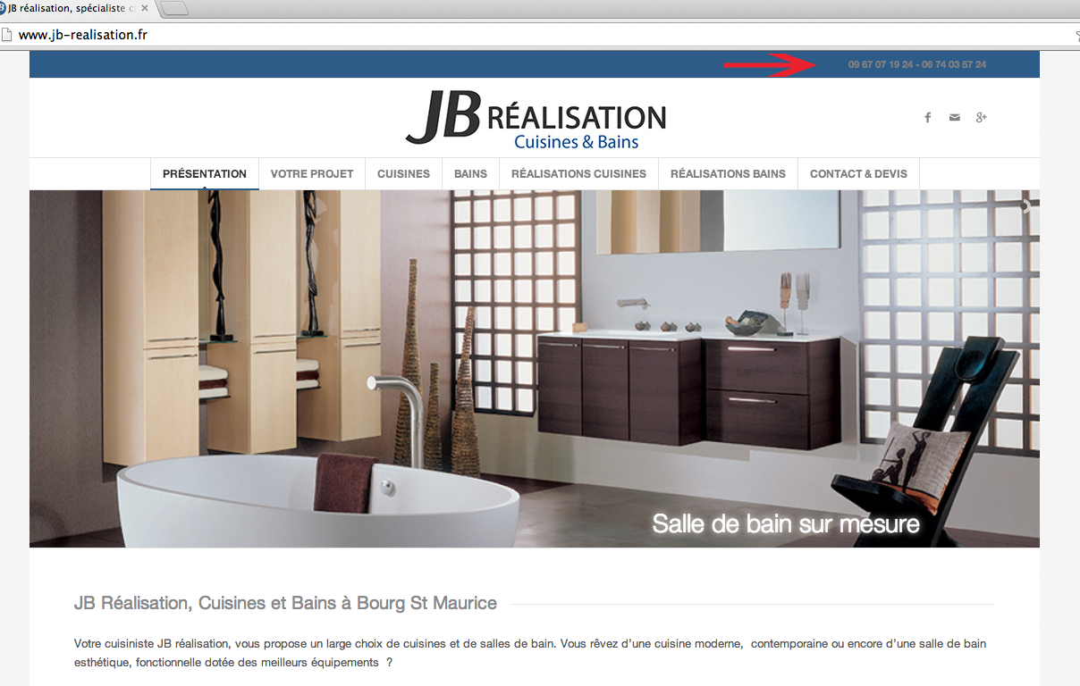
DCTopic: Top Header color
HEllo,
The color shown in Quick CSS is not taken into account. I would like to see the phone in white.
Quick CSS.social_header .phone-info { color: #ffffff; font-weight: normal; }
#top .social_bookmarks_mail:hover a {
color: #fff;
#top .social_header .phone-info { color: #ffffff; font-weight: normal; }Capture écran ci dessous:
http://www.jb-realisation.fr/wp-content/uploads/2014/03/capture.pngThank you
Bonjour,
La couleur indiqué dans Quick CSS n’est pas prise en compte. Je voudrais afficher en blanc le téléphone.MErci
Topic: Comments Not Displaying
Viewing 30 results - 131,881 through 131,910 (of 142,898 total)
When I switched to the Enfold theme, all of a sudden my comment forms stopped displaying. Is there a way to turn them on and off with Enfold? They’re certainly allowed within my discussion settings. Are there any special controls for comments with Enfold?