Thank you very much, it worked! Topic can be closed Thanks!
Hello,
I have a horizontal gallery that should be displayed differently on mobile than on desktop. So I have set 2 and show and hide them accordingly. that works so far, but the change of the image size and the height of the gallery are not taken over, no matter what I do. If I change the images in general, the new images are also displayed, but also in the wrong size. What am I doing wrong?
Settings:

I have also tested image size large 1030 x 1030, but it didn’t work either (on the desktop, but not mobile).
thanks in advance
best KiM
Hi,
Thank you for the update.
Did you add the css code as is? You have to modify it a bit to target the appropriate element.
Example:
#top .av_header_transparency #header_meta {
    padding-top: 20px;
    border-bottom: 0;
}

#top #wrap_all .av_header_transparency .sub_menu > ul #menu-item-21 a {
    border: 2px solid #ffffff;
    border-radius: 2px;
    padding: 9px;
}
View post on imgur.com
Best regards,
Ismael
Hey Antonio,
Thank you for the inquiry.
The button-style will get applied for the items in the main menu, not for secondary menu items. You may need to manually apply the styles to secondary menu items using the Quick CSS field.
These are the css rules for the bordered menu item, which can be adjusted based on your requirements.
#top .av-menu-button > a .avia-menu-text {
    border: 2px solid;
    border-radius: 2px;
}

#top .av-menu-button > a .avia-menu-text {
    padding: 9px;
}
Best regards,
Ismael
Hey steviger,
Thank you for the inquiry.
You may need to adjust the background-position and right padding a bit. Please try this css code:
.av_searchform_wrapper {
    border: #2c7d95 1px solid!important;
    border-radius: 40px!important;
    background-image: url('https://www.steviger.nl/wp-content/uploads/2025/07/vergrootglas.webp');
    background-repeat: no-repeat;
    background-position: right 20px center;
    padding-right: 50px;
}
To disable the ajax response container, include this:
#top .ajax_search_response {
    display: none !important;
}
View post on imgur.com
Best regards,
Ismael
Hey Kevin,
The update to 7.1.1 has to be done manually from the version you are running, please refer to my replies in this thread: https://kriesi.at/support/topic/enfold-4-5-theme-update-update-failed-download-failed-a-valid-url-was-not-pro/#post-1021541
You can either update manually via FTP: https://kriesi.at/documentation/enfold/how-to-install-enfold-theme/#theme-update, or upload the theme as if it was new under Appearance->Themes->Add New Theme.
If that doesn’t work then please try to delete the whole theme folder, then replace it with the new version. Make sure that you have backups of the site before starting updating.
Also please read this after you have updated: https://kriesi.at/documentation/enfold/theme-registration/
Best regards,
Rikard
-
This reply was modified 8 months, 2 weeks ago by
 Rikard.
Hi,
Suddenly can’t find my facebook and instagram icon in mobile screen?
For desktop view, it appears at the top of right corner. (next to menu)
However, for mobile, I can’t find it.
Would you help me to show them again?
So I have an email address in “Autoresponder From E-Mail Address” (same as the delivery email) but the fields “Autoresponder Reply To E-Mail Address”, “Autoresponder Subject” and “Autoresponder Text” are all blank/empty.
Do I need to delete the address in “Autoresponder From E-Mail Address” to stop the errors?
Obviously, you have more faith in a moderator than in an experienced participant. There is no danger of trying one of them – and if that doesn’t work, testing the other solution.
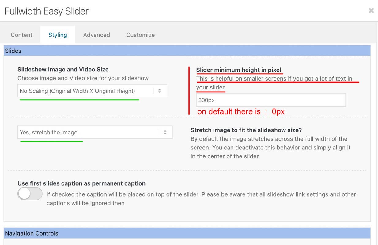
A full-width slider is responsive by default, so there’s no reason to define heights or minimum heights here. Only if the content of the color section gets bigger in height than the height of the background-video (or background-image). See here for example – there a min-height would be nice: https://kriesi.at/themes/enfold-wedding/
I can’t provide any more proof of this than the video, which shows a screen width of 320px.
So if you say that you have removed this minimum height from the color section, and have removed this one rule from the quick css; have saved everything, then it can actually only be due to a caching tool or to the Enfold own (merged or minified css) settings that I still see these settings in your source code.
I’m going to take a break from here.
Last hint – you can force my results if you place inside your quick css instead:
#top.home #wrap_all #full_slider_1,
#top.home #wrap_all #full_slider_1 .avia-slideshow,
#top.home #wrap_all #full_slider_1 .avia-slideshow-inner,
#top.home #wrap_all #full_slider_1 .avia-slide-wrap {
  min-height: unset !important;
  height: unset !important;
}
Hi guys,
A pretty straight forward question. How can I properly right position a background image (icon) with a right padding in the searchbox?
I’ve done it several times with other projects but after half a day trying, I can’t seem to get it to work this time.
This is the CSS so far:
.av_searchform_wrapper {
border: #2c7d95 1px solid!important;
border-radius: 40px!important;
	background-image: url('https://www.steviger.nl/wp-content/uploads/2025/07/vergrootglas.webp');
  background-repeat: no-repeat;
  background-position: right center;
	padding-right:30px;
}

#top #s{background:#fff!important;}
And, while I’m on it…. How can I hide the Ajax search response because this no longer works
#top #searchform .ajax_search_response, .ajax_load {
display: none !important;
}
Thanks in advance!
Regards,
Steven
Hi @guenni007,
Thanks for your assistance.
I have added your custom CSS and applied the class .html5-video to the color-section but I still have black bars top and bottom of the video.
I have also purged the caches.
Hopefully, you can help me?
Many thanks in advance,
Ben
but you have read the instruction:
this is the content of my code-block element inside a color-section
custom class on that color-section is: html5-video
the css code isn’t all needed if you do not want to have an overlay over the video ( other enfold elements )
this is then sufficient:
#top .html5-video .responsive-video {
  width: 100%;
  height: auto;
  display: block;
}

.responsive #top #wrap_all .html5-video .container {
  max-width: 100% !important;
  width: 100%;
  padding: 0;
}

#top .html5-video .content {
  padding: 0;
}
But i will make a color-section solution with background video and the needed css for you now
btw. i optimized those rules a little – and you do not need to shrink the menu items font-size – because it breaks to burger menu earlier.
So : better remove all the code from above – and insert instead:
#top #header .av-main-nav > li > a {
  font-size: 16px !important;
  padding: 0 12px !important;
}

@media only screen and (min-width: 1430px) {
  #header #header_main {
    width: 1430px;
    margin: 0 auto;
  }
}

@media only screen and (min-width: 990px) {
  #header #header_main {
    display: flex;
    flex-flow: row wrap;
    justify-content: space-around;
  }
  #header #header_main > * {
    flex: 1 1 auto;
    align-self: center;
    width: unset;
  }
  #header #header_main .av-logo-container {
    flex-basis: calc(100% - 170px);
    flex-grow: 1;
    order: 1;
    max-width: unset;
  }
  #header #header_main .widget {
    margin-right: 50px;
    flex-grow: 0;
    flex-basis: 120px !important;
    order: 2;
    display: flex;
    justify-content: center;
  }
  #header #header_main #header_main_alternate {
    flex-basis: 100%;
    order: 3;
    border-top: none;
  }
}

@media only screen and (max-width: 989px) {
  #header #header_main {
    display: flex;
    flex-flow: wrap column-reverse;
  }
  #header #header_main .widget {
    margin-top: 0px;
    padding: 10px 0 !important;
  }
   #header_main .av-logo-container {
    height: 150px !important;
  }
  #header_main .inner-container {
    display: flex;
    justify-content: space-between;
    align-items: center;
    height: 150px;
  }
  #header_main .inner-container > * {
    align-self: center;
  }

  #header_main .inner-container .main_menu {
    display: flex !important;
    align-items: center;
  }
  #header_main .inner-container .avia-standard-logo {
    width: 215px
  }
  #header_main .inner-container .main_menu .social_bookmarks  {
    top: 0;
    margin-top: 0 !important;
  }
}

@media only screen and (max-width: 767px) {
  .responsive #top #wrap_all .main_menu {
    position: relative !important;
  }
}
Hi,
Thank you for the screenshot. You could try applying a minimum height to the grid content to keep them aligned and eliminate the blank space.
#top .grid-content {
    min-height: 124px;
}
Adjust the min-height value as needed.
Best regards,
Ismael
Hey cnpetr,
Thank you for the inquiry.
Unfortunately, it’s not possible to move the widget inside the burger menu. You may need to create a dedicated menu item for the “Request a Consultation” button in the main menu, hide it on desktop, and display it only on mobile view using css.
Best regards,
Ismael
Hi,
Thank you for the info.
We edited the Quick CSS field and adjusted the selector in the css rule. Please purge the cache before checking.
#top #wrap_all .main_color .button, .main_color #submit, #top #wrap_all .contact-form :is([type=submit], button:not([type=reset]))
View post on imgur.com
Best regards,
Ismael
That actually worked like a charm, thank you so much! I modifyed it a bit so the h1 stays at the top and it moves only the rest of the description:
I know why i still stay with enfold after all those years :D
function custom_script() { ?>
<script>
document.addEventListener('DOMContentLoaded', function () {

	/* --- Grab required elements ---------------------------------------- */
	const termDescription = document.querySelector('.archive .term-description');
	const productsGrid    = document.querySelector('.archive .products');   // works for columns-3/4/5 …

	if (!termDescription || !productsGrid) return;

	/* --- 1) Create wrapper for the moved text -------------------------- */
	const movedDesc = document.createElement('div');
	movedDesc.className = 'moved-term-description';
	movedDesc.style.cssText = 'clear:both;margin-top:4rem;';

	/* --- 2) Move everything except the first <h1> into movedDesc ------- */
	const h1 = termDescription.querySelector('h1');   // stays in place
	[...termDescription.childNodes].forEach(node => {
		// Keep the H1 where it is, move the rest
		if (h1 && node === h1) return;
		movedDesc.appendChild(node);
	});

	/* --- 3) Insert movedDesc AFTER the product grid -------------------- */
	productsGrid.parentNode.insertBefore(movedDesc, productsGrid.nextSibling);

});
</script>
<?php }
add_action( 'wp_footer', 'custom_script', 99 );
Hi,
Try adding this code to the end of your child theme functions.php file in Appearance ▸ Editor, If you are not using a child theme you could use the WP Code plugin then add a new snippet, in the top right corner use the PHP snippet as the code type:

and ensure that it is activated, then add the bellow code and save.
Please ensure to copy the code from the forum and not an email notification so the symbols are not converted.
function custom_script() { ?>
  <script>
  document.addEventListener("DOMContentLoaded", function () {
  const termDescription = document.querySelector(".archive .term-description");
  const productsGrid = document.querySelector(".archive .products.columns-3");

  if (termDescription && productsGrid && productsGrid.parentNode) {
    productsGrid.parentNode.insertBefore(termDescription, productsGrid.nextSibling);
  }
});
</script>
  <?php
}
add_action( 'wp_footer', 'custom_script', 99 );
Sorry, I don’t read your language in the screenshot, now that I can translate your live page it does make sense. :)
Best regards,
Mike
Hi, I appreciate @guenni007 reply but sadly I could not understand what he meant.
I’ve pasted the link below. It’s on desktop screens where the issue is visible.
Many thanks in advance, you guys are the best!
Hi,
Perhaps this will be easier, try adding this code to the end of your child theme functions.php file in Appearance ▸ Editor, If you are not using a child theme you could use the WP Code plugin then add a new snippet, in the top right corner use the PHP snippet as the code type:
and ensure that it is activated, then add the below code and save.
function custom_menu_by_page_name($args) {
    // Only modify the main header menu
    if ($args['theme_location'] != 'avia') {
        return $args;
    }

    // Get current page object
    if (is_page()) {
        global $post;
        $page_slug = $post->post_name;

        // Map of page slugs to custom menu names
        $menu_switches = array(
            'about-us'     => 'rick-sherman',
            'faq'     	   => 'rick-sherman',
            'contact'      => 'sherman-sound',
            'help'         => 'sherman-sound',
            // Add more as needed
        );

        // Check if the current page slug is in our list
        if (array_key_exists($page_slug, $menu_switches)) {
            $menu_name = $menu_switches[$page_slug];
            $menu_obj = wp_get_nav_menu_object($menu_name);

            if ($menu_obj) {
                $args['menu'] = $menu_obj->term_id;
            }
        }
    }

    return $args;
}
add_filter('wp_nav_menu_args', 'custom_menu_by_page_name');
in the code under $menu_switches = array( you see four page names with the menu name, such as:
'about-us' => 'rick-sherman',
change the page “slugs” or names to suit and the menu names, whatever pages or posts that you don’t add to the code will use your default menu.
Please ensure to copy the code from the forum and not an email notification so the symbols are not converted.
Best regards,
Mike
Hi! I was able to follow instructions on adding a widget area to the header so that I could display a button on the right. So I have Logo (left), menu (centered) and button (right). I like the look on desktop but would like it to adjust in mobile so that the button goes within the hamburger menu dropdown. Is this possible?
and after doing that – try:
@media only screen and (max-width: 479px) {
  .html_header_transparency #top .avia-builder-el-0 .container,
  .html_header_transparency #top .avia-builder-el-0 .slideshow_caption {
    padding-top: 25px;
  }
  @media only screen and (max-width: 476px) {
    #top .avia-caption-content {
      display: none!important
    }
  }
}
Hello people on the support forum,
I am creating a new website on this subdomain:
Yesterday, all of a sudden the “Save” buttons in the editor stopped working! So right now I can’t save any of the changes I make in the editor.
It happened suddenly, out of nowhere.
Any help would be much appreciated!
Best regards,
Maarten
my solution – a little adjust of css from ismael – but easiest way is to remove it – and remove please the rule:
#header_main .widget {
  display: flex;
  align-items: center;
  margin-left: 85%;
  margin-top: 2%;
  position: absolute;
}
now try:
@media only screen and (min-width: 1430px) {
  #header #header_main {
    width: 1430px;
    margin: 0 auto;
  }
}

@media only screen and (min-width: 990px) {
  #header #header_main {
    display: flex;
    flex-flow: row wrap;
    justify-content: space-around;
  }
  #header #header_main > * {
    flex: 1 1 auto;
    align-self: center;
    width: unset;
  }
  #header #header_main .av-logo-container {
    flex-basis: calc(100% - 170px);
    flex-grow: 1;
    order: 1;
    max-width: unset;
  }
  #header #header_main .widget {
    margin-right: 50px;
    flex-grow: 0;
    flex-basis: 120px !important;
    order: 2;
    display: flex;
    justify-content: center;
  }
  #header #header_main #header_main_alternate {
    flex-basis: 100%;
    order: 3;
    border-top: none;
  }
}

@media only screen and (max-width: 989px) {
  #header #header_main {
    display: flex;
    flex-flow: wrap column-reverse;
  }
  #header #header_main .widget {
    margin-top: 0px;
    padding: 10px 0 !important;
  }
}
sadly we loose with this the border-top of #header_main_alternate – or you can live with it that the border-top does not have the full screen-width.
then remove that border-top: none line.
Hey tonyiatridis,
Thanks for the inquiry.
You can use this css code to display the post navigation on mobile view:
@media only screen and (max-width: 789px) {

  /* Add your Mobile Styles here */
  .responsive #top .avia-post-nav {
    display: block;
  }
}
Make sure to toggle or temporarily disable the Enfold > Performance > File Compression settings and purge the cache.
Let us know the result.
Best regards,
Ismael
Hey GWS,
Thank you for the inquiry.
You can add this css code to move the donate button below the logo on mobile view.
@media screen and (max-width: 768px) {
  .header_main {
    display: flex;
    flex-direction: column;
  }

  .widget_text {
    order: 2;
  }

  .av-logo-container {
    order: 1;
  }

  .header_main_alternate {
    order: 3;
  }

  #header_main #custom_html-22 {
    margin-top: 0 !important;
    padding: 10px 0;
   }
}
View post on imgur.com
Best regards,
Ismael
hi guys,
I need to get the side arrow nav working on the mobile version for portfolio pages as such as this one:
I have the sidebar on smartphones option on, and have added. hits code I found online:\
@media only screen and (max-width: 767px) {
.responsive #top .avia-sidebar-wrapper {
display: block; /* Or adjust to your desired layout */
}
}
That however made no difference so I deleted it.
Is here some more recent css I Need r another setting which needs a tweak?
Thank
Hi,
I assume that this is a new customization that you want to achieve, and not one that you have in the theme now.
Try this solution
Best regards,
Mike