here are some rulesets that belong to your question.
#top #header_main_alternate,
#top #header .av-main-nav > li > a {
  background-color: #aaa;
}

#top #header .av-main-nav > li > a,
top #wrap_all #header #menu-item-search > a{
  border-color: #fff  !important;
}

#top #header .av-main-nav > li > a .avia-menu-text {
  color: #333
}

#top #menu-item-search a.avia-svg-icon svg {
  z-index: 1;
  fill: #333 !important;
}
_____________
btw. dear mods : why is the search icon set to z-index: -1 on header_main_alternate on default ?
your rule:
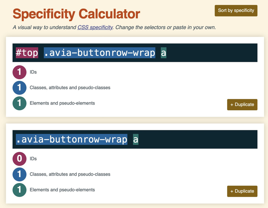
#top .avia-buttonrow-wrap a {
  max-width: 50% !important;
  font-weight: 500!important;
}
the selector is more specific because it has one ID that counts much more than classes.
thats the reason why the selector : .avia-buttonrow-wrap a does not win the race ;)
so try:
#top .textcloud .avia-button {
  text-align:left!important;
  font-weight:500!important;
}

#top .avia-buttonrow-wrap a {
  max-width: 50% !important;
  font-weight: 500!important;
}
@media only screen and (max-width: 767px) {
  #top .avia-buttonrow-wrap a {
    max-width: 100% !important;
  }
}
https://specificity.keegan.st/
I would probably do things differently, especially when it comes to responsive layouts.
The grid box layout has several advantages, especially if you want the containers to be in different positions than in the DOM.
In this case, I would define the individual elements as special grid areas. You can choose the names of the areas freely, but some names are obvious choices.
The whole thing would then possibly respond as follows (however, this can also be customized to your requirements):
(click to enlarge)
The best thing would definitely be to remove the settings that are already set from your CSS, but for testing purposes, I think it will also work if you add this CSS to the end of your quick CSS.
i would change the settings for your widget divs to:
/* and change these values */
.phone {
  background-image: url(https://peter-test1.co.uk/wp-content/uploads/2025/09/phone-icon.png);
  background-repeat: no-repeat;
  background-position: left 4px;
  padding-left: 30px;
  padding-top: 0;
  font-size: 24px;
  color: #fff;
  overflow: visible !important;
  line-height: 30px;
}

.headlogos {
  background-image: url(https://peter-test1.co.uk/wp-content/uploads/2025/09/bda-hcpc-logos.png);
  background-repeat: no-repeat;
  display: block;
  width: 269px;
  height: 54px;
  background-position: center left;
  Float: left;
}
and grid-layout settings:
#top #header #header_main .container.av-logo-container .inner-container {
  display: grid !important;
  gap: 10px;
  grid-auto-flow: row;
  grid-template-columns: 210px 1fr;
  grid-template-areas:
    "logo widget"
    "logo menu";
}

#top #header #header_main .container.av-logo-container .logo {
  grid-area: logo;
}

#top #header #header_main .container.av-logo-container .main_menu {
  grid-area: menu;
}

#top #header #header_main .container.av-logo-container .widget {
  grid-area: widget;
  justify-self: end;
}

.header_color .av-hamburger-inner,
.header_color .av-hamburger-inner::before,
.header_color .av-hamburger-inner::after {
  background-color: #FFF;
}

#top #header #header_main .container.av-logo-container .widget:before,
#top #header #header_main .container.av-logo-container .widget:after {
  display: none;
}

@media only screen and (max-width: 1000px) {
  #top #header #header_main .container.av-logo-container .main_menu {
    justify-self: center
  }
}

@media only screen and (max-width: 889px) {
  .responsive #top #wrap_all .container {
    width: 95%;
    max-width: 95%;
  }
  #top #header #header_main .container.av-logo-container .inner-container {
    display: grid !important;
    gap: 10px;
    grid-auto-flow: row;
    grid-template-columns: 1fr 80px;
    justify-content: space-between;
    grid-template-areas:
      "logo menu"
      "widget widget";
  }
  #top #header #header_main .container.av-logo-container .widget {
    justify-self: auto;
  }

  #top .topcontainer {
    display: flex;
    gap: 20px;
    flex-flow: row wrap;
    justify-content: space-between;
  }
}

@media only screen and (max-width: 605px) {
  #top .topcontainer {
    justify-content: center;
  }
}
Hello everyone,
First of all, kudos for the support and theme development.
I probably only have a minor problem.
On the test page, I:
1) created a row of buttons. However, for some reason, I can’t control them properly with CSS.
2) More importantly, although I managed to limit the maximum size of the buttons, this also applies to mobile devices. A width of 100% would definitely be useful here.
The idea is that the buttons should also be a kind of text cloud, so that I have both buttons and text content.
Is there a simple solution here? Attached is the code I’ve put together, but it’s not working properly.
Many thanks.
Matthias
My Code:
/* buttonrow max width of Buttons*/
#top .avia-buttonrow-wrap a {
max-width: 50% !important;
font-weight: 500!important;
}
@media only screen and (max-width: 767px) {
.avia-buttonrow-wrap a {
max-width: 100% !important;
font-weight: 500!important;
}
}
/* buttonrow Font size on desktop */
#top .textcloud .avia-button
{text-align:left!important;
font-weight:500!important;
}
Hey Gianluca,
Thank you for the inquiry.
You can use this css code to adjust the border of the input fields inside the form and decrease the space between the checkboxes.
#top div .av-light-form .input-text, #top div .av-light-form input[type=email], #top div .av-light-form input[type=input], #top div .av-light-form input[type=number], #top div .av-light-form input[type=password], #top div .av-light-form input[type=search], #top div .av-light-form input[type=tel], #top div .av-light-form input[type=text], #top div .av-light-form input[type=url], #top div .av-light-form select, #top div .av-light-form textarea, div div .av-light-form .button {
    color: #fff;
    border-color: #fff;
    border-width: 1px!important;
}

#top .avia-builder-el-25 #avia_7_1 p {
    margin-bottom: 10px;
    display: block;
    height: 40px;
    float: none;
}

#top .avia-builder-el-25 .avia_ajax_form
.element_avia_8_1 label,
#top .avia-builder-el-25 .avia_ajax_form
.element_avia_9_1 label,
#top .avia-builder-el-25 .avia_ajax_form
.element_avia_10_1 label,
#top .avia-builder-el-25 .avia_ajax_form
.element_avia_11_1 label,
#top .avia-builder-el-25 .avia_ajax_form
.element_avia_12_1 label,
#top .avia-builder-el-25 .avia_ajax_form
.element_avia_13_1 label,

#top .avia-builder-el-25 .avia_ajax_form
.element_avia_8_1 input[type=checkbox],
#top .avia-builder-el-25 .avia_ajax_form
.element_avia_9_1 input[type=checkbox],
#top .avia-builder-el-25 .avia_ajax_form
.element_avia_10_1 input[type=checkbox],
#top .avia-builder-el-25 .avia_ajax_form
.element_avia_11_1 input[type=checkbox],
#top .avia-builder-el-25 .avia_ajax_form
.element_avia_12_1 input[type=checkbox],
#top .avia-builder-el-25 .avia_ajax_form
.element_avia_13_1 input[type=checkbox] {
    top: -20px;
    position: relative;
    margin-bottom: 0;
}

#top .avia-builder-el-25 input.button {
    top: -20px;
    position: relative;
}
Best regards,
Ismael
Hello,
I would like to sort my posts two different ways on two different pages, and I’m wondering if there is an easy way to do it.
On my songs page, I post the songs I write in chronological order. Each song is a blog post, and I organized them on my songs page by posting excerpts in order. The oldest song is at the bottom, the newest at the top.
On my blog page, however, I would like to present a different order, because I tend to write about each song out of chronological order. So if I decide to write about the fifth song I ever posted, for example, I would like its blog post to appear as the first blog post, whereas on the song page, it would be remain in order. But if I update the date on the blog post, it reorders it in both places. Is there a way, maybe using page IDs, to keep the order the same on the Songs page but fluid on the Blog page? T
Hoping this makes sense lol. Thank you!
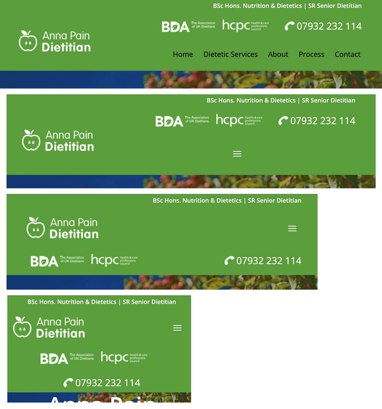
Hey condonp,
Thanks for the mockup image:

it looks like you are close to achieving this, but I only see one widget in the header:

to change the color of your widget and move the menu try adding this css:
.responsive #top #header #header_main .inner-container .widget>div {
    background: rgb(77, 172, 56);
}
.topconatiner {
    align-items: center;
}
.responsive #top #header #header_main .inner-container .main_menu {
    justify-content: right;
}
.responsive #top #header #header_main .inner-container .main_menu {
	margin-right: 6%;
}
for this:

The snippet from the documentation that you are trying to follow looks nothing like your mockup.

Best regards,
Mike
Hey oburlin,
For the image caption, you will note in the element that it’s placement is in the overlay:

To move to the lower part of the image, I see that you have added this custom css:
.av-image-caption-overlay {
    background: none repeat scroll 0 0 rgba(0, 0, 0, 0) !important;
    bottom: 0px !important;
    color: black !important;
    height: auto !important;
    left: 50% !important;
    transform: translate(-50%) !important;
    width: auto !important;
}
Resulting in this:

To make it one line try removing width: auto !important; from your css.
Then you would see:

If you want the caption below the image, try this css instead:
#top .av-image-caption-overlay {
    height: auto;
    width: 100%;
    left: 0px;
    bottom: 0px;
    transform: translateY(100%);
}
#top .av-overlay-hover-deactivate .avia-image-overlay-wrap:hover .av-caption-image-overlay-bg {
    opacity: 0.4 !important;
}
#top .avia-image-container .av-caption-image-overlay-bg {
    opacity: 0.4;
    background-color: transparent;
}
#top .avia-image-container .av-image-caption-overlay-center {
    color: #000;
}
resulting in this:

Best regards,
Mike
Hi,
Thanks for the update. Please let us know if you should need any further help on the topic, or if we can close it.
Best regards,
Rikard
Hey mshane,
Envato (Theme Forest) stopped using the API a few years ago, now they use a Token, but you can not use the Token with your version so you will need to manually update, then set up the Token and next time you can update in the theme panel. We expect no issues with updating, but recommend creating a full backup using your webhost backup tool, not a plugin unless you have specific knowledge with it and it has worked for you in the past. Often backup plugins fail when restoring.
Also note that if you are not using a child theme and the core files such as functions.php were modified those customizations will be lost, so backup any customizations.
Also note that if you are using a child theme and you have a copy of the header.php or footer.php in the child theme, please remove these as these files have changed and will cause an error.
To update your version of Enfold you will need to download the latest installable WP version from your Theme Forest account and upload it to your WordPress ▸ Appearance ▸ Themes ▸ Add Themes ▸ Add New

after you choose the zip file and click install, you will see a This theme is already installed message because you are updating, you can continue

then you will see the Theme updated successfully message.

Best regards,
Mike
Hi Ismael, thanks for your support.
This latest code seems to have solved the problem on desktop, and the image display in the list is now correct.

Unfortunately, the list previews on smartphones are now incorrect.

And when you open the post on both desktop and smartphone, the image is reduced in height (probably to the 82px value indicated in the code).

Regarding the login details, I sent them on August 15th, but you’ll find them listed again in the private field because I think your direct access is essential.
Regards.
Hi Ismael,
Thank you for the hint. The CSS disapeared somhow and I have put it back, so it works noch. Thanks a lot.
@Guenni007, Thank you too. The
#top #wrap_all .av-social-link-bluesky a:hover svg * {
fill: #FFF
}
made it perfekt.
Hey idcdesign,
Thank you for the inquiry.
Looks like the background color is applied to the column itself, which already contains a background image. Remove the current css modification and replace it with the following code:
#rfbordertop:before {
    width: 100%;
    height: 100%;
    display: block;
    z-index: 2;
    position: absolute;
    top: 0;
    left: 0;
    visibility: visible;
}

#rfbordertop:hover::before {
    background: #0eb34b7d;
}

#rfbordertop .av_textblock_section, #rfbordertop .hr {
    z-index: 20;
    position: relative;
}
Let us know the result.
Best regards,
Ismael
Hi,
One of my clients website ( http://www.fiveeyesprod.com) has been hacked.
If you type the url in the address bar, you will arrive straight to the website (entertainment, events organisation etc.) but if, for exemple, you type ” five eyes production” in googl search it will show a website selling tshirts,etc.
We have asked Wordfense to do a full audit of the website and they’ve confirmed that a malware was found.
In the audid we have this, can you advise please ?
” Theme[s] require updating or are not actively maintained. One or more of your themes
are not currently updated. You will need to update:
!!! These themes have been delisted from the WordPress theme repository. This usually
happens due to a violation of WordPress terms and represents a serious violation of trust
or a major security issue. You will need to review them with their author to ensure you are
using the most recent version with all security updates applied. If they are no longer
supported, you should find an alternative.
● Enfold (enfold)
!!! These themes are not in the WordPress theme repository. You will need to review them
with their author to ensure you are using the most recent version with all security updates
applied.
● PopularFX (home_1748011905)
● PopularFX (widget_area_1751636759)
● PopularFX (top-1747415981) ”
I have to say that I use Enfold on most of my other clients websites and have never had any problems with it…
In advance, thank you for your help.
Best regards.
Hey Gert van der Laan,
The update to 7.1.2 has to be done manually from the version you are running, please refer to my replies in this thread: https://kriesi.at/support/topic/enfold-4-5-theme-update-update-failed-download-failed-a-valid-url-was-not-pro/#post-1021541
You can either update manually via FTP: https://kriesi.at/documentation/enfold/how-to-install-enfold-theme/#theme-update, or upload the theme as if it was new under Appearance->Themes->Add New Theme.
If that doesn’t work then please try to delete the whole theme folder, then replace it with the new version. Make sure that you have backups of the site before starting updating.
Also please read this after you have updated: https://kriesi.at/documentation/enfold/theme-registration/
Best regards,
Rikard
by the way – there is a possiblity to have on content an attribute f.e.:
(by the way both focus-visible and focus-within do not influence the click style !)
#top a.attachment:focus-visible:after {
  position: absolute;
  display: flex;
  justify-content: center;
  align-items: center;
  width: 100%;
  height: 100%;
  top: 0;
  left: 0;
  background-color: rgba(255,255,255,0.5);
  backdrop-filter: blur(3px);
  background-repeat: no-repeat;
  background-size: cover;
  font-size: 24px;
  color: #000;
  z-index: 5;
  content: attr(title);
}
btw: You need to be more precise with the selector. Otherwise, it will address all anchors.
or
#top a.portfolio:focus-visible:after
etc.
by the way – big advantage here of svg – you can change the fill colors.
#top #wrap_all .av-social-link-bluesky:hover a {
    color: #fff;
    background-color: #1185fe;
}
#top #wrap_all .av-social-link-bluesky a svg * {
    fill: var(--enfold-header-color-meta);
}
#top #wrap_all .av-social-link-bluesky a:hover svg * {
    fill: #FFF
}
Hi,
Thank you for the update.
Try to adjust the top margin of the svg icon:
.avia-icon-list .iconlist_icon img[is-svg-img=true], .avia-icon-list .iconlist_icon svg:first-child {
    margin-top: 2px;
    margin-left: 1px;
}

Best regards,
Ismael
Hey rixi,
Thank you for the inquiry.
The effect is actually disabled on mobile view because the css property that enables it is not supported, specially on iOS. You can try enabling it back using the following css code but you may find issues with the transition.
#top .alternate_color.avia-bg-style-fixed, #top .footer_color.avia-bg-style-fixed, #top .header_color .header_bg.avia-bg-style-fixed, #top .main_color.avia-bg-style-fixed, #top .socket_color.avia-bg-style-fixed {
    background-attachment: fixed;
}
— https://caniuse.com/background-attachment
Known Issues:
Firefox does not appear to support the local value when applied on a textarea element.
Chrome has an issue that occurs when using the will-change property on a selector which also has background-attachment: fixed defined. It causes the image to get cut off and gain whitespace around it.
iOS has an issue preventing background-attachment: fixed from being used with background-size: cover
Best regards,
Ismael
Have installed a plug-in that uses a pop-up box when someone tries to cancel a subscription/membership in Woo commerce. The pop-up doesn’t appear when cancel button is selected. I changed theme and it worked so I believe something in the enfold theme is stopping the pop-up from displaying.
Hi,
Thank you for the update.
You can apply a custom css class to the Tab Section element where specific tabs need to be hidden, then adjust the css rules accordingly.
#top .custom-tab-section-class-name a[href="#tab-2"][data-av-tab-section-title="2"] {
    display: none;
}
Best regards,
Ismael
Hey doste,
If you still have access to your Themeforest account, then you will only need to update the theme. You shouldn’t have to purchase it again.
The update to 7.1.2 has to be done manually from the version you are running, please refer to my replies in this thread: https://kriesi.at/support/topic/enfold-4-5-theme-update-update-failed-download-failed-a-valid-url-was-not-pro/#post-1021541
You can either update manually via FTP: https://kriesi.at/documentation/enfold/how-to-install-enfold-theme/#theme-update, or upload the theme as if it was new under Appearance->Themes->Add New Theme.
If that doesn’t work then please try to delete the whole theme folder, then replace it with the new version. Make sure that you have backups of the site before starting updating.
Also please read this after you have updated: https://kriesi.at/documentation/enfold/
Best regards,
Rikard
Hi Ismael,
thank you so much, it worked perfectly until i removed the background of the SVG because it had a white square arround the butterfly.
I beleave I did everything like before but it seems that the CSS does not grap anymore.
So now the Icon at the top has no brackground anymore and the icon in the footer is not grey.
Could you please let me know how I can fix this?
Thank you and have a great day!
Hey fiorettipau,
Thank you for the inquiry.
1.) Did you create a header widget area and added an html or text widget to it? Please refer to this section for more info: https://kriesi.at/documentation/enfold/header/#adding-a-header-widget-area
2.) You can use the following css code to move the footer columns and align them with the site title:
#footer .container .flex_column:nth-child(2), #footer .container .flex_column:nth-child(3), #footer .container .flex_column:nth-child(4) {
    margin-top: 100px;
}
Best regards,
Ismael
Hey Martina,
Thank you for the inquiry.
The custom css class (hide-this-tab) is only applied to the tab content, so it can’t be used to hide the tab section title. Try to use the following css code instead:
#top .av-tab-section-inner-container .hide-this-tab {
    display: none;
}

#top a[href="#tab-2"][data-av-tab-section-title="2"] {
    display: none;
}
The selector a[href=”#tab-2″][data-av-tab-section-title=”2″] should hide the second tab section title.
Best regards,
Ismael
Hi,
Thank you for the inquiry.
You can add this css code to adjust the hover state of the social icon:
#top #wrap_all .av-social-link-bluesky:hover a, #top #wrap_all .av-social-link-bluesky a:focus {
    color: #fff;
    background-color: #a67658;
}

#top .socket_color .social_bookmarks a, #top .socket_color .social_bookmarks a svg {
    filter: grayscale(1);
}

#top .socket_color .social_bookmarks .social_bookmarks_bluesky  svg {
    opacity: 0.5;
}
Best regards,
Ismael
Hi,
To open a new topic go to the forum, login, and click the big blue button at the top of the page.

Or follow this link: https://kriesi.at/support/forum/enfold/#new-post
Best regards,
Mike
Thanks for th help.
I know how to do this now.
Today I wanted to start a new topic, but I did not find where I where I can start a new topic.
Why is it so? My username is “oburlin”
//Regards Olof
I have an update regarding this issue. When I place the order using a smartphone, the process works correctly and the option to pay by credit card appears without needing to be logged in. The problem occurs when I try to place the order from a desktop computer. I’m not sure if this information will help in finding a solution, but I hope it does. Thank you!


