Hi,
on big sceens we have the menu on the left. so i can’t configure it to transparent…
i tried it with:
@media only screen and (max-width: 767px) {
	#top #wrap_all #header {
    background: transparent !important;
    position: absolute !important;
}}
But the class “header_color” in id “header” seems to override my settings…
Any suggestions?
thx
Chris
Hi Rikard,
you’ll seen the desktop version certainly. There it is OK.
On the mobile phone, the navigation is hidden behind the logo area. I have droped a screenshot a URL (private content).
The first option is the best.
If I hide the menu now, a part of the H1 headline is hidden behind the logo area.
Thank you.
Ulrich
if you use for your Main Nav Listpoint in your Enfold Menu the mark for Mega Menu this will start the Megamenu Stile.
Then as your “Heading of the Column” you can use an custom link. If you do not see on the left side of your Menu this point you can make it visible if you go on top of this window there are “Screen Options” of that menu Window. Here you can choose that Menu Window shows different advanced options and what List Points to choose ( Categories, Pages, Posts, Custom Link, Portfolio, etc)
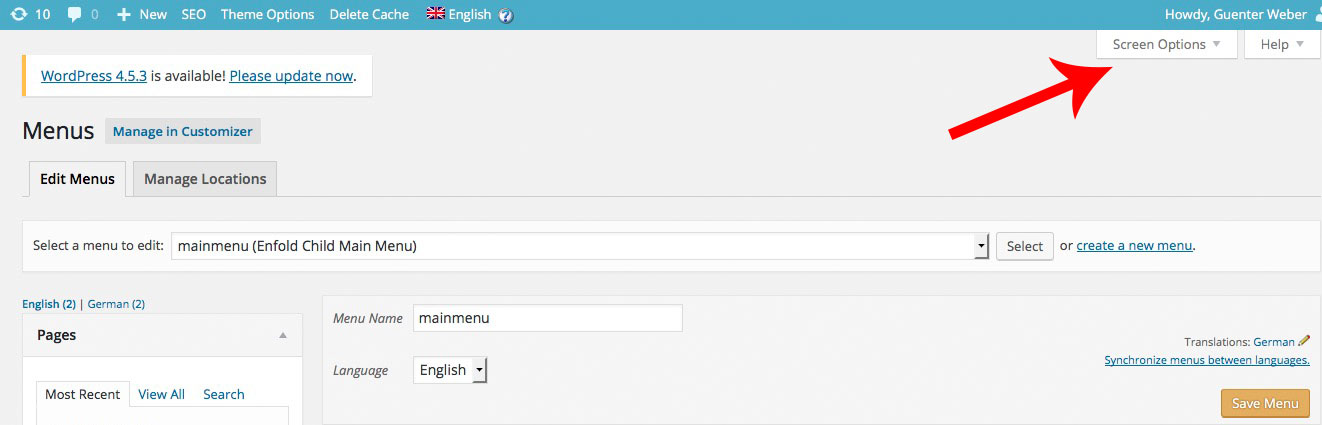

On That Custom Link you can insert as Linktarget “#” and the next is your “heading” of the column
so on that example Page these “Example Pages” “Slider” etc. are those Custom Links
PS: the blue arrow is if you want to give custom css classes even to every Navigation Point
Hi guys, I have some problems with icon cart after that I updated enfold to the latest version.
One problem is that the icon style is broker. Exampe the position of icon cart is top left of my website..
The second problem is that when the mouse hoover icon cart the mini popup doesn’t appear.
How can I fix these problems?
thank you very much
I noticed the same thing for Dutch language and started a group-translation-effort trough GoogleTranslate Services. Maybe user: Station1 can join in translation?
Check https://kriesi.at/support/topic/enfold-nl-changed-to-english-language/#post-660466
You can translate MO/PO files with Google Translate ONLINE and edit a language together.
Here more for Dutch translations
https://kriesi.at/support/topic/enfold-nl-changed-to-english-language/#post-660466
Hi,
I have a video background on my home page and I want to add a transparent png image on top of it.
The only option I saw I have is to write text that will show on the video. and that is not good for me.
This is my website im working on:
This is the image I want to have on top of the main video (while the video is running of course):
http://new.crossfithaifa.co.il/wp-content/uploads/2016/02/main-video-slide-01.png
Also, I have several other issues I would love some advice on:
1. How can I make the main menu pages bigger on the top header (increase font size)?
2. how can I make the main video non-clickable. if I click on it now it stops.
3. I want to add a font family from google fonts (Rubik), what is the best way to do this. I saw the tutorial with the php code but I do not know how to code and would be happy for a more step-by-step guidance.
4. Is there a way to easily make the theme RTL (right to left) compatible?
Thank you!
Didi
Hi Yigit
Yes, I thought of that, but I want to be able to place elements, eg columns with text box, etc, over the top of the background image but still have the whole image (the whole section) as a link.
many thanks
Peter
Hi,
Page sections with video background set to 100% height. Using sticky header with transparent bg.

Issue is that the page sections only scroll up to the base of the header, not the top of the screen. As a result you can see the top of the previous section with the down arrow behind the header.
Any help really appreciated!
Jon.
-
This topic was modified 9 years, 8 months ago by
 kops. Reason: I'm a moron
See the private section for the link
In addition to the above first point:
1) align this header widget-text just in the middle/center of the Logo. I have now used “top 28%;” as part of the css – But I’m wondering if there is a better trick to position this always in the middle of the logo;
I would like to see this text also be aligned with the middle of the logo when you scroll down. Now the logo is changing in size and the text remains on the same position.
Hi!
My problem is back (accented letters don’t look right and error message at the top of the page) when i try to buy a gift card. Can you take a look please?
Thanks!
Érik
Thank you Yigit, but I speak about desktop screen but different resolution: HD1920x1080px and normal 1366x768px
Hi RobWu!
Please refer to this post – https://kriesi.at/support/topic/woocommerce-2-6-problem-urgent/#post-650161
Regards,
Yigit
Hi,
Great, glad you found the problem. Please let us know if you should need any more help on the topic.
Thanks,
Rikard
Hi,
Great, glad we could help. Please let us know if you should need any more help on the topic.
Best regards,
Rikard
Hi,
I get the same problem on desktop as well, it looks like your logo is linked to localhost?
http://localhost/wpenfold/wp-content/uploads/2016/07/logo-300×37.png
Regards,
Rikard
Hi, how do I add a static png image on top of my main video background?
Thank you,
Didi
Hi fernandosantospanarama,
You can block search engines from crawling by editing your robots.txt file, please see this for more info: http://www.inmotionhosting.com/support/website/restricting-bots/how-to-stop-search-engines-from-crawling-your-website
Best regards,
Rikard
Hi,
try this code:
#avia2-menu {
position: relative !important;
top: -30px !important;
}
Best regards,
Andy
Hey Katja Dell,
1.) pro Seite benötigst du eine Lizenz.
2.) Google hat seinen Code stark verändert und Kriesi arbeitet bereits an einem Fix. Versuche es bis dahin mit dieser Lösung: https://kriesi.at/support/topic/cant-get-google-maps-on-contact-page-to-show-up/#post-655214
3.) Da wo du die Telefonnummer eingibst, solltest du auch den entsprechenden HTML Code dafür verwenden können. Wenn das nicht klappt schick uns Admin Zugang und einen präzisen Link.
Bitte immer eine Frage pro Ticket verwenden.
Gruß,
Andy
Hi,
für solch eine Funktion benötigst du ein spezielles Plugin. Vielleicht wirst du in dieser Liste fündig: https://kriesi.at/support/topic/recommended-plugins/
Ansonsten müsstest du dich anderweitig umschauen.
Gruß,
Andy
Hello again Josue,
Top Tip! Thanks
It works like a dream.
Thanks to you and the other guys at your team for all your excellent help.
BR
Jacob
Hi guys,
I was wondering if there was maybe a way to remove the product name from the breadcrumbs in Enfold Shop?
For example, I have some products with very long titles, like this…
You are here: Home / Shop / Homecare / Kitchen & Dining / Food Preparation / BangRui Can Opener Electric One Touch Can Opener Best Can Opener Soft Edge Automatic Electric Can Opener with Assistive Auto-Stop
…and this stretches across the whole page.
Is there any way to remove the product name so that it stops at the category level, like this…
You are here: Home / Shop / Homecare / Kitchen & Dining / Food Preparation
Many thanks for your help!
Paul
-
This topic was modified 9 years, 8 months ago by
 advancetogo.
Hi,
you didn’t put “icon-offset” as custom css class inside your icons in question, Vinay told it to you already. Afterwards I put this code into your Quick CSS field:
.avia_textblock.icon-offset {
margin-top: -86px;
}
Hope you’re happy now?
Best regards,
Andy
Hi,
Are you referring to the submit button? Please try this:
#gform_3 input[type="submit"] {
    margin-top: -1px;
}
Again, you can add a custom css class attribute to the text block.
Best regards,
Ismael
Hey Andy,
Sorry, you might understood it wrong. I am not meaning any sidebar widgets. The whole thing is about the Enfold sidebar menu.(sidebar header or whatever it might be called) On a default WordPress theme the WPML language selector is not seen at all. I also tried this solution but didn`t had any changing effect – https://kriesi.at/support/topic/wpml-language-selector-text-instead-of-flag-2
I have uploaded the development website to a temporary server online and attached the link and access credentials to the private area. I just want to replace the WPML flags with the language name with two letters for each language but not sure how to do that. That`s all.
Regards