Hi,
Ok, try adding this css:
@media only screen and (max-width: 767px) {
	.responsive #top.post-type-archive-tribe_events #main {
		 padding-top: 30px !important;
	}
	#main > .container_wrap.container_wrap_first {
		 border-top-width: 0;
	}
}
Then clear your cache and check.
Best regards,
Mike
This bug is causes by a missing closing tag inside a av_textbox element. Imho, this should not break the template system as the shortode itself is closes properly and browsers also can handle this naturaly.
How to reproduce:
– create 2 textblocks
– make the first one have invalid html by adding a opening element
From my understanding, this bug is quite new, since our client has been using this template for quite some time.
p.s.
This topic notes bug reports should be posted to this group if there’s no valid support license:
> In case you do not have a valid support but would like to report a bug or make a suggestion, you can use either Pre-sale question form or post a comment on Enfold’s ThemeForest page :)
Hi Mike,
I just can’t seem to find it.
On all the mobile pages, the spacing of the logo is correct except on the page linked below:
The spacing isn’t correct there.
padding-top: 30px !important; ? not find.
Thanks, best regards, Franz
Hey hegartpetersen,
Thank you for the update.
If you prefer wrapping the title container into multiple rows, please try to add this css code:
#top .av-tabs-scrollable .av-tab-section-outer-container {
    overflow: visible;
}

#top .av-tabs-scrollable .av-tab-section-tab-title-container {
    display: flex !important;
    flex-wrap: wrap;
    justify-content: center;
    min-width: unset !important;
    left: 0 !important;
    white-space: normal;
}

#top .av-tabs-scrollable .av-section-tab-title {
    flex: 0 0 auto;
}
Note that this will hide the arrow indicator beneath the active tab since it depends on the container’s positioning logic. Please refer to the documentation on adding custom css classes to elements:
— https://kriesi.at/documentation/enfold/add-custom-css/
Let us know the result.
Best regards,
Ismael
Hey cherrmann,
Thank you for the update.
The negative margin-top values in your custom css are pulling the footer upward and overlapping the content above it, which is why the submit button and other elements near the footer get cut off.
You have these rules defined in two places:
#footer {
    padding: 0 0 190px 0;
    margin-top: -190px;
    background-image: url(//janisch-schulz.com/wp-content/uploads/2022/05/090-footer-wasser.jpg);
    background-size: cover;
}

@media only screen and (max-width: 768px) {
    #footer {
        background: url(//janisch-schulz.com/wp-content/uploads/2022/05/090-footer-wasser-mobil.jpg);
        background-size: cover !important;
        margin-top: -360px;
    }
}
The negative margin-top on both rules is what pulls the footer up over your content. Remove both margin-top values and your submit button should become visible again. The padding-bottom on the desktop rule was likely added to compensate for the overlap, so you may want to revisit that value as well once the margin is removed.
Let us know if the issue persists.
Best regards,
Ismael
Hello, can you get me CSS to increase mobile font size, sub menu font size & line spacing? I just need to the mobile menu to look better. Please let me know what will look good. thanks!
I also have that very top of page link that says “Book a Free Strategy Call” That goes to an anchor link “https://bemodesign.com/contact-bemo-design/#book-call but it cuts off the top of headline when it does. how can I move this down when they click on this achor link?
THanks!!
Hi,
I think that you misunderstand, do not add the css above, you already added it before, you need to remove it or change the padding-top: 0 !important; to padding-top: 30px !important;
Best regards,
Mike
Hi,
I changed the script to this:
function disable_horizontal_gallery_image_nav() { ?>
  <script>
document.addEventListener('DOMContentLoaded', function() {
  document.querySelectorAll('.av-horizontal-gallery-wrap').forEach(function(wrap) {
    const link = wrap.querySelector('a[href^="#toggle-id-"]');
    if (!link) return;

    const href = link.getAttribute('href');

    wrap.style.cursor = 'pointer';
    wrap.addEventListener('click', function(e) {
      e.stopPropagation();

      const toggleId = href.replace('#', '');
      const toggleTrigger = document.querySelector('[data-fake-id="' + href + '"], [href="' + href + '"], #' + toggleId + ' .toggler, .toggle-title[href="' + href + '"]');

      if (toggleTrigger) {
        toggleTrigger.click();

        let scrollTimer = null;
        window.addEventListener('scroll', function onScroll() {
          clearTimeout(scrollTimer);
          scrollTimer = setTimeout(function() {
            window.removeEventListener('scroll', onScroll);
            window.scrollBy({ top: -250, behavior: 'smooth' });
          }, 300);
        });

      } else {
        window.location.hash = href;
      }
    });

    link.addEventListener('click', function(e) {
      e.preventDefault();
      e.stopPropagation();
    });
  });
});
  </script>
  <?php
}
add_action( 'wp_footer', 'disable_horizontal_gallery_image_nav', 99 );
Give it a try.
Best regards,
Mike
Hello,
In a page element, I select “Hide on very small screens (smaller than 479px for example mobile phones portrait)” – (translated from Dutch…).
This works well: the element is not visible on my iPhone.
However, when I would like the element to be visible on my Ipad only, landscape, I select (= hide):
– Hide on larger than screens (bigger than 990px – for example Desktop)
– Hide on small screens (between 484px and 768px, like tablet portrait)
– Hide on very small screens (smaller than 484px, like mobile phone portrait)
and so Ieave open (= visible):
– Hide on average screens (between 768px and 989px, like tablet landscape)
The problem is: this element is NOT visible on my iPad, landscape.
Could you please help?
warum hast du für #footer ein negatives margin-top definiert?
Du hast es an zwei Stellen so gesetzt:
#footer {
    padding: 0 0 190px 0;
    margin-top: -190px;
    background-image: url(//janisch-schulz.com/wp-content/uploads/2022/05/090-footer-wasser.jpg);
    background-size:cover
}

@media only screen and (max-width: 768px) {
    #footer {
        background: url(//janisch-schulz.com/wp-content/uploads/2022/05/090-footer-wasser-mobil.jpg);
        background-size: cover !important;
        margin-top:-360px
    }
}
lösche mal beide margin-top Werte – dann siehst du auch wieder deinen Submit Button.
Hi Mike,
Thank you very much for your reply.
I’ve installed the same search function on five other pages.
Everything was working fine until a few days ago.
And I was able to open the galleries on mobile exactly the same way—
just like on the desktop.
I would “Auswählen” the dropdown, choose the desired gallery, press OK, and then click Search.
No updates have been applied to the script.
Only WordPress and Enfold.
I installed the same search function on the page linked below:
It works fine on desktop, but doesn’t open on mobile.
Is there anywhere I can download an older version of Enfold Child?
Thanks and best regards,
Franz
Hi,
That’s helping. Next thing is, I would like the slideshow full width same as the header, so out of the box. Then the content beneath with a negative margin-top sliding up into the slideshow. How can I do that? Because the site is still under construction, I’ve added the login credentials in the Private content box.
Hi,
I don’t understand how your custom search field is applied to your page, but I see that it is not the same on mobile. On desktop, when opened it has the classes: SumoSelect sumo_gallery_ids open and has a div with the classes: optWrapper okCancelInMulti multiple that creates the drop down.
On mobile it only has the class: SumoSelect and doesn’t have the div.
I see no errors that might point to this, but I believe that this is an error with your script and not with the theme. Try asking wherever you got the script from for further advice.
Yes img.savvyify.com is no longer working, try freeimage.host instead.
Best regards,
Mike
Hey spitsdesign,
You can request demos in our Feature Requests where the Dev Team will see it, click the green button at the top right “New Issue” to create a new request with the type of demo you would like to see.
Please keep each request to one topic, but you can summit multiple topics.
Best regards,
Mike
Hey schweg33,
Looks like you have added this custom css:
@media only screen and (max-width: 767px) {
    .responsive #top #main {
        padding-top: 0 !important;
        margin: 0;
    }
}
Remove it or adjust the zero to something like 30px
Best regards,
Mike
Hey rixi,
Looks like you have this css in your child theme:
#header_main_alternate, #top #header .av-main-nav > li > a {
    background-color: #02507d !important;
}
Change to this:
#header_main_alternate,.responsive #top #header .av-main-nav > li:not(.av-burger-menu-main) > a {
    background-color: #02507d !important;
}
Best regards,
Mike
By default, when Enfold Maintenance Mode is activated, only the Administrators, Editors and Authors can view the site.
I would like subscribed users to be able to view the site as well.
@Mike,
you had already replied to me in this ticket (but the screenshot is no longer visible).
Could you please send me the instructions again to edit line 304 in /enfold/includes/classes/class-avia-custom-pages.php ?
Best regards,
Oriano
Sorry about that.
Since the main page (first link)
is currently under heavy revision, I’ve created a new link.
See below.
Thanks, best regards, Franz
There is a search function on this page:
Link below:
It works perfectly on the desktop.
Until a few days ago, it was also working fine on mobile. I don’t know if there was a change due to the WordPress update or the Enfold theme update,
but in any case, I can no longer click on the dropdown on mobile.
https://img.savvyify.com/
Is this page no longer working?
 Arjan Steenbergen
Guest
Hi,
We’re encountering a bug in the template-import system: It’ll import everything visually correctly, but the underlying saved data stops after this first content section.
reproduce:
– copy the saved data to a page, add a textblock below it and save as template.
– import that template in a new page, visually it’ll have the textbox, but the data wont have the textbox saved (reload page to verify the textbox is now gone).
There is a search function on this page:
Link below:
It works perfectly on the desktop.
Until a few days ago, it was also working fine on mobile. I don’t know if there was a change due to the WordPress update or the Enfold theme update,
but in any case, I can no longer click on the dropdown on mobile.
Thanks for the info,
Best regards,
Franz
https://img.savvyify.com/
Is this page no longer working?
[EDIT: I’m sorry I messed up, because I set the header image on button to not show on small devices, but still the following is valid:]
Applying https://kriesi.at/support/topic/display-issues-on-iphone-13/#post-1495940 this Is what I got (section above footer not fully visible):

The issue is only to see on a real iPhone unfortunately.
@Guenni007 – die svg-Trenner werde ich ausprobieren, danke für den Hinweis.
Hey macuti,
I have added it below for you. Please see this post: https://kriesi.at/support/topic/copytrack-wants-me-to-show-a-license-for-an-image-included-in-the-demo/#post-1495685
If you read the whole thread you will see two links to the same image, the one for which we have a license for from 2014 by the user francesco83 and a newer one that copytrack is claiming for the user genious2000de or perhaps it is the same person, we don’t know. Either way our extended license is valid.
Please note that we can not offer legal advice.
Best regards,
Mike
Hallo Kriesi & Team,
wir haben dasselbe Problem, wie bereits in diesem Beitrag beschrieben:
Wir haben für einen Kunden eine Webseite mit Enfold aufgebaut und den Blogbereich mit Platzhaltertexten sowie den mitgelieferten Bildern aufgebaut um zu zeigen, wie es aussehen könnte. Der Link zum Blog war nie und ist nach wie vor nicht in der Navigation enthalten, aber COPYTRACK mahnt nun die Verwendung eines Bildes an.
Ich bitte daher freundlicherweise um einen Lizenznachweis, im Folgenden noch der Link zum Bild “cheese”.
Vielen Dank im Voraus
Marcus
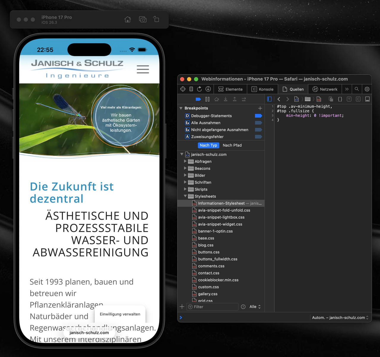
ich frage mich nur woher dieses /wp-content/uploads/dynamic_avia/js.css kommt. Denn ich glaube nicht das es eine Enfold Datei ist. Eventuell gehört die zu einem Plugin? Vielleicht kann da einer der Mods näheres zu sagen.
du kannst auch nur diese Regel überschreiben ohne auf andere Devices Einfluss zu nehmen:
in das Quick css :
@supports (-webkit-touch-callout: none) {
    #top .av-minimum-height, #top .fullsize {
        min-height: 0 !important;
    }
}
_____________
I’m just wondering where this /wp-content/uploads/dynamic_avia/js.css comes from. Because I don’t think it’s an Enfold file. Maybe it belongs to a plugin? Perhaps one of the mods can say more about this.
You can also just override this rule in js.css without affecting other devices: see above
Hey debbiepeverelli,
Thank you for the inquiry.
1. The overlapping image is likely due to the absolute positioning, which causes it to appear incorrectly scaled on smaller screens. The best approach is to either hide it on mobile or manually adjust its size using css media queries.
You may need to apply a custom css class name to the overlapping image element.
— https://kriesi.at/documentation/enfold/add-custom-css/#enable-custom-css-class-name-support
Once you have added a custom class, for example av-overlap-image, you can target it on smaller screens like this:
@media only screen and (max-width: 767px) {
    .av-overlap-image {
        display: none;
    }
}
Or if you prefer to keep it visible but resize it:
@media only screen and (max-width: 767px) {
    .av-overlap-image {
        width: 80px;
        height: auto;
        top: 20px;
        left: 10px;
    }
}
You can add these css rules to Enfold > General Styling > Quick CSS field and adjust the values as needed.
2. The light blue highlight on focused fields and the green success message are default styles applied to the contact form. You can override them by adding the following to Enfold > General Styling > Quick CSS field — adjust the color values to match your site:
#top .avia-form .avia-input:focus,
#top .avia-form .avia-textfield:focus {
    background-color: #yourcolor;
    border-color: #yourcolor;
}

#top .avia-form .avia-success {
    background-color: #yourcolor;
}

#top .avia-form .avia-success p {
    font-family: inherit;
    font-size: inherit;
    color: #yourcolor;
}
Replace #yourcolor with the hex values that match your site palette.
Let us know the result.
Best regards,
Ismael
Hey!
Thank you for the info.
We tried logging to the site but the previous credentials are invalid.
We adjusted the script a bit so it properly intercepts the click at the .av-horizontal-gallery-wrap level, check if the clicked target is an anchor pointing to a toggle or accordion item and override the default gallery behavior.
Please replace the existing script in functions.php with this updated version:
add_action( 'wp_footer', 'ava_wp_footer_script_mod', 99 );

function ava_wp_footer_script_mod() {
    ?>
    <script>
    (function($) {
        $(document).on('click', '.av-horizontal-gallery-wrap', function(e) {
            var $anchor = $(e.target).closest('a[href^="#toggle-id-"]');

            if (!$anchor.length) return;

            e.preventDefault();
            e.stopImmediatePropagation();

            var href = $anchor.attr('href');
            var targetId = href.slice(1);
            var $title = $('#toggle-toggle-' + targetId);
            var $wrap = $('#' + targetId);

            if (!$title.length) return;

            if (!$wrap.hasClass('active_tc')) {
                $title.trigger('click');
            }

            setTimeout(function() {
                $('html, body').animate({ scrollTop: $title.offset().top - 80 }, 500);
            }, 300);
        });
    })(jQuery);
    </script>
    <?php
}
Please make sure to purge the cache before testing. Let us know the result.
Best regards,
Ismael
ok – man bekommt das wirklich nur raus, wenn man einen mac mit safari zur verfügung hat, und dort die XCode nebst iOS Simulatoren installiert.
Dann hat man nämlich dev Tools für die iPhone zur Verfügung ;)
es ist ein spezieller Hack, der aber hier dazuführt, das dieser extreme Leerraum ensteht:
height: -webkit-fill-available
teste doch mal im Quick css:
zunächst mal nur für diese Selektoren:
#top .av-minimum-height,
#top .fullsize {
    min-height: 0 !important;
}
_____________
OK – you can only find this out if you have a Mac with Safari and have installed XCode and iOS simulators.
Then you have dev tools for an iPhone at your disposal ;)
It’s a special hack, but it leads to this extreme empty space:
height: -webkit-fill-available
Try testing it in Quick CSS:
First, just for these selectors: see above
I’ve built my website with the Enfold Parallax theme. I’m very happy with the results! However, on mobile view there are a few pictures (4 in total, at 2 different positions) that are cropped and placed wrongly, which I can’t seem to fix. On desktop view they are perfect. There’s a larger picture and a smaller one overlaps. In mobile view the larger picture appears smaller than the original smaller one. This way it doesn’t look nice at all. Could you please help me fix this issue?
Additionally, I have a question about the contact form. When I fill in an address, the space turns light blue and when I press send, the form turns green. These colors don’t match the colors of my website at all. Also, the text that appears after sending a message isn’t the typography I chose for my website and it also doesn’t match the rest of my website.
Looking forward to your response.
Hi Mike!
I have to come back to this thread https://kriesi.at/support/topic/footer-appears-while-scrolling/#post-1495334:
#3 is because you have the sidebar enabled on the page, disable this in the settings for the page, or try this css
.home #after_section_9 {
display: none;
}
I have now made three other pages (link below). How can I switch of the lines here?
Thanks for your Feedback!
Michael F.