On this Site i’m trying to get more structure by a second level into the submenu.
How can i define:
– the height of the topics
– the font of an single topic
– the witdth of the submenu?

I have setup a test page with 1/2 sections. The first is the TinyMCE text editor block which I placed the code into the text section and the other section is a code block with the same code.
Both of these links work but as soon as I change the text editor block, it will strip the a href tag out the the top and bottom line. No plugins I have tried worked to fix this.
I have enabled debug mode on the site.
Hi,
Great, glad we could help :-)
Please let us know if you should need any further help on the topic.
Best regards,
Rikard
Hi,
I can’t open the link you’ve provided. It simply does not load.
So I have no idea what you mean to be honest. A precise link would help.
As already said, use the code already provided to you and wrap media queries around it:
@media only screen and (max-width: 736px) {
html.html_boxed {
    background: url(https://i2.wp.com/www.flanagan-wedding.com/wp-content/uploads/2016/11/Rebecca-wedding-background.jpg) center center no-repeat fixed;
  background-size: 100px 100px !important;
  background-positon: 0px 100px !important;
}}
Play with different values, until you find what fits to you.
Please stick to one issue/problem in one ticket only. Feel free to open a new ticket for another topic.
Best regards,
Andy
You can login and look around yourself. The top image on the page is the linked image with the rollover issue.
Hi Andy,
Thanks for reply.
I have re-created tickets on the same topic. I believe the wait time and misunderstanding on the moderator(s) part on what I am trying to achieve after many links to see images of the desired menu on the mobile have been shared.
Before your message Ismael kindly went into the css and added the code. I left the comments on how I would like it changed…
Along with examples.
Note, I am not tech savvy CSS does not mean anything to me… However have managed to work my way around your theme. Do I remove what he has placed already with your new code. I don’t want to remove the wrong thing. Saying that as he clearly labelled his workings above I probably can work it out.
I would appreciate if you kindly log back in and place it where it should be also giving me clear steps on how to achieve myself.
And what your code is actually changing?
Thanks for help I will create a NEW ticket with the same info now.
11:32 UK time. I have removed all CSS as none of them have given me what I require. Overall there are too many things appearing on the mobile screen which is cluttered. Green header, captions that are squashed, 300 height is fine however in landscape it is not stretched. I don’t know the values to make it fit without distorting the image.
Can someone please assist in creating what I want from the links I have shared below. My reply on another post did not go through as Andy closed the ticket as I pressed send. Thank You.
-
This topic was modified 9 years, 4 months ago by
 Epic. Reason: reply on other ticket was closed!
Hi,
you could try this code:
@media only screen and (max-width: 767px) {
#top .avia-smallarrow-slider .slide-image, #top .avia-logo-element-container img {
width: 215px;
}}
and adjust as needed.
Best regards,
Andy
Hi Andy,
Thanks for reply.
I have re-created tickets on the same topic. I believe the wait time and misunderstanding on the moderator(s) part on what I am trying to achieve after many links to see images of the desired menu on the mobile have been shared.
Before your message Ismael kindly went into the css and added the code. I left the comments on how I would like it changed…
Along with examples.
Note, I am not tech savvy CSS does not mean anything to me… However have managed to work my way around your theme. Do I remove what he has placed already with your new code. I don’t want to remove the wrong thing. Saying that as he clearly labelled his workings above I probably can work it out.
I would appreciate if you kindly log back in and place it where it should be also giving me clear steps on how to achieve myself.
And what your code is actually changing?
Thanks for help I will create a NEW ticket with the same info now.
-
This reply was modified 9 years, 4 months ago by Epic. Reason: Login
Hi,
you can use my code and wrap media queries around, so it only works on bigger screen sizes (desktop). For example:
@media screen and (min-width: 1200px) {
#header_meta {
height: 34px;
}}
For more information about media queries: https://css-tricks.com/snippets/css/media-queries-for-standard-devices/
Best regards,
Andy
Hi,
I think it would be best to open a new ticket for new questions/issues, as it gets too big and confusing here otherwise.
However, use this code for mobile menu:
@media only screen and (max-width: 767px) {
.responsive.html_mobile_menu_tablet .container #advanced_menu_toggle, .responsive.html_mobile_menu_tablet #advanced_menu_hide {
top: -15px;
left: 0px;
}}
Slideshow picture on mobile:
@media only screen and (max-width: 767px) {
.avia-slideshow.image_no_stretch li img {
height: 300px;
}}
Adjust the values as needed.
Best regards,
Andy
Hi,
check out this post to find out about the individual image sizes in Enfold: https://kriesi.at/support/topic/enfold-image-sizes/#post-336176
Hope this helps!
Best regards,
Andy
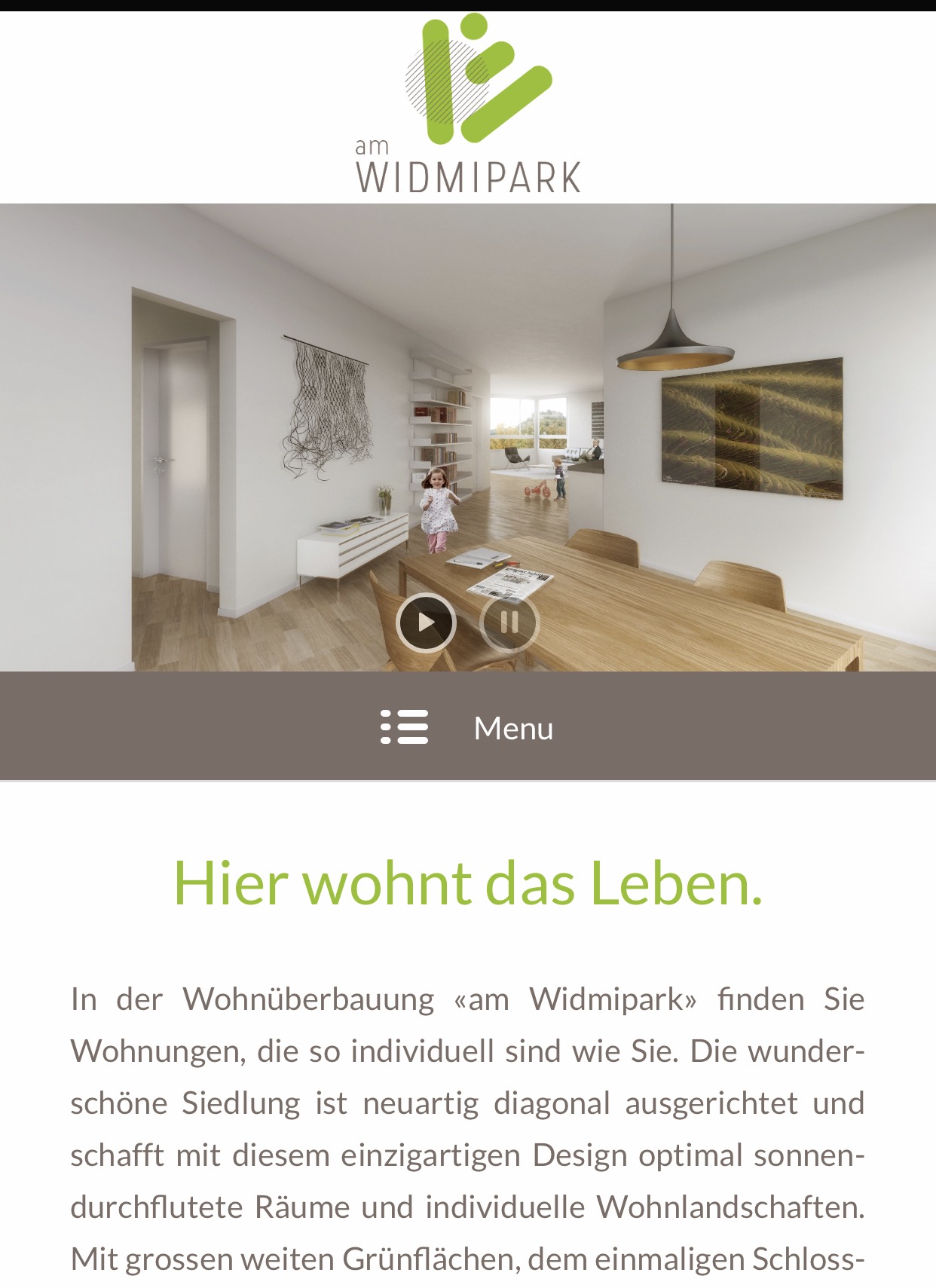
Hi guys,
I use a logo above the layerslider in the header which is displayed fine on PC, meaning it’s vertical centered and has some padding on top and bottom of the logo. However, on mobile there’s no space between the logo and the header Image, that’s why I use following code in quick css:
@media only screen and (max-width: 768px) {
.responsive #top .logo img {
margin: auto;
}}
.responsive #top .logo img {
margin: auto;
vertical-align: centered;
}
.responsive #top .logo {
width: 100%!important;
height: 80%!important;
margin-bottom: 5px;
margin-top: 5px;
}
Now everything works fine, except that “margin-top” is black instead of white (screen shot: http://am-widmipark.ch/wp-content/uploads/2016/11/enfold-support-printsc.jpg) . Do you have any solution to this or maybe a different approach?
Best regards,
Michel
Thank you very much Ismael for your support.
Yes, if i disable “Shrinking Header” the size of header its ok, but still fixed at bottom.
I want to move my header to top of my browser when i scroll down.
The problem its the img of header be resized when scrolls down.
Kind regards.
Hi!
We apologize if we can’t respond as soon as you reply since there are lots of queries lately and we are trying to answer them one by one which also takes time. Please add this code in Quick CSS, if there’s no logo white space should be removed.
#top #header_main > .container {
    height: auto !important;
}

@media only screen and (min-width:768px) {
  .html_header_top.html_header_sticky #top #wrap_all #main {
    padding-top: 50px !important;
  }
}
Let us know if it works, if not kindly give us temporary admin access so we can atleast check the backend.
Cheers!
Nikko
Hey!
I ran a test in the “varvy” tool and I find it inconsistent. For example, I found this result:
Unsere_massnahme.png | | ALT text: No ALT text
I checked the markup and the image contains an alt attribute “Unsere massnahme”.
<img class="ls-l" style="top: 313.971px; left: -3.53571px; white-space: nowrap; width: 558.643px; height: 94.05px; padding: 0px; border-width: 0px; margin-left: 0px; margin-top: 0px; transform-origin: 50% 50% 0px; transform: matrix3d(1, 0, 0, 0, 0, 1, 0, 0, 0, 0, 1, 0, 0, 0, 0, 1); opacity: 1; visibility: visible; filter: none;" data-ls="offsetxin:-80;delayin:200;offsetxout:0;durationout:300;" src="https://www.mehrwach.de/wp-content/uploads/2016/08/Unsere_massnahme.png" alt=" Unsere massnahme">
Cheers!
Ismael
Hi,
Great, glad we could help :-)
Please let us know if you should need any further help on the topic.
Best regards,
Rikard
Hi,
Great, glad we could help :-)
Please let us know if you should need any further help on the topic.
Best regards,
Rikard
Hey!
Please target the actual device with the following css codes.
iPhone 5s
@media only screen
and (min-device-width : 320px)
and (max-device-width : 568px) {
    .responsive #top #main #av_section_1 {
        background-size: 450% 100% !important;
        background-position: center center !important;
    }
}
Nexus 5 and 6:
@media only screen
and (min-width: 360px)
and (orientation: portrait)
and (-webkit-min-device-pixel-ratio: 3.0) {
  * {
    .responsive #top #main #av_section_1 {
        background-size: 450% 100% !important;
        background-position: center center !important;
    }
  }
}
If you want to replace the generic selector “#av_section_1” with your own custom selector, apply a unique Section ID to the color section. Don’t forget to remove browser cache or hard refresh before checking the page.
For more css media queries, please check the following link:
// http://stephen.io/mediaqueries/
Best regards,
Ismael
Hey!
1.) Unfortunately, there is no element for that. You can try the special heading element for the title and follow the instructions in the following thread if you want to add the post meta info. https://kriesi.at/support/topic/missing-category-info-in-post-meta-infos-using-alb/#post-589014
2.) Please set the user role to administrator so that we can check the settings and the plugins. Go to the Users panel, edit the user then set the Role to “Administrator”.
Cheers!
Ismael
Hey!
I noticed that you have been replying to older threads. If possible, please refrain from doing that and stick to your own thread. The more you reply to older threads, the bigger the queue gets so we won’t be able to respond to your original thread quickly.
// https://kriesi.at/support/topic/contact-form-resets-to-default-formatting/#post-710970
And regarding the issue at hand, please check our response from the previous thread.
Did you subscribe the site to a cdn provider? This old thread might help.
// https://kriesi.at/support/topic/contact-form-resetting-to-defaults/#post-391712
Regards,
Ismael
Hi Nikko,
I added the snippet in the css styling box and there was no change to the menus. I added the !important as well:
#top #header .av-main-nav li a {
    font-weight: bold;
    font-size: 14px; !important;
}
Hey!
Did you subscribe the site to a cdn provider? This old thread might help.
// https://kriesi.at/support/topic/contact-form-resetting-to-defaults/#post-391712
Best regards,
Ismael
Hi!
Please add this in the Quick CSS field:
.av-main-nav {
    position: relative;
    top: 20px;
}
.av-main-nav li {
    max-height: 30px;
}

.av-main-nav li a{
    line-height: 30px !important;
    height: 30px !important
}

.av-main-nav li:hover a {
    background: blue;
}

.av-main-nav li:hover a .avia-menu-text{
    color: white;
}
Best regards,
Ismael
Hi Tarakbc!
Try to add this code in Quick CSS (located in Enfold > General Styling):
#header .logo a, #header .logo img {
    max-height: 88px !important;
    min-height: 88px;
}

#header.header-scrolled .logo img {
    margin-top: -44px;
}
Hope this helps :)
Best regards,
Nikko
-
This reply was modified 9 years, 4 months ago by
 Nikko.
Hey!
Try to add this code in Quick CSS:
@media only screen and (min-width: 768px) {
  #top .sidebar .widget_shopping_cart .button {
    width: auto;
    height: auto;
    display: inline-block;
    margin-bottom: 10px;
    float: none;
  }
}
Let us know if it works :)
Best regards,
Nikko
Hi Mel,
You’re welcome. Let us know if you need more assistance regarding this topic :)
Regards,
Nikko
Hi!
It should work now. I have replaced this code:
#top .avia-content-slider a:hover .thumbnail_container img {
    -webkit-transform: scaleX(1.2,1.2);
    -ms-transform: scaleX(1.2,1.2);
    -o-transform: scaleX(1.2,1.2);
    transform: scaleX(1.2,1.2);
}
To this code:
#top .avia-content-slider a:hover .thumbnail_container img {
    -webkit-transform: scale(1.2,1.2);
    -ms-transform: scale(1.2,1.2);
    -o-transform: scale(1.2,1.2);
    transform: scale(1.2,1.2);
}
Best regards,
Nikko
Hey!
Try using this code snippet in Quick CSS:
#top #header .av-main-nav li a {
    font-weight: bold;
    font-size: 14px;
}
Hope this helps :)
Regards,
Nikko
Hey!
Try to add this code in Quick CSS:
#top #header_meta a,
#top #header_meta li,
#top #header_meta .phone-info {
    font-size: 16px;
}
Just adjust the font-size values. Hope this helps :)
Best regards,
Nikko