-
Search Results
-
Hi – After months of work building an Enfold-based site, I’m very disappointed to discover that Vimeo embeds that look great in the “easy slider” don’t show up on mobile (!). Why even have a video as a slide option if it only works on desktop?!?
I’ve tested inserting Vimeo videos in text blocks, the video element in a color section, and via raw embed. But they show up with the titles and bylines! Don’t want!!
What is the recommended way to insert video easily in the Enfold theme and have it work on mobile and not show Vimeo titles/bylines?
Hi, I’m currently using the dummy gym theme.
I’ve been trying to make the header slightly transparent when I first go to the page. I found a CSS code to make it transparent after a scroll, but not initially. Initially it appears to be in a white horizontal box “above” my fullscreen slider image… is there a way to put this header ON the fullscreen slider image (such as in the Health theme).
Thanks,
KyleHI,
Urgent
I followed the suggestion in thread #285801 and now it places the side bar on the top, it pushes down everything, such as the header image. It now looks terrible. Any suggestions or css code to fix this please.
Thanks,
Paul
Hi,
I developed a new website using the Enfold Theme. The images are looking good on a desktop and laptop but on a smartphone and tablet the images don’t resize enough to be displayed in an acceptable manner.
Please find in the private content the website and login details.
I appreciate your advice on how to change settings to achieve a better layout on these platforms.Kind Regards,
MaartenTopic: Features seem to be broken
For some reason my website stopped displaying my sliders, it now has 2 scroll bars, and it doesn’t want to load all the content. I’m not sure what’s happening, but it’s very strange. Earlier today it was fine and now it’s not. Any ideas on what’s happening?
Topic: Probleme mit Layerslider
Hallo,
nach dem Enfold-Update heute, funktionieren die Layslider-Slides nicht mehr korrekt.
Zum Einen stoppen bei Maus-over sämtliche noch zu absolvierende Bewegungen,
außerdem funktionieren die Links nicht mehr
Startseite https://www.meier-oel.de; die ersten drei Slides haben eine Verlinkung.Ich benötige Eure Hilfe, besten Dank, Gerd.
Hi there,
I’m a bit stuck.
AIM:
I’d like to have a background radial gradient in my footer but also retain the option to select a custom background overlay image in the Enfold theme settings so I can put a top shadow that repeats horizontally. Is that possible?Currently, when I add the radial gradient to the #footer or .footer-color (or many other combinations) CSS, it is in front of the uploaded custom image and the shadow can’t be seen.
My CSS code:
#footer {
background-image: -ms-radial-gradient(center top, ellipse farthest-corner, #FFFFFF 0%, #DADBE2 100%);
background-image: -moz-radial-gradient(center top, ellipse farthest-corner, #FFFFFF 0%, #DADBE2 100%);
background-image: -o-radial-gradient(center top, ellipse farthest-corner, #FFFFFF 0%, #DADBE2 100%);
background-image: -webkit-gradient(radial, center top, 0, center top, 359, color-stop(0, #FFFFFF), color-stop(100, #DADBE2));
background-image: -webkit-radial-gradient(center top, ellipse farthest-corner, #FFFFFF 0%, #DADBE2 100%);
background-image: radial-gradient(ellipse farthest-corner at center top, #FFFFFF 0%, #DADBE2 100%);}
Custom background image (transparent png) set in Enfold theme settings
.footer_color {
    background: #ffffff url(" (Email address hidden if logged out) ") repeat-x scroll center top;
    z-index: 1;}
You will need login credentials to see the site. Below if required.
Topic: Yigit don't go to sleep yet…
Yigit, I just discovered after we closed that thread that “our” mods on that slideshow don’t look very good on mobile…. I have an only_desktop css class… can you tell or where I can add this so that the slideshow still displays on both mobile and desktop, but the quick search box only displays on desktop? Or another approach? I’m fine with the quick search box only showing up on desktop.
Thanks!!!!
Rob
Hi Enfold Support Staff,
I was just wondering how, in the Enfold Medical Demo, you had the 3 blue boxes a the top of the homepage hovering overtop of the bottom of the fullscreen slider?
Thanks!
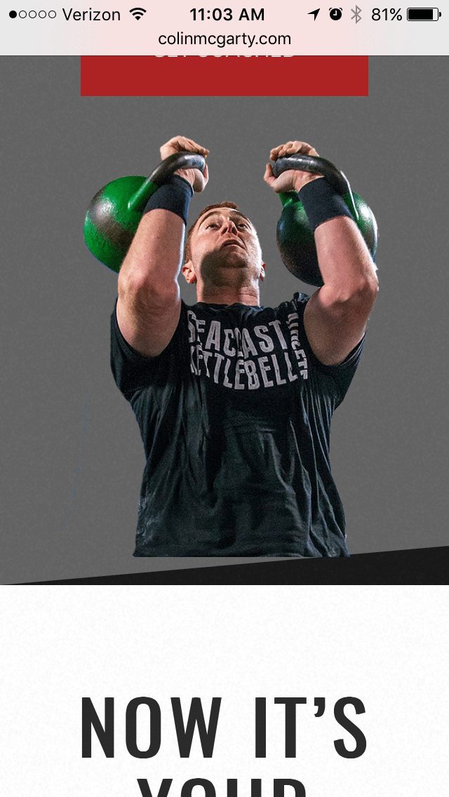
Hello,
Love the Enfold theme – I use it for all my websites!
I have a question about a photo placement on the bottom of a section. On the desktop view, the photo in the middle section nicely lays on top of the section with a diagonal section border. See here: http://colinmcgarty.com/wp-content/uploads/2017/02/Screen-Shot-2017-02-28-at-11.20.44-AM.png
On mobile, the image is floating above the bottom with a significant space appearing. See here: http://colinmcgarty.com/wp-content/uploads/2017/02/IMG_6271.png
How can I eliminate that space in mobile so it looks like the desktop view. I’d like the image in mobile to rest at the bottom of the section like it does on the desktop view.
Can you help?
Thank you.
Viewing 30 results - 83,731 through 83,760 (of 142,823 total)