Hi,
I cannot access the page settings sidebar when editing a page in the Avia Layout Builder.
There is a icon at the top-right that shows “Settings” (when hovered over) but clicking it does nothing – apart from it turning black.
Shortcut Ctrl+Shift+, also turns the icon black but does not show the settings sidebar.
Regards.
Hi,
Thank you for the inquiry.
The best step forward is to implement the suggested improvements outlined by the PageSpeed Insights tool. Begin by addressing the issue of render-blocking resources, which can be done by disabling the Enfold > Performance > File Compression settings. You should also consider exploring alternative compression options like Autoptimize or BWP Minify. Another recommendations is to reduce unused JavaScript, which includes “botano.js” from ionoscloud, Google Tag Manager, and the dynamic footer script. Again, the footer script can be deactivated by adjusting the Enfold > Performance > File Compression settings.
Next recommendation is to enable gzip compression. Most cache plugins, such as WP Rocket or W3 Total Cache, come with this option by default. If you encounter difficulties, your hosting provider should be able to assist you in enabling gzip compression. In addition to the steps mentioned above, you can follow the recommendations in the following articles.
// https://kriesi.at/archives/scoring-100-100-in-google-pagespeed-insights-gtmetrix-pagespeed-and-yslow
// https://gtmetrix.com/wordpress-optimization-guide.html
Best regards,
Ismael
Hi,
Thank you for the update.
but I would like it to look like a popup that only fills the device screen to about 75% of the space on desktop, but 100% of the space on mobile
To adjust the size of the lightbox container on desktop view, try to use this css code instead.
@media only screen and (min-width: 768px) {

  /* Add your Desktop Styles here */
  .mfp-ajax-holder .mfp-content,
  .mfp-inline-holder .mfp-content {
    width: 75%;
  }
}
On mobile view, you can add this css to make the lightbox full width again.
@media only screen and (max-width: 767px) {

  /* Add your Mobile Styles here */
  .mfp-ajax-holder .mfp-content,
  .mfp-inline-holder .mfp-content {
    width: 100%;
    cursor: auto;
  }
}
Please make sure to remove the previous css modifications to get rid of the padding or space around the lightbox.
Best regards,
Ismael
Hi,
Thank you for the update.
The account above doesn’t have admin rights, so we were not able to adjust anything. To adjust the style of the post headings, go to the Enfold > Advanced Styling panel and configure the H3 heading element. You can also use this css code.
.html_elegant-blog #top #wrap_all .avia-content-slider .slide-entry-title {
    color: red;
    font-size: 20px;
    font-weight: normal;
}
Best regards,
Ismael
Hi meanster99,
I checked your site and it’s black for burger icon for every page, to make it white for transparent pages, just add this CSS code in Enfold > General Styling > Quick CSS:
#top #header.av_header_transparency .av-hamburger .av-hamburger-inner,
#top #header.av_header_transparency .av-hamburger .av-hamburger-inner:after,
#top #header.av_header_transparency .av-hamburger .av-hamburger-inner:before {
    background-color: white;
}
Best regards,
Nikko
Hi Akhurst,
Yes, it’s possible using this code, you just need to change the content value:
#top #header .logo img {
    content: url(https://website.com/wp-content/uploads/2023/11/new_logo.jpg);
}
However, I think it’s much better to change it in the theme options.
Best regards,
Nikko
Hi woogie07,
Please try to add this CSS code in Enfold > General Styling > Quick CSS:
#top #wrap_all #footer .social_bookmarks li a {
    color: white;
    font-size: 20px;
}
Hope it helps.
Best regards,
Nikko
Hi Carsten,
Try to add this CSS code in Enfold > General Styling > Quick CSS:
#top .avia-data-table tr > th:first-child,
#top .avia-data-table tr > td:first-child {
    width: 300px;
}
Just adjust the width value as you see fit.
The code will affect all tables, if you want to make to affect only a single page then you can give us a link to the page and we’ll modify the code to a more customized one.
Best regards,
Nikko
Hi NicomIT,
Please try to add this CSS code as well:
#top .highlight-bullet li {
    padding-left: 28px;
    position: relative;
}

#top .highlight-bullet li:before {
    position: absolute;
    left: 0;
    top: 20px;
}
Best regards,
Nikko
Hi navindesigns,
Yes, I have checked on it and when tapping on it on mobile I don’t see the white background anymore but I don’t see any change in background color.
I inspected it and it seems the background color stays the same with this CSS code:
.html_av-overlay-side #top #wrap_all div .av-burger-overlay-scroll #av-burger-menu-ul a:hover {
    background-color: #032d57!important;
}
I think you’ll need to clear the cache in your mobile browser to see the changes.
Best regards,
Nikko
Hi Philip,
It seems Ismael has already responded to the same issue on your other thread. https://kriesi.at/support/topic/dynamic_avia-folder-full-of-thousands-of-files/
I will be closing this thread now, and the discussion will be continued on the other thread.
Best regards,
Nikko
Hi Christian,
The other option would be to align it to top but it would not look good as well.
Can you give us a link of the shop you mentioned? at the moment I could not think of a solution without some trade-off like stretching .
Best regards,
Nikko
Hello, I am using the Masonry Gallery on 12 pages of the my site. Each gallery has between one and six associated pages. Each page has 6 images. At some point the the recent past, the gallery pages stopped allowing users to click on one of those 6 images and navigate through all site images — forward and backward — using arrows embedded to the left and right of each image. Can you tell me know I can get that functionality back, please. John
http://www.johnsnyderpottery.com
A few days ago adjusted the allocated memory.
I am still receiving fatal errors, but even though they are seen as fatal errors they since looks down for a moment and then I refresh and the site comes back.
There is a wp org WooCommerce thread I made.
https://wordpress.org/support/topic/recovery-mode-mentions-these-errors/#post-17201893
-
This reply was modified 2 years, 5 months ago by
 SHR Design. Reason: Adjusting text
Hello Nikko,
thank you so much, it fix the issue, one another thing that I want to add some space in the top and bottom of the logo like 5 or 7 px I have found through inspect, if we change the width value from auto to 70px, it will fix the issue, I open the file avia-merged-styles-2ecff8ddfb8aa8901d1c5c36c31532c2—6553d4bb76230.css which are located in uploads/dynamic_avia/ and edited, but after some time it change back to auto, i think these are temporary file, could you please help where I can find the original file location for below code or have I can add 5px space in the top and bottom of the Logo only in Mobile view header.
@media only screen and (max-width: 767px)
.responsive .logo img, .responsive .logo svg {
height: auto!important;
width: auto;
max-width: 100%;
display: block;
max-height: 80px;
}
Thank you so much!!! I don’t know, why I’ve inserted this code…
The topic can be closed
Hi,
Thanks for the update. I’m seeing 403 errors coming from the Autoptimize plugin, please try deactivating the plugin to see what happens then. If you need further help with that plugin, then please try reaching out directly to their support.
Best regards,
Rikard
thanks for the link :
First: you had the wrong language defintiton on your page – for a good hyphenation you should have your lang set for the main language on your page.
guess it is:lang="da-DK"
(alway click to enlarge the images)
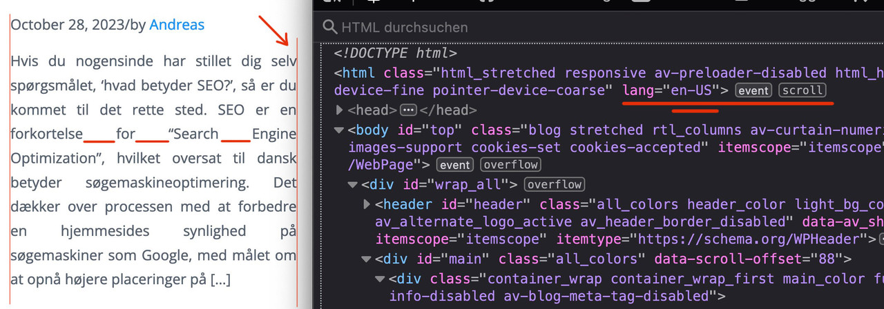
Next: this is justified text layout ! – you can see the rule for it here:
i told you in the other topic that it is alway difficult to have a nice word distance without breaking the words on justified text.
if you do not like to justify the text get rid of that part inside:
#top .fullsize .template-blog .post .entry-content-wrapper {
  text-align: left;   /****** this part is set to justify in your css *****/
  font-size: 1.15em;
  line-height: 1.7em;
  max-width: 800px;  /****** see comment under this codeblock *****/
  margin: 0 auto;
}
the 800px ( or 40em ) max-width is a default setting from enfold – if this is what you mean in your e-mail talking about:
it’s stuck in the center regardless of the CSS I apply
then you can avoid that by:
#top #wrap_all .fullsize .template-blog .post .entry-content-wrapper,
#top #wrap_all .fullsize .template-blog .post .entry-content-wrapper > * ,
#top #wrap_all .fullsize .template-blog .post-title {
  max-width: unset !important;
  margin: 0;
}
if you like to preserve the justification of your paragraph texts – then a hyphens: auto will mainly solve that issue:
(those ugly underlined spaces inside block : “for______Search_____Engine”)
#top #wrap_all .fullsize .template-blog .post .entry-content-wrapper p {
  text-align: justify;
  -webkit-hyphens: auto;
  hyphens: auto !important;
  text-justify:  distribute;
  word-spacing: -0.05em !important;
  text-align-last: left;
}
but: as mentioned above the hyphenation only works well if the lang attribute on html is set to the language of your texts.
F.e. the word “Søgemaskineoptimering” does not hyphen on small screens.
Thanks Guenni007, I changed the deprecated bit and it stopped working completely!
I’ve added links privately, but happy to share with you if you have a safe space I can connect to you with?
 MM
MMParticipant
Hi,
I added the following code to my child theme functions.php, so that I could use the Magnific lightbox for pop-ups from button clicks on the same page:
// add inline popup/lightbox functionality
function popup_inline() { ?>
<script type="text/javascript">
jQuery(window).load(function(){
       jQuery('.pu-link a').addClass('open-popup-link');
	jQuery('.open-popup-link').magnificPopup({
	  type:'inline',
	  midClick: true // Allow opening popup on middle mouse click. Always set it to true if you don't provide alternative source in href.
	});
});
</script>
<?php }

add_action('wp_head', 'popup_inline');
It does exactly what I want it to do on desktop, that is; it opens the contents of a hidden color section on the same page in a lightbox when a button is clicked in another color section. However, the styling still needs lot of work (the lightbox covers the full screen currently – left to right), but I would like it to look like a popup that only fills the device screen to about 75% of the space on desktop, but 100% of the space on mobile. It currently looks terrible on mobile devices, in that the color section doesn’t seem to follow breakpoints (my color section that is loaded into the lightbox uses 2 columns – a 2/5 and a 3/5. I have an image on the left in a 2/5 column and a text block on the right in a 3/5 column. I’ve played around with CSS for hours, but can’t get it to look good on mobile).
I’m using the following CSS currently:
/* style inline popup box width */
@media only screen and (min-width: 767px) {
.mfp-container.mfp-s-ready.mfp-inline-holder {
padding:0 300px!important;
}
#pu-splash.container.av-section-cont-open {
    padding-left: 0!important;
}
}
.mfp-content #pu-splash{
border-radius:15px!important;
}
Do you have any suggestions please?
Cheers,
Matt
Hi,
Try this CSS in your Enfold Theme Options ▸ General Styling ▸ Quick CSS field:
@media only screen and (max-width: 1534px) {
	#top #wrap_all .avia-builder-el-0 .av-element-cover video {
    height: 100%;
    width: 190vh;
}
}
After applying the css, please clear your browser cache and check.
Best regards,
Mike
Hi,
Thanks for the update. Please let us know if you should need any further help on the topic, or if we can close it.
Best regards,
Rikard
Hi Nikko,
thank you very much for your help.
I tried your code. Unfortunately it looks like this:
Once the product category boxes: https://postimg.cc/YvKHfp1W
Once the product boxes: https://postimg.cc/kR60KZGs
Some of them are the same, but in the product category boxes they are pulled up and it sometimes looks very strange.
With the product boxes it is always the same at the bottom of the boxes but often different at the top.
Can the product boxes and product category boxes be made larger without changing the images?
I hope I don’t have to adjust the size of all the product images :) I also see many other shops that also have different sized product images and still have everything the same size for the product boxes and product category boxes everywhere.
Best regards
Christian
Hi,
Thanks for the update. Please let us know if you should need any further help on the topic, or if we can close it.
Best regards,
Rikard
Hi navindesigns,
No worries, please try to add this CSS code in Enfold > General Styling > Quick CSS:
.html_av-overlay-side #top #wrap_all div .av-burger-overlay-scroll #av-burger-menu-ul a:hover {
    background-color: black;
}
Best regards,
Nikko
Hi nasrullah2,
I see, please replace it with this CSS code:
@media only screen and (max-width: 767px) {
  .responsive #top #wrap_all #header {
    position: fixed !important;
    top: 0;
    width: 100%;
    z-index: 9999;
  }

  .responsive #top #main {
    padding-top: 82px !important;
  }
}
Best regards,
Nikko
Hey Martin,
Thank you for the inquiry.
You can use this css code to adjust the height of the submenu items and increase the space around them.
#top #wrap_all .av-main-nav ul > li > a {
    line-height: 1.4em;
    min-height: 33px;
    padding: 10px 16px;
}
Please toggle or temporarily disable the Enfold > Performance > File Compression settings in order to ensure that the changes take effect.
Best regards,
Ismael
Hi web4698,
You’re welcome :)
1) How do I change the colour of the social media icons in the footer?
Please try to add this CSS code in Enfold > General Styling > Quick CSS:
#top #socket .social_bookmarks li a {
    color: yellow !important;
}
Just adjust the color value as you see fit.
2) The blog posts don’t contain /blog/ in the urls. Why is this?
The blog posts are using category instead /blog in the urls, you can change this in Settings > Permalink, and set the Custom Structure in there.
You can just add blog in there however, it affects other post types as well such as portfolio so it’s not really a good solution, I found this article but haven’t tested it out yet, you might want to check it: https://www.goldenoakwebdesign.com/blog/how-to-force-wordpress-urls-to-use-blog-in-posts-permalink-structure
Hope this helps.
Best regards,
Nikko
Hi nasrullah2,
Can you try to change the CSS code to:
@media only screen and (max-width: 767px) {
  #header {
    position: fixed !important;
    top: 0;
    width: 100%;
    z-index: 9999;
  }
}
Let us know if it helps.
Best regards,
Nikko