-
AuthorSearch Results
-
November 21, 2023 at 9:17 am #1426124
In reply to: Button – Link on Pictures
Hi,
Great, I’m glad that Mike could help you out. Please let us know if you should need any further help on the topic, or if we can close it.
Best regards,
RikardNovember 21, 2023 at 4:22 am #1426108In reply to: Increase Speed site
Hey paoluccimarketing2015,
Thank you for the inquiry.
We ran a test using the Pagespeed Insights tool, and some of the recommendations include reducing unused CSS/JS code and eliminating render-blocking resources. You may enhance this by disabling the Enfold > Performance > File Compression settings and installing a third-party compression plugin such as Autoptimize, WP Super Minify, or BWP Minify. You can also utilize the default compression settings from cache plugins like WP Rocket or W3 Total Cache.
Another area for improvement is minimizing the impact of third-party code, including Google Tag Manager and scripts from sibforms.com. And you should also leverage browser caching, which can be achieved by editing your .htaccess file or installing a caching plugin.
Please check the articles below for more info about site optimization.
// https://kriesi.at/archives/scoring-100-100-in-google-pagespeed-insights-gtmetrix-pagespeed-and-yslow
// https://gtmetrix.com/wordpress-optimization-guide.htmlBest regards,
IsmaelNovember 20, 2023 at 7:04 pm #1426098In reply to: strange black bar
Hey ausgesonnen,
Please try the following in Quick CSS under Enfold->General Styling:
#footer {
    border-top-width: 0;
}
Best regards,
RikardNovember 20, 2023 at 6:57 pm #1426095In reply to: Hide main menu for one pager theme on a second site
Hi Rikard,
you can close the topic.
Thanks again,
VeronikaHi,
Thanks for the clarification. Please try the following in Quick CSS under Enfold->General Styling:
#top .av_header_with_border.av_header_transparency #header_main, #top .av_header_with_border.av_header_transparency .avia-menu.av_menu_icon_beside {
    border: 1px solid #daa520;
}
Best regards,
RikardHi Mike,
yes, I think you understood it correctly :) There are a few buttons that change in some places in the settings in the theme. I would like to adjust it on some pages
Here are the screenshots with the areas where I don’t know how to adjust these areas individually:
1. https://postimg.cc/94S5WkVt
2. https://postimg.cc/p5fgJXjq
3. https://postimg.cc/0bxg2Dg3– Heading colors on all product category pages should have a specific color. So it’s not the same everywhere as on the homepage, etc.
– The button with the sale price should have its own color
– The “buttons/circle” on the homepage (see screenshot) should have their own color
– These small characters (stars and & characters between the headings and dividing lines should be given a separate color )
– The buttons in the top right corner (Watchlist and Registration) should have a different color
– The headings of the sidebar, i.e. everything that is on the left of the widget, should have a different color for the headings AND a colored background. Just like with the product filter.
That was my wish list of colors for now :)
Is it possible to customize this separately?
Best regards
ChristianNovember 20, 2023 at 3:02 pm #1426079In reply to: Hide main menu for one pager theme on a second site
Hi,
Great, I’m glad that we could help you out. Please let us know if you should need any further help on the topic, or if we can close it.
Best regards,
RikardNovember 20, 2023 at 10:52 am #1426045Hi Mike,
Thank you for this.
I expect I can turn all of the options to NO or WPI without an issue.The WPI – is just a way to revert those options if something goes wrong because anything other than YES is equal to NO. So by setting them to WPI I can run a query to replace WPI with NO or YES but I cannot do that if I go straight to NO.
Sorry I think you have misunderstood.
I am asking if Enfold can update the way that WP_Options Autoloaded features are managed.
As a stop gap. I am capable of manually changing these values but what I was hoping is that we can alter the queries here so that:1. We already have an option to only load the CSS and JS of used components in the Enfold performance panel BUT it looks like those options are still set to Autoload= YES even if they are not used. Is it possible to add some logic to change the value from YES to NO and back again depending on if the components are used?
2. A review of the other autoloaded functions that Enfold createsBy doing this it will speed up WP-Admin and the front end of the site as less autoloads means less data required per pageload. This will improve the TTFB scores for uncached queries and speed up page caching because less data is autoloaded.
Let me know your thoughts.
November 20, 2023 at 9:49 am #1426043In reply to: OSM Leaflet Map: only one marker pop-up displaying
Dear Mike,
the OSM Leaflet Map still works as supposed. So the technical error seems to have appeared only once, when WP could not find the original PHP file. You can close this topic now. Thanks again for your great support!
Best regards,
CJGVDNovember 20, 2023 at 8:31 am #1426039In reply to: Transparent Mobile Header & Logo
Hey meanster99,
Thank you for the inquiry.
but isn’t now and it doesn’t use the transparent logo on anything below the breakpoint when the burger menu appears.
Please try to add this code inside the css media query for mobile view.
.responsive.html_mobile_menu_tablet #top .av_header_transparency.av_alternate_logo_active .logo a > img, .responsive.html_mobile_menu_tablet #top .av_header_transparency.av_alternate_logo_active .logo a > svg {
    opacity: 0;
}

.responsive.html_mobile_menu_tablet #top .av_header_transparency .logo img.alternate, .responsive.html_mobile_menu_tablet #top .av_header_transparency .logo .subtext.avia-svg-logo-sub {
    display: block;
}
Best regards,
IsmaelNovember 20, 2023 at 8:25 am #1426038In reply to: Inline popup/lightbox styling
Hi,
How can I style the two columns in the colour section (one with an image, one with a textblock) that is called from the popup link, to fill the width of the popup?
Please add this code inside the css media query (max-width: 767px) for mobile view.
#top .mfp-content .flex_column_table .flex_column {
    width: 100%;
}
Best regards,
IsmaelNovember 20, 2023 at 8:11 am #1426036In reply to: Footer-Seite wird Mobil nicht angezeigt
Hi,
everything is fine now – you can close the topic :-)
Kind regards
BerndNovember 20, 2023 at 5:58 am #1426034In reply to: Inline popup/lightbox styling
Thanks both for all the help. I have got the popup how I want it on desktop, but on mobile it still needs some styling, and it appears to put the content of the colour section in a column the same width as is set in the css snippet you gave me (so width 75%).
How can I style the two columns in the colour section (one with an image, one with a textblock) that is called from the popup link, to fill the width of the popup?
Cheers,
MattNovember 20, 2023 at 5:54 am #1426033Topic: Transparent Mobile Header & Logo
in forum EnfoldMM
ParticipantHi,
I have a transparent logo set in theme options, and a sticky header. I currently only use a transparent header on my homepage (but would prefer if it was available on any page with a transparent header). Transparent header works fine on desktop and large tablets, and I added the following code I found in your docs, to use a transparent header on mobile and smaller tablets. I would also like the transparent logo to show on any page with the transparent header, so added the second part of the css that I found in the forum:
/* Transparent Header For Mobile */
@media only screen and (max-width: 990px) {
.responsive.html_mobile_menu_tablet #top #wrap_all #header {
        position: absolute;
}
.html_mobile_menu_tablet #top #wrap_all .av_header_transparency {
	background: transparent;
}
}
/* Transparent Logo on Header */
@media only screen and (max-width: 990px) {
.responsive #top .av_header_transparency.av_alternate_logo_active .logo a > img {
  opacity: 0;
}
.responsive #top .av_header_transparency .logo img.alternate {
  display: block;
}}
This was working at one stage, but isn’t now and it doesn’t use the transparent logo on anything below the breakpoint when the burger menu appears.
Any ideas why it isn’t working please?
Thanks,
MattNovember 20, 2023 at 3:32 am #1426021Topic: Link Question
in forum Enfoldjnightingale
ParticipantHi,
My site is at zeptepland.com. On the top menu, there is “service.” It is linking down to the headline rotator. I see in the menu how the link is set at #service, but I am not seeing how to get to that on the actual front page so I can change it as I don’t want it linking there. Can you please tell me how?
THanks!November 20, 2023 at 1:22 am #1426017In reply to: Make blog header span full width
Hey navindesigns,
Thank you for the link to your site and your example, try adding this code to the end of your child theme functions.php file in Appearance ▸ Editor:function custom_single_post_banner() { ?> <script> (function($) { $(function() { var postTitle = $('.single-post h1.post-title').detach().text(); var postBanner = $('<div class="banner"><h1>'+ postTitle +'</h1></div>'); $('.single-post .big-preview.single-big').detach().insertBefore('.container_wrap_first'); $(postBanner).insertAfter('.single-post .big-preview.single-big img'); }); })(jQuery); </script> <?php } add_action('wp_footer', 'custom_single_post_banner', 99);and this CSS in your Enfold Theme Options ▸ General Styling ▸ Quick CSS field:
@media only screen and (max-width: 767px) {
#top.single-post #wrap_all .all_colors .big-preview.single-big .banner h1 {
	font-size: 18px;
}
.single-post .big-preview.single-big .banner {
	top:18%;
	padding:0 5%;
}
}

.single-post .big-preview.single-big {
    padding: 0;
	pointer-events:none;
}
.single-post .big-preview.single-big .banner {
	top:30%;
	position:absolute;
	z-index:4;
	padding:0 10%;
	color:#000;
}
.single-post .banner h1 {
	background-color: rgba(255,255,255,71%);
}

@media only screen and (min-width: 1440px) {
.single-post .big-preview.single-big {
	max-height: 450px;
}
.single-post .big-preview.single-big a img {
	transform: translateY(-20%);
}
.single-post .big-preview.single-big a {
	max-height: 450px;
}
.single-post .big-preview.single-big .banner {
	top:36%;
	padding:0 15%;
}
}
it will take the single post feature image and title from the default layout like this:

and create a full width banner with the title in it like this:

On mobile it should look like this:

Please ensure to copy the code from the forum and not an email notification so the symbols are not converted.Best regards,
MikeNovember 19, 2023 at 11:03 pm #1426010In reply to: Problème SEO
Hi,
Thanks for your question, please note that the “preview” that YOAST SEO plugin shows you is only their guess, Google will show what they believe is the “most helpful content”, this is what their last “Helpful Content” update was for. If you think that you have made changes and it should be different then you can go to your Google Search Console account and request a new crawl. I searched your page and found that your listing shows your topbar links and menu, please see the screenshots in the Private Content area.
When I check your page source code all of the YOAST SEO plugin code is there, so the theme is not causing any issues and Yoast is working correctly, but they should not mislead you into thinking that your search results will be exactly like the “preview” they show you.
You can go to your Google Search Console account and request a new crawl and perhaps Google will show something different.
Try reading more about the “Helpful Content” update:
https://developers.google.com/search/blog/2022/08/helpful-content-update
https://developers.google.com/search/docs/appearance/helpful-content-systemBest regards,
MikeNovember 19, 2023 at 10:38 pm #1426009In reply to: Import font does not work on mobile
While I was going back and forth and trying things out, I completely overlooked it!
Thank you! Now the font looks as it should on desktop and mobile. :)
I wish you a nice evening!
November 19, 2023 at 10:28 pm #1426007In reply to: Import font does not work on mobile
Hi,
The subline above is calling the font-family “calibriz” which is not correct, it should be font-family “calibri-cursiv-bold”
So please correct your css to this:#top .av-special-heading .av-subheading.av-subheading_above { font-size: 32px !important; font-family: 'calibri-cursiv-bold'!important; font-style: italic; bold !important; color: #ff0044 !important; }then clear your browser cache and check.

Best regards,
MikeNovember 19, 2023 at 9:37 pm #1426004In reply to: Import font does not work on mobile
Hey Mike,
many thanks for your response!
It’s not about the font in the headlines, but in the subline above, which I want to enforce with code:
#top .av-special-heading .av-subheading.av-subheading_above {
font-size: 32px !important;
    font-family: 'calibri'!important;
    font-style: italic; bold !important;
    color: #ff0044 !important;
}
Everything was displayed correctly on the desktop, but not on mobile. Safari displays a different font.
Since the font face rule, the correct font is no longer displayed on the desktop:
 November 19, 2023 at 7:23 pm #1425996
Topic: Make blog header span full width
in forum Enfoldnavindesigns
ParticipantHi,
I do not want to use the page builder for my blogs because of performance issues and easy maintenance.
I am using the default wordpress editor which looks great but I need my header to span across with the title ontop of it if possible
ex – something like this – https://grandimageinc.com/news/making-powerful-first-impression-for-20-years/My current blog post
url – https://rgoproductions.com/blog/we-better-get-going-if-were-going-to-stay-ahead-of-the-weather-tips-for-trade-show-success-when-the-weather-turns-on-you/Thanks
November 19, 2023 at 7:09 pm #1425995In reply to: Video on mobile
I wanted to keep it for desktop
I adjusted the code to the following@media only screen and (min-width: 769px) {
.av_slideshow_full .slideshow_inner_caption {
padding-bottom: 100px !important;
}
}but it did not apply to the desktop version. Please note I am using two separate slider on the page (one for desktop and one for mobile). could that be the reason why?
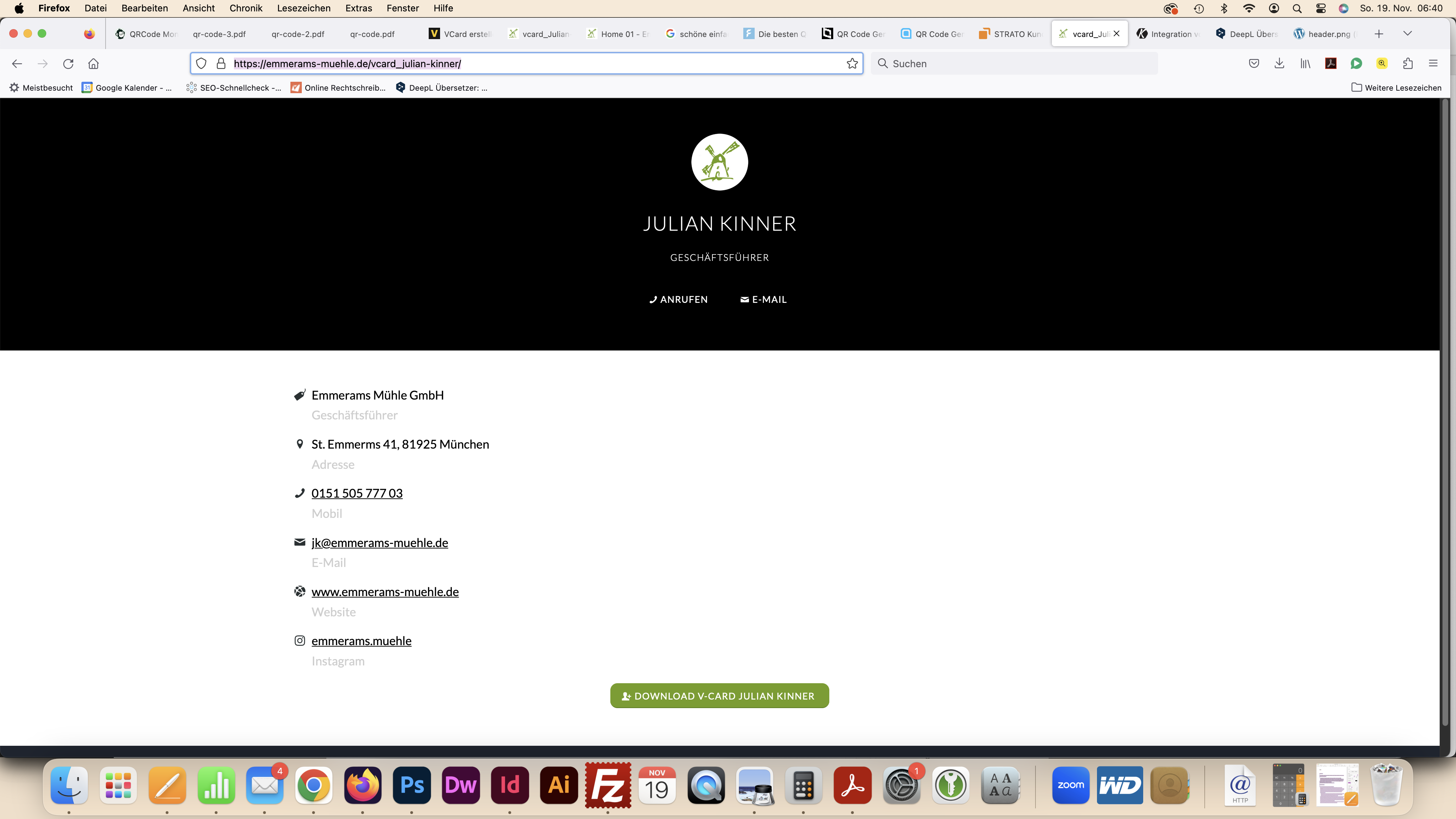
thanks as alwaysNovember 19, 2023 at 2:39 pm #1425975In reply to: Integration vcf file
Hi,
The white space is caused by 140px of top padding, which the removed css corrected, but it was affecting your other pages, so please try this css so the white space of the hidden header will be removed only for this one page:.html_header_top.html_header_sticky #top.page-id-825 #wrap_all #main { padding-top: 0px !important; }After applying the css, please clear your browser cache and check.
Best regards,
MikeNovember 19, 2023 at 6:42 am #1425962In reply to: Integration vcf file
Hello Rikard,
I have temporarily removed the recommended script:
.html_header_top.html_header_sticky #top #wrap_all #main {
padding-top: 0px !important;
}
>> But then a white bar appears at the top where the header is: see view now: https://emmerams-muehle.de/vcard_julian-kinner/
in comparison to the view before with the script mentioned above: see screenshot: https://emmerams-muehle.de/support/header.pngHow can I remove this bar without using the aforementioned problematic script? The header should only not appear for this one page.
Best regards, Diana
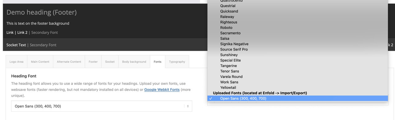
November 19, 2023 at 6:06 am #1425961In reply to: nunito-sans squished
First – i think you have uploaded the whole downloaded archive from google to enfold. Because only the static font-styles are seen – and they are registered as “static” font.
Next: do you really need all those font-weights ? form 200 to 900 and italic too?
for most websites it is sufficient to offer only 300, 400 and 700.
Hint: as you can see here on a post of mine for a lot of fonts it is o.k. to use the browser way to render italic fonts.
https://kriesi.at/support/topic/host-web-font-yourself-some-info/#post-1364066. – ( that topic is in many ways old and obsolete – because a lot of those features are now included to enfold – but f.e. the transfonter tool is still good to use)
You can see that only a few serif fonts show significant differences between browser-rendered italic fonts and real italic fonts.
Next: if you look inside the downloaded static folder – you see some expanded, condensed, semicondensed etc. font-styles-
This is what you mean by squished. Only upload those fonts you like to use.Next: the nunito font is separated on google to a 7pt and a 10pt style ( i believe it is a kind of kerning they use. optical or metric kerning)
i think the 7pt will be the most used.Conclusion: Long story short – I have put together the 7pt version as ttf and woff2 ( for modern browsers this is best) font in an uploadable zip.
Delete your uploaded file from the font manager and upload this zip here instead: https://webers-testseite.de/NunitoSans.zipby the way – activating it for enfold : the fontmanager fonts will be at the end of the dropdown list.
 November 18, 2023 at 10:35 pm #1425946
In reply to: Social Media Buttons Footer
Hey Chrisxx1982,
Thank you for your patience and the screenshot, please see this shortcode created by Guenni007, you can add it to a custom HTML widget in your footer widget area.Best regards,
MikeNovember 18, 2023 at 10:29 pm #1425945Hi,
For the post in your screenshot there are two widths, the first is the layout width which is set to 1310px on your site at Enfold Theme Options ▸ General Layout ▸ Dimensions ▸ Maximum Container width, so if this is what you mean please adjust this setting.

The second is the blog template which on your site is 800px:

which you can change to 100% with this css in your Enfold Theme Options ▸ General Styling ▸ Quick CSS field#top.single .fullsize .template-blog .post .entry-content-wrapper, #top.single .fullsize .template-blog .post .entry-content-wrapper>* { max-width: 100%; }This is the expected results:

Please ensure to copy the code from the forum and not an email notification so the symbols are not converted.
After applying the css, please clear your browser cache and check.Best regards,
MikeNovember 18, 2023 at 9:38 pm #1425941In reply to: 2 Questions for my Website
Hey artVantage,
Thank you for your patience, but unfortunately we don’t have a carousel option with the exact same look as the classic gallery. Try reviewing the WordPress plugins for a carousel plugin.
For your second question, please review the column margin, current the columns with the images have a negative top margin (-220px), and the columns with the text also has a negative top of -180px, so use the mobile icon to remove this for mobile.

Since the animation doesn’t have a mobile setting and you are currently hiding these item on mobile, you could clone the columns for mobile and remove the animation and negative position to achieve this.
If you have trouble with this, try cloning your page as a test page and include a admin login in the Private Content area so we can help and then you can review the settings for your live page.Best regards,
MikeNovember 18, 2023 at 6:57 pm #1425936In reply to: Position setting does not change anything
Hey Michael,
Thank you for your patience, but the site you linked to is not working, but I believe that I found the correct site in one of your other threads.
When I checked your three columns, all of them were set to “position 1”:

please note that this will only work when “Column Behaviour” set to individual:

One way around this limitation is to add custom IDs the elements:

and then this css, which I added to your WordPress ▸ Customize ▸ Additional CSS@media only screen and (max-width: 767px) { #changeorder,#changeorder .entry-content-wrapper,#changeorder .flex_column_table { display: flex !important; flex-wrap: wrap !important; } #placeone { order: 1 !important; } #placetwo { order: 2 !important; } #placethree { order: 3 !important; } }and this works for your DE site, but your EN & FR pages don’t update correctly, I’m not sure if it is your caching or your WPML. To correct I added this css:
@media only screen and (max-width: 767px) {
  #top.home #av_section_1,#top.home #av_section_1 .entry-content-wrapper {
  display: flex !important;
  flex-wrap: wrap !important;
  }
  #top.home #av_section_1 .av_one_fourth.first {
      order: 1 !important;
  }
  #top.home #av_section_1 .av_one_fourth.last {
      order: 2 !important;
  }
  #top.home #av_section_1 .av_one_half {
      order: 3 !important;
  }
}
Now it is working for all three languages, please clear your browser cache and check.
Best regards,
MikeNovember 18, 2023 at 11:20 am #1425922In reply to: Logo is not shown in mobile view
-
AuthorSearch Results
-
Search Results
-
Hi,
I have a transparent logo set in theme options, and a sticky header. I currently only use a transparent header on my homepage (but would prefer if it was available on any page with a transparent header). Transparent header works fine on desktop and large tablets, and I added the following code I found in your docs, to use a transparent header on mobile and smaller tablets. I would also like the transparent logo to show on any page with the transparent header, so added the second part of the css that I found in the forum:
/* Transparent Header For Mobile */ @media only screen and (max-width: 990px) { .responsive.html_mobile_menu_tablet #top #wrap_all #header { position: absolute; } .html_mobile_menu_tablet #top #wrap_all .av_header_transparency { background: transparent; } } /* Transparent Logo on Header */ @media only screen and (max-width: 990px) { .responsive #top .av_header_transparency.av_alternate_logo_active .logo a > img { opacity: 0; } .responsive #top .av_header_transparency .logo img.alternate { display: block; }}This was working at one stage, but isn’t now and it doesn’t use the transparent logo on anything below the breakpoint when the burger menu appears.
Any ideas why it isn’t working please?
Thanks,
MattTopic: Link Question
Hi,
My site is at zeptepland.com. On the top menu, there is “service.” It is linking down to the headline rotator. I see in the menu how the link is set at #service, but I am not seeing how to get to that on the actual front page so I can change it as I don’t want it linking there. Can you please tell me how?
THanks!Hi,
I do not want to use the page builder for my blogs because of performance issues and easy maintenance.
I am using the default wordpress editor which looks great but I need my header to span across with the title ontop of it if possible
ex – something like this – https://grandimageinc.com/news/making-powerful-first-impression-for-20-years/My current blog post
url – https://rgoproductions.com/blog/we-better-get-going-if-were-going-to-stay-ahead-of-the-weather-tips-for-trade-show-success-when-the-weather-turns-on-you/Thanks