Hi there,
I would like to know, if there is a solution for round corners to the masonry grid? I would like to set the border-radius only at the 4 corners of the whole gallery. The images shouldn’t be rounded, except the 4 at the corners: 1 top-left, 1 top right a.s.o.
Could you give me a solution? This would be great!
Viki
Hi, I’m having some problems with the videos embedded on my site http://www.giravoce.com, both are on YouTube, the first one at the top is as the background of a “color section” element and in the mobile version it doesn’t start automatically.
The second is in a video element, it starts automatically even in the mobile version but it has no audio, can you help me please?
Hi,
It looks like you are not using the new code that I posted above that allows buttons to be used.
It also looks like you didn’t add the custom class to the buttons for the new script to work, please review this thread again.
Best regards,
Mike
Hi,
Great, I’m glad that Mike could help you out. Please let us know if you should need any further help on the topic, or if we can close it.
Best regards,
Rikard
Hi,
Great, I’m glad that you got it working. Please let us know if you should need any further help on the topic, or if we can close it.
Best regards,
Rikard
Hi,
Great, I’m glad that we could help. Please let us know if you should need any further help on the topic, or if we can close it.
Best regards,
Rikard
Hi,
I need to create a product technical sheet that has a table; in desktop mode, the table is displayed well, unlike on mobile; so I found a solution for mobile by copying the table into a text block, but I can’t set the width of the first column to prevent the texts from overlapping the texts of the second column. or i can’t se the font dimension of the first column.How can I solve this problem?
Looking forward hearing from you .
Best regards
Ms
Hi,
Thanks for that. Please try the following in Quick CSS under Enfold->General Styling:
.home #after_section_1 {
  border-top-width: 0;
}
Best regards,
Rikard
Hi,
The function that they posted:
function varnish_safe_http_headers() {
    header( 'X-UA-Compatible: IE=edge,chrome=1' );
    session_cache_limiter('');
    header("Cache-Control: public, s-maxage=120");
  if( !session_id() )
  {
    session_start();
  }
}
add_action( 'send_headers', 'varnish_safe_http_headers' );
is the function that you added from this post above.
Which is from this Stack Exchange solution to override the WordPress default PHPSESSID to solve issues with a Varnish server.
Best regards,
Mike
Hi,
Thank you for the update.
The menu items are not displaying because their opacity is set to 0. Did you add this modification somewhere?
#top #wrap_all #av-burger-menu-ul > li {
    opacity: 0;
    position: relative;
    top: 18px;
    transition: opacity 0.3s ease-out,top 0.3s ease-out,left 0.3s ease-out;
    transform: translate3d(0,0,0);
}
You may need to remove the code or override it with the following css.
#top #wrap_all #av-burger-menu-ul > li {
    opacity: 1;
}
Please make sure to toggle or temporarily disable the Enfold > Performance > File Compression settings to make sure that the changes take effect.
Best regards,
Ismael
Hey Createve_Solutions,
Please try the following in Quick CSS under Enfold->General Styling:
body#top #wrap_all .footer_color .widgettitle {
  color: #fff;
  border-color: #ddd;
}
Best regards,
Rikard
-
This reply was modified 2 years, 3 months ago by
 Rikard.
Hi,
Great, I’m glad that you found a solution, and thanks for the update. Please let us know if you should need any further help on the topic, or if we can close it.
Best regards,
Rikard
Hey Thomas,
You can use the “ava_after_main_container” hook instead of the “woocommerce_before_shop_loop” for that.
If you created your Blog page using ALB, the simpler way would be adding the Widget Area element to the top of your page and choosing your widget.
Best regards,
Yigit
Hi,
We have found out that here are a bug with the accordion.
If we set the accordion behaviour to be “Multiple toggles open allowed (Toggle Mode)” in the backend and you are on the frontend and click on a accordion, it scrolls to the top of the page.
But if we choose “Only one toggle open at a time (Accordion Mode)” it works. Can you maybe look into this with a new update to the theme?
I have added a test link so you can see it.
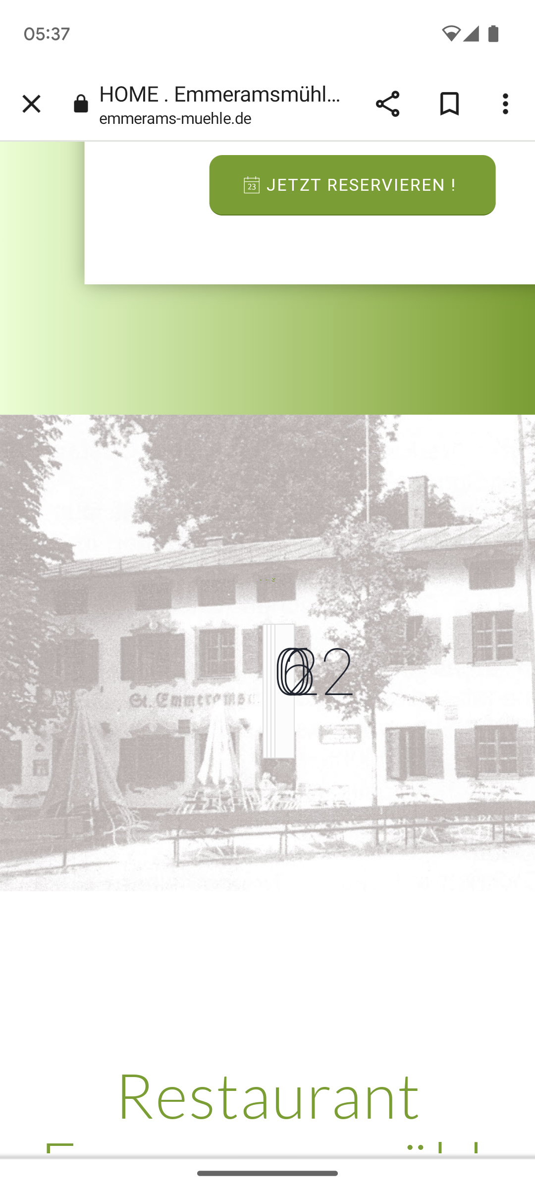
dear support team
We have an ‘animated countdown’ on the https://emmerams-muehle.de/#neu website. Everything works perfectly on the desktop version.
Only in the mobile version the numbers of the countdown are displayed on top of each other: see screenshot: https://emmerams-muehle.de/support/countdown.png
How can I achieve a correct display on a cell phone?
Best regards, Diana
Hey Diana,
Thank you for the inquiry.
The issue occurs because of the overflow property in this css rule, which is only applied on mobile view.
.av-parallax-section {
    position: relative;
    border-top: none;
    overflow: hidden;
}
To override it, you can add this css code.
#reservierung + .av-parallax-section {
    overflow: visible !important;
}
Best regards,
Ismael
I tried this on our site (both variances you described) and it did not work. Here’s what I’m seeing now… Other options?
Total Autoload Size
2419 KB
Autoload top list:
# Option name Size
1 aviaAsset_css_filecontent 529 KB
2 av_alb_usage_av_hr 272 KB
3 aviaAsset_js_filecontent 254 KB
4 av_alb_usage_av_icon_box 145 KB
5 av_alb_usage_av_one_half 145 KB
6 av_alb_usage_av_textblock 93 KB
7 rewrite_rules 91 KB
8 av_alb_usage_av_heading 91 KB
9 av_alb_usage_av_social_share 68 KB
Hey ballindigital,
Thank you for the link to your site, when I check your page on my desktop the height of the elements are the same and so the buttons are lined up, but I believe that your screen size is smaller, so we need to set the height of the elements at certain screen sizes when the content length causes the text to wrap into a new line. I see you are using three grid rows with two cells each, and in each is a image, special heading, text block and a button. So we need to set the height for all special headings and text blocks to the same.
Try adding this code to the end of your child theme functions.php file in Appearance ▸ Editor:
function grid_row_special_headings_and_text_blocks_equal_heights() { ?>
  <script>
(function($){
	var width = $(window).width();
  	if (width > 767) {
  $('.page-id-3083 .av-layout-grid-container').each(function(){
     var $specialHeading = $('.flex_cell .av-special-heading-tag',this);
     var $textBlock = $('.flex_cell .av_textblock_section p',this);
     var specialHeadingHeight = Math.max.apply(Math, $specialHeading.map(function(){
         return $(this).height();
     }).get());
     var textBlockHeight = Math.max.apply(Math, $textBlock.map(function(){
         return $(this).height();
     }).get());
     $specialHeading.height(specialHeadingHeight);
     $textBlock.height(textBlockHeight);
  });
} else {}
})(jQuery);
</script>
  <?php
}
add_action( 'wp_footer', 'grid_row_special_headings_and_text_blocks_equal_heights', 99 );
Please ensure to copy the code from the forum and not an email notification so the symbols are not converted.
Best regards,
Mike
Hey ballindigital,
Try this CSS in your Enfold Theme Options ▸ General Styling ▸ Quick CSS field:
@media only screen and (max-width: 767px) {
.responsive #top #wrap_all #footer .container {
    display: flex;
    flex-wrap: wrap;
    justify-content: space-between;
    width: 90%;
	max-width: 90%;
}

.responsive #top #wrap_all #footer .flex_column.av_one_third:first-child {
    width: calc(50%);
    clear: none;
}
.responsive #top #wrap_all #footer .flex_column.av_one_third:first-child .widgettitle {
	width: 98%;
}
.responsive #top #wrap_all #footer .flex_column.av_one_third:nth-child(2) .widgettitle {
	width: 100%;
}
.responsive #top #wrap_all #footer .flex_column.av_one_third:nth-child(2) #menu-item-1422 a {
	padding-right: 0;
}
.responsive #top #wrap_all #footer .flex_column.av_one_third:nth-child(2) {
    text-align: right;
    width: calc(50%);
}

.responsive #top #wrap_all #footer .flex_column.av_one_third:last-child {
    width: 100%;
    text-align: center;
}
.wpcf7 .wpcf7-spinner {
	display: none;
}
}
Please ensure to copy the code from the forum and not an email notification so the symbols are not converted.
After applying the css, please clear your browser cache and check.
Best regards,
Mike
Hi,
Try this CSS in your Enfold Theme Options ▸ General Styling ▸ Quick CSS field:
#top .avia-post-nav:hover .entry-info-wrap {
    width: auto;
}
#top .avia-post-nav .entry-info {
    width: auto;
}
Please ensure to copy the code from the forum and not an email notification so the symbols are not converted.
After applying the css, please clear your browser cache and check.
Best regards,
Mike
Hi,
Is there a way of aligning these buttons on desktop view?
View post on imgur.com
Thanks,
Harvinder
Hey schweg33,
Try this CSS in your Enfold Theme Options ▸ General Styling ▸ Quick CSS field:
#top .avia-post-nav .entry-image {
    display: none;
}
#top .avia-post-nav .entry-info-wrap {
text-align: center;
}
Please ensure to copy the code from the forum and not an email notification so the symbols are not converted.
After applying the css, please clear your browser cache and check.
Best regards,
Mike
Happy new year to all of you guys!
As described on https://kriesi.at/documentation/enfold/tab-sections/, there’s the possibility to direct the user to a specific tab section by using a tab section ID. That works like a charm: the desired tab is marked as active.
But there’s a problem if the tab section is not at the top of the page: it’s not scrolled into view.
For example try this:
- Open a new browser tab
- Insert the Link given below and click ENTER
As you can see, the page is opened. But you need to scroll down to see the tab section (where the correct tab is active already).
Any idea how to change that behaviour, so that the tab section is scrolled into view as well?
Cheers,
Jürgen
Hi Enfold team – Happy New Year,
I’ve been working with a developer on managing performance / wp_options and have found an issue much like Ref. https://kriesi.at/support/topic/cleanup-wp_options-table-aviaasset_avia-head-scripts/ from 2020 where the Enfold theme entries are the biggest offenders. We host on WP Engine.
What we see:
option_name
aviaAsset_css_filecontent length of option value is 604041 and 589.88KB in size
aviaAsset_js_filecontent length of option value is 498428 and 486.75KB in size
Many others follow but not as large. Is the 2020 solution referenced above still valid? What steps should I take to rectify this situation?
Thanks!
Hi,
Try this CSS in your Enfold Theme Options ▸ General Styling ▸ Quick CSS field:
#top .av-tab-section-outer-container .av-active-tab-title.av-section-tab-title,
#top .av-tab-section-outer-container .av-section-tab-title:hover {
    background-color: #fff;
}
adjust color to suit.
Best regards,
Mike
Hi,
It looks like for level one & three the menu item gets the class current-menu-item
But not for level two, it gets the class active-parent-item
So try adding this css:
#top #header .av-main-nav > li.active-parent-item > a {
    background-color: #776fb1;
}
After applying the css, please clear your browser cache and check.
Best regards,
Mike
Hey imc-html,
Try changing this line:
.responsive #top #header #header_main .inner-container .main_menu {
    order: 1;
to this:
.responsive #top #header #header_main .inner-container .main_menu {
    order: 3;
After applying the css, please clear your browser cache and check.
Best regards,
Mike
Hi,
I added this css:
#top .all_colors h1 {
	font-size: 18px;
}
#top .all_colors h2 {
	font-size: 14px;
}
check now.
Best regards,
Mike
Hey lausianne,
There is not a built-in way to do this, but you can try this solution
Best regards,
Mike