Hi,
Thank you for the update.
1. The Cart and Search buttons a little larger
You can add this css code to make the cart and search icons larger:
@media only screen and (max-width: 767px) {

  /* Add your Mobile Styles here */
  #menu-item-shop .cart_dropdown_link {
    font-size: 24px;
  }

  #top #menu-item-search a:before {
    font-size: 30px !important;
  }
}
If you have any additional questions at this time we kindly ask that you open them up in a separate thread. The longer threads get in the forum, they become more difficult to support as they tend to drift off topic and they also make it troublesome for users trying to search for solutions. Keeping threads relevant to their original inquiry ensures that we can keep better track of what has been resolved and that users can more effectively find answers to similar issues they might be experiencing.
Thanks!
Best regards,
Ismael
Hey cheffe,
Thank you for the inquiry.
You can use this css code to adjust the size and aspect ratio of the lightbox container.
.page-id-2447 .mfp-wrap {
    height: 90% !important;
    top: 20px !important;
}

.page-id-2447 .mfp-iframe-holder .mfp-content {
    width: 100%;
    max-width: 692px;
}

.page-id-2447 .mfp-iframe-scaler {
    width: 100%;
    height: 0;
    overflow: hidden;
    padding-top: 100%;
}
You can further adjust the values as necessary.
Best regards,
Ismael
Hi,
I would recommend adding the categories as a class to the single posts, try adding this code to the end of your child theme functions.php file in Appearance ▸ Editor:
add_filter('body_class','add_category_to_single');
  function add_category_to_single($classes) {
    if (is_single() ) {
      global $post;
      foreach((get_the_category($post->ID)) as $category) {
        $classes[] = $category->category_nicename;
      }
    }
    return $classes;
  }
This will add the categories as a body class, so for example if your post belongs to the categories News, Personal, Uncategorized

the body will have these classes:

So if you wanted to use CSS to target this it would look like:
#top.news.personal.uncategorized {
/* your color here */
}
You can make this would for only one category if you wish, my example just happened to have three.
Best regards,
Mike
Hi,
do you think it`s possible to set this list the other way around so that on the page “history” the newest dates are on top of the list? The order in the backend is the oldest in the beginning.
I could make the sorting already with your help on another list. There its perfect to have the newest date on top, by the history page would be great to have it the other way around. But i am not so sure if that is possible.
Maik helped me with that the last time.
You have any ideo for that? That would be perfect!
Many regards rixi
Hi Mike, also – is there a way that I don’t have a go to a new page when I click on the items on the home page? At the moment they open to a portfolio page and then the little menu at the top for all/ Corporate/illustration etc disappears which is confusing.
so either:
1. is there a way to keep the little menu at all times?
2. or – is there a way to open to a lightbox immediately when clicking on a portfiolio entry on the home page? so no detour va an extra page?
Best
Pete
thank you Mike, I have played around with that a little. Now the next issue.
When you look at the url you will notice, that the layout jumps when you toggle between All or the other options in the menu. Its shifts shlightly to the left. I mean the whole layout, including the logo at the top. What might be the reason? Can you send something to fix it please?
Best
Pete
Hi,
Glad to know that initial issues have been fixed. If you have any additional questions at this time we kindly ask that you open them up in a separate thread. The longer threads get in the forum, they become more difficult to support as they tend to drift off topic and they also make it troublesome for users trying to search for solutions. Keeping threads relevant to their original inquiry ensures that we can keep better track of what has been resolved and that users can more effectively find answers to similar issues they might be experiencing.
Thank you for your understanding.
Best regards,
Ismael
Hey bemodesign,
Thank you for the inquiry.
You can add this css code to set the header to transparent on mobile view:
@media only screen and (max-width: 989px) {
  #top #wrap_all .av_header_transparency {
    background: transparent !important;
    position: absolute !important;
  }
}
Best regards,
Ismael
On mobile view, I want the top header to be transparent and show the image thru, like the example included. Can you add or get me CSS for this? thanks
Hey Norbert,
Thanks for the login details. The update to 5.7.1 has to be done manually from the version you are running, please refer to my replies in this thread: https://kriesi.at/support/topic/enfold-4-5-theme-update-update-failed-download-failed-a-valid-url-was-not-pro/#post-1021541
You can either update manually via FTP: https://kriesi.at/documentation/enfold/how-to-install-enfold-theme/#theme-update, or upload the theme as if it was new under Appearance->Themes->Add New Theme.
If that doesn’t work then please try to delete the whole theme folder, then replace it with the new version. Make sure that you have backups of the site before starting updating.
Also please read this after you have updated: https://kriesi.at/documentation/enfold/theme-registration/
Also please note that you are running a very old version of WordPress, I would recommend that you update that first of all.
Best regards,
Rikard
everything is fine. You might close this topic
THANKS
Hi,
Thank you for the info.
You can add this css code to adjust the size of the logo on scroll:
#header.header-scrolled .avia-standard-logo img {
    padding-top: 10px;
    height: 32px;
}
Best regards,
Ismael
Hi,
Thanks for the update. Please let us know if you should need any further help on the topic, or if we can close it.
Best regards,
Rikard
Wow – thank you very much. Don’t you think it’s an improvement?
Maybe a sliding timing as ALB Option would be nice too. On that example page i changed to 1000ms
Edit: https://kriesi.at/support/topic/slidedown-speed-on-toggles/#post-1448252
Hi,
Please read this reply again. We’ll close this thread for now.
Best regards,
Rikard
this technique is called : infinite scroll – maybe that older post can help you on that:
https://kriesi.at/support/topic/quick-way-to-add-infinite-scroll/#post-681490
Edit: it still works.
Download that little script: https://jscroll.com/#/installation
and upload it to your child-theme js folder ( if there is none – create that child-theme subfolder )
I load the script only for my test page (ID: 45777)
put this to your child-theme functions.php:
function my_custom_infinite_scoll() {
    if ( is_page(45777) ) {
        wp_enqueue_script( 'avia-child-jscroll', get_stylesheet_directory_uri().'/js/jscroll.min.js', array('jquery'), 2, true );
    }
}
add_action('wp_enqueue_scripts', 'my_custom_infinite_scoll');
and
function infinite_scroll() {
if ( is_page(45777) ) {
?>
<script type="text/javascript">
(function($) {
$( ".content" ).jscroll({
	loadingHtml: '<img src="/wp-content/uploads/anim-world.gif" alt="Loading" /> Loading...',
	nextSelector: 'span.current + a',
	contentSelector: '.article-grid',
	autoTrigger: true,
});

})(jQuery);
</script>
<?php
}
}
add_action('wp_footer', 'infinite_scroll', 999);
In my case it is a blog element – give that custom class: article-grid to that element.
Read the setting carefully ( with pagination – this nav is set to display none via css )
see: https://webers-testseite.de/infinite-scroll/
Hallo Günni,
mit den Bildern in dem Textrahmen hatte ich gar nicht mehr auf dem Schirm, das benutze ich sehr selten. Aber es ist deutlich einfacher, als dieses über das CSS abzubilden. Top Idee! Manchmal ist man etwas betriebsblind.
Ich habe das jetzt 2-spaltig im Textblock angelegt, ich vermute mal, das war auch Deine Idee.
Wenn ich noch eine Frage stellen darf: Kann man auch sagen, dass die eine Spalte nur für den Text und die andere nur für das Bild sein soll?
Ich habe es auf der Musterseite mal beispielhaft integriert.
Vielen Dank
Matthias
Hi,
Guenni007 is correct for #2, the “blog” option is not for category pages, if you want category/archive pages to be a grid then try adding this code to the end of your child theme functions.php file in Appearance ▸ Editor:
add_filter('avf_blog_style','avia_change_category_blog_layout', 10, 2);
function avia_change_category_blog_layout($layout, $context){
if($context == 'archive') $layout = 'blog-grid';
return $layout;
}
You can not have a custom layout for a category / archive page with a hero image at the top like https://sii-talents.de/aktuell/
To add the hero image to the top of the category pages try this solution
Best regards,
Mike
I would like to have the desktop alignment grid title left (as it is now) and the mobile alignment grid title in the center. How can I do this? I tried several options but that didn’t work.
Hi,
Great, I’m glad that we could help. Please let us know if you should need any further help on the topic, or if we can close it.
Best regards,
Rikard
Hi,
Thanks for the update. Please let us know if you should need any further help on the topic, or if we can close it.
Best regards,
Rikard
it is the green button under “Philosophie und Anspruch” – just a little styled to look like a button.
if you look to that via developer tools – you can switch positions by drag&drop – so that the toggle_wrap is before the toggler.
Doing that – the function is working and that is something that looks nice to me too.
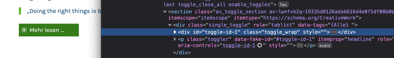
But : changing position inside toggles.php will not work that way:
$output  = '';
$output .= "<section class='{$section_class}' {$markup_tab}>";
$output .=		'<div role="tablist" class="single_toggle" ' . $this->create_tag_string( $toggle_atts['tags'], $toggle_atts ) . '  >';

$output .=			"<div id='{$toggle_atts['custom_id']}' class='toggle_wrap {$item_contentClass} {$contentClass}' {$toggle_init_open_style} {$markup_answer}>";
$output .=				"<div class='toggle_content invers-color {$item_inherit}' {$markup_text}>";
$output .=					ShortcodeHelper::avia_apply_autop( ShortcodeHelper::avia_remove_autop( $content ) );
$output .=				'</div>';
$output .=			'</div>';

$output .=			"<{$this->heading_tag} data-fake-id='#{$toggle_atts['custom_id']}' class='toggler {$item_titleClass} {$titleClass} {$item_inherit}' {$markup_title} role='tab' tabindex='0' aria-controls='{$toggle_atts['custom_id']}'>";
$output .=				$toggle_atts['title'];
$output .=				'<span class="toggle_icon">';
$output .=					'<span class="vert_icon"></span>';
$output .=					'<span class="hor_icon"></span>';
$output .=				'</span>';
$output .=			"</{$this->heading_tag}>";

$output .=		'</div>';
$output .= '</section>';
so there must be ( inside the js file ?) a selector that needs the DOM ( first toggler then toggle_wrap ) Structure ( like .next) but i only found one – and changing it to previous will not work.
Edit: oh sorry – i should have searched for the opposite of .next() in my memory it was previous – because previousSibling was still anchored in my memory bank.
jQuery is of course : .prev()
And now you can see what i mean on that page.
It is a better effect with the toggler than realising it via ‘Fold to Container Height’ on text-block. With the toggler you have better control over what is shown and what is not – at any screen width.
Hi,
Thank you for the inquiry.
How did you add the dummy content? We can only see one widget in the header, and the logo is missing. You can add two widgets in the header: one for the current layout and another for the phone and email icon, then we can provide the css code to toggle the visibility of the widgets on desktop and mobile view.
Please provide a screenshot of the changes you’d like to implement using platforms like Savvyify, Imgur, or Dropbox.
Best regards,
Ismael
Hey annameis,
Thank you for the inquiry.
Please use this css code to adjust the text color in the search bar:
#top .header_color input[type='text']#s {
    color: red;
}
Best regards,
Ismael
The double menu strategy works quite well. I can have anchor links on the main page now. However, the issue does persist though, so I will continue investigating that.
I do have another question concerning the menu though. On the Desktop, while hovering over the “Services” section, the submenus opens up quite cleanly and elegantly (one column). However, once I go to any internal page (Photography for example), highlighting the Services section again now displays a rather large and inelegant submenu. Is there a way to fix this? It’s only a problem if you’re in one of the internal pages on Desktop (Photo, Video, Aerial, Floor Plan).
Is there a way to make the internal mega menu at least consistent with the home page’s elegant presentation? If possible, an arrow for a dropdown submenu would be great as well.
Thank you
Hi – I was wondering if you could help me with CSS to change the text color in the search bar. It is currently white on a white background. Link below.
CSS being used in header area:
.header_color .header_bg, .header_color .main_menu ul ul, .header_color .main_menu .menu ul li a, .header_color .pointer_arrow_wrap .pointer_arrow, .header_color .avia_mega_div, .header_color .av-subnav-menu > li ul, .header_color .av-subnav-menu a {
background-color: transparent;
}
#top #header #header_main .mega_menu_title a {
color: #ffffff;
}
#top #header #header_main .mega_menu_title a:hover {
color: #d6001d;
}
.av-masonry-entry .av-masonry-entry-title {
font-size: 32px !important; text-transform: uppercase;
}
#top #header #header_main .mega_menu_title a:hover {
text-decoration: none;
}
@media only screen and (max-width: 1024px) {
nav.main_menu {
display: block !important;
}
#avia-menu .menu-item {
display: none;
}
.av-burger-menu-main.menu-item-avia-special {
display: block;
}
}
.footer_color { background-size: cover; }
.toggler.activeTitle {
border-bottom: 0;
}
.taglist a:hover, #top .taglist .activeFilter {
color: red;
}
.taglist a:hover, #top .taglist {
color: white;
}
.av-elegant-toggle .taglist a {
background: #fff;
border-radius: 4px;
padding: 5px 15px;
margin: 5px;
color: #333;
text-decoration: none;
}
.av-elegant-toggle .taglist { margin-bottom: 20px; }
.av-elegant-toggle .tag-seperator { display: none; }
@media only screen and (max-width: 767px) {
.av-elegant-toggle .taglist a {
line-height: 2.0em;
font-size: 0.9em;
padding: 3px 15px;
display: inline-block;
}
}
Hi,
Thanks for the login, I believe that you want this for the /horarios/ page, so I added this css to your Quick CSS:
#top.page-id-528 #after_section_1.main_color {
	background-color: #000;
}
Please clear your browser cache and check.
Best regards,
Mike
Hi,
Thanks for the update. Please let us know if you should need any further help on the topic, or if we can close it.
Best regards,
Rikard