choose the large gap and place that css into your child-theme quick css:
(masonry-gallery – or do you mean the masonry-entries?)
#top .av-large-gap.av-fixed-size .av-masonry-entry .av-inner-masonry {
    right: 50px;
    bottom: 50px;
}
i try to find a solution for av-flex-size now…
Hi
Is it possible to add plain text ( like an adress ) in the left side bar menu?
Like the text u you can add in the top bar menu..( telephone number etc. )
Greetz Karin
I added an iframe code to my website in a text box, and it works well on desktop. However, it’s not displaying on mobile devices. What could be causing this issue?
The code is : <iframe style=”position: absolute; left: 0; right: 0; top: 0; border-radius: 15px; border: 0; margin: 0 auto;” src=”https://3d-configurator.arimars.com/arimars/AutumnSeasonTshirt” width=”560″ height=”500″></iframe>
sorry – i did not think of that. But – there is no hover style on mobile devices!
So that is normal behaviour for mobile devices – if you do not want that blur and that darker overlay – change the offered rule to:
.responsive.avia_desktop #top .av-caption-style-overlay .av-masonry-item-with-image .av-inner-masonry-content {
  background:rgba(0,0,0,.5);
  -webkit-backdrop-filter:blur(3px);
  backdrop-filter:blur(3px)
}
because mobile devices have on html the class: avia_mobile the default enfold setting will work instead.
Sorry misunderstanding. This is not what I meant. Of course the lettering should remain white also on small screens on roll over.
The problem is another. On Mobile view, the title of the image and the masked black blurred background are there from the beginning. Not on rollover. So on mobile one never gets to see the normal image. Only with the writing on top. This is not good.
Please send solution for that.
Sorry misunderstanding. This is not what I meant. Of couse the lettering should rremain white also on small screen on roll over.
The problem is another. On Mobile view, the titel of the image and the smaked blurred background are there from the beginning. Not on rollover. So on mobile one never gets to see the image as it is. Only with the writing on top which is not good.
Please send solution for that.
Hi,
Thanks for the update. Please let us know if you should need any further help on the topic, or if we can close it.
Best regards,
Rikard
Hi,
Thanks for the update, please let us know if you should need any further help on the topic, or if we can close it.
Thanks @guenni007 for helping out :-)
Best regards,
Rikard
Hello Rikard,
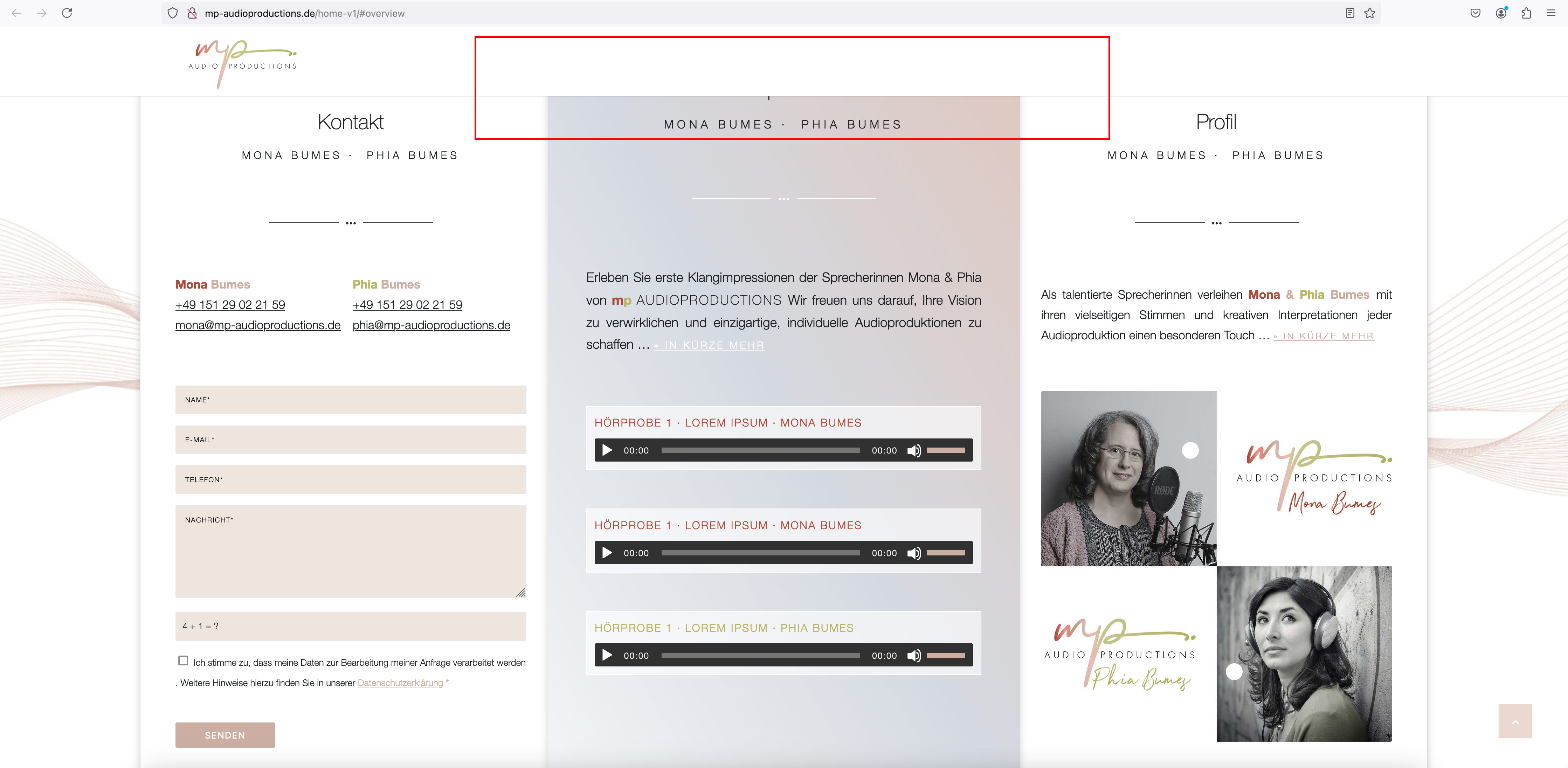
Thanks for the tip. I followed your suggestion and added another color section (with the fixed background image) above it: see screenshot: https://mp-audioproductions.de/support/overview-section.jpg
In the frontend, however, a part is still hidden when jumping to the section: https://mp-audioproductions.de/home-v1/#overview
See also screenshot: https://mp-audioproductions.de/support/frontend.jpg
—-
Somehow everything always disappears behind the header, even though it is shown as non-transparent.
I also had to add several “free space” elements (each 50px > 200px in total) to the Enter section at the top (where it says “Welcome”) so that the heading doesn’t disappear behind the header: see screenshot: https://mp-audioproductions.de/support/leerraum.jpg
Is there perhaps a better solution for this?
Best regards, Diana
hier oben : https://kriesi.at/support/topic/logo-springt/#post-1469978
sieht Du ja das da eine margin-left drin ist. Bei der Screenweite jedoch macht es keinen Sinn.
wenn du lieber über die gesamten Breiten den Batch gleich groß haben möchtest:
(also dann den margin-left weg und doch eine absolute Größe definieren.
#top .ideen-batch svg, #top .ideen-batch .avia_image {
  width: 200px !important;
}
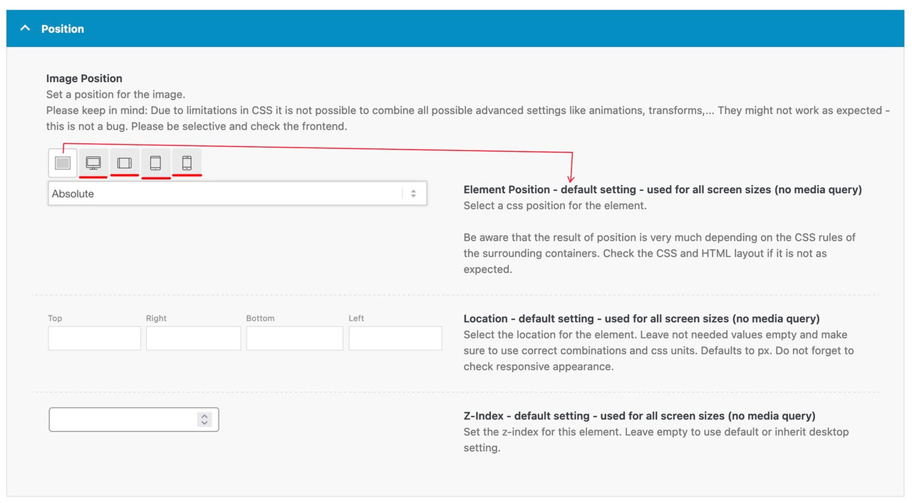
They are part of these settings, as ismael mentioned. These 4 icons (underlined in red) give you settings for different screen widths. There is some explanatory text on the right. The only thing I set as a default is whether absolute or relative positioning is selected. I then set the values for the individual widths.
f.e. on this demo page here (the three columns with that special ampersand) : https://kriesi.at/themes/enfold-parallax/
it will make no sense for mobile view that the columns do overlap and move that parallax way. So these settings are not the same as for the desktop version.
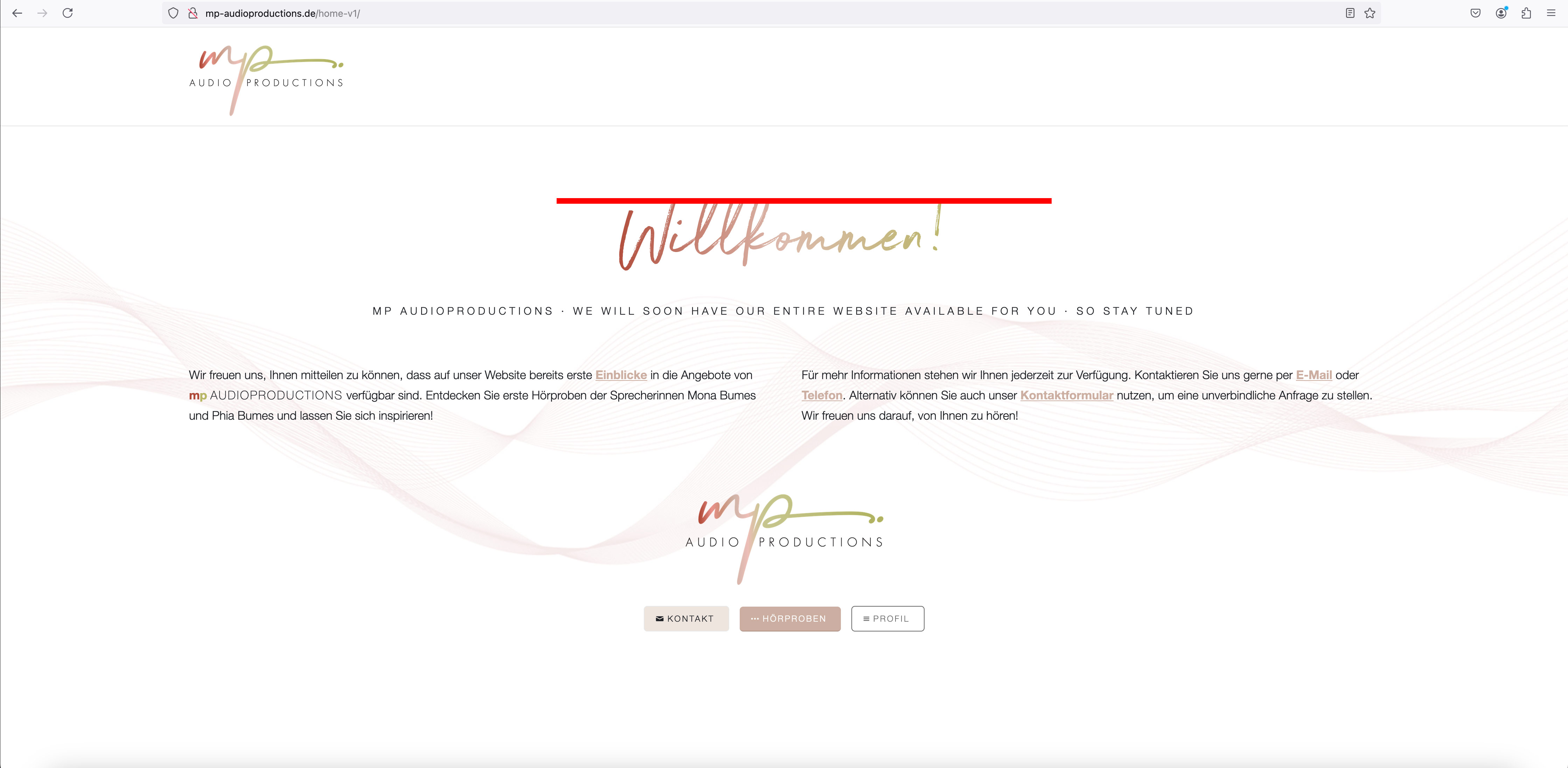
Dear Support Team
On the following website I use a headline with a color gradient called “Welcome” at the top: http://mp-audioproductions.de/home-v1/
Unfortunately, the headline is cut off at the top and it is inexplicable to me why: see screenshot: http://mp-audioproductions.de/support/heading.jpg
In the CSS I have inserted the following Css for this heading:
h6 {
font-weight: 400 !important;
letter-spacing: 0.01em !important;
background: linear-gradient(to right, #b04938, #ddbbae, #b8b665);
-webkit-background-clip: text;
-webkit-text-fill-color: transparent;
}
(I took the templates for this from one of your support threads: https://kriesi.at/support/topic/gradients-buttons-and-text/)
Could you please help me?
Best regards, Diana
thank you Ismael, i got the point with the licence.
i tried to fix the issues with my website and resolved the logo / header bug
nevertheless, i still have instability with the superior color section that is a top of the pages .; 2 pages of the website are always disabling the chosen colors and become “white” for no reasons … the landing page is fine, the contact page is fine but oddly these pages were ok yesterday and this morning are again with the color section white (i thought i found the solution by clearing the cache with hummingbird but it doesnt work this morning)
by the way, the color section at the bottom of the pages are also bugging
please not that some the modification made in some sections of these pages have not been made despite my multiple udpates yesterday, everything was fine yesterday but this morning half of my modification disappeared (change colors of some sections).
do you think it comes from enfold or from the data base ? i feel there is an update and cache problem (some troubles happened with the library where i need to remove lot of double images and eventually re import most of the pictures.
Hi Rikard,
the subpage pasted in private link was not a good example :-(
Please see new link.
As you can see, the couple in the mobile view is at the top left of the picture. You can mainly see the seat basket.
I would now like the couple to be more central again – as it is in the desktop view in the picture.
That’s why I thought i could use object-position to align the image accordingly.
Of course, I could manually adjust the ‘left’ value for each image in each slider. But that is too complicated.
Hope my intention is more clear now :-)
Kind regards
Bernd
Kind regards
Hi,
We replied here: https://kriesi.at/support/topic/update-11/#post-1470071
You can continue the discussion here or in the previous thread.
Best regards,
Ismael
Hey amandahook62,
Thank you for the inquiry.
Have you tried adjusting the Row Settings > Row Margin > Custom Top and Bottom Margin settings for mobile view or smaller screens? You can toggle the device icons to specify different margins for different screen sizes.
Best regards,
Ismael
Hey whdsolutions,
Thank you for the inquiry.
This css code hides the basket or cart icon:
.menu-item {
    display: none;
}
It’s from the plugin “hide-prices-private-store”. Try to override it with this code:
@media only screen and (max-width: 767px) {
    /* Add your Mobile Styles here */
    .responsive #top .cart_dropdown {
        display: block;
    }
}
Best regards,
Ismael
Hi,
Thank you for the update.
We adjusted the css a bit so that it only applies on desktop view. Please make sure to purge the cache or remove the browser history before checking.
@media only screen and (min-width: 768px) {
	/* Add your Desktop Styles here */
	#top #wrap_all .all_colors .av-masonry-entry h3 {
		color: #fff;
	}

	#top
		.av-caption-style-overlay
		.av-masonry-item-with-image
		.av-inner-masonry-content {
		background: rgba(0, 0, 0, 0.35);
		-webkit-backdrop-filter: blur(3px);
		backdrop-filter: blur(3px);
	}
}
Best regards,
Ismael
Hi,
Thank you for the update.
How could I indicate center alignment only to Text Caption?
Try adding this css code:
#top .avia-slideshow .av-slideshow-caption.av-m2fnm33t-7194a2c2891f3e7874849bd5c29c844f__0 .avia-caption-content p {
    text-align: center;
}
If you have any additional questions at this time we kindly ask that you open them up in a separate thread. The longer threads get in the forum, they become more difficult to support as they tend to drift off topic and they also make it troublesome for users trying to search for solutions. Keeping threads relevant to their original inquiry ensures that we can keep better track of what has been resolved and that users can more effectively find answers to similar issues they might be experiencing.
Thanks!
Best regards,
Ismael
Hi Im following this thread https://kriesi.at/support/topic/icon-boxes-not-equal-height-2/ I have multiple pages with different height icon boxes. I put in this code but it only works for the icons on my first page
@media only screen and (max-width: 767px) {
.iconbox_top .iconbox_content {
min-height: 300px;
}
}
How do I taget the icons on my other pages? I need 2 addtional min heights.
Hi, on my desktop site I added Image Position to -100 so it overlaps the top of the columns. ON mobile though it doesn’t look great. Do you know how I would fix this for mobile tablet view?
Thank you Ismael, it’s done.
Regarding <p> style and Fullscreen Slider text caption, I need some orientation. If open a new thread whith this subject, let me know.
I need typography for <p> element be justify aligned by default. I looked for an option into Enfold Settings and couldn’t find Text Alagnment attribute neither on General Styles / Tipography nor on Advanced Styles. So I’m using this CSS code:
p, li {
text-align: justify;
}
It works fine. However, when I center Caption into a Fullscreen Slider, only Caption Title takes centered alignment, but Caption Text does not. I tried adding add html <p style=”text-align: center;> element into caption text field, but the complete page breaks, so this was not a solution.
How could I indicate center alignment only to Text Caption?
As always, thanks in advance. If I have to open a different thread for this topic, let me know.
Best regards.
Still doesn’t show the image after clearing phone cache. Have re-loaded the page multiple times.
I turned on Remote Debug for Android devices and inspected the page via Dev Tools – https://imgur.com/gallery/debug-dQTFKAs.
As you can see the phone is still trying to load the 495×279.jpg file, which no longer exists.
A similar problem existed on the next day’s page. Android was trying to load the 495px images of the top two photos. So, I re-uploaded both of those photos and edited the page to load these new images.
The original image is FULL. As 495px is no longer allowed, just 4 thumbnails were created as below.
FULL (700×394)
MEDIUM (300×169)
SQUARE (180×101)
LEAFLET (150×84)
THUMBNAIL (80×45)
Screen capture of Uploads – https://imgur.com/gallery/files-GSxY4FP
So forget about the 495 px image above, here’s the crux of the issue – I’d like to understand if this is correct behaviour or if there’s a problem with the image size being loaded by Android. My phone is a OnePlus 5, 5.5-inch display with a resolution of 1920×1080 pixels, the same pixel resolution as my desktop screen. As stated before, my desktop screen only ever shows the 180px image.
The new img code for the re-uploaded images lists all 5 image sizes above.
<img decoding="async" aria-describedby="caption-attachment-14027" class="wp-image-14027 size-square" src="https://www.americanroadtrips.net/wp-content/uploads/2024/10/Hotel-Nevada-2-180x101.jpg" alt="Hotel Nevada #2" width="180" height="101" srcset="https://www.americanroadtrips.net/wp-content/uploads/2024/10/Hotel-Nevada-2-180x101.jpg 180w, https://www.americanroadtrips.net/wp-content/uploads/2024/10/Hotel-Nevada-2-300x169.jpg 300w, https://www.americanroadtrips.net/wp-content/uploads/2024/10/Hotel-Nevada-2-80x45.jpg 80w, https://www.americanroadtrips.net/wp-content/uploads/2024/10/Hotel-Nevada-2-150x84.jpg 150w, https://www.americanroadtrips.net/wp-content/uploads/2024/10/Hotel-Nevada-2.jpg 700w" sizes="(max-width: 180px) 100vw, 180px">
#1 – The page specifies to display the Square thumbnail at 180px wide: if I am stating I want a 180 px image to display, why does srcset list the Medium and Full image sizes as options when these are larger than what the page code specifies? (i.e. how does srcset work? I wouldn’t have expected it to include larger image sizes than specified)
#2 – Remote Debug for Android says (I think) that the image actually being loaded on Android (the Intrinsic Size) is the Full size image, 700x394px at 35kB, and not any of the smaller thumbnails. Why is Android loading the Full size image (and not Square) – or am I incorrectly interpreting Remote Debug?
Hey Jak73,
Try this CSS in your Enfold Theme Options ▸ General Styling ▸ Quick CSS field:
#scroll-top-link {
	display: none;
}
Best regards,
Mike
Hello there,
I have integrated an image with the full-screen Easy Slider on a website.
Mobile this has a minimum height of 430px.
As the image is now naturally wider than the mobile viewport, Enfold always shifts the image with “left: -410.667px”.
I would now like to adjust the alignment similar to the fullwidth slider, e.g. with top centre. Unfortunately, all attempts in the dev tools to adjust the img element with object-position did not work.
What other way is there to align the image in the slider elements?
Kind regards
Bernd
du hast es noch auf bild mittig!
und auf Grund der Setzung der allgemeinen svg weite, müssen wir hierfür dann selectiver werden:
#top .ideen-batch svg,
#top .ideen-batch .avia_image {
  width:20vw !important;
  margin-left:10vw
}
Hi,
Did you read my reply earlier in this thread? 403 error means that the server is not allowing the action, we cannot fix this for you. You need to reach out to your hosting provider for further help.
Best regards,
Rikard
Hi,
Thanks for the update. Please let us know if you should need any further help on the topic, or if we can close it.
Thanks @guenni007 for helping out :-)
Best regards,
Rikard
Hi,
Thanks for the update. Please let us know if you should need any further help on the topic, or if we can close it.
Best regards,
Rikard
Wenn Du selektiver ( und nicht bei allen masonries ) das ändern möchtest musst du eventuell mit custom classes arbeiten.
ja – du könntest den dunklen overlay dunkler machen, oder du entscheidest dich – das Bild bei hover zu soften:
_______
If you want to change this more selectively (and not for all masonries), you may need to work with custom classes.
Yes – you could make the dark overlay darker, or you could decide to soften the image on hover:
#top #wrap_all .all_colors .av-masonry-entry h3 {
  color: #FFF;
}

#top .av-caption-style-overlay .av-masonry-item-with-image .av-inner-masonry-content {
  background: rgba(0,0,0,.35);
  -webkit-backdrop-filter: blur(3px);
  backdrop-filter: blur(3px);
}