Hi,
It looks like you did not add the css above, or you have an error before the css above so it is not working correctly, nonetheless I tested it and found that some extra css is needed to line up the search in the header before and after scroll, this is the css I tested:
#top .header_color input[type='search'],
.dgwt-wcas-search-wrapp .dgwt-wcas-sf-wrapp .dgwt-wcas-search-submit {
	margin-top: -10px;
}
#top .header_color.header-scrolled input[type='search'],
#top .header_color.header-scrolled .dgwt-wcas-search-wrapp .dgwt-wcas-sf-wrapp .dgwt-wcas-search-submit {
	margin-top: -49px;
	padding: 0;
}
/* Fra Fibiosearch  support 9 nov 2023. */
/* Overriding default Enfold code. */
.menu-item .dgwt-wcas-search-wrapp {
  opacity: 1 !important;
  display: block !important;
}

.dgwt-wcas-search-input {
  margin-bottom: 0 !important;
}

.menu-item .dgwt-wcas-search-form {
  margin-bottom: 0 !important;
}

/* Search field. */
#menu-item-3327 {
  height: 90px;
  display: flex;
  align-items: center;
}

/* Search field. 6 nov Joachim. */
#top .header_color .input-text, #top .header_color input[type='text'], #top .header_color input[type='input'], #top .header_color input[type='password'], #top .header_color input[type='email'], #top .header_color input[type='number'], #top .header_color input[type='url'], #top .header_color input[type='tel'], #top .header_color input[type='search'], #top .header_color textarea, #top .header_color select {
    border: 1px solid lightgrey;
    background: white;
}

/* Search button. 6 Nov Joachim. */
.dgwt-wcas-search-wrapp .dgwt-wcas-sf-wrapp .dgwt-wcas-search-submit, .dgwt-wcas-om-bar .dgwt-wcas-om-return {
    background-color: #f7f7f7;
    color: #0f0f0f;
    border-top: 1px solid lightgrey;
    border-right: 1px solid lightgrey;
    border-bottom: 1px solid lightgrey;
}
and this is the result before scroll:

this is after scroll:

Best regards,
Mike
Hi
Thank you for leaving the thread open.
The whole process stopped up with FiboSearch. As I forgot to reply to their message when trying to figure out why the search was slow.
I have added FiboSearch to another site: https://industrihuset.no/
I transferred the same settings from the first site to the second site, but either I forgot something to transfer over or I have to add additional CSS to Enfold as the search bar is there for a second before it disappears perhaps behind the menu. I also will need to move the search bar down to align it with the rest of the menu.
Do you have some advice on this? Thank you.
Hello!
I customized Enfold to create my site (see private content). Is there a way to get the overlapping block effect seen in the Parallax Theme without switching themes completely: https://kriesi.at/themes/enfold-parallax/
I’m particularly interested in how the “get in touch” form overlays on top of the image.
Thank you!
Now to Montserrat. If you download the font from Google : you have inside the zip file the variable font files and those static font files and indeed the internal Font Name is: Montserrat thin.
if you look at : https://caniuse.com/variable-fonts you see that it is now quite possible to work with variable fonts. Whether you need all these features – and Montserrat is one of these lavishly equipped variable fonts – is up to you to decide. If only a few fonts (300, 400, 700) are needed on the website, I think it is better to use the static fonts.
And comparing the difference between normal and italic Font it seems there will be no big difference on browser rendered italic font and embedded italic font. So it might be enough to use only those static font files.
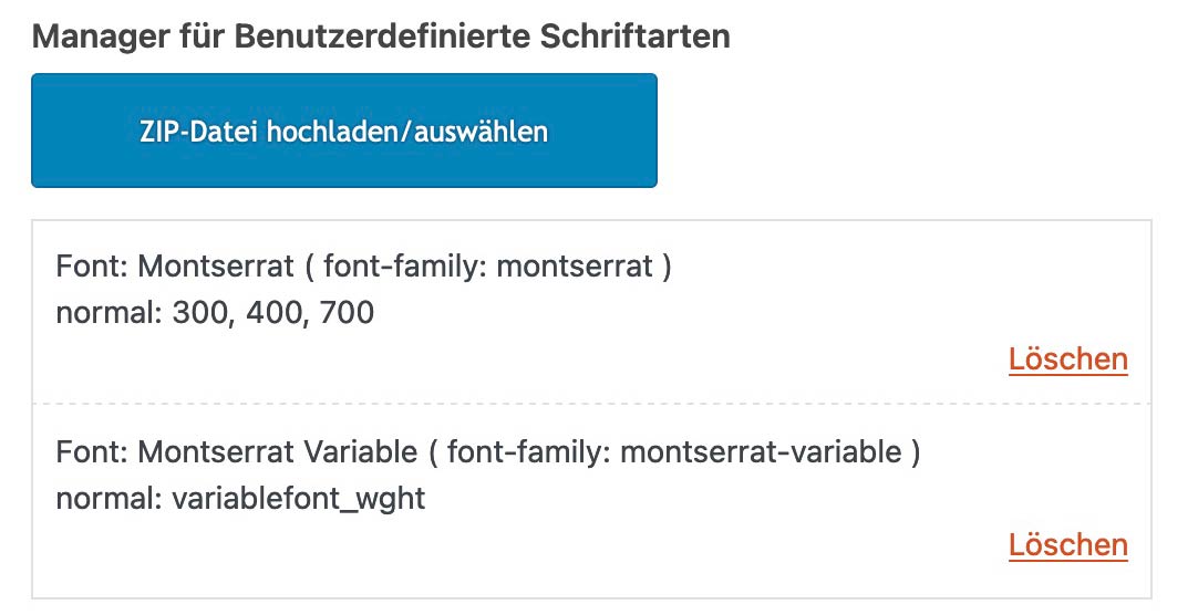
Here are both zip files prepared to upload to enfold font manager:
( all will have ttf and woff2 inside – that will be enough for all browsers (ttf as fallback if there are very old browsers only on users desktop installation))
- Montserrat varible: Link
- Montserrat static: Link
on Font Manager it will look like this ( choose or use both with this https://kriesi.at/documentation/enfold/typography/#using-variable-fonts )
besides that on inspecting your page – i see some errors in your css:
see these rules for:
- #top .main_color .grid-entry-title.entry-title
- .avia-fullwidth-portfolio .sort_width_container
- .avia-tooltip
they have two closing curly brackets
Thanks – do I add the custom class like this?
iconpadding. #top .av-iconlist-small li {
padding: 10px 0;
}
and than add the class iconpadding to the element?
This reply has been marked as private.
Hi,
Please try the following in Quick CSS under Enfold->General Styling:
html {
  border-top: 8px solid red;
}
Best regards,
Rikard
I would like to use the functionality of the fullwidth sub menu on a color section. I want to have a color section stick to the top of the browser after the element is seen and touches the top of the browser, like the fullwidth sub menu. I have included the link and un/pw to the page I am working on in the private section. Can you help me add this functionality to the purple section that has the arrival, departure, bedrooms, etc quick search?
Hey ibuzaev,
Try this CSS in your Enfold Theme Options ▸ General Styling ▸ Quick CSS field:
#top #main a:where(:not(.wp-element-button,.avia-button)) {
    text-decoration: underline;
}
Best regards,
Mike
In the Enfold Theme Options and the Extra Elements of the HEADER section, one of the options is:
Header Phone Number/Extra Info
Choose if you want to display an additional phone number or some extra info in your header
I have selected “Display in the Top Bar at the left”
I have left the phone number field blank.
This creates a small colored bar above the logo/menu section.
I don’t want any info in the bar, I just want the colored bar but I want it to be only 8 pixels tall.
If there is another way to do that, I’d be open to knowing how.
Thank you for any help you can give.
Hey Thumphreys,
You have an open media query in Quick CSS:
.logo img {
    top: 50%;
    transform: translateY(-50%);
}
@media only screen and (min-width: 768px) and (max-width: 989px) {
    .responsive .logo img {
        margin: 0;
        display: none;
    }
#top div .caption_center .slideshow_caption {
    left: 0;
    width: 100%;
    text-align: center;
    font-size: 35px;
}
That is likely why the theme options are not applying.
Best regards,
Rikard
These didn’t work for me – so I tried this and for somw reasoon adding it puts the sidebar on the top of the page on desktop also :-(
@media only screen and (max-width:767px) {
.responsive #top.woocommerce-page #main .sidebar {
display: block;
border-color: transparent;
margin-top: -30px;
margin-bottom: -60px; }
}
.responsive #top.woocommerce-page #main .sidebar .inner_sidebar {
margin-left: 0 !important;
}
.responsive #top.woocommerce-page #wrap_all .container_wrap_first .container {
display: flex;
flex-direction: column-reverse;
}
}
@media only screen and (max-width: 767px) {
.responsive #top .container .av-content-small, .responsive #top #wrap_all .flex_column, .responsive #top #wrap_all .av-flex-cells .no_margin {
margin: 0;
margin-bottom: 20px;
width: 100%;
}
}
@media only screen and (max-width: 767px) {
.responsive #top .container .av-content-small, .responsive #top #wrap_all .flex_column, .responsive #top #wrap_all .av-flex-cells .no_margin {
padding: 50px 0px 0px 0px;
}
}
Hey michelebond,
I can’t see that happening on my end, the excerpt shows on mobile just like on desktop. Could you let us know how to reproduce the results that you are seeing on your end please?
Best regards,
Rikard
Thank you but you did not say anything about the buttons, the green button in desktop, in mobile is clear grey, what about that?
Hi,
Thank you for following up.
Can the hamburger menu also be displayed on the right side
You can add this css code to move the burger menu to the right.
.responsive #top .av-main-nav .menu-item-avia-special {
        float: right;
}
Make sure to place this modification inside this css media query:
@media only screen and (max-width: 767px) {
     /* Add your Mobile Styles here */
}
Best regards,
Ismael
Hello Enfold team,
***Issue 1***
I’m having a hard time trying to apply some simple styling changes to a website I manage.
Using Advanced Styling, I can’t…
– Change <p> styling for all <p> tags. Whatever I change here does not apply to the website.
– Change <body> styling for all <body> tags. Whatever I change here does not apply to the website.
– Change text transform for <H2> tags. Whatever I change here does not apply to the website.
For example, using Advanced Styling, I set:
<p> – Change the styling for all <p> tags
Font Size 21px
Line Height 1.5em
Yet all text blocks using paragraph text formatting on my site DO NOT use these settings. I’m having to set each text block text size manually to achieve the desired result, which is an annoying and time-consuming approach and workaround that isn’t a sustainable approach for managing the website.
I’ve also set:
H2 – Change the styling for your H2 Tag
Text Transform: NONE
And yet ALL my H2 tags across the site are still capitalised, which looks bad. I need these to be Normal case. I don’t know what’s going on. Advanced Styling seems to be all over the place and a complete mess on this site. Why? Even setting “All Headings (H1-H6) – Change the styling for all Heading tags” text transform to NONE or LOWERCASE doesn’t change anything.
I really need some insight into what’s going on here; thank you.
***Issue 2***
I would also like to know how to set the text transform for all avia-caption-title tags for my slideshow elements at once. Currently, I’m having to do Quick CSS like the below for each individual slideshow on the site – which seems like a poor solution:
#top #wrap_all .avia-slideshow .av-slideshow-caption.av-lynrrnic-2807a30891cbcdbcb963567175d45a9b__0 .avia-caption-title {
font-size: 80px;
text-transform: none;
}
Thanks,
Tom
-
This topic was modified 1 year, 4 months ago by
 Thumphreys.
Hey Ismael. Sorry for my late reply. But I found out that the problem might have to do with the Rankmath plugin, although I’m not sure. The following happened:
I’ve duplicated the homepage, like you said. After that I was able to edit the duplicate, but still not the original homepage. I then changed the WordPress title ‘Home’ of my original homepage into ‘Home2’ and changed the slug into ‘home2’. After that I changed the title of the duplicate homepage ‘Home (copy)’ into ‘Home’ and changed the slug to ‘home’ and I published the page.
First I got a notification in WordPress backend from Rankmath that a slug was changed and that I could set a new redirection. I deleted my original homepage and deleted the redirection, associated with that old homepage, in Rankmath. It didn’t go smooth. I can’t recall exactly, but the notification kept coming, although I clicked it away. After that I checked the title and slug from the new homepage again and everything seemed fine.
I now CAN edit the new homepage, but when viewing my homepage in a browser I get a critical error: “There has been a critical error on this website.” The only solution is disabling Rankmath, then the homepage works fine again. I only have a few plugins. I have deactivated all and then reactivated each one individually. Only Rankmath gave this critical error.
I don’t understand what went wrong. I’ve used Rankmath (free) without problems for two months, but now it suddenly causes a critical error. Somehow I think I messed up with changing slugs or redirections, but I don’t know how. But there’s also the weird problem that started it all: not being able to edit the original homepage, but being able to edit the duplicate.
Because the problem now seems to be related to Rankmath, I have contacted their Support. So I sent them the error log and I’m waiting for their reply. I will come back to you when I have more answers. Could you keep this topic open for now please?
I want to make the top bar above the main menu 8 pixels tall, with no type, phone numbers or icons inside.
Any help would be gratefully received.
Hello, For some reason on my blog page on mobile it shows the full blow and not the preview grid like desktop. Any clue why this is?
Sure I have, all three options. I want to use Modern Header though.
The problem is due to I’m using CSS code to justify all <p> elements, because alignment is not part of typography settings nor the Advanced Styles. So, I needed to add the following custom CSS:
p, li {
text-align: justify;
}
When I block this instruction by commenting it, center alignment in subheading works well. Nevertheless, I would like to have both styles working together.
Is there any CSS code that could be applied to Avia elements to get this? The one you suggested me for slider caption works very well (#top .avia-slideshow .av-slideshow-caption.av-m2fnm33t-7194a2c2891f3e7874849bd5c29c844f__0 .avia-caption-content p { text-align: center; })
See the first column at https://franco.integracionwebmx.com/contacto/#mapas
Best regards.
-
This reply was modified 1 year, 4 months ago by
 ezimbron.
-
This reply was modified 1 year, 4 months ago by ezimbron.
Hi,
Thanks for the update. Please let us know if you should need any further help on the topic, or if we can close it.
Best regards,
Rikard
How do I attach a screenshot? I don’t see an option for this.
I am talking about the magnifying glass icon that is used for searching.
When my browser window is large, there is a magnifying glass next to the main menu.
When my browser is medium (I’d assume for tablets), there is a burger menu that when opened does NOT show this magnifying glass
When my browser is small (I’d assume for phones), there is a burger menu that when opened does show the magnifying glass at the top.
Until I figure out how to attach a screenshot, just goto the website I provided, and look at the site with the browser window wide enough to show the full main menu (not the burger)–you’ll notice that there is a magnifying glass next to the main menu. Then shrink it horizontally until the burger menu appears . . .then click the burger…you’ll notice that there is no magnifying glass. Then continue to shrink the browser window horizontally until you notice that a magnifying glass DOES appear at the top of the menu (next to the X that closes the burger menu).
ADULT CONTENT
When I placed orders, the confirmations go directly to my Junk Mail. How can we stop this from happening?
Hey michelebond,
Thank you for the inquiry.
Did you set the Styling > General Styling > List Styling settings to Minimal small list? Please try to reset it to default, or add this css code:
#top .av-iconlist-small li {
    padding: 10px 0;
}
Best regards,
Ismael
Hi,
Thank you for the update.
Please include this css code to adjust the color of the date and categories:
#top .news-content .news-link a, #top .news-content .news-time {
    color: #ffffff;
}
Best regards,
Ismael
Hi,
Thanks for the update. Please let us know if you should need any further help on the topic, or if we can close it.
Best regards,
Rikard
Hello I found some code on this thread https://kriesi.at/support/topic/how-do-i-change-the-button-and-font-color-of-submit-button-in-contact-form/ to change the contact form button color. How would I also change the button hover color?
.main_color #submit, .main_color input[type=submit]{
background-color: red!important;
color: #fff!important;
border-color: red!important;
}
Hi,
My flipbox grid displays images correctly in Chrome desktop. Screenshot:

But it displays only the text without images in Safari and all mobile browsers. Screenshots:


The other difference is that it displays correctly in a browser where I’m logged into my WordPress account, but not in browsers where I’m not. Any idea what causes this?
Thanks
http://www.isaacsbbq.cz/domu
You have a ruleset on your css that is causing the issue.
.html_header_top.html_header_sticky #top #wrap_all #main {
  padding-top: 0px !important;
}