Hi!
@guenn007i: I think he’s using the default editor.
Enfold Child > Blog Layout > Blog Layout > Use Advanced Layout Editor to build your own (but I cannot use ALE once I’m in there because I use the ALE for my Pages, so I’m forced to use the Default Editor for each post . . . I still do not understand why I cannot use ALE on both, but I know that it breaks something)
// https://kriesi.at/support/topic/append-all-blog-posts-with-updated-mm-dd-yyyy/#post-1470539
Regards,
Ismael
Hi I have a question about Enfold accordeon. On mobile, while clicking one of the lower buttons, the page jumps back up all the way to the top. What do I do?
For clarification: this only happens when you get to the lower buttons of the accordeon.
Hi,
Thank you for the update.
You can add this css code to remove the bottom margin of the logo:
@media only screen and (max-width: 767px) {
    /* Add your Mobile Styles here */
    #top .logo, #top .logo a {
        margin-bottom: 0 !important;
    }
}
Best regards,
Ismael
Hi,
Thank you for the inquiry.
You can use this css code to move the button up closer to the header:
@media only screen and (min-width: 768px) {
	/* Add your Desktop Styles here */
	#top .avia-button-wrap.av-232tvi-166076b32a0c965820e82261d552fa95-wrap {
		top: -150px;
		position: relative;
	}
}
Best regards,
Ismael
Rikard,
I tried as you suggested and it worked. However, the mobile version has too much white space between the logo and first section of content. Is there CSS that will take care of that issue on mobile while maintaining the desktop version? This is the custom CSS I currently have. Thanks!
#top .logo,
#top .logo a {
overflow: visible;
}
/* Subtext styling */
.logo .subtext h1 {
font-size: 13px;
font-weight: 600;
}
.logo .subtext {
z-index: 999;
}
/* Reduce the logo height to make space for the subtext below */
#top #header .logo img {
max-height: 65%!important;
margin-top: 10px;
margin-bottom: 12px;
}
/* OPTIONAL CHOICE : Change position of subtext when scrolled */
#top #header.header-scrolled .logo img {
max-height: 100%!important;
}
#top #header.header-scrolled .logo .subtext {
position: absolute;
top: 50%;
right: 0;
transform: translate(120%, -50%);
}
UPDATE:
Sorry for the messages, but I keep messing with it and almost got there.
See home page or and attached screen shots.
The “BECOME A DEALER” look perfect on Mobile view, but it is too low on Desktop view. How do I move it up on desktop view only, so that it sits right below the menu/logo, like it is on mobile view. Without messing with mobile view.
thanks!
-
This reply was modified 1 year, 4 months ago by
 bemodesign.
I had to remove the top menu because the wording was stacked. I am now using a button on the home page.
See home page or and attached screen shots.
The “BECOME A DEALER” look perfect on Mobile view, but it is too low on Desktop view. How do I move it up on desktop view only, so that it sits right below the menu/logo, like it is on mobile view. Without messing with mobile view.
thanks!
-
This reply was modified 1 year, 4 months ago by bemodesign.
-
This reply was modified 1 year, 4 months ago by bemodesign.
UPDATE:
See home page or and attached screen shots.
The “BECOME A DEALER” look perfect on Mobile view, but it is too low on Desktop view. How do I move it up on desktop view only, so that it sits right below the menu/logo, like it is on mobile view. Without messing with mobile view.
thanks!
-
This reply was modified 1 year, 4 months ago by bemodesign.
Hey Peter,
Try this CSS in your Enfold Theme Options ▸ General Styling ▸ Quick CSS field:
#top #main a:hover:where(:not(.wp-element-button,.avia-button)) {
    text-decoration: underline;
}
Please ensure to copy the code from the forum and not an email notification so the symbols are not converted.
After applying the css, please clear your browser cache and check.
Best regards,
Mike
Can you please help me figure out why the text link wording is stacked instead of normal “BECOME A DEALER”. I tried removing CSS and it stll didn’t work. It also cuts cutoff on Mobile view.
thanks
Hi,
I got some great help from you for a similar question I had the other day (but in that case it was with respect to the Secondary Menu at the top of the page).
My question this time …
Can you please post the CSS code snippet I need so that links I include in Anchor Tool CONTENT get underlined when hovered over?
Thanks!
Peter
Hey IW,
The update to 6.0.6 has to be done manually from the version you are running, please refer to my replies in this thread: https://kriesi.at/support/topic/enfold-4-5-theme-update-update-failed-download-failed-a-valid-url-was-not-pro/#post-1021541
You can either update manually via FTP: https://kriesi.at/documentation/enfold/how-to-install-enfold-theme/#theme-update, or upload the theme as if it was new under Appearance->Themes->Add New Theme.
If that doesn’t work then please try to delete the whole theme folder, then replace it with the new version. Make sure that you have backups of the site before starting updating.
Also please read this after you have updated: https://kriesi.at/documentation/enfold/
Best regards,
Rikard
Hi,
Thanks for the update. Please let us know if you should need any further help on the topic, or if we can close it.
Best regards,
Rikard
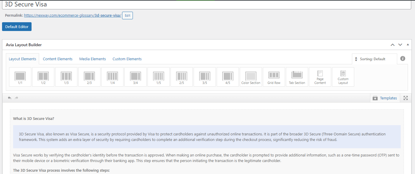
Hello,
This page use Advanced Layout Builder as you can see at the top of the screenshoot. We only use one text block for the moment.
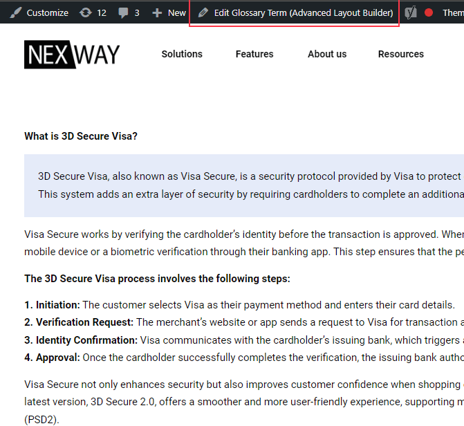
https://cdn.static.nexway.com/i/emailing2024/Nexway/nurturing/OutboundLeads-9/blocs.gif
Hi,
If you’re using the Upcoming Events Dountdown element, please note that this element can display only the original event, not recurring events.
As mentioned above, this is the intended behavior but you can try the filter that another user suggested in order to adjust the upcoming events query.
add_filter('avia_tribe_events_upcoming', 'fcfc_upcoming_events_query_fix', 10, 2);

function fcfc_upcoming_events_query_fix($query, $params) {
    $query['ends_after'] = 'now';
    $query['start_date'] = null;
    return $query;
}
Thread: https://kriesi.at/support/topic/upcoming-events-shortcode-not-showing-events-that-have-a-valid-date-range/#post-1470477
Best regards,
Ismael
Hi,
Thank you for the update.
The value “iconpadding” is used as the ID attribute instead of class name. Try to use this css code:
#top #iconpadding .av-iconlist-small li {
   padding: 10px 0;
}
If you want to use it as a class name, move “iconpadding” to the Custom CSS Class field, then use this css:
#top .iconpadding .av-iconlist-small li {
   padding: 10px 0;
}
Best regards,
Ismael
Thank you. I found the solution here:
Can you let me know why my top bar “Become a Dealer” has stacked wording? See screenshots. It shows correct for a second on desktop and then stacks the wording. I thought is was some current CSS code but removed it and it still didn’t format correctly.
And on Mobile view, it is Cut off at the top, and I also need option to have it centered.
Let me know please.
Thanks!
Hi,
I am looking for guidance; I have a homepage with links to blog pages displaying category posts.
However, I have two sets of users using the site.
For Example, I have 16 Categories.
Customer A has access to all Category links on the homepage.
Customer B only has access to ten category links on the home page.
So, can I hide some elements on the homepage depending on the User login role?
Also, on a side note, how do I have the Howdy on the top right of the page?
Thanks in advance.
Hi,
Thanks for the update and for using Enfold :-)
Please let us know if you should need any further help on the topic, or if we can close it.
Best regards,
Rikard
Hi,
Great, I’m glad that Ismael could help you out. Please let us know if you should need any further help on the topic, or if we can close it.
Best regards,
Rikard
if you only got these projects as portfolio files – yes:
(otherwise if there are different portfolios – the item ID 44 will do that too. – then we had to find a more complex way.
#top.single-portfolio li#menu-item-44 .avia-menu-text {
  font-weight: 800;
}
PS: i recommend doing that: https://kriesi.at/support/topic/keep-menu-item-bold/#post-1470571
because : too many fonts are loaded (on team page). This is not necessary for performance reasons – you have everything you need if the variable font works correctly.
https://kriesi.at/support/topic/menu-on-one-page-is-bolder/
???
der variable font den du jetzt hast arbeitet doch korrekt!
War es damit nicht gelöst?
Du hattest wohl offensichtlich bei der Erstellung des Templates die Schrift mit ausgewählt. Mein Rat war es dort auf default (nutze die Themenschrift) zu lassen. Durch das Nachladen der Montserrat Schrift nur auf dieser Seite (und dort wurde der bold font mitgeladen) erschien dann nur dort auf der Seite die Schrift im Menü bold. Auf den anderen Seiten wurde diese Schrift nicht nachgeladen, weshalb nur die Montserrat light zur Verfügung stand.
Meine Empfehlung deshalb war: im Plugin die Standard Schrift nutzen ( welche dann eine sauber konfigurierte Montserrat des Systemes wäre )
Und die Montserrat vernünftig zippen, und hochladen.
_____________
Wasn’t that the solution?
You had obviously selected the font when you created the template. My advice was to leave it at default (use the theme font). By reloading the Montserrat font only on this page (and the bold font was also loaded there), the font then only appeared there on the page in the bold menu. This font was not loaded on the other pages, which is why only the Montserrat light font was available.
My recommendation was therefore: use the standard font in the plugin (which would then be a cleanly configured Montserrat of the system)
And zip the Montserrat properly and upload it.
Hi Ismael,
Unfortunately, we’re currently using the free version of the plugin, so shortcodes aren’t available to us:
Currently, we’re using the “upcoming events” element under the “plugin additions” tab. This works perfectly with a default theme, but we’re experiencing issues when using it with the Enfold theme.
I found as wenn this thread. Maybe it helps:
Could you help us with this problem?
Thanks in advance for your assistance!
Best regards,
Alisa
Thank you Ismael. This topic can be closed for now.
Hi,
Thank you for the update.
Question: I would like to set up the links on my Secondary Menu to be such that when someone hovers on them, the link word gets underlined (and thus the user can easily see that these ARE links).
You can add this css code to underline the menu items on hover:
#top #header_meta a:hover {
    text-decoration: underline;
}
Best regards,
Ismael
Hi,
, the green button in desktop, i
The button is still green when we check it in mobile device emulation. Could you provide a screenshot? You can use platforms like Savvyify, Imgur, or Dropbox to upload and share the screenshot.
Best regards,
Ismael
Hey rixi,
Do you mean the form under “Nehmen Sie gerne Kontakt mit uns auf” if so try this css:
#top .main_color .input-text, #top .main_color input[type='text'], #top .main_color input[type='input'], #top .main_color input[type='password'], #top .main_color input[type='email'], #top .main_color input[type='number'], #top .main_color input[type='url'], #top .main_color input[type='tel'], #top .main_color input[type='search'], #top .main_color textarea, #top .main_color select {
font-family: 'open-sans';
font-weight: 700;
color: #000;
}
Best regards,
Mike
Hey Peter,
We can help make your sub-menu links underlined on hover for desktop, but when I check your site it is not loading correctly, this is what I see:

please check and once it is loading we can help.
Please note that mobile devices don’t have a “hover” event.
Best regards,
Mike