-
AuthorSearch Results
-
September 18, 2023 at 2:17 pm #1419472
Topic: Update License.
in forum Pre Sale QuestionsFazius
GuestHello,
I am new administrator of a website. Enfold is used as a theme there. Unfortunately it no longer works since the PHP update. Unfortunately I don’t see any way to update it and have no concat to old administrator.I also have no way of updating it via Themeforest.
How can I get the latest version of Enfold?
I See only in a config file: Envato_ID: 4519990.
Can you help?September 18, 2023 at 2:05 pm #1419471This reply has been marked as private.September 18, 2023 at 1:19 pm #1419467In reply to: Show only blog entries from ONE category
Hey solidt,
Thank you for the inquiry.
Are you referring to the Enfold > Blog Layout > Single Post Navigation? If so, then you can add this filter in the functions.php file to exclude items that are not in the same category.
/*
 * Single post navigation filter
 */
function avf_post_nav_settings_cb($settings)
{
	$settings['same_category'] = true;
        $settings['loop_post_nav'] = false;
        return $settings;
}
add_filter( 'avf_post_nav_settings', 'avf_post_nav_settings_cb', 10, 2);
Best regards,
IsmaelSeptember 18, 2023 at 1:05 pm #1419466In reply to: Number of social media icons
Hi,
Thank you for the update.
You can add or edit the team member social icons by adjusting the Add/Edit Social Service or Icon Links settings. If the social icon that you want to add is missing, you can use the Iconfont Manager to upload additional icons to the library. Please check the documentation below for more info.
// https://kriesi.at/documentation/enfold/icon/#adding-your-own-fontello-or-flaticon-icons-
Best regards,
IsmaelSeptember 18, 2023 at 11:49 am #1419462Hi,
To show the header inage as a background image for the header after scroll, I added this CSS in your Enfold Theme Options ▸ General Styling ▸ Quick CSS field:#top #header.av_header_sticky:not(.av_header_transparency) #header_main { background-image: url(https://wp-experten.com/wp-planer-consulting/wp-content/uploads/2023/09/planer-consulting-photovoltaik-anlagen-header-2.jpg); background-size: cover; background-repeat: no-repeat; background-position: top center; height: 100%; width: 100%; }please clear your browser cache and check.
Best regards,
MikeSeptember 18, 2023 at 5:22 am #1419445Hey!
You should be able to update the theme in the Enfold > Theme Updates panel, which will require your private or personal token. If you haven’t generated a private token yet, please check the documentation below.
// https://kriesi.at/documentation/enfold/theme-registration/#what-is-an-envato-personal-token
You can also update the theme manually via FTP. The latest version can be downloaded from your Themeforest account.
// https://kriesi.at/documentation/enfold/theme-update/#update-via-ftp
Cheers!
IsmaelSeptember 18, 2023 at 4:43 am #1419441Hi,
Athe slideshow is still not working properly until now. :(
Updating the theme from version 5.6.4 to version 5.6.6 might help. Please upgrade the theme to the latest version, then toggle or temporarily disable the Enfold > Performance > File Compression settings and purge the cache afterward.
Best regards,
IsmaelSeptember 17, 2023 at 10:46 pm #1419424Hi,
To add a screenshot please try using an Screenshot service and pasting the image URL in your post.
To center Olha Karpi on small screens

Try this CSS in your Enfold Theme Options ▸ General Styling ▸ Quick CSS field:@media only screen and (max-width: 425px) { #top #main .av-large-testimonial-slider .avia-testimonial-meta { display: flex; flex-direction: column; align-items: center; } }After applying the css, please clear your browser cache and check.

Best regards,
MikeSeptember 17, 2023 at 9:17 pm #1419418Hey yas28,
Do you mean that the titles don’t fit on a single line like this:

you can adjust the font size for mobile at styling ▸ font size and click the icon for the phone and then set the size you wish

To see a better display of your site for mobile when you are editing, try opening your site in another tab and use the Dev Tools Responsive Design Mode

Best regards,
MikeSeptember 17, 2023 at 9:05 pm #1419415In reply to: submenu buttons
Hi,
You can change the font size in the Enfold Theme Options ▸ Advanced Styling for menu items, but the flag is a very small icon, so you can’t make it larger.Best regards,
MikeSeptember 17, 2023 at 8:55 pm #1419406In reply to: Productpage
Hi,
I see that the image for your product “Complete Opleiding” was cropped even though the uploaded original image seems to be the same size as the others.
It also looked cropped in the product featured image of the backend, so I downloaded it and renamed it and uploaded it to your product again and then it looked correct in the featured image:

and now it looks correct on the frontend:

Perhaps it was just a hickup, it seems to be working correctly now, please check.Best regards,
MikeSeptember 17, 2023 at 8:02 pm #1419401In reply to: products images mobile smaller
Hi,
Try this CSS in your Enfold Theme Options ▸ General Styling ▸ Quick CSS field:@media only screen and (max-width: 1366px) { #top.page-id-3627 .av-masonry-entry.type-product .av-masonry-image-container { transform: scale(.5); } }adjust the “.5” to suit, “.5” is 50% smaller and 1 would be the original size.
I added the page ID page-id-3627 in the code so it will only work on the one page, you can remove it if you want it to work on all pages.Best regards,
MikeSeptember 17, 2023 at 7:47 pm #1419399In reply to: logo at center and above the submenu
Hey Stilecatalini,
I carefully examined your site and came up with a way to center your logo for all device sizes and for it to show in the same place when the menu is open.
This is the logo before the menu is open:

and this is with the menu open the logo shows in the same place:

Add this code to the end of your child theme functions.php file in Appearance ▸ Editor:function show_logo_in_burger_menu() { ?> <script> (function($){ $('#avia-menu').one('click', function(){ jQuery('.logo.avia-standard-logo').clone().wrapInner('<div class="burger-logo"/>').children(0).unwrap().prependTo('#av-burger-menu-ul'); }); })(jQuery); </script> <?php } add_action('wp_footer', 'show_logo_in_burger_menu', 99);and this CSS in your Enfold Theme Options ▸ General Styling ▸ Quick CSS field:
@media only screen and (min-width: 990px) {
	.logo.avia-standard-logo,
	.logo.avia-standard-logo a {
		display: flex;
	    justify-content: center;
	    width: 100%;
	    align-items: center;
	}
	.av-burger-overlay-active .burger-logo {
		top: 30px;
	    position: absolute;
	    justify-content: center;
	    display: flex;
	    width: 100%;
	}
}
@media only screen and (max-width: 989px) {
	.responsive #top .logo {
		width: 100%;
		display: flex;
		justify-content: center;
        align-items: center;
	}
	.responsive #top #wrap_all .main_menu,
	.responsive #top #wrap_all .av_mobile_menu_tablet .main_menu {
    	top: 11px;
    	height: 55px;
	}
	.av-burger-overlay-active .burger-logo img {
		height: 30px;
    	max-height: 30px;
    	width: 155.17px;
	}
	.av-burger-overlay-active .burger-logo {
		top: 25px;
	    position: absolute;
	    justify-content: center;
	    display: flex;
	    width: 100%;
	}
}
@media only screen and (min-width: 768px) and (max-width: 989px) {
	.responsive.html_header_transparency.html_header_top #top #main {
    	margin-top: -70px;
	}
	.responsive #top .logo {
    	height: 80px !important;
	}
}
Best regards,
MikeSeptember 17, 2023 at 7:37 pm #1419398In reply to: submenu fullscreen problem
Hey Stilecatalini,
Try this CSS in your Enfold Theme Options ▸ General Styling ▸ Quick CSS field:.av-burger-overlay-active { overflow: hidden }to prevent scrolling when the menu is open.
Best regards,
MikeSeptember 17, 2023 at 7:34 pm #1419397In reply to: submenu buttons
Hey Stilecatalini,
Your menu items a white text on a black background, please explain further what you want to change, perhaps a mockup would help.

Best regards,
MikeSeptember 17, 2023 at 7:10 pm #1419392Hey ariane1001,
Try this CSS in your Enfold Theme Options ▸ General Styling ▸ Quick CSS field:.slide-entry-wrap a:hover img { animation: zoom 2s; animation-fill-mode: forwards; } @keyframes zoom { to { transform: scale(1.2) } }After applying the css, please clear your browser cache and check.
Best regards,
MikeSeptember 17, 2023 at 7:04 pm #1419391Hey Bee84,
Try going to Enfold Theme Options ▸ Advanced Styling ▸ Linked Image Overlay and set Disable Overlay

Then clear your browser cache and any cache plugin and check.Best regards,
MikeSeptember 17, 2023 at 6:53 pm #1419390In reply to: Add Amazon style search bar in top menu
Hi,
Thank you for your patience, I see that you are using the Code Snippets plugin so I will add the customizations in it,
I also see that you are using the heading setting Logo left, menu below, I disabled the Shrinking Header because it didn’t give enough room for the search box. The following code will only show the search bar on screens larger that 990px when there is enough room.
So first I added the function to add the widget to the header as a code snippet:add_action( 'ava_main_header', 'enfold_customization_header_widget_area' ); function enfold_customization_header_widget_area() { dynamic_sidebar( 'header' ); }Then the custom header widget with a search widget:
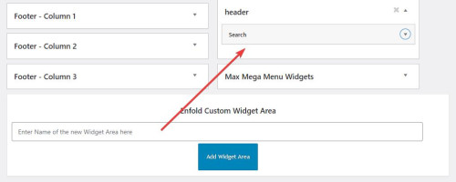
then I added this code to place the widget after the logo in the header:function header_widget_placement() { ?> <script> window.addEventListener('DOMContentLoaded', function() { (function($){ var width = $(window).width(); if ((width >= 990)) { $('#header_main .widget').detach().insertBefore('.av-logo-container .inner-container #menu-item-shop'); } else {} })(jQuery); }); </script> <?php } add_action('wp_footer', 'header_widget_placement', 99);then this css to style and order the header elements:
@media only screen and (max-width: 989px) {
	#header_main > .widget {
	display: none;
}
}
@media only screen and (min-width: 990px) {
.av-logo-container .inner-container {
	display: flex;
    flex-direction: row-reverse;
}
.av-logo-container .inner-container .widget {
	display: flex;
    order: 3;
    flex-basis: 65%;
}
#header_main > .widget {
	display: none;
}
.av-logo-container .inner-container .widget #searchform {
	 width: 100%;
}
.av-logo-container .inner-container .widget #searchform .ajax_search_response {
	background-color: #fff;
    z-index: 3;
}
.av-logo-container .inner-container #menu-item-shop {
	display: flex;
    order: 2;
}
}
This is the final result:

Best regards,
MikeSeptember 17, 2023 at 4:01 pm #1419387Hi,
The project page that you linked to is using the Portfolio Grid element to display your portfolio items in a single column, so it shows each portfolio title and manual excerpt on the left and the featured image on the right:

and when you click on an item you go to the portfolio page that shows more images an details, so you can modify the portfolio pages.
If you don’t want to link to the portfolio pages you have the option Open a preview of the entry (known as AJAX Portfolio)

which will open on the same page and you can show more images.

you can add the images to show in the portfolio item under Ajax Portfolio Preview Settings at the bottom of the screen:

Let us know if this helps.Best regards,
MikeSeptember 17, 2023 at 3:33 pm #1419386In reply to: Need old theme Enfold Version 4.7.5
Hi,
Glad we were able to help, if you have any further questions please create a new thread and we will gladly try to help you. Thank you for using Enfold.Best regards,
MikeSeptember 17, 2023 at 3:29 pm #1419385Hi,
To move your account & search menu items next to the cart icon:

this is only needed for screens larger than 990px, because on mobile it’s already next to the burger menu:

Add this CSS in your Enfold Theme Options ▸ General Styling ▸ Quick CSS field:@media only screen and (min-width: 990px) { .account-menu { position: absolute; z-index: 3; height: 46px; right: 0; width: 150px; line-height: 46px; text-decoration: none; text-align: center; top: 38%; margin: -23px 0 0 0; } .account-menu .cart_dropdown { top: 85%; } .account-menu #menu-item-wc-account-icon { display: inline-block; height: 46px; width: 46px; float: left; } .account-menu #menu-item-search { display: inline-block; height: 46px; width: 46px; float: left; } .account-menu .menu-item-account-icon a { line-height: 46px !important; width: 46px; height: 46px !important; display: inline-block; } .account-menu #menu-item-search a { line-height: 46px !important; width: 46px; height: 46px !important; display: inline-block; } }Then add this code to the end of your child theme functions.php file in Appearance ▸ Editor:
function move_account_search_nexto_cart() { ?>
  <script>
window.addEventListener('DOMContentLoaded', function() {
(function($){
	var width = $(window).width();
	if ((width >= 990)) {
 $(".menu-item.cart_dropdown ").wrapAll("<span class=account-menu></span>");
 $('#avia-menu #menu-item-wc-account-icon').detach().insertBefore('.account-menu .cart_dropdown');
 $('#avia-menu #menu-item-search').detach().insertBefore('.account-menu .cart_dropdown');
	} else {}
})(jQuery);
});
</script>
  <?php
}
add_action('wp_footer', 'move_account_search_nexto_cart', 99);
this is the expected results:
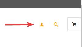
Best regards,
MikeSeptember 17, 2023 at 11:40 am #1419379In reply to: virus in theme
Hey Carolina,
First of all, please try updating your theme to the latest version: https://kriesi.at/documentation/enfold/how-to-install-enfold-theme/#theme-update.
If header.php is located in a child theme, then try replacing that file with the parent theme file.
Best regards,
RikardSeptember 17, 2023 at 12:39 am #1419372In reply to: Style featured image
Hi,
Thank you for the link to your site, I see that your image has a white border edge in the image, and as I understand you want a tan inner border to cover this over, try this CSS in your Enfold Theme Options ▸ General Styling ▸ Quick CSS field:.single-post .single-small.with-slider .small-preview img { width: 200px; height: 200px; outline: 10px solid #f4ecdf; outline-offset: -9px; }and remove your css above, then clear your browser cache and any cache plugin, and check.
Best regards,
MikeSeptember 17, 2023 at 12:02 am #1419371In reply to: Inconsistent links with Masonry Gallery
Hi,
Glad we were able to help, if you have any further questions please create a new thread and we will gladly try to help you. Thank you for using Enfold.Best regards,
MikeSeptember 17, 2023 at 12:02 am #1419370Hey bassato,
It looks like there is enough room in your menu for more items, Please see the screenshot in the Private Content area.
Or do you mean at smaller screen sizes, if so you should make the mobile menu show until the desktop menu will fit on the screen, such as 1215px with this css:
Try this CSS in your Enfold Theme Options ▸ General Styling ▸ Quick CSS field:@media only screen and (max-width: 1215px) { #top #header .av-main-nav > li.menu-item { display: none!important; } #top #header .av-burger-menu-main { cursor: pointer; display: block!important; } }Please ensure to copy the code from the forum and not an email notification so the symbols are not converted.
After applying the css, please clear your browser cache and check.Best regards,
MikeSeptember 17, 2023 at 12:00 am #1419369In reply to: Add Amazon style search bar in top menu
Yes I will look at SearchWP functionality next. For now, ideally, I would want the desktop/tablet users to see the open/static search bar where I specified, responsive for different screen sizes in that range, and not shown at all for mobile users since, as you mentioned, there is no room. I do not want it below the menu bar really.
I have tried the Header Widget Area code, it does not seem to function as intended, at least not on our site. Please advise how I can achieve what I am after within Enfold theme. I’d prefer to stick with you all vs using some other them. Thanks again.
September 16, 2023 at 11:45 pm #1419365In reply to: Featured Image Of Blog Post Getting Cropped
Hi,
Right now your image looks like this:

if you try this CSS in your Enfold Theme Options ▸ General Styling ▸ Quick CSS field:#top .av-masonry-image-container { background-position: unset; background-size: contain; background-repeat: no-repeat; }it should look like this:

but you will need to make sure all of your images are square, unlike this one:

Best regards,
MikeSeptember 16, 2023 at 11:25 pm #1419363Hi,
Have you tried adding phone number link in the topbar at Enfold Theme Options ▸ Header ▸ Extra Elements ▸ Phone Number or small info textBest regards,
MikeSeptember 16, 2023 at 11:13 pm #1419362In reply to: Need old theme Enfold Version 4.7.5
Hi,
I have downloaded v4.7.5 from our archives and while the version.txt in seems to have not been updated, the stylesheet says Version: 4.7.5, so it is the correct one:


Best regards,
MikeSeptember 16, 2023 at 11:03 pm #1419361In reply to: Add Amazon style search bar in top menu
Hi,
Thanks for the login, if you plan on using the WPSearch perhap you should use it’s shortcode so it will have the correct functionality, I see that you have not set it up yet.

To add the search bar in the header you will need to add a Header Widget Area like you linked to above, but in that case there is not enough room there on mobile devices, are you sure you don’t want to add it under the menu so there is more room and east for people to use?Best regards,
Mike -
AuthorSearch Results
Viewing 30 results - 13,321 through 13,350 (of 244,548 total)
-
Search Results
-
Topic: Update License.
Hello,
I am new administrator of a website. Enfold is used as a theme there. Unfortunately it no longer works since the PHP update. Unfortunately I don’t see any way to update it and have no concat to old administrator.I also have no way of updating it via Themeforest.
How can I get the latest version of Enfold?
I See only in a config file: Envato_ID: 4519990.
Can you help?