Viewing 30 results - 2,821 through 2,850 (of 7,495 total)
  • Author
    Search Results
  • Thanks, but that was not my question.

    Please see my post above:

    – no child theme, I work with the custom.css in ENFOLD’s folder “css”
    – since updating to v4.4.1 lots of my styles in custom.css of ENFOLD (NO CHILD-THEME!) does not take effect, only when I add !important or #top in front of it
    – why? I cannot search my whole site where it works and where not and where I need to put !important in front of it and where not, because it works like a charme with ENFOLD v.4.2.3 and without any changes (!!!!!) in v4.4.1 there are these troubles.

    Can it have somethingto do with the new “performance” thing of compression and merging of CSS?
    Because when I set in the theme settings at “performance” the CSS file merging and compression to “enabled”, then the custom.css of ENFOLD has obviously no longer priority. As soon as I disable this setting, my styles at the custom.css take effect.

    And your solution please for enabling the file compression AND priority of the styles in the custom.css of ENFOLD?
    Sounds for me like a bug, because the custom.css should have priority, because there I add those styles, that should override normal ENFOLD CSS styles with my own – no matter if I enable or disable the file compression & merging in the theme settings.

    havi
    Participant

    Hi guys!

    I just wanted to share this with you as I don’t understand why these Enfold elements wouldn’t load.

    https://search.google.com/test/mobile-friendly?utm_source=wmx&utm_campaign=wmx_mft&hl=en&id=8Y8ebEhcD_wYocK0J7EAZw&view=fetch-info

    I was testing this page to clear up an old issue: argen-travel.com/a-beautiful-bruising-trip-to-salta-argentina/

    They all seem to point to jQuery not defined.

    Any ideas?

    Thank you!!!

    Havi

    BeeCee
    Participant

    Hi,

    – I updated my site from ENFOLD 4.2.3 to 4.4.1.
    – I have not changed anything at all at this site and nothing in my files or CSS styles.
    – I have a lot of own CSS styles in the custom.css file.
    – I do not use a child theme, I work in the parent theme for my own reasons, don’t worry, I do not make automatic theme updates :-)

    But since this update 4.4.1 a lot of my own CSS styles suddenly don’t take effect any more:
    I have to add !important after these styles like for example this:

    .widget_nav_menu li{
    	border: 1px solid #ffffff !important;
    }

    So I have to correct now a lot of my own CSS styles in the custom.css file :-(

    Looking at my source code, the custom.css link is at the end of all other CSS files – but has it then priority?

    View post on imgur.com

    What has happend in this theme update, so that this is not working properly any more?
    I searched the forum concerning this, and found issues concerning “dynamic CSS”, but I haven’t understood this.

    Isn’t there a possibility to keep my CSS styles in the custom.css file as they were before the theme update 4.4.1, without adding !important and searching my whole site, where they don’t take effect?

    Thanks.

    P.S.: my site is not online yet.

    #983174

    How do I find this “Colour Section” you refer to? I have searched the Enfold documentation for “Colour Section” and have found nothing! Can you explain more or send me a link?

    #982481

    In reply to: Logo Pic responsive

    Hi,

    Thank you for sharing the example site to show what you are trying to achieve.

    In the example site, the image behind the logo is absolute positioned and in the WordPress site, the image behind the logo is set using CSS background property which is why it does not work the way you expect.

    Enfold is fully responsive and works right out of the box as you may have already seen it in our demos. If you like to make the theme work in a different way which it is not designed for then you need to add the necessary code.

    I personally like the header style which you are trying to achieve using Enfold. I was able to achieve a similar header style on my local system with a slightly different approach.

    Please perform the below steps:

    1. Remove all modification/codes added to achieve this header style.
    2. Remove the header background image from Enfold > General Styling > Logo area.
    3. Create a header widget area.
    4. Add the header background as a widget image from WordPress > Appearance > Widget > Header > Image Widget
    5. Copy and paste the below CSS to your child theme styles.css file.

    /************************************
    
     Full width widget as background 
    
    *************************************
    
    
    CSS Settings:
    
    » Initiate Flexbox
    » Topbar
    » Header
    » Logo
    » Menu
    » Widget
    » Social icons
    » Search
    » Cart icon
    
    ***********************************/ 


    /*--------------------------------
    
    » Initiate Flexbox
    
    --------------------------------*/


    /* Header */
    .responsive #top #header,
    /* Top bar */
    .responsive #top #header #header_meta,
    /* Search icon */
    .responsive #top #header #menu-item-search a,
    /* Cart icon */
    .responsive #top #header a.cart_dropdown_link,
    /* Social icon */
    .responsive #top #header #header_main nav .social_bookmarks,
    /* Logo */
    .responsive #top #header #header_main .inner-container .logo,
    /* Main menu, cart and social icons */
    .responsive #top #header #header_main .inner-container .main_menu,
    /* Widgets */
    .responsive #top #header #header_main .inner-container .widget,
    /* Header inner container */
    #top #header #header_main .container.av-logo-container .inner-container {    
        display: flex;
        position: relative;
    }


    /*--------------------------------
    
    » Topbar
    
    --------------------------------*/


    /* Top bar */
    
    .responsive #top #header #header_meta {
        flex-basis: 100%;    
    }


    /*--------------------------------
    
    » Header
    
    --------------------------------*/
    
    /* Height */
    
    #top #header #header_main .container.av-logo-container {
        height: inherit;   /* Auto height: Header takes the height of the contents */
        padding: 0; 
    }
    
    
    /* Header inner container */
    
    #top #header #header_main .container.av-logo-container .inner-container {
      height: inherit; 
      position: relative !important;
      flex-wrap: wrap;
    }
    
    
    /* Wrappers 
    --------------------------------*/
    
    /* Header content and Topbar */
    
    .responsive #top #header {
        flex-wrap: wrap;
    }
    
    /* Header contents: Logo, Menu, Social Icons and Widgets. */
    
    .responsive #top #header #header_main {
        flex-basis: 100%;    
    }
    
    /* Transparent header 
    --------------------------------*/
    
    .responsive.html_header_transparency #top #wrap_all #header {
        position: absolute;
    }
    
    
    /* Main content: 
    -----------------------*/
    
    .responsive #top #main { 
        padding-top: 0px; /* Gap between the content and header */
    } 
    
    
    /* Fixed header 
    --------------------------------*/
    
    /* Fixed header */
    
    .html_header_sticky.html_header_transparency #top #wrap_all #header,
    .html_header_sticky #top #wrap_all #header { 
        position: fixed; 
    } 
    
    
    /* Fixed header and page content gap. 
       Padding value should be same as the fixed header height. */
    
    .html_header_sticky:not(.html_header_transparency) #top #wrap_all #main { 
        /*padding-top: 145px !important; */
    } 
    
    @media only screen and (max-width: 767px) {
    .html_header_sticky #top #wrap_all #main {
        /*padding-top: 145px !important; */
    }}


    /*--------------------------------
    
    » Logo
    
    --------------------------------*/


    /* Logo */
    
    .responsive #top #header #header_main .inner-container .logo {
       order: 2;
        flex-basis: 100%;    
    
        width: auto;
        min-width: 80px; /* Minimum width of the logo in small screens */
        z-index: 1;
        justify-content: center;
        align-self: center;  
    
    
        /* Logo Overflow */
        /*transform: translateY(50%);*/
    }
    
    /* Logo image size */
    /*.responsive #top #header .logo,*/
    .responsive #top #header .logo a,
    .responsive #top #header .logo img { /* Logo Width and alignment */
        width: auto;         
        max-width: auto;  /* Logo width: (auto | 100% | px );  Set auto to display the uploaded image size. Select full size in media library */
        height: auto; /* Height specification is not required. It is proportional to the max width of the logo */
        align-items: center;
        align-self: center;
    }
    
    /* center transparency logo */
     .responsive #top #header .logo span img {
        position: absolute;
        top: 50%;
        transform: translateY(-50%);
    } 
    
    
    /*--------------------------------
    
    » Menu
    
    --------------------------------*/


    /* Menu outer container: Menu with siblings cart and social icons */
    
    .responsive #top #header #header_main .inner-container .main_menu {
        order: 3;
        flex-basis: 100%;   /* Use calc to minus the width of the logo */
        align-items: flex-end;
        align-self: center;
        justify-content: center;
        margin-top: -100px;
    }
    
    /* Navigation */
    
    #header .av-main-nav {
        display: flex;
        flex-wrap: nowrap;
    }
    
    /*  Activate burger menu  */
    
    @media only screen and (max-width: 1000px) {
        #top #header .av-main-nav>li.menu-item {
            display: none!important;
        }
        #top #header .av-burger-menu-main {
            cursor: pointer;
            display: block!important;
        }
    }
    
    @media only screen and (max-width: 767px) {
    
    /* Mobile menu position fix */
    .responsive #top .av-logo-container .avia-menu {
        display: flex!important;
        align-items: center;
    }}
    
    /* Mega menu fix */
    #header li .avia_mega_div,
    #header li:hover .avia_mega_div {    
        right: auto!important;
        left: auto!important;
        max-width: 50vw;
    }
    
    /*--------------------------------
    
    » Widget
    
    --------------------------------*/
    
    
    /* Widgets */
    
    .responsive #top #header #header_main .inner-container .widget {
        order: 1;
        flex-basis: auto;
        padding: unset;
        clear: none!important;
    
        align-self: center;
        align-items: center;
        z-index: 1;
    }
    
    .responsive #top #header #header_main .inner-container .widget > div {
        display: flex;
        align-items: center;
    
        width: 100%;
        line-height: 14px;
        padding:0 10px;
    }


    /*--------------------------------
    
    » Social icons
    
    --------------------------------*/


    /* Flex support and position fix */
    .responsive #top #header #header_main nav .social_bookmarks {
        display: flex;
         top: auto;
         margin-top: 0;
         align-items: center;
    }
    /* Inherit height for flex alignment */
    #top .av-logo-container .social_bookmarks li {
        height: inherit;
    }


    /*--------------------------------
    
    » Search 
    
    --------------------------------*/


    /* Your styles here */


    /*--------------------------------
    
    » Cart 
    
    --------------------------------*/


    @media only screen and (max-width: 767px) {
    .responsive #top #menu-item-shop.cart_dropdown {
        display: flex;
        align-items: center;
    }
    .cart_dropdown .dropdown_widget .avia-arrow {
        display: none;
    }}


    /*--------------------------------
    
    Position fix
    
    ----------------------------------*/
    
    
    .responsive #top #header #header_main .inner-container .logo {
        margin-top: -75%;
        z-index: 9;
    }
    .responsive #top #header #header_main .inner-container .main_menu {
        margin-top: -10%;
    }
    .responsive #top #header #header_main .inner-container .widget {
        z-index: 1;
    }

    If you have any issue please post the WP login credentials with the user role as admin in private content area so we can take a closer look at the issue.

    Best regards,
    Vinay

    • This reply was modified 7 years, 8 months ago by Vinay.
    #982435

    Ok i found a solution in the forum from Ismael.

    Hey radugidei,

    Thank you for using Enfold.

    This is possible but the search form will be limited to products. It won’t be able to fetch other post types. Please add this in the functions.php file:

    // add post type product
    add_action(‘ava_frontend_search_form’,’ava_frontend_search_form_mod’);
    function ava_frontend_search_form_mod()
    {
    echo ‘<input type=”hidden” name=”post_type” value=”product”>’;
    }
    Best regards,
    Ismael

    That work perfectly with the standard code in the searchform.php.

    Thanks!

    • This reply was modified 7 years, 8 months ago by Max.
    #982425

    Hi,

    To center the logo and menu please remove the previous code and add the below CSS:

    NOTE: The code works for both text and Icon menu. To activate the Icon menu go to Enfold > Main Menu > General > Menu Items for Desktop

    CSS:

    /************************************
    
    Centered menu widget and logo
    
    *************************************
    
    
    CSS Settings:
    
    » Initiate Flexbox
    » Topbar
    » Header
    » Logo
    » Menu
    » Widget
    » Social icons
    » Search
    » Cart icon
    
    ***********************************/ 


    /*--------------------------------
    
    » Initiate Flexbox
    
    --------------------------------*/


    /* Header */
    .responsive #top #header,
    /* Top bar */
    .responsive #top #header #header_meta,
    /* Search icon */
    .responsive #top #header #menu-item-search a,
    /* Cart icon */
    .responsive #top #header a.cart_dropdown_link,
    /* Social icon */
    .responsive #top #header #header_main nav .social_bookmarks,
    /* Logo */
    .responsive #top #header #header_main .inner-container .logo,
    /* Main menu, cart and social icons */
    .responsive #top #header #header_main .inner-container .main_menu,
    /* Widgets */
    .responsive #top #header #header_main .inner-container .widget:nth-child(3),
    /* Header inner container */
    #top #header #header_main .container.av-logo-container .inner-container {    
        display: flex;
        position: relative;
    }


    /*--------------------------------
    
    » Topbar
    
    --------------------------------*/


    /* Top bar */
    
    .responsive #top #header #header_meta {
        flex-basis: 100%;    
    }


    /*--------------------------------
    
    » Header
    
    --------------------------------*/
    
    /* Height */
    
    #top #header #header_main .container.av-logo-container {
        height: inherit;   /* Auto height: Header takes the height of the contents */
    }
    
    
    /* Header inner container */
    
    #top #header #header_main .container.av-logo-container .inner-container {
      height: inherit; 
      position: relative !important;
      flex-wrap: wrap;
      justify-content: center;
    }
    
    
    /* Wrappers 
    --------------------------------*/
    
    /* Header content and Topbar */
    
    .responsive #top #header {
        flex-wrap: wrap;
    }
    
    /* Header contents: Logo, Menu, Social Icons and Widgets. */
    
    .responsive #top #header #header_main {
        flex-basis: 100%;    
    }
    
    /* Transparent header 
    --------------------------------*/
    
    .responsive.html_header_transparency #top #wrap_all #header {
        position: absolute;
    }
    
    
    /* Main content: 
    -----------------------*/
    
    .responsive #top #main { 
        padding-top: 0px; /* Gap between the content and header */
    } 
    
    
    /* Fixed header 
    --------------------------------*/
    
    /* Fixed header */
    
    .html_header_sticky.html_header_transparency #top #wrap_all #header,
    .html_header_sticky #top #wrap_all #header { 
        position: fixed; 
    } 
    
    
    /* Fixed header and page content gap. 
       Padding value should be same as the fixed header height. */
    
    .html_header_sticky:not(.html_header_transparency) #top #wrap_all #main { 
        /*padding-top: 145px !important; */
    } 
    
    @media only screen and (max-width: 767px) {
    .html_header_sticky #top #wrap_all #main {
        /*padding-top: 145px !important; */
    }}


    /*--------------------------------
    
    » Logo
    
    --------------------------------*/


    /* Logo */
    
    .responsive #top #header #header_main .inner-container .logo {
       order: 1;
       flex-basis: auto;
       /*width: auto;*/
       min-width: 80px; /* Minimum width of the logo in small screens */
       z-index: 1;
    }
    
    /* Logo image size */
    .responsive #top #header .logo,
    .responsive #top #header .logo a,
    .responsive #top #header .logo img { /* Logo Width and alignment */
        width: auto;         
        max-width:200px;  /* Logo width: (auto | 100% | px );  Set auto to display the uploaded image size. Select full size in media library */
        height: auto; /* Height specification is not required. It is proportional to the max width of the logo */
        align-items: center;
        align-self: center;
    }
    
    /* center transparency logo */
     .responsive #top #header .logo span img {
        position: absolute;
        top: 50%;
        transform: translateY(-50%);
    } 
    
    
    /*--------------------------------
    
    » Menu
    
    --------------------------------*/


    /* Menu outer container: Menu with siblings cart and social icons */
    
    .responsive #top #header #header_main .inner-container .main_menu {
        order: 1;
        flex-basis: auto;   /* Use calc to minus the width of the logo */
        align-items: center;
        align-self: center;
    }
    
    /* Navigation */
    
    #header .av-main-nav {
        display: flex;
        flex-wrap: nowrap;
    }
    
    /*  Activate burger menu  */
    
    @media only screen and (max-width: 1000px) {
        #top #header .av-main-nav>li.menu-item {
            display: none!important;
        }
        #top #header .av-burger-menu-main {
            cursor: pointer;
            display: block!important;
        }
    }
    
    @media only screen and (max-width: 767px) {
    
    /* Mobile menu position fix */
    .responsive #top .av-logo-container .avia-menu {
        display: flex!important;
        align-items: center;
    }}
    
    /* Mega menu fix */
    #header li .avia_mega_div,
    #header li:hover .avia_mega_div {    
        right: auto!important;
        left: auto!important;
        max-width: 50vw;
    }
    
    /*--------------------------------
    
    » Widget
    
    --------------------------------*/
    
    
    /* Widgets */
    
    .responsive #top #header #header_main .inner-container .widget {
        order: 2;
        flex-basis: auto;
        padding: unset;
        clear: none!important;
    
        align-self: center;
        align-items: center;
        z-index: 1;
        max-width: 200px;
    }
    
    .responsive #top #header #header_main .inner-container .widget > div {
        display: flex;
        align-items: center;
    
        width: 100%;
        line-height: 14px;
        padding:0 10px;
    }


    /*--------------------------------
    
    » Social icons
    
    --------------------------------*/


    /* Flex support and position fix */
    .responsive #top #header #header_main nav .social_bookmarks {
        display: flex;
         top: auto;
         margin-top: 0;
         align-items: center;
    }
    /* Inherit height for flex alignment */
    #top .av-logo-container .social_bookmarks li {
        height: inherit;
    }


    /*--------------------------------
    
    » Search 
    
    --------------------------------*/


    /* Your styles here */


    /*--------------------------------
    
    » Cart 
    
    --------------------------------*/


    @media only screen and (max-width: 767px) {
    .responsive #top #menu-item-shop.cart_dropdown {
        display: flex;
        align-items: center;
    }
    .cart_dropdown .dropdown_widget .avia-arrow {
        display: none;
    }}
    

    Best regards,
    Vinay

    #982419

    Ok, i understand. Lets try it easier.
    That is the former code. This code was working fine except, it had no focus in the text field but on the search button. Maybe you can give me a hint with this.

    <form role="search" method="get" id="searchform" action="<?php echo home_url( '/' ); ?>">
    			<div>
    				<label class="screen-reader-text" for="s">Search for:</label>
    				<input type="text" placeholder="<?php _e('Produktsuche', 'avia_framework')?>" name="s" id="s" autofocus>
    				<input type="submit" id="searchsubmit" value="Suche">
    				<input type="hidden" name="post_type" value="product">
    			</div>
    		</form>

    When i use the standard code from Enfold the results are only in textform. I found some people in the forum had the same problem. For a online text results are not possible and practicable.

    • This reply was modified 7 years, 8 months ago by Max.
    #982366

    Hi,

    To display a shop banner image elsewhere on selected pages of the site please create a header widget area and add the below CSS.

    The below code will display the banner on all pages by default.

    To display widget on selected pages, first hide the widget on all pages with the below code:

    .widget {
       display:none;
    }

    Then use the page ID of the page on which you want to display before .widget in the “Initiate Flexbox” section of the below code:

    /************************************
    
    Full-width banner below logo and menu
    
    *************************************
    
    
    CSS Settings:
    
    » Initiate Flexbox
    » Topbar
    » Header
    » Logo
    » Menu
    » Widget
    » Social icons
    » Search
    » Cart icon
    
    ***********************************/ 


    /*--------------------------------
    
    » Initiate Flexbox
    
    --------------------------------*/


    /* Header */
    .responsive #top #header,
    /* Top bar */
    .responsive #top #header #header_meta,
    /* Search icon */
    .responsive #top #header #menu-item-search a,
    /* Cart icon */
    .responsive #top #header a.cart_dropdown_link,
    /* Social icon */
    .responsive #top #header #header_main nav .social_bookmarks,
    /* Logo */
    .responsive #top #header #header_main .inner-container .logo,
    /* Main menu, cart and social icons */
    .responsive #top #header #header_main .inner-container .main_menu,
    /* Widgets */
    .responsive #top #header #header_main .inner-container .widget,
    /* Header inner container */
    #top #header #header_main .container.av-logo-container .inner-container {    
        display: flex;
        position: relative;
    }


    /*--------------------------------
    
    » Topbar
    
    --------------------------------*/


    /* Top bar */
    
    .responsive #top #header #header_meta {
        flex-basis: 100%;    
    }


    /*--------------------------------
    
    » Header
    
    --------------------------------*/
    
    /* Height */
    
    #top #header #header_main .container.av-logo-container {
        height: inherit;   /* Auto height: Header takes the height of the contents */
    }
    
    
    /* Header inner container */
    
    #top #header #header_main .container.av-logo-container .inner-container {
      height: inherit; 
      position: relative !important;
      flex-wrap: wrap;
      justify-content: space-between;
    }
    
    
    /* Wrappers 
    --------------------------------*/
    
    /* Header content and Topbar */
    
    .responsive #top #header {
        flex-wrap: wrap;
    }
    
    /* Header contents: Logo, Menu, Social Icons and Widgets. */
    
    .responsive #top #header #header_main {
        flex-basis: 100%;    
    }
    
    /* Transparent header 
    --------------------------------*/
    
    .responsive.html_header_transparency #top #wrap_all #header {
        position: absolute;
    }
    
    
    /* Main content: 
    -----------------------*/
    
    .responsive #top #main { 
        padding-top: 0px; /* Gap between the content and header */
    } 
    
    
    /* Fixed header 
    --------------------------------*/
    
    /* Fixed header */
    
    .html_header_sticky.html_header_transparency #top #wrap_all #header,
    .html_header_sticky #top #wrap_all #header { 
        position: fixed; 
    } 
    
    
    /* Fixed header and page content gap. 
       Padding value should be same as the fixed header height. */
    
    .html_header_sticky:not(.html_header_transparency) #top #wrap_all #main { 
        /*padding-top: 145px !important; */
    } 
    
    @media only screen and (max-width: 767px) {
    .html_header_sticky #top #wrap_all #main {
        /*padding-top: 145px !important; */
    }}


    /*--------------------------------
    
    » Logo
    
    --------------------------------*/


    /* Logo */
    
    .responsive #top #header #header_main .inner-container .logo {
       order: 2;
        flex-basis: auto;
    
        /*width: auto;*/
        min-width: 80px; /* Minimum width of the logo in small screens */
        z-index: 1;
    }
    
    /* Logo image size */
    .responsive #top #header .logo,
    .responsive #top #header .logo a,
    .responsive #top #header .logo img { /* Logo Width and alignment */
        width: auto;         
        max-width:250px;  /* Logo width: (auto | 100% | px );  Set auto to display the uploaded image size. Select full size in media library */
        height: auto; /* Height specification is not required. It is proportional to the max width of the logo */
        align-items: center;
        align-self: center;
        justify-content: center;
    }
    
    /* center transparency logo */
     .responsive #top #header .logo span img {
        position: absolute;
        top: 50%;
        transform: translateY(-50%);
    } 
    
    
    /*--------------------------------
    
    » Menu
    
    --------------------------------*/


    /* Menu outer container: Menu with siblings cart and social icons */
    
    .responsive #top #header #header_main .inner-container .main_menu {
        order: 3;
        flex-basis: auto;   /* Use calc to minus the width of the logo */
        align-items: center;
        align-self: center;
    }
    
    /* Navigation */
    
    #header .av-main-nav {
        display: flex;
        flex-wrap: nowrap;
    }
    
    /*  Activate burger menu  */
    
    @media only screen and (max-width: 1000px) {
        #top #header .av-main-nav>li.menu-item {
            display: none!important;
        }
        #top #header .av-burger-menu-main {
            cursor: pointer;
            display: block!important;
        }
    }
    
    @media only screen and (max-width: 767px) {
    
    /* Mobile menu position fix */
    .responsive #top .av-logo-container .avia-menu {
        display: flex!important;
        align-items: center;
    }}
    
    
    /*--------------------------------
    
    » Widget
    
    --------------------------------*/
    
    
    /* Widgets */
    
    .responsive #top #header #header_main .inner-container .widget {
        order: 4;
        flex-basis: 100%;
        padding: unset;
        clear: none!important;
    
        align-self: center;
        align-items: center;
        z-index: 1;
    
    }
    
    .responsive #top #header #header_main .inner-container .widget > div {
        display: flex;
        align-items: center;
    
        width: 100%;
        line-height: 14px;
        padding:0 10px;
    }


    /*--------------------------------
    
    » Social icons
    
    --------------------------------*/


    /* Flex support and position fix */
    .responsive #top #header #header_main nav .social_bookmarks {
        display: flex;
         top: auto;
         margin-top: 0;
         align-items: center;
    }
    /* Inherit height for flex alignment */
    #top .av-logo-container .social_bookmarks li {
        height: inherit;
    }


    /*--------------------------------
    
    » Search 
    
    --------------------------------*/


    /* Your styles here */


    /*--------------------------------
    
    » Cart 
    
    --------------------------------*/


    @media only screen and (max-width: 767px) {
    .responsive #top #menu-item-shop.cart_dropdown {
        display: flex;
        align-items: center;
    }
    .cart_dropdown .dropdown_widget .avia-arrow {
        display: none;
    }}

    Best regards,
    Vinay

    #982350

    Hey hmuscroft,

    1. Please try the following in Quick CSS under Enfold->General Styling:

    #top #bbp-search-form #bbp_search_submit {
        top: 1px;
    }

    2. I’m not sure which element you mean, the search box in the main menu? If so that already has a placeholder?

    Best regards,
    Rikard

    #982232

    Hi Victoria,

    I search on the forums, but I don’t know what you mean by that. Do you mean the Performance-tab in Enfold?

    Beste Regards, Marcel

    #981610

    Hi,

    Please try adding this code to the Quick CSS section under Enfold > General Styling or to your child theme’s style.css file:

    CSS Snippet:

    @media only screen and (max-width: 1300px) {
    #top #header .av-main-nav > li#menu-item-search.menu-item {
        display: block!important;
    }}


    Best regards,
    Yigit

    #981351
    zizibe1
    Participant

    Hi,

    I would like to change the color of the font on the mobile menu to red (#ff0000) when you hover on it. I’ve been searching the enfold support forum and tried several codes but none seems to work.

    How can I change the hover color of the font on the mobile menu?

    Best regards,
    zizibe1

    #981050

    In reply to: Ajax Search Function

    That’s great.

    So I simply need to replace my codeblock code with code from enfold\config-templatebuilder\avia-shortcodes\search\search.php (line 776+)

    Correct?

    Hello Mike,
    the website XY is it not mine, I used it as an example ;-)
    With help from people on the Enfold FB group I’ve been able to add a phone icon in the menu (not image in a widget area)
    BUT I’m struggling with the icon size I would like it to be 20px – I cannot seem to make just that menu-item larger.
    This is the test website: http://new.eaglebelgium.com

    This is the PHP

    /* Phone Icon */
    if(!function_exists('avia_append_phone_icon'))
    {
    //first append search item to main menu
    add_filter( 'wp_nav_menu_items', 'avia_append_phone_icon', 9997, 2 );
    add_filter( 'avf_fallback_menu_items', 'avia_append_phone_icon', 9997, 2 );
    
    function avia_append_phone_icon( $items, $args )
    {	
    if ((is_object($args) && $args->theme_location == 'avia') || (is_string($args) && $args = "fallback_menu"))
    {
    $items .= '<li id="menu-item-phone" class="noMobile menu-item menu-phone menu-item-avia-special">
    <a href="#" '.av_icon_string('phone').'><span class="avia_hidden_link_text">'.__('Phone','avia_framework').'</span></a>
    </li>';
    }
    return $items;
    }
    }
    
    function avf_default_icons_mod($icons) {
    $icons['phone']	= array( 'font' =>'entypo-fontello', 'icon' => 'ue854');
    return $icons;
    }
    add_filter('avf_default_icons','avf_default_icons_mod', 10, 1);

    The CSS to hide the phone-icon on large screens

    @media only screen and (min-width: 480px) {
    #menu-item-phone {
    display: none !important;
    }
    }
    #980803
    MediaMix1
    Participant

    Good Afternoon,
    I am experiencing some issues with a plugin called the Modern Events Calendar. When I first installed this plugin, it worked fine, it wasn’t until after I updated to the newest version of Enfold, that I started having problems. When I first updated the theme, it broke my website, then after doing some searching, I found out that I needed to remove the file events_upcoming.php from the avia-shortcodes folder. Once that file had been removed, my website was working again, but the plugin was not. I contacted the plugin’s support team and they have been trying to fix it, but with no luck so far. I’ve been looking through the forum for this issue, but I cannot find much help with the Modern Events Calendar. It sounds like this is an issue with Enfold and not with the plugin, so I was wondering if you had any idea why this was happening/how to fix it?

    • This topic was modified 7 years, 8 months ago by MediaMix1.
    #980701

    In reply to: Ajax Search Function

    Hi,

    This requires some work and testing. I’d recommend to use the search form code in enfold\config-templatebuilder\avia-shortcodes\search\search.php (line 776+) as a starting point. Note that the “avia_search_element” class of the wrapper div is important because the ajax function is bound to it (enfold\js\avia.js on line 35).

    Best regards,
    Dude

    Hi,
    I corrected the code in your functions.php, so you can add the “thumbs-up” next to your social icons at:
    Enfold Theme Options > Social Profiles > Your social profiles
    But I thought that we could add a link to the icon to create the “Like” feature, but as I search I don’t see that the “Like” can be a url, it seems that it must be a script.
    So, I added the script for you and placed it next to the other social icons, unfortunately it must be the blue FB button. I hope this is ok.
    2018-07-02_195932
    This is how I added it:
    I added the FB script to a custom html widget in your “header” widget area:

    <div class="fb-like" data-href="http://www.facebook.com/your-fb-page" data-layout="button" data-action="like" data-size="small" data-show-faces="false" data-share="false"></div>

    then I moved it next to your social icons with this function in your functions.php:

    function custom_script(){
      ?>
      <script>
    jQuery(window).load(function(){
      jQuery( "#custom_html-4" ).appendTo( ".social_bookmarks" );
      });
      </script>
      <?php
      }
      add_action('wp_footer', 'custom_script');

    and made some minor adjustments with this css in your Quick CSS:

    #custom_html-4.widget {
        width: 50px !important; 
        padding: 15px 0 !important; 
        display: inline-block !important; 
    }

    Best regards,
    Mike

    #979662
    StefanLauermann
    Participant

    ENGLISH: by webteam Isabel Morales Rey & Astrid Seng

    The Enfold Theme is still in need of development and improvement

    We muddled through Enfold for our customer http://www.kastner-brillen-haus.de and realized that we were quite disappointed with much within the theme and don’t want to call it user friendly yet. Too often we had to search for a quick CSS, because the theme didn’t take this into account and pre-programmed it for the user.

    Here are a few points of criticism that we think could be improved:

    01) The rollover effect for top navigation should not be assigned in two different locations with colors, but in one location. The trembling during rollover by narrowing the distance between the bushings should also not be specified as standard.

    02) The different blog designs (classic or modern) should simply be pre-installed and selectable, instead of having to build them together first. We should also be able to select the categories simple and easy.

    03) The side navigation at the blog is hardly visually designable. Line spacing, icons, font size color? We missed them.

    04) The basic design with the headline above the photo is also not very appealing in the blog. The selection to change this is missing.

    05) What is the strange ampersand symbol in the H1 line? That curly-blue thing “&” there?

    06) As with top navigation, the second roll over color cannot be defined for the buttons. Why? Also here we had to search for a quick CSS. Roll-over, roll-out color and active-color, that’s what we always need didactically. Why don’t you make it easier for us users?

    07) The scroll-to-top button in the footer is not visible on the smart-phone. Here also we had to make do with an additional quick-CSS. That doesn’t have to be the case.

    08) Why are the module symbols in your page builder “Avia Layout Architect” so light grey and not more clearly visible?

    09) Why doesn’t the link setter recognize the mail address automatically and doesn’t put it in the href line like in other themes?

    10) The number of icons you provide. Sad.

    11) Why do you automatically color the bolt headlines in the body text? I just want it bold, not colored. They look like links. This is simply a no go didactically. Here also you specify this and do not let the user have the freedom to design it himself.

    12) Where can I modify the color of the social icons?

    13) Where can I modify the design of the sharing icons?

    14) Why does the save button not run in the page builder view or is at least displayed again at the end below? So you have to scroll constantly upwards to save or activate.

    15) Too bad that you have equipped your slider so unspectacularly and have not integrated the great RevolutionSlider.

    16) Also for your Masonry Gallery we had to use a Quick-CSS to disable the excited fluttering in of images. The animation comes too late and also very delayed when scrolling down. For the user it then looks as if there would be an empty space and there would be nothing more information. Also here we miss a clean and clear choice when creating this gallery: Activate animation, change animation, deactivate animation and the images remain visible (loaded) from the beginning.

    Working with Enfold took a lot of unnecessary time, it was quite frustrating and lengthy working with Enfold. We know much better premium themes. I hope with the Gutenberg-Step there will be some changes and you will catch up to keep up with the current theme.
    .
    .
    .
    GERMAN: by webteam Isabel Morales Rey & Astrid Seng

    Das Enfold Theme empfinden wir als noch recht entwicklungsbedürftig und verbesserungswürdig

    Wir haben uns für unseren Kunden http://www.kastner-brillen-haus.de durch Enfold durchgewurstelt und festgestellt, dass wir mit vielem innerhalb des Themes recht enttäuscht waren und das Theme noch nicht als UserFriendly bezeichnen möchten. Zu oft mussten wir nach einem Quick CSS suchen, weil das Theme das nicht für den User als Einstellung mit bedacht und vorweg programmiert hat.

    Hier ein paar Kritikpunkte, die unserer Meinung nach verbesserungswürdig sind:

    01. Der RollOver Effekt bei der Topnavigation sollte nicht an zwei unterschiedlichen Orten mit Farben, sondern an einem Ort vergeben werden. Das Zittern beim RollOver durch Verengung des Buchstenabstandes bitte auch nicht als Standard angeben.

    02. Die unterschiedlichen Blogdesigns (Classisch oder Modern) sollten einfach schon mal vorinstalliert und auswählbar sein, statt sich das erst zusammen bauen zu müssen. Auch die Kategorien sollten wir simple and easy danach auswählen können.

    03. Die Side Navigation beim Blog ist kaum optisch designbar. Zeilenabstand, Icons, Schriftgröße Farbe? Haben wir vermisst.

    04. Ebenso das Grunddesign mit der Headline über dem Foto ist optisch nicht besonders ansprechend im Blog. Die Auswahl dies zu ändern fehlt.

    05. Was ist das mit dem seltsamen Kaufmannsund in der H1 Zeile? Dieses kringelblaue Dingens “&” da?

    06. Bei den Buttons sind wie bei der TopNavigation auch hier wieder die zweite RollOver Farbe NICHT definierbar. Warum? Auch hier mussten wir nach einen Quick CSS suchen. RollOver, RollOut Farbe und AktivFarbe (visited), das benötigen wir didaktisch eigentlich immer. Warum macht ihr es uns User nicht leichter?

    07. Der ScrollToTop Button im Footer ist bei den SmartPhone nicht sichtbar. Auch da mussten wir uns mit einem zusätzlichen Quick CSS behelfen. Das muss doch nicht sein.

    08. Weshalb sind bei eurem PageBuilder die Modulsymbole so hellgrau und nicht deutlicher sichtbar?

    09. Weshalb erkennt der Linksetzer die Mailadresse nicht automatisch und setzt sie in die href Zeile wie bei anderen Themes gleich ein?

    10. So wenige Icons stellt ihr bereit. Traurig.

    11. Warum färbt ihr automatisch die Bold-Headlines ein? Ich will sie nur bold haben, aber nicht eingefärbt. Sie sehn aus wie Links. Das ist didaktisch einfach ein no go. Auch hier gebt ihr das vor und lasst den User nicht die Freiheit das selbst zu gestalten.

    12. Wo kann man die Social Icons farblich modifizieren?

    13. Wo kann man die Sharing-Icons im Design modifizieren?

    14. Weshalb läuft der Speichern-Button bei der PageBuilder Ansicht nicht mit oder wird zumindest am Ende unten erneut dargestellt? So muss man ständig nach oben scrollen, um zu speichern, bzw. zu aktivieren.

    15. Schade, dass ihr euren Slider so unspektakulär bestückt und nicht den tollen RevolutionSlider integriert habt.

    16. Auch bei eurer Masonry Gallery mussten wir uns mit einem Quick-CSS behelfen, um das aufgeregte Hereinflattern von Bildern zu deaktivieren. Die Animation kommt zu spät und auch erst beim Hinscrollen sehr verzögert. Für den User sieht es dann so aus, als wäre dort ein leerer Platz und es käme nichts mehr an Information. Auch hier vermissen wir eine saubere und klare Wahlmöglichkeit beim Erstellen dieser Gallery: Animation aktivieren, Animation verändern, Animation deaktivieren und die Bilder bleiben dann von Anfang an sichtbar (geladen).

    Das Arbeiten mit Enfold hat uns viel unnötige Zeit gekostet, es war recht frustrierend und langatmig mit Enfold zu arbeiten. Da kennen wir viel bessere PremiumThemes. Ich hoffe mit dem Gutenberg-Step wird sich bei euch noch einiges ändern und ihr holt etwas auf, um mit dem gegenwärtigen Themestand mithalten zu können.
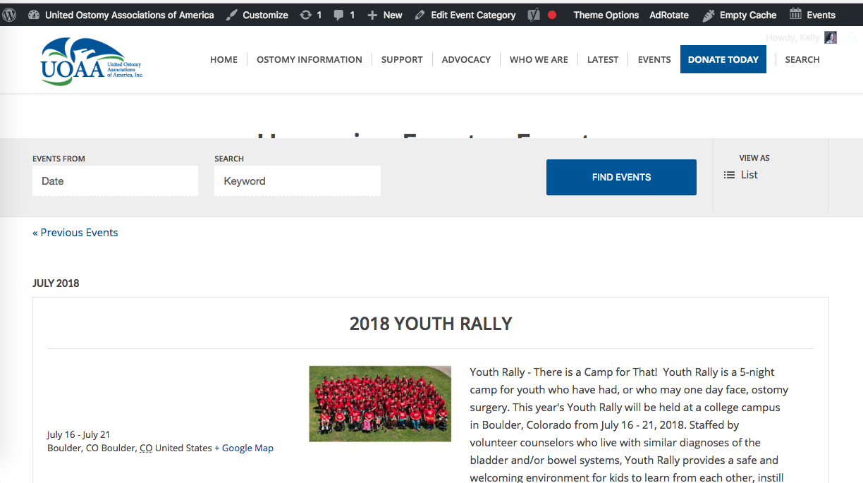
    #979514

    In reply to: Membership plugins

    Hey nick_obee,
    Please describe which errors you see with the “Simple WordPress Membership” with Enfold.
    My research found some good posts with the two together, so I wanted to verify your issue.

    Best regards,
    Mike

    Hi,

    Glad you like the change.

    1. Enabling CSS and JS merging loads the CSS/JS files which are cached. When you make changes to CSS/JS files, most of the time changes will not reflect until the cache expires. Hence it is recommended to disable during the development and enable it later to improve the site speed.

    2. Add your custom CSS to the child theme styles.css file. The changes will not be overwritten when the main theme is updated. Yes, that’s correct, we have used CSS to overwrite the header settings. It’s ok you can leave the header settings as it is.

    The additional CSS which you are not using now might be useful in the future it is lightweight as well you can simply comment it out. I left it there because it is really lightweight and the extra code makes it super easy if you need any future modifications.

    3. By default, the search icon is disabled in mobile. I have added the below CSS to enable it.

    /* Display in mobile */
    @media only screen and (max-width: 1000px) {
    #top #header .av-main-nav>li#menu-item-search {
        display: inline-block!important;
    }}

    4. Don’t worry you haven’t missed out on any code, to add the custom styles to the menu items like color, hover effects please check our documentation.

    Please bookmark the documentation, we constantly add new topics and update the code snippets here.

    Best regards,
    Vinay

    #979425
    KellyKilgallon
    Participant

    Hello –

    First of all, great work on the new performance updates in Enfold! Love this theme and all the support.

    I’m having an issue with the Events Calendar plugin following the recent update. I’ve deactivated plugins to rule out a conflict. I’ve added the calendar as a category in the menu and I’m seeing text trying to appear underneath the calendar search bar – see below:

    https://www.ostomy.org/wp-content/uploads/2018/06/Screen-Shot-2018-06-29-at-12.25.07-PM.png

    Have any advice?

    Thanks!

    Hi Vinay,
    thank you very much for this great job and all your willingness and support!!!!
    So far it looks great, the overflow is showing up even at mobile screen – GREAT!!! – (Didn’t expected that …)

    Now I’m getting the idea and I’m working at the responsive part, because at mobile your settings looks great but at larger screens the font could be a bit bigger… so I’m using the above snippets provided by Victoria, only changed “media screen only” to “media only screen” (the code editor at my host “asked” for this change) – and it works :)) – ok, still have to refine…
    …and to clean up the duplicates at Enfold > Advanced Styling once I understand clearly what is what at the css file, so I can find the duplications, but till now haven’t found any.
    Looks like you already deleted font styling at css?!

    Now for my understanding:
    CSS and JS merging – you said: “enable once the customization process is completed”
    I understand that you refer to the customization process at the Logo – or do you mean also the customization process at the header in total or even more – is it related to all the changes I do at style.css?
    What happens if I need to add or change something later? Can I enable and disable / or even should I enable and disable always CSS and JS merging before I make changes at style.css?
    Thanks for clarifying this.

    And will it be necessary to make all the changes and setting related to the header at style.css in the future?
    I’m asking because I see that my old setting of header heights is still in the settings but overwritten by the style sheet. What do I do with these settings, this is a kind of duplication as well, isn’t it?

    Append search icon to main menu is still enabled but not showing up – is this related to the CSS and JS merging?
    Thanks for clarifying this also.

    Best regards,
    Britta

    #979400
    Rgrant74
    Participant

    Hi,
    I want to add a “Shipped” status to my Woo statuses and found the below online. Before I try this I wanted to check with you guys if it looks ok (except I’d change awaiting shipment to shipped). Nothing will conflict with Enfold?

    // Register new status
    function register_awaiting_shipment_order_status() {
    register_post_status( ‘wc-awaiting-shipment’, array(
    ‘label’ => ‘Awaiting shipment’,
    ‘public’ => true,
    ‘exclude_from_search’ => false,
    ‘show_in_admin_all_list’ => true,
    ‘show_in_admin_status_list’ => true,
    ‘label_count’ => _n_noop( ‘Awaiting shipment (%s)’, ‘Awaiting shipment (%s)’ )
    ) );
    }
    add_action( ‘init’, ‘register_awaiting_shipment_order_status’ );

    #979325

    Hey Christian,

    Thank you for using Enfold.

    1.) This feature is already in production but it’s not included in the core yet. You have to edit the search page style using custom css codes for now.

    2.) I would like to check the site but it returns a “forbidden” error.

    Best regards,
    Ismael

    #979026

    Many… all started a few days ago
    Nothing or very limited seems to work in the dashboard, even the enfold theme you can only get the same screen
    Media Library is blank yet images are in product but not on the website
    When you click on update in the dashboard it takes you to the website search page
    Backup/restore stopped working
    Warnings from google in chrome
    Probably easier to have a wonder round the dashboard to see

    Thank you for contacting me

    #978985
    leroyflow
    Participant

    Hello,
    I’m searching for a form plugin and I’ve found so many Gravity Form problems so I decided to ask the developers – which forms plugins do you know are compatible with Enfold and that are reliable? I appreciate your help

    Priscilla

    #978965

    In reply to: Schema.org not https

    Hey Siniz,

    Please go to enfold/includes/helper-markup.php in Appearance > Editor and search ” http: ” and change it to https. We have reported it to our devs.

    Best regards,
    Yigit

    #978903
    ballindigital
    Participant

    Hi,

    I’ve searched the forums but can’t find the answer to this.

    I’ve used easy slider on this page:

    The easy slider doesn’t work very well as it isn’t obvious to the viewer that they can swipe across and the next picture will be displayed.

    The auto rotation doesn’t work either.

    How do I fix this?

    Also – if it isn’t too complicated I’d like the image and easy slider to be shown next to each other on a mobile device as opposed to on top of each other.

    I see it on other websites so was hoping there’s a way to do this in Enfold.

    Thanks,

    Harvinder

    #978878

    Case closed…
    It was proberly a combination of my “Search Settings” in my Google Analytics … Vs Enfold Vs something else!!
    I edit the search settings and removed the funny letter with the X and got Norton to rescan … Voila CLEAN?!
    Maybe a false negative?

    Anyway thanks for your help and support !!

Viewing 30 results - 2,821 through 2,850 (of 7,495 total)