Does anyone know what the CSS is to style the woocommerce search bar (that searches for products only) to look the same as the default enfold search box which I have disabled as it is returning posts not products?
I would like the woocommerce search to look identical with a little magnifying glass search icon rather than a button below saying “search”
Thank you
Hello together,
We are utilizing the tab section element on our website but the height option “auto adjust to content” does not seem to work properly.
All tab sections still have the same height as the tab section with the most content (see private content section).
We have also tried to completely redesign the section from scratch but with no luck at all.
After some research we have found quite a few topics on this issue but mostly from older Enfold versions (between 2017-2019), so it seems that the issue had been fixed in some former release.
We are running Enfold 5.6.8 on PHP 8.2.12.
How can this be fixed?
Best regards,
Marc
Hi,
I have reviewed the settings in your plugin All in One SEO and the AIOSEO ▸ Search Appearance ▸ Remove Query Args option is what was removing the required pagination url:

I disabled this setting and tested when logged out and the pagination is now working correctly.
Best regards,
Mike
Hi FW,
Please try to check Relevanssi Search
In their Advanced Features, it lists: “Log queries, show most popular queries and recent queries with no hits.” maybe it would help.
To integrate Relevanssi with our theme, please check our documentation: https://kriesi.at/documentation/enfold/search/#use-relevanssi-in-search-instead-of-the-default-search
Hope it helps.
Best regards,
Nikko
 FW
FWParticipant
Hi,
is there a way to save the search requests on the website? I think it could be very interessting to take a look at searches on our website.
“did you make sure to select it as both the heading and body font”
Yes, I did, as I wrote in my initial posting.
I think I set all elements in (Enfold > General Styling and) Enfold > Advanced Styling to the uploaded font.
But as every element needs to be picked individually for editing it is not straight forward to stay on top of things. Therefore could you please let me know where to find the respective css files which are modified by these two UI configurations? It would be easier to search for the font names in an editor.
Best Regards,
ABIX
Hi,
Thanks for the link to your site, I have not seen a custom menu item with a “search icon” option before:

the reason it only shows until the slider shows is because it is hidden by “display:none opacity:0” once the slider shows, this could be a “lazy load” conflict, I see that you are using JetPack & possibility so other plugins that could cause this, although I don’t know what the default behavior for FiboSearch is.
Try disabling your other plugins to ensure there is not a conflict, then check the FiboSearch options, if this doesn’t help try using the FiboSearch shortcode instead of the custom element.
Best regards,
Mike
Hi Mike
The following seems like the easiest method.
1-
I turned off Append Search Icon To Main Menu in the Enfold Theme Options.
2-
WooCommerce -> FiboSearch -> Starting.
Turned off the Search bars to replace Enfold with the FidoSearch.
3-
Added the Custom Link FiboSearch bar to the menu her.
Used Layout: Default. Menu Style: Default.
Results. Search field or Search icon can for a very short moment be seen to the left of the top menu here. Just to the left of the Hjem / Home menu item.
https://labhuset.no/
I do not know what is going on there.
Hi,
Thank you for your patience, I have just found this thread and have reviewed it, typically this situation is not typically covered by our support because sorting though what an agency has done to create your custom theme can be tricky.
As I recall back in july I was tring to assist you with a issue you were having, I updated your custom theme for you and left it as it was to hear back from you that all was well, as I recall many issues came up after the update and we worked on them, I don’t specific remember how it all ended, but nonetheless we are here now.
So I have changed your wp-config.php to define(‘DISALLOW_FILE_EDIT’, true); to allow the theme file editor to show again, and I have modified your “enfold-child” with your “Kropik Child” files then I activated your “enfold-child” and imported your “Kropik Child” theme settings, and cleared your cache a bunch of times and the new Enfold theme seemed to work while I was logged in, but not when I was logged out.
After much research it looks like the agency that created this theme for you created it is such a way the theme adds meta data to the WordPress database that is used for WPML to show the correct pages, I don’t fully understand the reason, but changing to the “Enfold” teme seems to break this and I don’t know how to move this meta data to the new Enfold database.
So I enabled the “Kropik Child” and your site is working correctly again.
Unfortunately I believe you will need to contenue to manuly update or to will need to hire a developer that understands what the original developer did and why, I have not seen this before.
Sorry that I couldn’t be more help.
Best regards,
Mike
Hey Silje,
Thank you for the link to your site, does your ‘FiboSearch’ plugin offer a shortcode to display the search field? If so you could add a header widget area for it, please see our documentation here. Another option mat be to add the ‘FiboSearch’ shortcode as menu item, in the navigation label.
Then to hide the default search icon you can disable it at Enfold Theme Options ▸ Main Menu ▸ General ▸ Append search icon to main menu
Best regards,
Mike
Hi
I have been looking through various threads in the matter of changing the default search magnifying class icon with a search field/bar but the various solutions I have found have not worked.
Including an Enfold setting to instead use the search field would be helpful.
This is the site: https://labhuset.no/
It uses: Enfold Version: 5.6.8
WordPress: 6.3.2
WooCommerce version 8.2.1
I have installed and activated: “FiboSearch – AJAX Search for WooCommerce” to make search show up with more details as well as be able to get WooCommerce categories, tags, content etc into the search.
I now need to be able to show the Search field instead of the Search icon in the header where the icon can be seen today. https://labhuset.no/
Thank you!
Hi
I have a compatibility problem with BestWebSoft Plugin pdf&print plugin.
To check out I deactivated Enfold and all plugins except BestWebSoft Plugin pdf&print and activated twenty-twenty.
Than I activated the plugins one by one – BestWebSoft Plugin pdf&print still worked
only after activating Enfold the problem occurred again.
With the shortcode [bws_pdfprint display=’pdf,print’] on a page I get a “Not found” search result when I click on the pdf icon on the page
and when I click the print icon just the headline is printed instead of the content.
Best regards
Bettina
-
This topic was modified 2 years, 4 months ago by
 Thina.
Well with your Alias name and a little search i found your page ;)
and on FAQ everything works fine here in OSX Chrome
Edit : . You are right. I see – if you open the 5th or 6th toggle there are again this behavior.
Can you please remove the interims solution with toggle_wrap set to display: none
and refresh all cachings and merging please after that.
I had to inspect where we can correct this. – on the enfold page https://kriesi.at/themes/enfold-2017/elements/accordion/ it works as i said as expected.
Hi,
Thank you for the inquiry.
You can modify or override the themes/enfold/searchform.php file in your child theme. Add the label element around line 24.
<label for="s">Search</label>
<input type="submit" value="<?php echo $icon; ?>" id="searchsubmit" class="button <?php echo $class; ?>" />
<input type="text" id="s" name="<?php echo $search_params['search_id']; ?>" value="<?php if( ! empty( $_GET['s'] ) ) { echo get_search_query(); } ?>" placeholder='<?php echo $search_params['placeholder']; ?>' />
Best regards,
Ismael
I’m building a bookshop
Which will present 1000’s of books
I have connected WooCommerce with the Book Importer as we use BatchLine for stocking supply:
BCS BatchLine Book Importer (Its working well)
The import creates 2 custom fields (relevant to my question) main_image and thumbnail_image both populated with url values.
The Main image appears correctly within a product page.
However I am trying to work out how I can update the relevant file for the grid, slider, and list Enfold features. I believe from research Enfold is using the shop thumbnail image? I can’t quite work out the structure and if I could develop the files to pull in the url from a Custom Field – thumbnail_image. I assume this is not a function.php solution but developing some code. Can anyone give me any points on how the code is even structured. It looks like it takes information for the html rendering from the WooCommerce files. Batchline inform me it works fine with the shopfront WooCommerce theme, so if anyone who’s the difference, I would be very grateful.
Best Regards C
Hey Daniel Patriasz,
Thanks for your patience, try enabling the option at Enfold Theme Options ▸ SEO Support ▸ Search Engine Optimization Support ▸ Preprocessing Shortcodes In Header typically this helps but there are some limitations with the Yoast Pro plugin and the pages created with the Advanced Layout Builder.
Best regards,
Mike
Hey gatehealing,
Thanks for your patience, I see that the lazyload classes are present on the images, perhaps your caching plugin doesn’t recognize them, try disability your caching plugin and then check again, if this doesn’t help try following the Page Speed Insights recommendation of installing a lazy-load WordPress plugin and disable the theme lazyload option.
Another point could be that either your caching plugin or the option in the theme settings has disable jQuery Migrate or has deferred the loading of jQuery, this could prevent the teeme lazyload from working, so a good please to start testing would be to disable the caching plugin, and any other “optimizing” plugins, and then ensure the Enfold Theme Options ▸ Performance ▸ Load jQuery in your footer and Enfold Theme Options ▸ Performance ▸ Disable jQuery Migrate are not enabled.
and then check again to see if that helps.
Best regards,
Mike
hm – I have never attached any particular importance to it. But you are indeed right. It seems that the base.css (line 470ff) setting of the font is used there. It’s listed as HelveticaNeue, Helvetica etc. Since Enfold stores the fonts you set in options as a variable, you can set here:
#top .input-text,
#top input[type="text"],
#top input[type="input"],
#top input[type="password"],
#top input[type="email"],
#top input[type="number"],
#top input[type="url"],
#top input[type="tel"],
#top input[type="search"],
#top textarea,
#top select {
	font-family: var(--enfold-font-family-body) !important
}
or if you like to change it only for that input field:
#top #s {
  font-family: var(--enfold-font-family-body) !important
}
maybe this should be changed on default to inherit the font like all the other settings ( line 20ff)
(html, body, div, span, applet, object, iframe, h1, h2, h3, h4, h5, h6, p, etc. )
Two questions:
1. I am starting from the Enfold Gym demo and noticed that the Main Menu search box does not following my font settings. Is there a way to force the search box to use the Body Text Font?
2. I noticed in the demo that hovering on the Main Menu items turns the button background a different color (red)? That does not work for my site no matter how I configure the Logo Area colors. How can I make this work on my site?
Thank you.
-
This topic was modified 2 years, 5 months ago by
 kaneljeff.
-
This topic was modified 2 years, 5 months ago by kaneljeff.
-
This topic was modified 2 years, 5 months ago by kaneljeff.
Good day, I am using the most recent version of Enfold and the most recent version of WordPress and all my plugins are up to date.
I just received an email from Google Search Console saying there’s a new reason preventing my videos from being indexed. When I log into my Google Search Console and investigate further, it says there’s a problem on my website with the “Video outside the viewport.”
The description Google gives on its website is:
“The video must appear in the viewport when loading the page to be considered for indexing. Move the video so that the entire video is inside the renderable area of the page and seen when the page loads. The videos on these pages aren’t indexed or served on Google as video results.”
I’m using your Avia Layout Builder and just basic layout options for 1 column or 2 columns, and your basic video media element for a video I have on my YouTube channel. On some pages I have videos in one column, and on some pages, I have videos in a 1/2 column. Both pages where I have a video in either 1 column or in a 1/2 column are getting flagged by Google saying that the video is outside the viewport, and as a result, Google is not indexing the video, which is very important to my client.
What should I do to ensure the videos are not outside the viewport to ensure Google indexes them properly? Like I said, I’m using very basic elements of your Avia Layout Builder. I’m not doing anything complex or using any custom code, I’m using 1 or 2 column layouts and just dragging the video media element inside them.
I included a few pages that Google said have the “video outside the viewport” in the private section of this message.
Any help would be greatly appreciated.
Hi there,
I want a help in below
1.The home page head
The right 中文 in square. When in hover, the words color change to same color of square.
Can I change the square color or words color in hover
I want to add a search in head, I forget where to add. Could you advise.
2.
pls sea the sidebar. I want to remove the words below picture and no line outside picture and no change when hover. Where can I set?
The products categories
I set categories, I think it is a post categories, so it doesn’t show anything. May I set as portfolio instead of categories.
3. the tag cloud does not work
Both in sidebar and footer, could you help
4.in foot, how can I delete “Enfold Theme by Kriesi”
Thanks and best regards,
Wang
Hi,
Thanks for the feedback and the link to your example site, it helped me by seeing what they have done. When I check the site I see the break point for the mobile menu is 992px, and the set the menu item width to 14.25% and the font is a little smaller.
So to show the burger menu until 991px we will use this css:
@media only screen and (min-width: 767px) and (max-width: 991px) {
  #top #header .av-main-nav > li.menu-item  {
      display: none!important;
  }
  #top #header .av-burger-menu-main.menu-item-avia-special  {
      cursor: pointer;
      display: block!important;
  }
  #top #header .av-main-nav > li > a {
  	background-color: transparent !important;
  }
  .html_header_top #top .av_menu_left .main_menu {
    right: 20% !important;
    left: auto !important;
  }
  .html_header_top .av_bottom_nav_header .av-logo-container .main_menu {
    display: block !important;
}
  #top #header_main_alternate {
	 display: none;
}
}
the expected results:

Then to set the main menu similar to the other site we will use this css:
@media only screen and (min-width: 992px) {
.main_menu {
    display: flex;
    align-items: center;
}
.avia-menu>ul.av-main-nav {
    margin: 0;
    display: flex;
    justify-content: space-around;
    position: relative;
}
.avia-menu>ul.av-main-nav>li.menu-item {
    width: 14.25%;
    padding: 0;
}
.avia-menu>ul.av-main-nav>li.menu-item>a,
.avia-menu>ul.av-main-nav>li.menu-item>a span {
    display: flex;
    align-items: center;
    justify-content: center;
    width: 100%;
    padding: 0;
    font-size: 18px;
}
.avia-menu>ul.av-main-nav>li.menu-item .avia-menu-text,
.avia-menu>ul.av-main-nav>li.menu-item-search-dropdown {
	display: flex;
    justify-content: center;
}
#top #header_main_alternate .container {
    margin: 0 auto;
    padding: 0px 50px;
}
}
@media only screen and (min-width: 1200px) {
.avia-menu>ul.av-main-nav>li.menu-item {
    margin: 0 13px;
}
}
the expected results 992px:

and at larger screens 1440px:

Please give this a try.
Please ensure to copy the code from the forum and not an email notification so the symbols are not converted.
Best regards,
Mike
i think that the additional classes inside text-block element will come from a plugin. If you search for those extemely specific class like : min-h-[20px] i only found that tailwind css from https://tailpress.io/
Did you build the site on an existing installation – and possibly change the theme to Enfold afterwards?
The loading of jQuery in the footer could be set on Enfold on the settings page: performance
This is of course possible, but then you have to take into account that the scripts that need jQuery are loaded afterwards. This can be achieved, for example, by first not loading the scripts in the head area and then setting a correspondingly higher priority number for the function.
Next: do you really need jQuery Migrate ? – same on performance tab
Hi Enfold,
I got a google console alert for several of our enfold websites here is an example of a page that got dinged:
https://getfitdontquit.com/work-that-core/
Here is the text of the alert:
New reason preventing your videos from being indexed
Search Console has identified that some videos on your site are not being indexed due to the following new reason:
Video outside the viewport
If this reason is not intentional, we recommend that you fix it in order to get affected videos indexed and appearing on Google.
156 videos on this page were indexed, just this one not: https://youtu.be/McNvQMaPLYs
I wonder why. Hope you can help.
Thanks
Tina
Hey Oriano,
I tried searching for Motopress Hotel Booking Plugin but I didn’t find any results for using it with Enfold, I did find that they offer a free version: Hotel Booking Lite so assuming that it is built the same way, perhaps you can test with it and ask the plugin author if it works in the same way.
Best regards,
Mike
For a client I needed to restyle their website. So I started to create a manual backup. In the backup folder I noticed that the daily backups (created automatically) had sizes larger than 2GB. I was in kind of shock, since it’s only a small website.
Doing some research I found out that Enfold created huge amounts of images (thumbnails) for each image that has been uploaded. And even more strange: a lot of image files are way larger than the originals.
I don’t need all these images and their sizes. I create my own images in Photoshop, crop them in the right aspect ratio and save them compressed. These are the only images I want to use.
Searching at this forum I see a lot of people are struggling with this issue. It’s hard to find out the best solution.
What is the best and easiest way anno 2023 to get rid of all the images/thumbnails I don’t need? Preferably I don’t want to code, don’t want to delete them manually through FTP and don’t want to install several external plugins…
Hi bonsaimedia,
Thanks, I tried to dig further on it and it seems that when no results are found a media attachment is added and breaks the layout.
If you go to enfold/config-templatebuilder/avia-template-builder/php/class-template-builder.php (line 3499)
$content = apply_filters( 'the_content', $content );
and dump the value of $content before this line of code, both search results (not found and with results) basically are the same but after it passed that line of code the value of $content is different on both search results which is weird, and definitely does not happen except in this case.
I’m not really sure how this would get fixed, maybe trying to put [wpgb_grid id=”2″] in search.php or via action hooks will work better.
Best regards,
Nikko
Hi,
You can remove the asterisc, that was only an example.
As for the URLs and SEO, I’m not a SEO expert so please research this, but I thought of two options, when you use the Classic Editor you can change the URL to something different than the page title, so I’m thinking that you can for example, change all of the “About” pages to use the URL slug of /about so the language switcher will work, and leave the titles in the appropriate language, like this:

you would need to do this for each language.
Or you can use a redirect plugin and manually add your pages and the corresponding page for each language, here is an example from the plugin page:
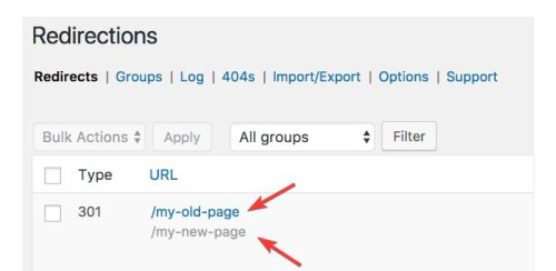
you would need to do this for each language, but all of these redirects will be “301” and I’m not sure if this is bad for SEO, it may be.
All in all, either of these will be a lot of work, if it was my site I think that I would just use the original menu and assume that if someone landed on the EN site and they really wanted the FR site, that they would be fine with going to the FR homepage. But I probably have not thought about it as much as you have.
I hope this helps.
Best regards,
Mike
This reply has been marked as private.
Hello support,
For some time now, I can no longer use the space bar in a special heading.
To troubleshoot, I enter the text I want into a text editor and then paste it into the special heading.
I searched and found the cause of the problem.
If I deactivate the spectra plugin, I can use space bar again
Is it possible to have a fix?
I absolutely need the spectra plugin (which is normally, according to its publisher, compatible with all themes).
My configuration (with the latest versions):
WP 6.3.1
ENFOLD 5.6.6
SPECTRA 2.7.10
Thanks in advance