-
Search Results
-
Topic: Masonry Grid modification
This is a followup to this prior thread:
https://kriesi.at/support/topic/masonry-perfect-grid-setting-images-are-zoomed/
The solution worked, however one thing I didn’t realize is that it added a big gap between the thumbnail and the title when viewing in responsive/mobile screen as well. This gap wasn’t so evident on desktop.
I realize I can change the suggested CSS to only apply to desktop view, using “@media only screen and (max-width: 767px)” modifier, and setting responsive/mobile to display the image at 100% height.
However, after I tested it, the image looks much better at an even smaller height percentage (for example 34%) when viewing in responsive/mobile screen resolution.
Unfortunately this makes the gap even larger between the thumbnail and the title.
I tried adding a “margin-top” to the title text (and adding a -250px value), which does work to move it to be below the thumbnail, but then there’s a major gap between each thumbnail/title grouping, so it also looks strange.
So, my question is – is there a way to make sure the title/description displays directly below the thumbnail, no matter what % the height of the thumbnail is set to, and that each subsequent thumbnail & title appear below each other, without major gaps?
Or at least, is there additional code I can add to the CSS to fix the appearance?
Any help would be greatly appreciated!
Hi,
I have an intro page for a blog made with the “Magazine” content element of the Avia Layout Builder. This creates a “Latest in the News” sidebar entry on each blog page, with small thumbnails of each blog entry arrayed vertically. I’ve noticed that when I have a caption on a featured image of a blog page, a fragment of that caption appears under the thumbnail of that featured image in this side bar. This looks messy.Is there any way to prevent this caption fragment appearing on the magazine sidebar? Screenshot link below.
Hey Gunter,
Recently we’ve encountered an issue with responsive images in the lightbox.
We can’t work out the cause, and have asked one of the hosts (we have sites on different hosts with the same issue) and they say it must be an issue with the responsive images setting in the theme. Turning off the Responsive Images setting fixes the issue, but then we lose retina/responsive images entirely.
If you look at the links below, you will see that images aren’t loading up properly. They should be pulling in image up to 1000px, but they are instead pulling in a cropped thumbnail size (flick through the gallery to see) of 200px or less.
We have this issue on 2 sites now, and are unable to work out the cause or the solution.
Really hoping you can help.
Thanks a lot
Tim.
Hi guys
I’ve setup a masonry on a page, and set to pull from a specific blog post category. I’ve set it to “Perfect Grid” setting, as I want it to display in clean, orderly rows where each entry is the same size (including title & description).
I’ve got it nearly exactly how I want it, however I noticed the post thumbnails are “zoomed” – ie it’s not displaying the full image. This results in some unusual images – you can’t really tell what the subject matter is etc.
I don’t know why this would happen, as I made sure the “Featured Image” for each post in that category was the exact same size.
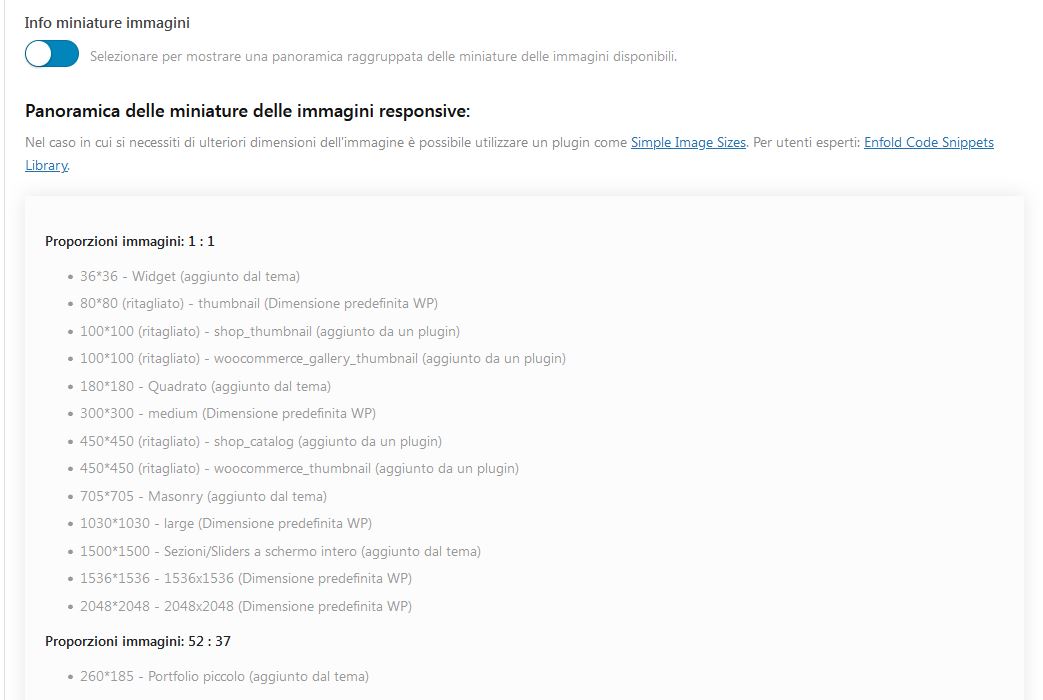
Is it because I haven’t gotten the correct dimensions for my images? Please advise best dimensions, and I can create the images to suit.
Thanks!
Hi guys
I’m working on modifying a site, and added in a masonry element to a page. It will feature recent posts from a specific category.
It’s looking fairly nice after a few tweaks, however none of the posts are clickable. Not the thumbnail, not the title, not the description.
I also note the mouseover effects don’t seem to work – the effect seems to happen on all the posts at the same time, and isn’t triggered when I move my mouse over each element – it just stays that way.
I just updated Enfold to ver. 4.9.2.3 but that didn’t seem to make a difference.
(As a side note, I also note that after I updated, it messed up the full screen slider on the homepage – but I can’t figure out how/what changed)
Any help would be greatly appreciated!
Hi, I am using the Events Calendar plugin with Enfold. I created an event and added a featured image to this event. However, the image being used on the Single Events template is too small and is cropping my image. Here is the event I am working with: https://www.zionrockbaptist.org/event/pastor-emeritus-james-c-edwards-appreciation/. I think Enfold is using the thumbnail or a smaller version of the featured image because the image is being cropped.
Here is a screenshot of the issue: https://share.getcloudapp.com/ApuXK9AA
I would like the image to be taller like the original file. Or just adjust the template to use the full-size image. I couldn’t find any CSS to fix this so I was hoping you could help me out a bit.
Is there a way to get the Single Events template to show the full size featured image? I appreciate any help you can offer. Thank you!
Hello,
I am using the ‘Blog Posts’ element. The left and right of each thumbnail have a grey box around each post and I want to get rid of it. I have tried various sizes for thumbnails to see if it’s the size of each thumbnail but it’s not. Even if I add a thumbnail 300×300, it shows those borders on each thumbnail. I have set it to the orginal size in the ‘edit section’ and also tried automatic size and still get it. How do I remove those borders? With those borders, the page looks too ‘crowded’ with the template I am using. I have posted the link to the page in private as well as a screenshot.
Thank you once again,
BR,
Mike