-
AuthorSearch Results
-
August 28, 2022 at 2:42 am #1362964
In reply to: Icons too big in responsive mood for small screens
Hi,
Thanks for your question, to make your red reservation icon half of its size on mobile you could use this css:@media only screen and (max-width: 767px) { .avia-icon-list.av-iconlist-big .iconlist_icon { height: 32px; width: 32px; line-height: 32px; font-size: 16px; } }but this will also affect some of your other icons, so you should add a custom class to all of your reservation icons and modify the css to include the custom class.
The two icons in your footer, RG and Blue Book, have a width of 12.5% on desktop, and a width of 48% on mobile, so to make them have a width of 12.5% on mobile you could use this css:@media only screen and (max-width: 767px) { .responsive #top #wrap_all .slide-entry.av_one_eighth { width: 12.5%; } }If you find this affecting other icons then you could also add a custom class to them.
After applying the css, please clear your browser cache and check.Best regards,
MikeAugust 27, 2022 at 7:27 pm #1362953In reply to: Custom CSS to style standard post table
Hi,
Please try this CSS instead:
.wp-block-table th {
font-size: 16px;
font-weight: bold;
color: #222;
padding: 5px;
}

.wp-block-table td {
font-size: 16px;
color: #666;
text-align: left;
padding: 5px;
}

.wp-block-table.is-style-stripes tbody tr:nth-child(odd) {
background-color: #e4f1f5;
}
Best regards,
RikardAugust 26, 2022 at 4:42 pm #1362897In reply to: Custom CSS to style standard post table
Hi,
Please try this in Quick CSS:
.wp-block-table th {
font-size: 16px;
font-weight: bold;
color: #222;
}

.wp-block-table td {
font-size: 16px;
color: #666;
}

.wp-block-table.is-style-stripes tbody tr:nth-child(odd) {
background-color: #e4f1f5;
}
Best regards,
RikardAugust 25, 2022 at 2:11 pm #1362790Topic: Custom CSS to style standard post table
in forum EnfoldSandy
ParticipantWhat is the Custom CSS to control the standard WordPress post table styling? These are the style items:
table header
font-size: 16px;
font-weight: bold;
text position: align left, no full width justification
font color: #222222
font: Open Sans, same as themetable body
font-size: 16px;
text position: align left, no full width justification
font color: #666666
font: Open Sans, same as themetable rows
alternating background colors: #e4f1f5 and white
cell padding: 5px or 2% equal on all sides of cellAugust 24, 2022 at 4:52 pm #1362654In reply to: Fullscreen slider change button size
Hey cktanju,
Please try the following in Quick CSS under Enfold->General Styling:
.home .avia-slideshow .slideshow_align_caption a {
    font-size: 26px;
    background: red;
}
Best regards,
RikardAugust 24, 2022 at 2:37 pm #1362637In reply to: Easy Slider issue
This reply has been marked as private.August 24, 2022 at 9:28 am #1362607In reply to: Full width Easy Slider does not resize in mobile
Thanks @NIkko..
It works, font size for mobile adjusted to the proper size and It’s all fine..
Thank You very much
August 24, 2022 at 9:08 am #1362602In reply to: Full width Easy Slider does not resize in mobile
Hi newmediologo,
Please try adding this CSS code in Enfold > General Styling > Quick CSS:
@media only screen and (max-width:767px) {
  #top .av_slideshow_full .avia-slideshow-inner {
    height: auto !important;
  }

  #top .av_slideshow_full .avia-slideshow-inner img {
    min-width: 200px !important;
    left: 0 !important;
  }
}
You may need to adjust the font sizes for mobile.
Best regards,
NikkoAugust 23, 2022 at 8:46 am #1362460Topic: Full width Easy Slider does not resize in mobile
in forum Enfoldnewmediologo
ParticipantHi all..
On a client’s site the Fullwidth Easy Slider does not resize in mobile view, I’ve decreased the font size for the caption and it’s ok bau the images appears cropped..
There’s a way to display the images in small size but entirely..?
Thank You very much
August 20, 2022 at 5:47 am #1362247Hi Mike,
i moved the menu to the sidebar and two old problems came up again.
1. the search resault pages have no graphic in the header.
2. with the imported pages the header graphic is too big
see https://parkinson-journal.de/probieren-geht-ueber-studieren-teil-1-3Can you please correct that for me?
here is the current CSS code:
.widget {
font-size: 16px !important;
font-family: ‘Lato’!important;
}#top.search-results #main p,
#top.search-results #main .post-meta-infos * {
font-size: 18px;
font-family: ‘Lato’!important;
}
#top.single-post .template-single-blog .entry-footer,
#top.single-post .template-single-blog .related_posts,
#top.single-post .template-single-blog .comment-entry,
#top.single-post .template-single-blog .post-meta-infos{
display: none;
}
#top.single-post .template-single-blog .entry-content-wrapper {
padding-left: 10px;
}
#top.single-post .template-single-blog .entry-content-wrapper > .entry-content {
box-shadow: 0 0 10px 0 rgb(0 0 0 / 23%);
padding: 2%;
font-family: ‘Lato’!important;
font-size: 18px;
}#top.single-post .template-single-blog .post-title {
text-transform: uppercase;
letter-spacing: 1px;
font-weight: 300;
color: #222222;
font-size: 28px;
line-height: 1.1em;
text-align: center;
}
#top.single-post .template-single-blog .post-title:after {
content: url(https://parkinson-journal.de/wp-content/uploads/2022/06/Blueline-with-red-icon.jpg);
display: inline-block;
margin-top: 30px;
}
#top.single-post .container_wrap_first:before {
content: url(https://parkinson-journal.de/wp-content/uploads/2022/05/Headpic.png);}
.rssSummary { font-size: 14px; }
a.rsswidget { font-size: 16px; }August 19, 2022 at 4:17 am #1362144In reply to: Custom Elements Not Working
Hi,
If I change a button font size in the custom elements , all the buttons on my page
Please note that only locked options or values will be shared across all CETs in the site. If you created a CET from a Button element for example and locked the value of the Button Label field, all CET instances in the site will share this label or value. So when you edit the Button Label of the CET Button again, all CET instances will inherit the updated label value.
Scenario 1:
1.) Create a CET from a Button element.
2.) Lock the Button Label field with the value “Click me!”.
3.) Add instances of CET Button in 3 different pages or different areas in a single page.
4.) All buttons will have the label “Click me!” by default.
5.) To edit the CET again, go to the “Custom Elements” tab and click the “Edit Custom Elements” button.
6.) Edit the CET Button again by clicking the pencil icon.
7.) Change the label to “Do not click me!”, save the changes.
8.) All instances of the CET Button will be updated and will now have the label “Do not click me!”.Best regards,
IsmaelAugust 18, 2022 at 9:49 pm #1362130Topic: MORE HEADER OPTIONS PLEASE
in forum Pre Sale QuestionsTri
GuestPlease add more header options design. I’ve been using them for 5 years and have not seen add any added functions to the header. The header creates a huge impact on the look and feel on the website.
I love your theme in every way but the header options are so limited and require much custom coding.
Please add the ability to add header widgets, icons, size, font, color. Please see my example below.August 18, 2022 at 5:02 am #1362028In reply to: Custom Elements Not Working
Thank you
I am still trying to understand how this works
If I change a button font size in the custom elements , all the buttons on my page that shares that same custom element should update with the new font size as well right?
It does not seem to be working like that on my site
August 18, 2022 at 4:21 am #1362024In reply to: Make Fullwidth Easy Slider buttons smaller on mobile
Hey navindesigns,
Thank you for the inquiry.
You can use this css code to adjust the size of the buttons on smaller screens.
@media only screen and (max-width: 767px) {

  /* Add your Mobile Styles here */
  .responsive #top .av-kw1jnirn-7aeec02aee509ff49f6cdea556f5817f__0 .avia-button {
    font-size: 13px;
    padding: 8px 18px 6px;
  }
}
We used the unique identifier (uid) of the slider as a selector so the css rule above should only change the size of the buttons within that slider.
Best regards,
IsmaelAugust 17, 2022 at 12:03 pm #1361917In reply to: kleiner Schrift in Mobil Version
Hey sroetheli,
You can set the general font size of the site for each screen size under Enfold->General Styling->Typography.
Please try this in Quick CSS to adjust the font size of the mobile menu:
@media only screen and (max-width: 767px) {
#av-burger-menu-ul li a {
  font-size: 14px;
}
}
Best regards,
RikardAugust 13, 2022 at 9:35 pm #1361616In reply to: General question
Hi Philippe,
Thanks for reaching out to us, and for using Enfold. Everyone has their own preferences as to what they think is appealing on a website, but most things are possible to set and change in the theme options. If you want to change the fonts and sizes, then you can do so under Enfold->General Styling->Typography for example, and further settings can be made under Enfold->Advanced Styling.
You should need further help, then please let us know what you would like to change on your sites. Please share screenshots with us if possible, since it makes it easier for us to understand what you are trying to achieve.
Best regards,
RikardAugust 13, 2022 at 11:56 am #1361592In reply to: Can't make notification font smaller in font
Hi,
Try this instead:
h2.gform_submission_error {
  font-size: 16px !important;
}
Best regards,
RikardAugust 12, 2022 at 6:21 pm #1361566In reply to: Can't make notification font smaller in font
Hi,
Thanks for that. Please try the following in Quick CSS under Enfold->General Styling:
h2.gform_submission_error {
  font-size: 16px;
}
Best regards,
RikardAugust 12, 2022 at 4:17 pm #1361552Topic: How to Bold Text in Tables
in forum Enfoldwildturkeyway
ParticipantI’ve used Text in other areas of Enfold without it breaking anything. But trying to use it in alternating table rows, it bolded text where I didn’t use Text :-(
At the bottom of this page Special Character do I need to use this plugin Translation plugin and then use ###lt###Text###gt### to Bold?
But what about the “/” in ###gt### to close the element?
I’ve spent hours trying to figure this out.I grabbed this from the forum and use it in Quick css
`// CSS – Pricing Table
//————————————–*//* Heading */
#top .pricing-table li.avia-heading-row,
#top .pricing-table li.avia-heading-row .pricing-extra {
background-color: #1379cb!important;
font-size: 14px;
/* color: #000000; */
border-color:#1379cb;
}/* Pricing rows */
#top .pricing-table li.avia-pricing-row {
background-color: #ff892f!important;
font-size: 24px;
color: #000000;
border-color:#1379cb;
}-
This topic was modified 3 years, 7 months ago by
wildturkeyway. Reason: update
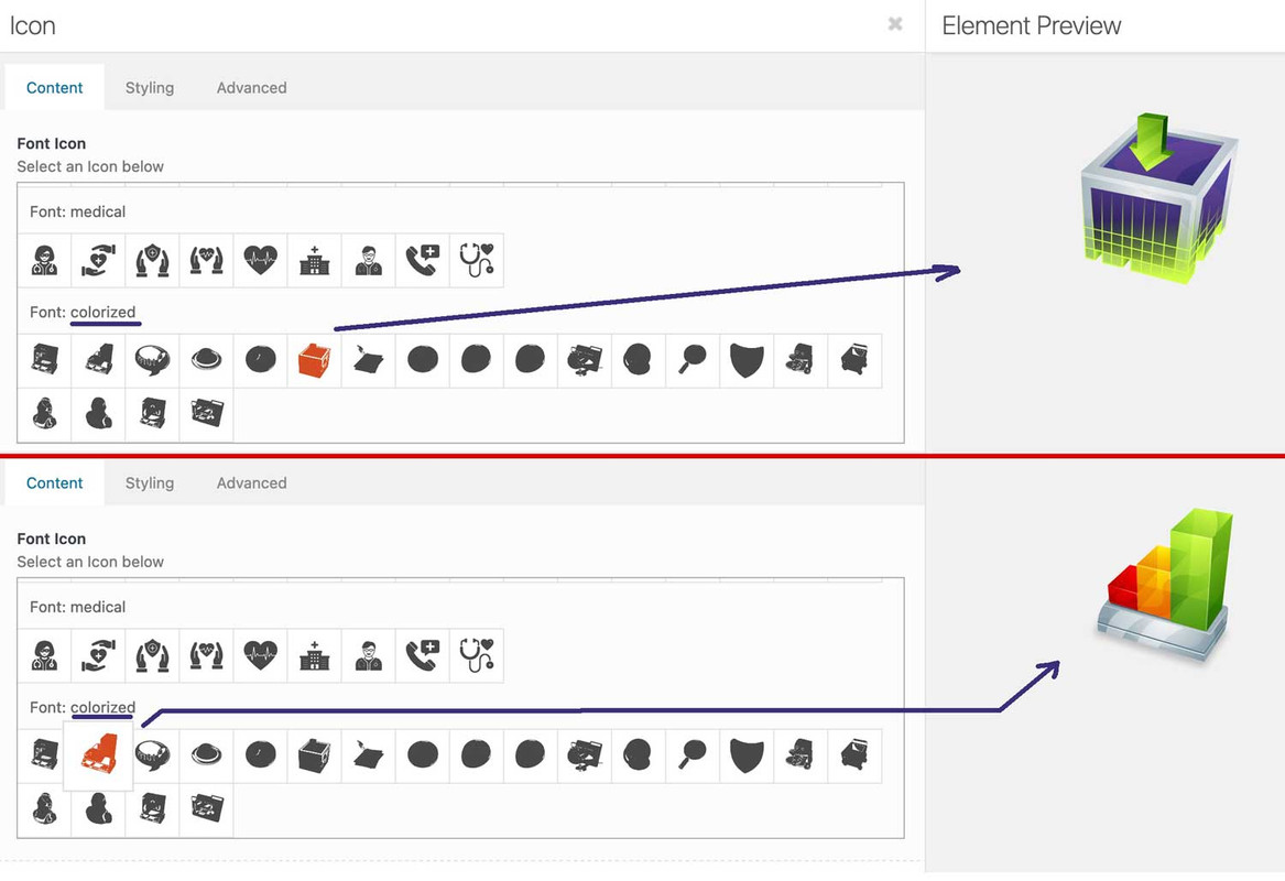
August 8, 2022 at 4:01 pm #1361130In reply to: How to upload icons
did you read further on: https://kriesi.at/support/topic/ajout-dicones-dans-enfold/#post-1356658
you can upload your svg files to media-library and replace existing font-icons. So you can use the enfold insertion of font-icons – and replace them by css:
f.e. with an unimated svg or gif: https://webers-testseite.de/

webdesing columnafter my posting i recognized that some icons are in span etc. you had to adjust the replacement code then
[data-av_icon="\e837"] {
	content: " ";
	background-image: url(/wp-content/uploads/ezgif-4-64b6614e32.gif);
	background-size: contain;
	background-repeat: no-repeat;
       font-size: 0 !important
}
_______
Yes – it’s a bit of work, but it’s worth doing this way.
You convert your colored svgs in icomoon app to black svgs – upload them to fontello and then import them into Enfold. Then you replace the black pendents with the colored svgs via css. Then you have the advantage to use these colored icons like font-icons everywhere where they can be positioned in Enfold Alb elements.and btw. if you only like to have colorized icons f.e. with gradient:
( You need to be more specific with this selector here – to not address all icons on the page )[data-av_icon]:before { background: linear-gradient(135deg,rgb(74,234,220) 0%,rgb(151,120,209) 20%,rgb(207,42,186) 40%,rgb(238,44,130) 60%,rgb(251,105,98) 80%,rgb(254,248,76) 100%); -webkit-background-clip: text; background-clip: text; -webkit-text-stroke: 0px blue; /*** you even can have strokes on the icons ***/ -webkit-text-fill-color: transparent; }for example: https://enfold.webers-webdesign.de/colorized-font-icons/
i named the svgs analog to the code the black icons have on the fontello fontin edit mode:
 August 7, 2022 at 8:41 pm #1361013
In reply to: Mobile Font Issues
Hi,
Thanks for the apology, it’s appreciated. If I suggest a to use a different element or a different way of doing something, it’s not to be rude. I’m only trying to help you out to have a better interaction with the theme.
Please help me understand why the special headings element works and the text element I was using does not. I do understand that only putting the 72px value in and nothing else means everything is set to 72px I’m confused about this part though….Each of those elements has the same text size component, where you can leave it blank or insert your desired text size for each screen size. I did that on the text element I initially used but it didn’t work. I had only placed text sizes in the last two screen sizes previously, but in the special headings element, I went ahead and filled in the size for each screen. Could that be part of the problem? Must you fill in all the text sizes for it to work properly?
This is what I tried explaining with the first test page I linked to. If you add inline CSS to any html markup, then in most cases it will override any other CSS which is trying to set the same value. I’ll try a different example:
//This text will override theme settings, and will always show at 70px
<h1 style="font-size: 70px;">My heading</h1>
//This text should get its size from the theme settings <h1>My heading</h1>Special Heading element – will get its styling from the theme settings. You can set the responsive font sizes under Enfold->General Styling->Typography. You can also set styling under Enfold->Advanced Styling.
Text Block element with responsive font settings – If you use a Text Block element and you set font sizes for each screen size in the element options, then that should override the general theme settings. Please note that you need to set values for all screen sizes, otherwise the last value set will apply to smaller screens.
I hope that explains it a bit clearer.
Best regards,
RikardAugust 7, 2022 at 5:56 pm #1361005Hi @Rikard. I already explained in my first message that I already did what you are asking to test.
1) I removed the whole CSS
2) I set the Default Content Font Size to a large value
3) Cleared the cache, opened the website: the default text is still unchanged.But I did it once again. In these screenshots you can see:
1) Set the default font size to 70px (all the 4 values, just to be sure it is not mistakenly skipping the first value): https://imgur.com/a/lZNGH0E
2) cleared the whole CSS area (you can see that it is also “saved” already: https://imgur.com/a/qJzNRMb
3) See the normal text when I access no matter what page (you can see that I am also in incognito mode): https://imgur.com/a/iSjGTmoTherefore, as I said in my previous messages, the Default Content Font Size seems NOT to be working.
I also wrote already that the H1, H2, H3… values in Typography are working fine. The only one that seems not working is the Default Content Size.Bye,
A.-August 7, 2022 at 2:13 pm #1360999Hi,
Thanks for the update. Please try to remove the CSS I referred to above, then make the settings you would like to have under Enfold->General Styling->Typography. Look for the Default content font size option.
Best regards,
RikardAugust 7, 2022 at 11:49 am #1360989Yes, Rikard: as I wrote in the P.S. of my message, I am now achieving the result I wanted by setting the size of the <P> font directly in the CSS.
I just wanted to do it with the “Default Content Size” in General Styling/Typography, because I’d like to avoid using CSS if not strictly necessary.
That one setting seems not to be working for me (while H1, H2, H3 settings are ok), and, as I wrote, I also tested it after deleting the whole CSS customization (in Staging, of course). Therefore, there should not be any “custom CSS” overriding that configuration.If you want to test it, feel free to temporarily comment out that part in the CSS…
You may also say “don’t bother us, please continue with the CSS configuration!” and I will accept if for sure :-)Thanks in any case!
Bye,
A.-August 7, 2022 at 10:51 am #1360983In reply to: Mobile Font Issues
This reply has been marked as private.August 7, 2022 at 10:39 am #1360979Hi,
Thanks for the update. The page you linked to on the staging site is still htaccess protected, but I checked your Quick CSS on the site you sent login details to, and it looks like you are overriding the theme settings with this CSS:
@media only screen and (max-width: 767px) {
p {
font-size: 18px !important;
/*line-height: 1.3em !important;*/
}
}
Best regards,
RikardAugust 7, 2022 at 10:27 am #1360975In reply to: Mobile Font Issues
Hi,
I tried your suggestion, and as I indicated before, it did not work. Adding the font size in css or inline makes to difference, the mobile settings are not responsive The font, remains at 72px on every screen.
But that is exactly what my example page showed you. If you add inline CSS, that will apply instead of any theme setting, since that CSS has a higher priority. If you don’t understand how CSS priority works, then please try to do a bit of research online.
This page will answer your question in the screenshot: https://wpexpert.se/enfold/text-block-font-sizes-example/
Not at all, I’m simply suggesting that when you design a website, it’s designed for the largest screen first, then the responsive settings adjust all the page elements to fit the appropriate size. That 72px value would still be there for the larger screens and naturally, adjust to smaller screens. That is how responsive websites are supposed to work.
You have explicitly told an element to be 72 pixels, with no further specification. How exactly should the theme then know when you want it to change, and on which screen sizes?
Best regards,
RikardAugust 6, 2022 at 10:23 pm #1360949In reply to: Mobile Font Issues
This reply has been marked as private.August 6, 2022 at 9:35 pm #1360947In reply to: Mobile Font Issues
This reply has been marked as private.August 6, 2022 at 5:39 pm #1360928In reply to: Mobile Font Issues
Hi,
First of all, please try to calm down a little bit. If you don’t understand something, then it’s better to ask. I’ve made a test page for you, so that you can see what happens when you add CSS inline. The first header is a copy from your site, the second one is a Special Heading element from the Layout builder, and I’ve specified font sizes for different screen sizes in the theme options:
https://wpexpert.se/enfold/header-test-page/
As you can see, your heading is displayed at 72 pixels on all screen sizes, since the inline CSS has priority over other CSS, unless you have added !important to it. And as far as I can see, you have not specified font sizes for any other screen size. Are you suggesting that we override the styling you have added yourself? If so, then even the 72 pixel setting which you have added, would not be respected.
About the paragraphs on the other two page; I can’t see that you have made any font size settings on either page. Could you try to explain the problem a bit further?
Best regards,
Rikard-
This reply was modified 3 years, 7 months ago by
Rikard.
-
This topic was modified 3 years, 7 months ago by
-
AuthorSearch Results
-
Search Results
-
What is the Custom CSS to control the standard WordPress post table styling? These are the style items:
table header
font-size: 16px;
font-weight: bold;
text position: align left, no full width justification
font color: #222222
font: Open Sans, same as themetable body
font-size: 16px;
text position: align left, no full width justification
font color: #666666
font: Open Sans, same as themetable rows
alternating background colors: #e4f1f5 and white
cell padding: 5px or 2% equal on all sides of cellHi all..
On a client’s site the Fullwidth Easy Slider does not resize in mobile view, I’ve decreased the font size for the caption and it’s ok bau the images appears cropped..
There’s a way to display the images in small size but entirely..?
Thank You very much
Topic: MORE HEADER OPTIONS PLEASE
Please add more header options design. I’ve been using them for 5 years and have not seen add any added functions to the header. The header creates a huge impact on the look and feel on the website.
I love your theme in every way but the header options are so limited and require much custom coding.
Please add the ability to add header widgets, icons, size, font, color. Please see my example below.Topic: How to Bold Text in Tables
I’ve used Text in other areas of Enfold without it breaking anything. But trying to use it in alternating table rows, it bolded text where I didn’t use Text :-(
At the bottom of this page Special Character do I need to use this plugin Translation plugin and then use ###lt###Text###gt### to Bold?
But what about the “/” in ###gt### to close the element?
I’ve spent hours trying to figure this out.I grabbed this from the forum and use it in Quick css
`// CSS – Pricing Table
//————————————–*//* Heading */
#top .pricing-table li.avia-heading-row,
#top .pricing-table li.avia-heading-row .pricing-extra {
background-color: #1379cb!important;
font-size: 14px;
/* color: #000000; */
border-color:#1379cb;
}/* Pricing rows */
#top .pricing-table li.avia-pricing-row {
background-color: #ff892f!important;
font-size: 24px;
color: #000000;
border-color:#1379cb;
}