Viewing 30 results - 5,071 through 5,100 (of 18,734 total)
  • Author
    Search Results
  • #1110683

    Hi,
    To center the “related products” title and increase the font, Please try this code in the General Styling > Quick CSS field or in the WordPress > Customize > Additional CSS field:

    .related.products {
        text-align: center !important; 
    }
    .related.products > h2 {
        font-size: 22px !important;
    }

    please adjust to suit, Then clear your browser cache and any cache plugin, and check.

    To change the related products text, Try adding this code to the end of your functions.php file in Appearance > Editor:

    function custom_related_products(){
      ?>
      <script>
    (function($){
      $(document).ready(function(){
      $('.related.products h2').each(function() {
        var text = $(this).text();
        $(this).text(text.replace('Related products', 'Awesome Deals')); 
    });
    });
    })(jQuery);
    </script>
    <?php
    }
    add_action('wp_footer', 'custom_related_products');

    Please adjust “Awesome Deals” to suit. Also note that with this text replace, case does matter, see ‘Related products’

    Best regards,
    Mike

    #1110631
    .page-id-102 #av_section_1 .avia-button.avia-size-large {
        padding: 15px 25px 13px;
        font-size: 13px;
        min-width: 150px;
    }

    btw: you had to break your menu earlier – on screen-width less than 1216px you have menu-items in top-section

    webworm72
    Participant

    So this is something I have ran into before so I figured it was time to get some help.;-)
    See private content for link to website I am working on
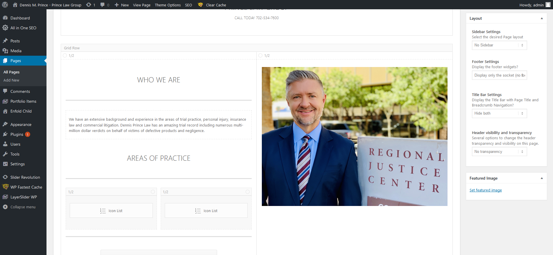
    The home page formats correctly on a desktop wide screen 1920 x 1080 monitor see screen shot below
    Desktop Home

    However on an Ipad Pro Tablet as you can see it needs some adjustments , the white area is being pushed down on the left side
    Ipad Pro

    So my solution is to go in and make adjustments to the elements on the left hand side like the Font size of the special header and the text and I may have to hide some of the elements so that it will format properly on smaller screens like the Ipad Pro screen. See screen shot
    Elements  to change

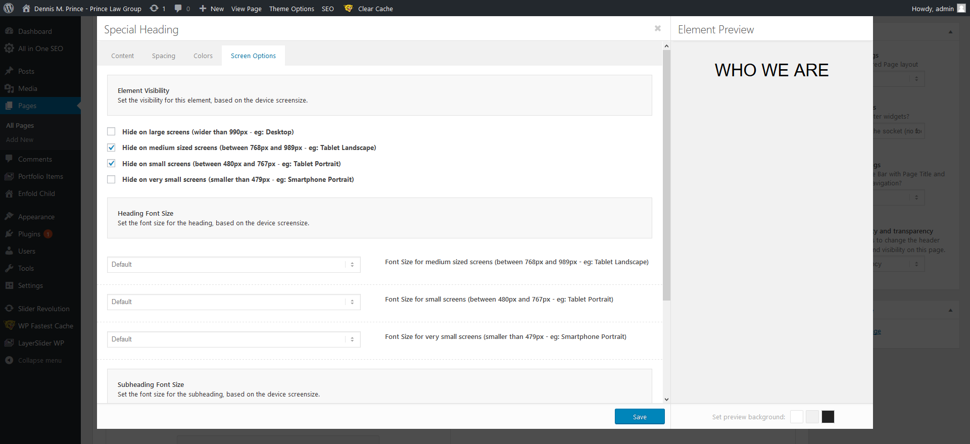
    The problem is that when I go into “Screen Options ” and make changes to font size or try to hide elements for the IPad Pro / Tablets in portrait or landscape nothing happens, I clear cache , so I know that’s not an issue and it works fine for Mobile / IPhone changes see screen shot
    and it only hides on screens 989px or smaller
    Sscreen Options

    So they say the IPad Pro has a 12.9 in screen and very high resolution so assuming that’s the problem 2732 x 2048
    screen sizes

    any thoughts on how I can get this page to be responsive across all platforms ?

    • This topic was modified 6 years, 9 months ago by webworm72.
    #1110459

    Hi Maya, 

    Here is the code you can put in Enfold > General Styling > Quick Css,  if it does not work, put into themes/enfold/css/custom.css

    
    .home #av_section_1 .av_textblock_section p em {
        font-size: 18px;
    }
    

    If you need further assistance please let us know.

    Best regards,
    Victoria

    #1110389

    In reply to: Sub Menu Font size

    Hey mayamaria,

    Here is the code you can put in Enfold > General Styling > Quick Css,  if it does not work, put into themes/enfold/css/custom.css

    
    #av-custom-submenu-1 .avia-menu-text {
        font-size: 12px;
    }
    

    If you need further assistance please let us know.

    Best regards,
    Victoria

    #1110340

    In reply to: Font upload issue

    Also, how could I adjust the size of the font. I would like to make it slightly smaller.

    Thank you,
    Maya

    #1110332

    Hi Victoria,

    Thank you that worked.

    I have the paragraph font size set in the Advanced setting but would like to change the size of the text on Home page with out altering the paragraph font size.

    Home Page: I want to enlarge the size of the text under THE CONDUIT.

    Thank you,
    Maya

    #1110330
    lagruga
    Participant

    Hi Guys,
    I need to change the title for Related Products, centralise the text and alter the size of the font without affecting any of the H2 headers – many thanks.

    • This topic was modified 6 years, 9 months ago by lagruga.
    #1110279

    Rikard

    I added the Quick CSS but there was no change.
    In fact, it is not the background color but the appearance – I will copy the original question sent :

    I created a basic contact form using WPForms – however, the appearance is different from what I see in the edit window of WPForms and the actual page of the form.

    Differences are :
    – Font size and style
    – Asterisk color
    – There should be no space between boxes and label text

    How it appears in the edit window of WPForms
    https://www.mocosbikehire.jp/wp-content/uploads/2019/06/スクリーンショット-2019-06-10-16.48.45.png

    How it appears
    https://www.mocosbikehire.jp/wp-content/uploads/2019/06/スクリーンショット-2019-06-10-17.01.39.png

    What can I do to display the form as it appears in the edit window?

    #1110045

    Hi Maya,

    Here is the code you can put in Enfold > General Styling > Quick Css,  if it does not work, put into themes/enfold/css/custom.css

    
    .aviaccordion-excerpt p {
        font-size: 12px;
    }


    If you need further assistance please let us know.

    Best regards,
    Victoria

    #1109911

    Hi Jordan,

    I uploaded originally at 1600 × 1067. It crops it properly, but it’s blurry.

    I also tried 300 x 450, but it doesn’t crop it at all and it’s still blurry.

    Login details below. And I have the following CSS in place:

    .av-tab-section-image {
    height: 300px !important;
    }

    .av-inner-tab-title, .av-tab-section-icon, .av-tab-arrow-container, .av-tab-section-image {
    width: 300px !important;
    }

    .av-tab-arrow-container {
    width: 300px !important;
    }

    .av-inner-tab-title {
    width: 300px !important;
    font-size: 16px !important;
    font-weight: bold !important;
    }

    #1109900

    Topic: Sub Menu Font size

    in forum Enfold
    mayamaria
    Participant

    Hi,

    I have a couple of questions.
    1. I would like to adjust the Sub Menu font size to match the Main menu.

    2. Home Page Maisonary Gallery Font – I would like to change this to be the same font as the Heading font please.

    3. Home Page – Under THE CONDUIT heading font I would like to increase the size of the body text (larger) however would not like the rest of the body text in the website to change.

    Thank you!
    Maya

    #1109664

    In reply to: Menu Center

    Hallo Franz,

    Thank you for the kind words :-)

    Please try this CSS as well:

    @media only screen and (max-width: 767px) {
    .av-submenu-container li {
        padding: 5px 0;
    }
    
    .av-submenu-container .avia-menu-text {
        font-size: 20px;
    }
    }

    LG,
    Rikard

    #1109655

    Hi,

    Ok, so then you need to use a font size which will fit in the container?

    Best regards,
    Rikard

    #1109653

    In reply to: Change Footer font

    Hi,

    Please try this instead:

    #footer .widgettitle {
      font-family:"transfonter.org-20190530-150259";
      font-size:12px;
    }

    Best regards,
    Rikard

    This reply has been marked as private.
    #1109437

    In reply to: Change Footer font

    Hi Rikard,

    Thank you, the worked. How can I now adjust the size of the fonts?

    Kind regards,
    Maya

    #1109418
    crg1
    Participant

    It has been some time since I used Enfold for any projects however, I have decided to give it another go for a client who has requested a specific design. I am having difficulty styling the navigation menu, more so due to caching issues. Every single time I make changes it is not showing, I have to clear the cache in order to see the changes. This is not practical, all I am trying to do is change the menu background colour and font colour / sizes.

    After giving up using Enfold on over 15 projects due to styling being a bit of a headache, I can see why I preferred the Avada theme in so many ways. It really shouldn’t be so awkward to amend the colours, fonts etc on the navigation bar and this seems to have been a problem for years.

    #1109367

    Hey mayamaria,

    Please try the following in Quick CSS under Enfold->General Styling:

    .aviaccordion-excerpt p {
      font-size:14px;
    }

    Best regards,
    Rikard

    #1109343

    In reply to: A touch of CSS

    Hi,

    Try this instead:

    .tax-product_cat .term-description p {
      font-size:16px;
      background-color:green;
      margin:0;
      border-radius:5px;
      padding: 5px 10px;
    }

    Best regards,
    Rikard

    Hi:-)
    Sry for still going on the your nerves, but

    1. I put in the code, it didn’t change the font size in the footer – but I solved it via text links, so it is ok.
    2. I can see the social icons on mobile, but they are too big now, so that the search function and menu overlay the logo. Number 1 an 2 in the screenshot. Is there any other possibility to place them? Perhaps down to the footer?
    Screenshot Mobile
    3. Then I ve hiddn an element on mobile view, but now the space is so large between header and the next element. It is Number 3 in the screenshot above. How can I correct this?
    4. NEW: I really tried for 1 hour to bring back the text section above the Read more Tag in the posting back under the post previewon the start page – but I don’t know how to do this.
    5. Whne you click on a post, you see only the text – but no picture and no headline. How can I bring that back?

    Thnx a lot Victoria!
    Best regards!
    Iris

    #1109228
    mayamaria
    Participant

    Hi,

    How can change the size of the font for the accordion slider?

    Thank you.

    #1109217

    Topic: Change Footer font

    in forum Enfold
    mayamaria
    Participant

    HI,

    I would like to change the Heading font for the footer to the body text font.

    I would also like to change enlarge the size of the font on the Home page Masonary Gallery section.

    How can I do this?

    Thank you,
    Maya

    Hi Wondergirrrl,

    https://cl.ly/3fcedc71d4fe The code I gave you just increases the icons here and in the footer. And so it does work, I am not sure what buttons you’re talking about here.

    2 You’re using different widgets for the footer columns and so they have different html and styles.

    The code can be added to the Quick css:

    
    #top .widget_nav_menu li {
        font-size: inherit;
    }
    

    The theme is fully responsive and so I am not sure what elements and for what screen sizes you need to adjust. A screenshot would help.

    This code will get the social icons to show on mobile:

    
    @media only screen and (max-width: 479px) {
        .responsive #top #wrap_all #header .social_bookmarks,
         .responsive #top #wrap_all #main .av-logo-container .social_bookmarks {
            display: block;
        }
    }
    

    Best regards,
    Victoria

    #1109167

    In reply to: Logo overlaps Menu

    Hi,

    Yes. Basically width is too much. You could consider decreasing font size of logo title text or size of icon

    Best regards,
    Yigit

    #1109122

    In reply to: A touch of CSS

    Hey wealthyone,

    Please try the following in Quick CSS under Enfold->General Styling:

    .tax-product_cat .term-description p {
      font-size:16px;
      background-color:green;
    }

    Best regards,
    Rikard

    #1109026

    Topic: A touch of CSS

    in forum Enfold
    wealthyone
    Participant

    Just wondering if you can help me here.

    If you look at my website I see the fond under the category image is very small.
    I would like to increase the size of the font and also put a background color behind the wording.

    I cant quite get the right code for this one..

    So

    Increase the size of the font and change its color. And also put a background color behind these words only.
    Can the background color have rounded corners as well.?

    Thanks for any help

    #1108907

    Hey NoraGTS,

    Add this to quick css:

    table caption{
    font-size:16px!important;
    color:#fff!important;
    }

    Best regards,
    Jordan Shannon

    #1108887
    NoraGTS
    Participant

    Hello,
    I set up a timetable for my page and would like to change the font color and the size of the ADDITIONAL WRITING ON TOP OF THE TABLE. I need to highlight it more, because right now you can hardly see it.
    Thanks Nora

    #1108807

    Hi Victoria,
    thanks, but it does not work, the buttons are still to small – and I cannot find themes/enfold/css/custom.css
    And further more, what do you mena with mockup? Didn’t you understand what I mean? If my english is too bad, I will open a support ticket in german – shall I? I try to explain better. The website is http://www.leonpluto.de, I put the lig in data into private info, too.

    2. And the font in the footer column 4 (with impressum and dateschutz) is different to the other columns, if you look at the page, you ll see the difference. I want the fonts in the columns all at the same size – Where can I change it?

    3. I want to show the social buttons in the FOOTER bigger, too- they are too small and I want to show them in the middle?? How can I change (I don#t know how to eplain better.)

    4. I want to adjust the theme to responsive – so, do I have to adjust each single objekt in the same – or ist there a special function? – I Mean: Where can I adjust the the seems lokks at mobile view good?

    5. Where can I adjust responisve options, when I don’t want to show 2 posts in a row, but just one (startpage) – just give a try, you’ll see it, whne you look at the page on monile view

    6. I had to hide the slider in the start page at mobile view – but now the space is too much between menu and the next object. How can I adjust this? – just give a try, you’ll see it, when you look at the page with mobile view

    7. I want to show social buttons in the header or footer at mobile view – at the moment they are hidden – how can I achieve this?

    8. And new: the space at mobile view beetween content an footer is too large. How can I adjust this?

    • This reply was modified 6 years, 9 months ago by Wondergirrrl.
Viewing 30 results - 5,071 through 5,100 (of 18,734 total)