
-
AuthorPosts
-
June 15, 2019 at 2:21 am #1110550
So this is something I have ran into before so I figured it was time to get some help.;-)
See private content for link to website I am working on
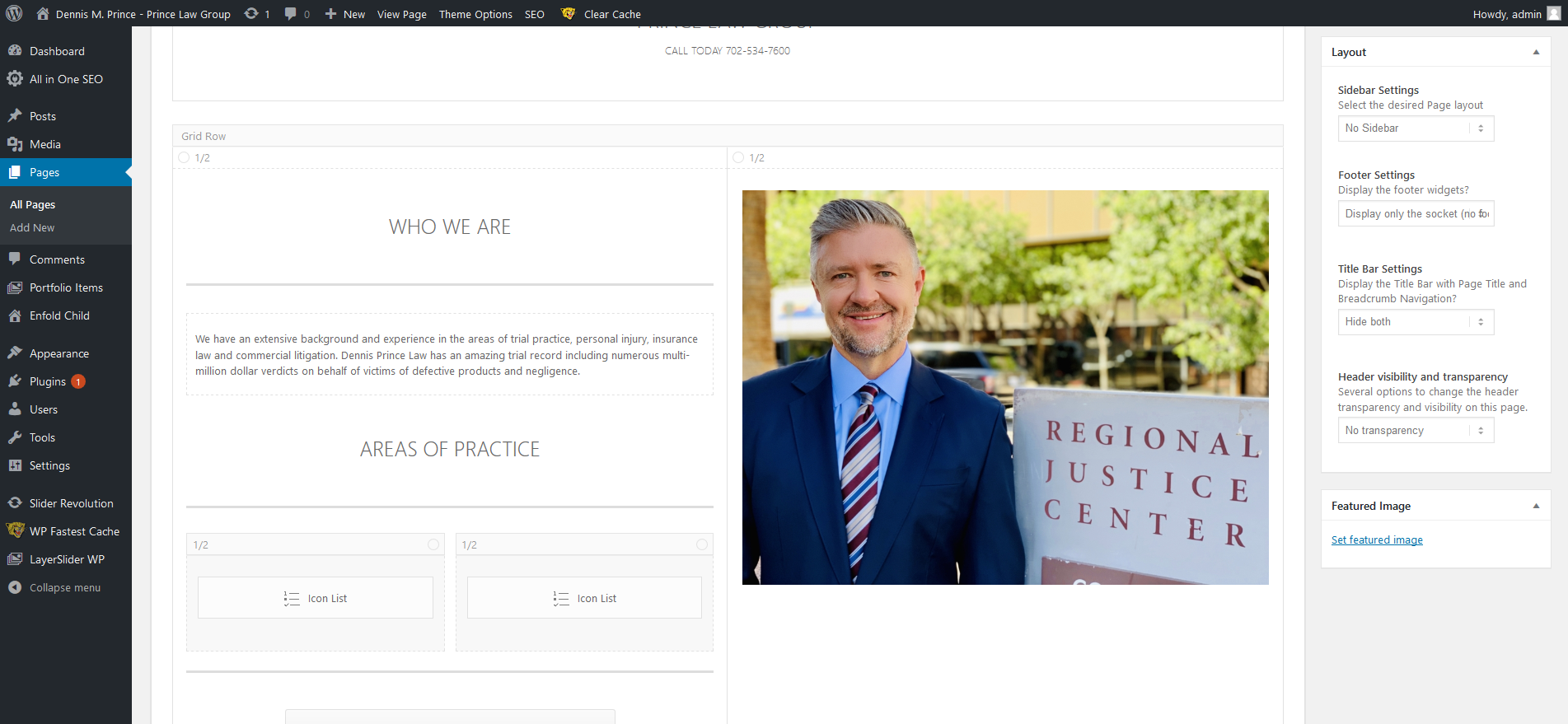
The home page formats correctly on a desktop wide screen 1920 x 1080 monitor see screen shot below

However on an Ipad Pro Tablet as you can see it needs some adjustments , the white area is being pushed down on the left side

So my solution is to go in and make adjustments to the elements on the left hand side like the Font size of the special header and the text and I may have to hide some of the elements so that it will format properly on smaller screens like the Ipad Pro screen. See screen shot
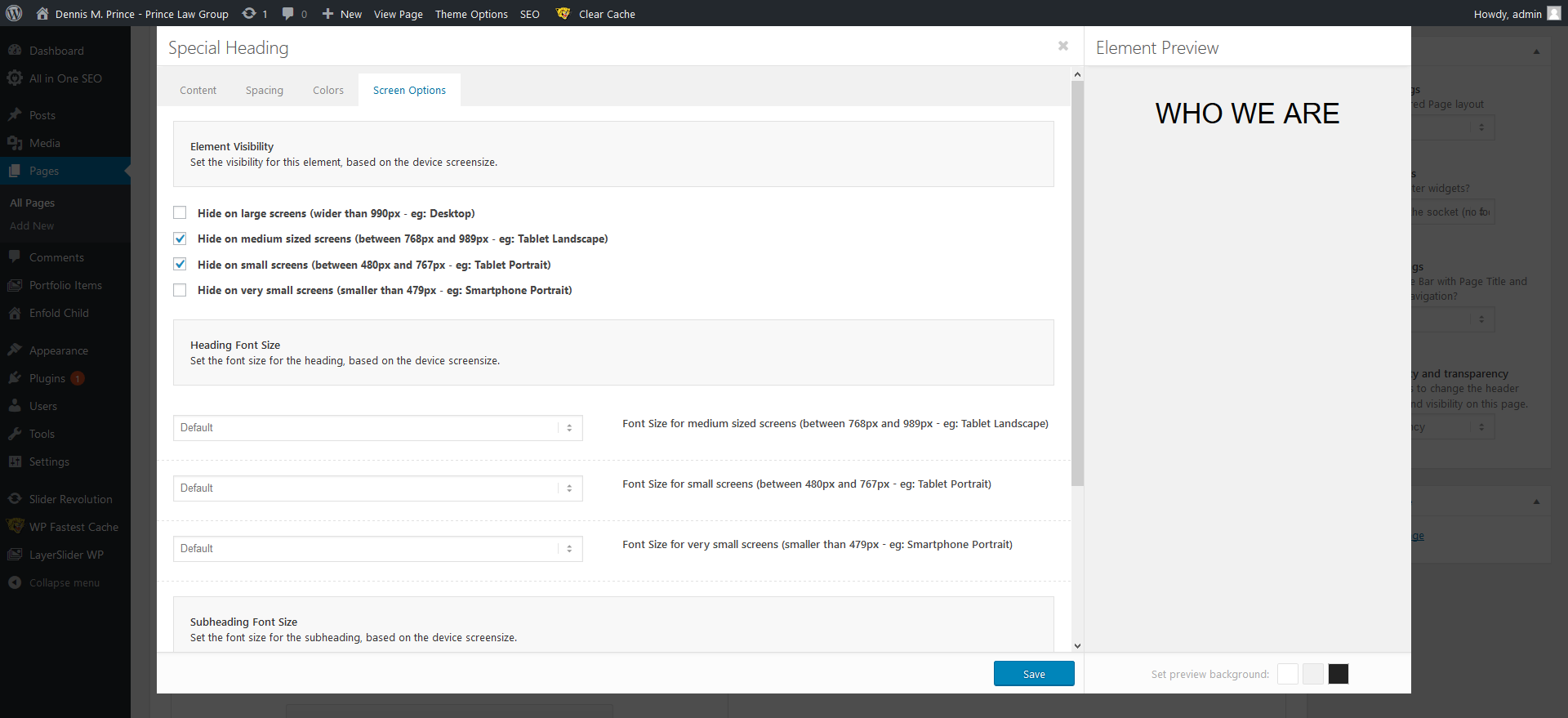
The problem is that when I go into “Screen Options ” and make changes to font size or try to hide elements for the IPad Pro / Tablets in portrait or landscape nothing happens, I clear cache , so I know that’s not an issue and it works fine for Mobile / IPhone changes see screen shot
and it only hides on screens 989px or smaller
So they say the IPad Pro has a 12.9 in screen and very high resolution so assuming that’s the problem 2732 x 2048
screen sizesany thoughts on how I can get this page to be responsive across all platforms ?
-
This topic was modified 4 years, 10 months ago by
webworm72.
June 17, 2019 at 12:02 am #1110875Hey webworm72,
You can use these media queries:/* ----------- iPad Pro ----------- */ /* Portrait and Landscape */ @media only screen and (min-width: 1024px) and (max-height: 1366px) and (-webkit-min-device-pixel-ratio: 1.5) { } /* Portrait */ @media only screen and (min-width: 1024px) and (max-height: 1366px) and (orientation: portrait) and (-webkit-min-device-pixel-ratio: 1.5) { } /* Landscape */ @media only screen and (min-width: 1024px) and (max-height: 1366px) and (orientation: landscape) and (-webkit-min-device-pixel-ratio: 1.5) { }Try adding a custom class or ID to the text area and then we can set the size in percentages like:
font-size: 70% !important;Best regards,
MikeJune 18, 2019 at 1:10 am #1111186thanks Mike !
how do you add a custom class or ID to a text area
June 18, 2019 at 12:12 pm #1111275Hi,
Please ensure that your custom classes are enabled at: Enfold Theme Options > Layout Builder > Show element options for developers

Then as you edit each element a new field will show at the bottom of the screen for custom classes or sometimes custom IDsBest regards,
MikeJuly 20, 2019 at 11:58 pm #1120504you can close this ticket
July 21, 2019 at 3:41 am #1120549Hi,
Glad we were able to help, we will close this now. Thank you for using Enfold.For your information, you can take a look at Enfold documentation here
For any other questions or issues, feel free to start new threads in the Enfold forum and we will gladly try to help you :)Best regards,
Mike -
This topic was modified 4 years, 10 months ago by
-
AuthorPosts
- The topic ‘How to Hide Elemetns or adjust font size under Screen Options for Ipad Pro’ is closed to new replies.