-
AuthorSearch Results
-
March 4, 2020 at 6:10 am #1189898
In reply to: Text box – custom sizes not working
Hi,
You should be able to keep your settings in Advanced Styling and use this CSS instead:
.page-id-535 #av_section_3 .av_one_fifth .avia_textblock {
  font-size: 12px !important;
}
The diagonal border is covering your button, do you want to make the section wider, or remove the padding on top of it?
Best regards,
RikardMarch 4, 2020 at 1:33 am #1189863In reply to: Few help needed
Hi,
Sorry for the late response.
1.) Are you referring to the base shop page or the actual product view? A link to the site will help. For the meantime, you can use this css code to adjust the style of the product price.
top .price, #top .price span, #top del, #top ins {
    display: inline;
    text-decoration: none;
    font-size: 20px;
    line-height: 24px;
    font-weight: 600;
    text-align: center;
}
2.) This is possible, but you have to modify or override the plugin templates as described in the documentation.
// https://docs.woocommerce.com/document/template-structure/
3.) The height of the item usually depends on the size of the image, but we can use css to adjust it. You can also adjust the thumbnail size and aspect ratio in the Appearance > Customize > Woocommerce > Product Images panel.
4.) Yes, that’s possible. You can use this css code to adjust the container of the featured image.
.single-product-main-image {
	width: 50%;
	float: left;
	margin-right: 50px;
	overflow: hidden;
	padding-bottom: 50px;
}
We always advice users to post their inquiries on separate threads or tickets instead of posting multiple ones in a single thread like this. The response time is usually faster that way and prevents confusion in our part and yours.
Best regards,
IsmaelMarch 3, 2020 at 9:40 pm #1189832elenagrassi
ParticipantHallo,
I am working on my new website by personalizing your Health Coach demo. I would like to change the background color of the breadcrumbs to white. It is now green (see sample page). I haven’t been able to find how to do that.
Also, I would like to reduce the font size in the icon boxes, in the same page as above, scrolling down.Can you help?
Thank youMarch 3, 2020 at 12:48 pm #1189703In reply to: Text box – custom sizes not working
I decided to remove the advanced styling where I was forcing the <p> tag to have 1.6em spacing and 16px font size… That then enabled your code to work.
It seems to be that the advanced styling overrides everything.
March 3, 2020 at 9:42 am #1189634In reply to: Increase font size in small menu above main menu
Hi,
Thanks for the update. Please try this CSS as well:
#top #header_meta .phone-info span {
  font-size: 18px;
}
Best regards,
RikardMarch 3, 2020 at 6:57 am #1189599In reply to: Text box – custom sizes not working
Hi,
Thanks for that. Please try the following in Quick CSS under Enfold->General Styling:
.page-id-535 #av_section_3 .av_one_fifth .avia_textblock {
  font-size: 12px;
}
Best regards,
RikardMarch 3, 2020 at 2:34 am #1189555Topic: Burger menu sublink font-size
in forum Enfoldmclweb
ParticipantHow can I change the font-size of the sublinks on a burger menu?
March 2, 2020 at 6:23 pm #1189494In reply to: Increase font size in small menu above main menu
Thank you! It increased the font size for the menu portion, the “Phone number or small info text” wasn’t affected. Is there an additional variable for that portion?
March 2, 2020 at 2:23 pm #1189434In reply to: logo & menu font size
Hey,
Thanks for contacting us!
1- You can go to Enfold theme options > Header > Header Size and increase it. Your logo would adapt to header height.
2- Please go to Enfold theme options > Advanced Styling and edit “Main menu links” and increase font size :)Cheers!
YigitMarch 2, 2020 at 2:12 pm #1189431Topic: logo & menu font size
in forum Enfoldpayton_sil
ParticipantHow do I increase the size of my logo and main menu font size?
March 2, 2020 at 1:05 pm #1189417In reply to: Text box – custom sizes not working
Hi!
I’m adding the link in the private box below.
I’d like to change the font size of the 5 boxes in the grey ribbon to something smaller.Thanks!
March 2, 2020 at 8:11 am #1189363In reply to: Increase font size in small menu above main menu
Hey weddingsetgo,
Please try the following in Quick CSS under Enfold->General Styling:
#top #header_meta li a {
  font-size: 18px;
}
Best regards,
RikardMarch 2, 2020 at 5:18 am #1189327In reply to: Header is disappearing
I don’t know if this conflict but I have added this to my Quick CSS as well :
/*— CARSTEN’S CSS Styles Burger menu START —*/
.av-active-burger-items{
text-transform: none !important;
font-size: 20px !important;
line-height: 100% !important;
font-weight: !important;
color: #ffffff !important;
letter-spacing: 2px !important;
padding: 12px 0px !important;
}
/*— CARSTEN’S CSS Styles Burger menu SLUT —*//*— CARSTEN’S CSS Styles scroll to top START —*/
@media only screen and (max-width: 767px) {
.responsive #scroll-top-link {
display: block;
}}#scroll-top-link { background-color: #c1c1c1; color: #000000; border: 1px solid #626262 !important;
}
/*— CARSTEN’S CSS Styles scroll to top SLUT —*/-
This reply was modified 6 years ago by
moisturewordpress.
March 2, 2020 at 3:14 am #1189293Topic: Increase font size in small menu above main menu
in forum EnfoldAlconic
ParticipantI’m attempting to increase the font size on the “Small menu above main menu” element, but in Advanced Styling, the font size is not there. I’m sure there is some CSS that can be utilizes to make it slightly bigger.. Can someone point me in the right direction?
Thanks!
March 1, 2020 at 5:55 pm #1189230Hello, below the javascrip sourcecode (Jameda badge):
<script src=”https://cdn1.jameda-elements.de/widgets/siegel/81251368_1/241129/” type=”text/javascript” async></script><div id=”jameda-widget-container241129″ style=”position:relative; width:272px; height:168px; margin:15px; background-image:url(https://cdn1.jameda-elements.de/premium/widgets/_images/top10-top20-bg.png); background-repeat:no-repeat; font-family:Arial, Helvetica, sans-serif; font-size:12px; line-height:15px;”><div style=”position:absolute; top:25px; left:108px; width:148px; height:58px; overflow:hidden; white-space:normal;”>Dr. med. Georg Schütze</div><div style=”position:absolute; top:98px; left:108px; width:152px; height:53px; overflow:hidden; color:#888; font-size:11px; line-height:13px;”>Innere- & Allgemeinmediziner<br>in Offenburg auf jameda</div></div>
Best Regards,
MatthiasMarch 1, 2020 at 7:54 am #1189166In reply to: Sticky Bar on top of menu header
Hi,
Please try this CSS to change the font size:
.phone-info span {
  font-size: 30px;
}
And this to change the background colour:
#top .av_header_transparency #header_meta {
    background: red;
}
Best regards,
RikardMarch 1, 2020 at 6:23 am #1189149In reply to: Fullscreen Slider Controls Are Misaligned
Hey Justin,
You have this in your child theme CSS:
.avia-slideshow-arrows a:before {
    border-radius: 0px;
    border-width: 2px;
    padding-left: 50px;
    padding-right: 50px;
    padding-top: 25px;
    padding-bottom: 25px;
    font-size: 14px;
    text-transform: uppercase;
}
Please try changing it to this instead:
.avia-slideshow-arrows a:before {
    border-radius: 0px;
    border-width: 2px;
    padding-left: 30px;
    padding-right: 50px;
    padding-top: 0;
    padding-bottom: 25px;
    font-size: 14px;
    text-transform: uppercase;
}
Best regards,
RikardMarch 1, 2020 at 5:50 am #1189140In reply to: Problems styling Mega Menu in Enfold
Hi Helen,
Thanks for the update. Please try the following in Quick CSS under Enfold->General Styling:
#menu-item-5349 .avia_mega_div .sub-menu li a {
  font-size: 15px;
  color: red;
}
Best regards,
RikardFebruary 29, 2020 at 3:35 pm #1189024In reply to: Mobile view on iPad/tablet (for single elements)
Hey micha_media,
Sorry for the late reply, I have examined your page and found with your grid row container (q:1) you are using two elements with the same ID, one with 1/2 columns and the other with 1/3 columns, so based on the Element Visibility options you have set you seem to want the 1/2 columns to show stacked for 768px (iPad/Tablet) if so Please try this code in the General Styling > Quick CSS field or in the WordPress > Customize > Additional CSS field:#top.home #wrap_all #kontaktelement_1.av-desktop-hide.av-small-hide.av-mini-hide .no_margin.av_one_half { width: 100% !important; display: block !important; } #top.home #wrap_all #kontaktelement_1.av-desktop-hide.av-small-hide.av-mini-hide .no_margin.av_one_half > .flex_cell_inner { transform: translate(25%, 100%); }After applying the css, Please clear your browser cache and check.
For (q:2) please try this css:@media only screen and (min-width: 767px) and (max-width: 770px) { #top.page-id-123 #av-masonry-1 h3.av-masonry-entry-title.entry-title { font-size: 20px!important; } }the font-size was set by your child theme to 26px, so 20px seems to work well, but feel free to adjust to suit.
For (q:3) please enable the two articles for 768px so we can adjust.Best regards,
MikeFebruary 29, 2020 at 11:39 am #1189001Hi,
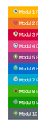
Thanks for your css, I added a flat png image to each one, please try added this code in the General Styling > Quick CSS field or in the WordPress > Customize > Additional CSS field:/* Tab 1 */ .av-accordion-bg-multi .av_toggle_section:nth-child(1) .toggler { background: #ffb600; } .av-accordion-bg-multi .av_toggle_section:nth-child(1) .toggler:before { content: url(https://img.icons8.com/flat_round/20/000000/bird--v1.png); padding-right: 5px; } /* Tab 2 */ .av-accordion-bg-multi .av_toggle_section:nth-child(2) .toggler { background: #ee7623; } .av-accordion-bg-multi .av_toggle_section:nth-child(2) .toggler:before { content: url(https://img.icons8.com/flat_round/20/000000/falcon.png ); padding-right: 5px; } /* Tab 3 */ .av-accordion-bg-multi .av_toggle_section:nth-child(3) .toggler { background: #d50037; } .av-accordion-bg-multi .av_toggle_section:nth-child(3) .toggler:before { content: url(https://img.icons8.com/flat_round/20/000000/owl--v1.png ); padding-right: 5px; } /* Tab 4 */ .av-accordion-bg-multi .av_toggle_section:nth-child(4) .toggler { background: #e64783; } .av-accordion-bg-multi .av_toggle_section:nth-child(4) .toggler:before { content: url(https://img.icons8.com/flat_round/20/000000/pinguin--v1.png ); padding-right: 5px; } /* Tab 5 */ .av-accordion-bg-multi .av_toggle_section:nth-child(5) .toggler { background: #923a7f; } .av-accordion-bg-multi .av_toggle_section:nth-child(5) .toggler:before { content: url(https://img.icons8.com/flat_round/20/000000/unicorn.png ); padding-right: 5px; } /* Tab 6 */ .av-accordion-bg-multi .av_toggle_section:nth-child(6) .toggler { background: #0071ce; } .av-accordion-bg-multi .av_toggle_section:nth-child(6) .toggler:before { content: url(https://img.icons8.com/flat_round/20/000000/stork.png ); padding-right: 5px; } /* Tab 7 */ .av-accordion-bg-multi .av_toggle_section:nth-child(7) .toggler { background: #00a6ce; } .av-accordion-bg-multi .av_toggle_section:nth-child(7) .toggler:before { content: url(https://img.icons8.com/flat_round/20/000000/butterfly--v1.png ); padding-right: 5px; } /* Tab 8 */ .av-accordion-bg-multi .av_toggle_section:nth-child(8) .toggler { background: #37b30e; } .av-accordion-bg-multi .av_toggle_section:nth-child(8) .toggler:before { content: url(https://img.icons8.com/flat_round/20/000000/insect--v1.png ); padding-right: 5px; } /* Tab 9 */ .av-accordion-bg-multi .av_toggle_section:nth-child(9) .toggler { background: #129605; } .av-accordion-bg-multi .av_toggle_section:nth-child(9) .toggler:before { content: url(https://img.icons8.com/flat_round/20/000000/pig--v1.png ); padding-right: 5px; } /* Tab 10 */ .av-accordion-bg-multi .av_toggle_section:nth-child(10) .toggler { background: #5b6670; } .av-accordion-bg-multi .av_toggle_section:nth-child(10) .toggler:before { content: url(https://img.icons8.com/flat_round/20/000000/panda--v1.png ); padding-right: 5px; } /* Tab title color */ .av-accordion-bg-multi .toggler, .av-accordion-bg-multi .toggler.activeTitle:hover { color: #FFF; border:none; } /* Hide default icon */ .av-accordion-bg-multi .toggle_icon { display: none; } .av-accordion-bg-multi .toggler { padding-left:20px; font-size: 18px; font-weight: bolder; } /*Toggle content area */ .av-accordion-bg-multi .toggle_content { background: #f2f6fa; }and adjust the images to what you want to use, After applying the css, Please clear your browser cache and check.
Expected results:
Best regards,
MikeFebruary 29, 2020 at 9:55 am #1188992Hi there,
here is the code from the documentation that I customized. In addition to icons, small pictures should be pngs in front of the text. Thanks for the support./* Tab 1 */
.av-accordion-bg-multi .av_toggle_section:nth-child(1) .toggler {
background: #ffb600;
}
/* Tab 2 */
.av-accordion-bg-multi .av_toggle_section:nth-child(2) .toggler {
background: #ee7623;
}
/* Tab 3 */
.av-accordion-bg-multi .av_toggle_section:nth-child(3) .toggler {
background: #d50037;
}
/* Tab 4 */
.av-accordion-bg-multi .av_toggle_section:nth-child(4) .toggler {
background: #e64783;
}
/* Tab 5 */
.av-accordion-bg-multi .av_toggle_section:nth-child(5) .toggler {
background: #923a7f;
}
/* Tab 6 */
.av-accordion-bg-multi .av_toggle_section:nth-child(6) .toggler {
background: #0071ce;
}
/* Tab 7 */
.av-accordion-bg-multi .av_toggle_section:nth-child(7) .toggler {
background: #00a6ce;
}
/* Tab 8 */
.av-accordion-bg-multi .av_toggle_section:nth-child(8) .toggler {
background: #37b30e;
}
/* Tab 9 */
.av-accordion-bg-multi .av_toggle_section:nth-child(9) .toggler {
background: #129605;
}
/* Tab 10 */
.av-accordion-bg-multi .av_toggle_section:nth-child(10) .toggler {
background: #5b6670;
}
/* Tab title color */
.av-accordion-bg-multi .toggler,
.av-accordion-bg-multi .toggler.activeTitle:hover {
color: #FFF;
border:none;
}
/* Hide default icon */
.av-accordion-bg-multi .toggle_icon {
display: none;
}
.av-accordion-bg-multi .toggler {
padding-left:20px;
font-size: 18px;
font-weight: bolder;
}
/*Toggle content area */
.av-accordion-bg-multi .toggle_content {
background: #f2f6fa;
}Site: https://protom-education.com/en/programm_en/
Best regards Raph
February 29, 2020 at 6:21 am #1188983In reply to: Sticky Bar on top of menu header
Thanks Victoria
How can I change the size of the font to say 30? Is it possible to change that portion of the banner to a different colour as well?
February 28, 2020 at 10:12 pm #1188926In reply to: Fullwidth easy slider – Fonts too large on mobile
Hi haines1,
Please try the code like this:
@media only screen
and (max-device-width : 767px)
and (max-width: 767px)
and (orientation : landscape) {
  .slideshow_align_caption h2 {
    font-size: 24px !important;
  }
  .avia-caption-content p {
    font-size: 18px !important;;
  }
}

@media only screen
and (max-device-width : 767px)
and (max-width: 767px)
and (orientation : portrait) {
  .slideshow_align_caption h2 {
    font-size: 20px !important;
  }
  .avia-caption-content p {
    font-size: 14px !important;
  }
}
If you need further assistance please let us know.
Best regards,
VictoriaFebruary 27, 2020 at 8:03 pm #1188599Topic: Sticky Bar on top of menu header
in forum EnfoldEugeniadms
ParticipantHi,
I was able to add the phone number on top of the menu header, but it is showing up on the left and right side only. Can I add it to the middle, while changing the size of the font/colour and issue a call with ex: “a href=”tel: 123 456 7899”
February 27, 2020 at 7:17 pm #1188573In reply to: Fullwidth easy slider – Fonts too large on mobile
This reply has been marked as private.February 27, 2020 at 5:49 pm #1188533In reply to: headline background margins
Hi,
Visually, it may be a little better to slightly reduce the font-size right before it goes mobile.
Best regards,
Jordan ShannonFebruary 27, 2020 at 2:09 pm #1188468In reply to: How to add icons above menu items ?
Hi,
Thank you for your feedback, lets try something different, using the shortcode wand get the shortcode for a icon like this:[av_font_icon icon='ue808' font='entypo-fontello' style='' caption='' size='40px' position='center' color='' link='' linktarget='' animation='' id='' custom_class='' av_uid='' admin_preview_bg=''][/av_font_icon]and enter it into a menu “Navigation Label” replacing the menu title like this:
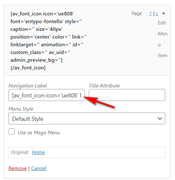
Then assuming this is#menu-item-3274we will add this Quick CSS to add the title under the icon:#menu-item-3274 span.av-icon-char::after { content: "Home"; font-size: 10px !important; display: block; line-height: 1px; } #menu-item-3274 > a > span.avia-menu-text > span { line-height: 40px; }
Since your menu is much larger the css may be a little different, can you include an admin login so we can adjust this for your site?Best regards,
MikeFebruary 27, 2020 at 11:08 am #1188380In reply to: Upgrade theme version for 4.7.1
Hi,
To change the hover background-color, & font-color & font-size, Please try this code in the General Styling > Quick CSS field or in the WordPress > Customize > Additional CSS field:#top.page #nav_menu-2 #menu-produtos li a:hover { background-color: #f8f8f8; } #top.page #nav_menu-2 #menu-produtos li a { color: #222; font-size: 15px; }After applying the css, Please clear your browser cache and check.
Best regards,
MikeFebruary 26, 2020 at 10:24 pm #1188286In reply to: smaller font for mobile
thank you, solved the issue
@media only screen and (max-width: 325px) {
body, body .avia-tooltip {
font-size: 16px !important;
}
}
did the trick ;)February 26, 2020 at 8:20 pm #1188231In reply to: Social media icons appearance on computer & mobile
Hi swisstraveler,
Here is the code you can put in Enfold > General Styling > Quick Css, if it does not work, put into themes/enfold/css/custom.css
@media only screen and (max-width:767px) {
    #top #wrap_all .avia-content-slider .slide-entry-title {
        font-size: 16px;
        line-height: 26px;
    }
}
If you need further assistance please let us know.
Best regards,
Victoria -
This reply was modified 6 years ago by
-
AuthorSearch Results
-
Search Results
-
Hallo,
I am working on my new website by personalizing your Health Coach demo. I would like to change the background color of the breadcrumbs to white. It is now green (see sample page). I haven’t been able to find how to do that.
Also, I would like to reduce the font size in the icon boxes, in the same page as above, scrolling down.Can you help?
Thank youTopic: logo & menu font size
I’m attempting to increase the font size on the “Small menu above main menu” element, but in Advanced Styling, the font size is not there. I’m sure there is some CSS that can be utilizes to make it slightly bigger.. Can someone point me in the right direction?
Thanks!