-
AuthorSearch Results
-
July 12, 2024 at 2:14 pm #1461924
In reply to: 2 times drop down menu in left side bar menu
Hi Mike
I managed to change the font to rift in the burger menu and also could change the font size, so for now it’s good for me and i can go on…
Thank you for all your help!
Greetz Karin
Have a nice weekend!July 10, 2024 at 3:52 pm #1461786Meine Empfehlung wäre schon eher den Code für die functions.php zu nehmen.
siehe den Endkommentar meinerseits.Da post ids und page ids wohl offenbar bei Enfold mit als Klasse bei html geführt werden sollte es reichen nur diese aufzuführen.
Damit der Selector stärker wird solltest Du noch das html vor die Klasse setzen.
Pass auf, das alle selectoren durch Kommata getrennt sind, nur der letzte in der Reihe erhält kein Komma vor der eröffnenden Klammer.die variablen kannst du natürlich anpassen. Je nachdem, was du ersetzen willst. Die Liste was Enfold da anlegt bezieht sich auf die Einstellungen – siehe unten – die Farben bzw. anderen Werte entsprechen den Styling-Einstellungen
html.html_entry_id_777,
html.html_entry_id_778,
html.html_entry_id_779 {
	--enfold-header-color-bg: #eee;
	--enfold-main-color-bg: #eee;
	--enfold-footer-color-bg: #eee;
	--enfold-alternate-color-bg2: #eee;
	--enfold-header-color-bg2: #eee;
	--enfold-socket-color-bg: #eee;
	--enfold-socket-color-border: #eee;
}
Beispiel-Liste was alles von Enfold als variablen geführt werden.
:root {
  --enfold-socket-color-bg:#333333;
  --enfold-socket-color-bg2:#555555;
  --enfold-socket-color-primary:#ffffff;
  --enfold-socket-color-secondary:#aaaaaa;
  --enfold-socket-color-color:#eeeeee;
  --enfold-socket-color-meta:#999999;
  --enfold-socket-color-heading:#ffffff;
  --enfold-socket-color-border:#444444;
  --enfold-socket-color-constant-font:#333333;
  --enfold-socket-color-button-border:#dddddd;
  --enfold-socket-color-button-border2:#888888;
  --enfold-socket-color-iconlist:#333333;
  --enfold-socket-color-timeline:#333333;
  --enfold-socket-color-timeline-date:#000000;
  --enfold-socket-color-masonry:#444444;
  --enfold-socket-color-stripe:#ffffff;
  --enfold-socket-color-stripe2:#ffffff;
  --enfold-socket-color-stripe2nd:#bbbbbb;
  --enfold-socket-color-button-font:#333333;
  --enfold-footer-color-bg:#222222;
  --enfold-footer-color-bg2:#333333;
  --enfold-footer-color-primary:#ffffff;
  --enfold-footer-color-secondary:#aaaaaa;
  --enfold-footer-color-color:#dddddd;
  --enfold-footer-color-meta:#919191;
  --enfold-footer-color-heading:#919191;
  --enfold-footer-color-border:#444444;
  --enfold-footer-color-constant-font:#222222;
  --enfold-footer-color-button-border:#dddddd;
  --enfold-footer-color-button-border2:#888888;
  --enfold-footer-color-iconlist:#333333;
  --enfold-footer-color-timeline:#333333;
  --enfold-footer-color-timeline-date:#000000;
  --enfold-footer-color-masonry:#222222;
  --enfold-footer-color-stripe:#ffffff;
  --enfold-footer-color-stripe2:#ffffff;
  --enfold-footer-color-stripe2nd:#bbbbbb;
  --enfold-footer-color-button-font:#222222;
  --enfold-alternate-color-bg:#fcfcfc;
  --enfold-alternate-color-bg2:#ffffff;
  --enfold-alternate-color-primary:#719430;
  --enfold-alternate-color-secondary:#83a83d;
  --enfold-alternate-color-color:#666666;
  --enfold-alternate-color-meta:#8f8f8f;
  --enfold-alternate-color-heading:#222222;
  --enfold-alternate-color-border:#e1e1e1;
  --enfold-alternate-color-constant-font:#ffffff;
  --enfold-alternate-color-button-border:#507210;
  --enfold-alternate-color-button-border2:#61861b;
  --enfold-alternate-color-iconlist:#d0d0d0;
  --enfold-alternate-color-timeline:#d0d0d0;
  --enfold-alternate-color-timeline-date:#a0a0a0;
  --enfold-alternate-color-masonry:#eeeeee;
  --enfold-alternate-color-stripe:#93b652;
  --enfold-alternate-color-stripe2:#82a541;
  --enfold-alternate-color-stripe2nd:#94b94e;
  --enfold-alternate-color-button-font:#ffffff;
  --enfold-main-color-bg:#ffffff;
  --enfold-main-color-bg2:#fcfcfc;
  --enfold-main-color-primary:#719430;
  --enfold-main-color-secondary:#83a83d;
  --enfold-main-color-color:#666666;
  --enfold-main-color-meta:#919191;
  --enfold-main-color-heading:#222222;
  --enfold-main-color-border:#e1e1e1;
  --enfold-main-color-constant-font:#ffffff;
  --enfold-main-color-button-border:#507210;
  --enfold-main-color-button-border2:#61861b;
  --enfold-main-color-iconlist:#d0d0d0;
  --enfold-main-color-timeline:#d0d0d0;
  --enfold-main-color-timeline-date:#a0a0a0;
  --enfold-main-color-masonry:#ebebeb;
  --enfold-main-color-stripe:#93b652;
  --enfold-main-color-stripe2:#82a541;
  --enfold-main-color-stripe2nd:#94b94e;
  --enfold-main-color-button-font:#ffffff;
  --enfold-header-color-bg:#ffffff;
  --enfold-header-color-bg2:#f8f8f8;
  --enfold-header-color-primary:#719430;
  --enfold-header-color-secondary:#444444;
  --enfold-header-color-color:#333333;
  --enfold-header-color-meta:#808080;
  --enfold-header-color-heading:#000000;
  --enfold-header-color-border:#e1e1e1;
  --enfold-header-color-constant-font:#ffffff;
  --enfold-header-color-button-border:#507210;
  --enfold-header-color-button-border2:#222222;
  --enfold-header-color-iconlist:#d0d0d0;
  --enfold-header-color-timeline:#d0d0d0;
  --enfold-header-color-timeline-date:#a0a0a0;
  --enfold-header-color-masonry:#e7e7e7;
  --enfold-header-color-stripe:#93b652;
  --enfold-header-color-stripe2:#82a541;
  --enfold-header-color-stripe2nd:#555555;
  --enfold-header-color-button-font:#ffffff;
  --enfold-header_burger_color:inherit;
  --enfold-header_replacement_menu_color:inherit;
  --enfold-header_replacement_menu_hover_color:inherit;
  --enfold-font-family-theme-body:"HelveticaNeue","Helvetica Neue",Helvetica,Arial,sans-serif;
  --enfold-font-size-theme-content:13px;
  --enfold-font-size-theme-h1:34px;
  --enfold-font-size-theme-h2:28px;
  --enfold-font-size-theme-h3:20px;
  --enfold-font-size-theme-h4:18px;
  --enfold-font-size-theme-h5:16px;
  --enfold-font-size-theme-h6:14px;
  --enfold-font-size-content-font:18px
}
July 9, 2024 at 6:06 am #1461650In reply to: Slider at Header truncates text on a cell phone.
Hi,
Thank you for the info.
We edited the contact page and set the Styling > Font Sizes > Caption Title Font Size to 18px for mobile devices. The default custom size is 60px. You can also adjust the size for desktop and tablet in portrait/landscape modes. The font size should respond automatically if the Font Size default is set to the initial option, but since it’s set to a custom size (60px), you have to manually define the font size for all screen sizes. Please check the screenshot in the private field.
Best regards,
IsmaelJuly 8, 2024 at 7:20 pm #1461628In reply to: Slider at Header truncates text on a cell phone.
HI.
Adjusting the font size affects the Desktop/Laptop adversely as well as the Cell mode.
This reply does not address why updates to the theme disrupted cell phone layouts.
Q: how do we retain our Desktop/Laptop layouts while regaining an elegant look for the cell mode in responsive Design?
Example pages:
https://www.stonecrafters.rocks/
https://www.stonecrafters.rocks/services/
https://www.stonecrafters.rocks/contact/
NOTE: we have not altered out layout since the initial rebuild of the site using Enfold theme. This site used to look perfect in responsive design.
Please advise. Note: I shared login credentials and you have permission to enter the site.
July 7, 2024 at 4:41 pm #1461556In reply to: Custom Fonts
Hey Mike,
I decided to use a different font family (Open Sans) for mobile and tablet and added this code:
@media only screen and (max-width: 768px) and (max-device-width: 1024px) and (orientation: portrait) {
h1, h2, h3, h4, h5, h6 {
  font-family: 'Open-Sans', sans-serif;
font-style: italic;
}
}
Funnily enough, the Calibri is now displayed as the headline on the iPhone. And I can’t find the reference to the code why the browser finally understands that it should use “Calibri”.
So why it works now, I have no idea, but it works ;)Unfortunately, Calibri or Open Sans are not displayed on the tablet in Safari. I don’t understand this again…
And I also adjusted the .av-special-heading using CSS:
#top .av-special-heading .av-subheading.av-subheading_above {
font-size: 32px !important;
    font-family: 'calibri' !important;
    color: #ff0044 !important;
}
Unfortunately the special heading font is not displayed on mobile in Safari… sorry i opened such a bottomless pit …
I hope your team finds a solution to help me out :’)
July 7, 2024 at 2:03 pm #1461537In reply to: Socket menue on left side
Hi,
Your screenshot looks like the socket is full width, but your site is smaller, so I recommend making the area full width and making the font smaller so there is enough room..responsive #socket > .container { max-width: 100%; font-size: 18px; } #socket .copyright { float: right; padding-left: 20px; line-height: 24px; }and then move the “title” on the right side over some in the css for it, currently you have:
#footer-title {
    font-size: 38px;
    font-family: zen-kaku-gothic-new;
    color: #000;
    font-weight: bold;
    float: right;
    top: -38px;
    position: relative;
    left: -15%;
}
change to:
#footer-title {
    font-size: 38px;
    font-family: zen-kaku-gothic-new;
    color: #000;
    font-weight: bold;
    float: right;
    top: -38px;
    position: relative;
    left: -5%;
}
Best regards,
MikeJuly 6, 2024 at 10:27 pm #1461505In reply to: Non-uniform layout for multiple paragraphs in tables
Hey reqonsult,
Thank you for the link to your site, this is because the first paragraph is in the “td” and the others are in a “p” which has more specialty.
Try this CSS in your Enfold Theme Options ▸ General Styling ▸ Quick CSS field:#top .all_colors td p { font-size: 13px; font-weight: 400; }After applying the css, please clear your browser cache and check.
Best regards,
MikeJuly 6, 2024 at 10:11 pm #1461503Topic: Non-uniform layout for multiple paragraphs in tables
in forum Enfoldreqonsult
ParticipantHello, on this subpage of our blog we have noticed that if there are multiple paragraphs or separate text units in the tables, the layout is different from the second paragraph onwards (please see attached screenshot). The font and font size are not the same as in the first paragraph.
We have of course made sure that all the text is added without being formatted. This cannot be the problem here.
How can this be solved? Many thanks for your support
July 4, 2024 at 12:07 am #1461269Hey ballindigital,
Try this CSS in your Enfold Theme Options ▸ General Styling ▸ Quick CSS field:#header_meta.av_extra_header_active > .container { display: flex; justify-content: center; } .phone-info { font-size: 14px; }Please ensure to copy the code from the forum and not an email notification so the symbols are not converted.
After applying the css, please clear your browser cache and check.Best regards,
MikeJuly 3, 2024 at 10:03 pm #1461259In reply to: Blog font size
Hey lauragrashoff,
Thank you for the link to your site, try this CSS in your Enfold Theme Options ▸ General Styling ▸ Quick CSS field and adjust the font sizes to suit:#top.single-post #wrap_all #main .container_wrap_first h1 { font-size: 60px; } #top.single-post #wrap_all #main .container_wrap_first h2 { font-size: 30px; } #top.single-post #wrap_all #main .container_wrap_first p { font-size: 20px; }After applying the css, please clear your browser cache and check.
Best regards,
MikeJuly 3, 2024 at 9:49 pm #1461255Topic: Blog font size
in forum Enfoldlauragrashoff
ParticipantHey,
ich würde gerne andere Schriftgrößen für die Texte in meinen Blog-Einträgen verändern. Der Content der restlichen Website soll sich dabei nicht verändern.
Ich würde gerne die H1, H2 und den Fließtext in anderen Schriftgrößen darstellen.
Habt ihr einen CSS Code für mich, um das umzusetzen?Vielen Dank!
July 3, 2024 at 1:06 pm #1461201Hi Guenni,
i will do that now. Sould i keep or delete:/**** Feld Definitionen ********/ #top .avia_textblock.img-with-caption-right .wp-caption .wp-caption-text { grid-area: feld1 } /*** depends on if there is a link on the image or not ****/ #top .avia_textblock.img-with-caption-right .wp-caption > *:first-child { grid-area: feld2 } #top .avia_textblock.img-with-caption-right .wp-caption { border: 1px solid #cccccc; width: 100% !important; margin: 0; display: grid; grid-auto-rows: auto; grid-template-columns: 1fr 1fr; grid-template-areas: "feld2 feld1"; align-items: flex-end; } #top .avia_textblock.img-with-caption-right .wp-caption img { padding: 0 !important; } #top .avia_textblock.img-with-caption-right .wp-caption .wp-caption-text { display: block ; color: #222222; font-style: normal; font-size: 18px; font-family: inherit; width: 100%; padding: 0 1em; text-align: left; } .avia_textblock.img-with-caption-right .wp-caption .wp-caption-text p { margin: 0 !important; } /*** Abstang über dem Rahmen ******/ #top .avia_textblock.img-with-caption-right .wp-caption img { margin-top: 70px } /**** for responsive case maybe:*****/ @media only screen and (min-width: 990px) and (max-width: 1051px) { #top .avia_textblock.img-with-caption-right .wp-caption { grid-template-columns: 1fr; grid-template-areas: "feld2" "feld1" !important; } }for css or just add your new css?
kind regards
Jak-
This reply was modified 1 year, 9 months ago by
Jak73.
July 3, 2024 at 7:02 am #1461159In reply to: Slider at Header truncates text on a cell phone.
Hi,
Thank you for the inquiry.
Have you tried adjusting the font sizes of the captions in the Styling > Font Sizes panel for each slide? It’s possible to set the font size for different screen sizes.
Best regards,
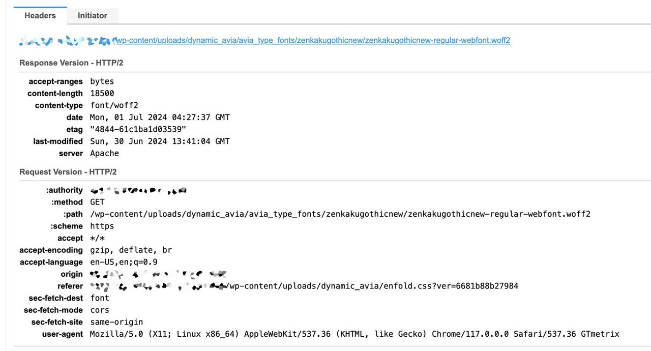
IsmaelJuly 1, 2024 at 6:37 am #1460725But The font does not seem to load completely when only the Latin fonts are used. At least it does not seem to load as slowly as the file size of the upload would suggest.
 June 30, 2024 at 5:17 pm #1460650
In reply to: How can i add a row with text above an image?
on the alb itself you got on styling options all you need : even the font color – and font-size.
The trick is that you can now use this class with different settings (backgrounds, font sizes and colours).
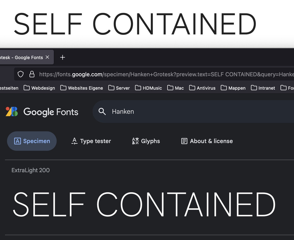
By the way – you are planning to use a chineese translation ? I do not really know why you are using such a performance hungry font for your page. I would at least set the English sentences in a similar Latin font.
For example from your page the comparison of zenkakugothicnew to (on Google Fonts) Hanken Grotesk:
 June 30, 2024 at 5:03 pm #1460646
In reply to: How to add a second title to the footer?
Hey Jak73,
Try this CSS in your Enfold Theme Options ▸ General Styling ▸ Quick CSS field:#footer-title { font-size: 38px; font-weight: bold; font-family: arial; color: #222; float: right; top: -38px; position: relative; left: -10%; }Then add this code to the end of your child theme functions.php file in Appearance ▸ Editor:
function custom_script() { ?>
  <script>
document.addEventListener("DOMContentLoaded", function() {
    var titleText = document.querySelector("h1.av-special-heading-tag").textContent;
    var footerTitleDiv = document.createElement("div");
    footerTitleDiv.id = "footer-title";
    footerTitleDiv.textContent = titleText;
    document.getElementById("socket").appendChild(footerTitleDiv);
});
</script>
  <?php
}
add_action( 'wp_footer', 'custom_script', 99 );
This is the expected result:

Best regards,
MikeJune 30, 2024 at 4:26 pm #1460641Topic: How to add a second title to the footer?
in forum EnfoldJak73
ParticipantHi,
i would like to add my title text to the footer, which should be formated in the following way (please see screenshot):
font-size: 38px;
font-weight: bold;
font-family: arial;
color: #222;
How can i do that?
kind regards JakJune 30, 2024 at 12:19 am #1460457In reply to: Masonry layout
Hello,
the only css i have concerning Masonry are :` .main_color .container .av-inner-masonry-content,
#top .main_color .container .av-masonry-load-more,
#top .main_color .container .av-masonry-sort,
.main_color .container .av-masonry-entry .avia-arrow {
background-color: rgba(248, 248, 248, 0.6);
}
.av-fixed-size .av-masonry-entry .av-inner-masonry-content,
.av-caption-on-hover .av-masonry-item-with-image.av-masonry-entry .av-inner-masonry-content {
text-align:center;
padding: 0 10px 0 10px;
font-size: 16px;
font-weight:700;}
.av-inner-masonry {
box-shadow:10px 10px 5px 1px rgba(0,0,0,0.3);
}`I removed it and it changed nothing..
Concerning the script, it doesn’t change anything too.
June 29, 2024 at 5:17 pm #1460179In reply to: Add button into header under Social Icons
well the hook : ava_main_header is just under the header_meta – it is the first child inside header_main.
Position is perfect. The rest is styling and positioning.you can create a widget area there – or insert directly just your button:
f.e.:function custom_func() { ?> <div class="spezial"><div class="avia-button-wrap avia-button-right"><a href="#" class="avia-button av-link-btn avia-icon_select-yes-left-icon avia-size-medium avia-position-center avia-color-theme-color"><span class="avia_button_icon avia_button_icon_left" aria-hidden="true" data-av_icon="" data-av_iconfont="fontelico"></span><span class="avia_iconbox_title">call to action …</span></a></div></div> <?php } add_action('ava_main_header' , 'custom_func');June 29, 2024 at 9:48 am #1460038Topic: Change font-size of text menu
in forum EnfoldParticipantHi,
how can i change the size and the font of the text menu?
kind regards JakJune 28, 2024 at 8:59 am #1459926oliverb71
ParticipantFor a couple of days, and suddenly without actively updating anything from our side, the pages started to look odd and layout, mostly font size was wrong.
This is still as you can see on the website.
Do you have any idea why the English page is acting differently than the German one? Any recommendation how to fix this or find the source of this?
June 26, 2024 at 4:21 pm #1459616Topic: Notification Element
in forum Enfoldnorthorie
ParticipantHi,
I’m using an notification element for links (cause I think they look good as a highlight).
What does cookie_lifetime=’60’ mean and can I delete it?<a href="#verlustangsttest">[av_notification title='Test' icon_select='yes' icon='ue81d' font='entypo-fontello' close_btn='' cookie_lifetime='60' size='normal' color='custom' custom_bg='#ECE5DB' gradient_bg_direction='vertical' gradient_bg_1='#000000' gradient_bg_2='#ffffff' gradient_bg_3='' custom_font='#434F5D' nb_border='' nb_border_width='' nb_border_width_sync='true' nb_border_color='' border='' border_radius='' border_radius_sync='true' box_shadow='' box_shadow_style='0px,0px,0px,0px' box_shadow_color='' sonar_effect_effect='shadow_hover_perm' sonar_effect_color='' sonar_effect_duration='1' sonar_effect_scale='' sonar_effect_opac='0.5' custom_class='' template_class='' element_template='' one_element_template='' av_uid='' sc_version='1.0' admin_preview_bg=''] <strong>Teste dich: Wie stark ist deine Verlustangst und dein Klammerverhalten?</strong> [/av_notification]</a>Best regards
June 26, 2024 at 8:10 am #1459280In reply to: back button to previous page
Hi,
And how do i adjust the css?
I mean: it says: your css here…; how and where do i place the font name ( and size ) and the color?To adjust the style of the link, you can use this css code in the Enfold > General Styling > Quick CSS field:
.go-back-link {
   color: red;
   font-size: 16px;
   font-family: 'Calibri', sans-serif;
}
Best regards,
IsmaelJune 25, 2024 at 11:34 pm #1458879In reply to: Pop up image gallery lightbox
see here with an image : https://webers-testseite.de/popup-gallery/
or simpler by a different font icon
#top .image-overlay .image-overlay-inside::before {
  content: "\E80E" !important;
  font-family: entypo-fontello;
  font-size: 42px;
  font-weight: 400;
}
June 25, 2024 at 1:16 pm #1458584In reply to: back button to previous page
use that class: go-back-link for styling.
i have on some installations for posts/portfolio on top a goback button with this:
function go_back_button(){ ?> <script type = "text/javascript"> (function($){ $('<div class="avia-button-wrap avia-button-left goback"><a href="" class="avia-button av-icon-on-hover avia-color-theme-color avia-icon_select-yes-left-icon avia-size-small avia-position-center "><span class="avia_button_icon avia_button_icon_left " aria-hidden="true" data-av_icon="" data-av_iconfont="entypo-fontello"></span><span class="avia_iconbox_title">zurück</span></a></div>').prependTo('#top.single .post-entry:first'); $('.goback').on('click', function(e){ e.preventDefault(); window.history.back(); }); })(jQuery); </script> <?php } add_action( 'wp_footer', 'go_back_button' );the
window.history.back();can do the job too.
but you can place that manually be each button with that class custom-class : goback
then only use:function go_back_button(){ ?> <script type = "text/javascript"> (function($){ $('.goback').on('click', function(e){ e.preventDefault(); window.history.back(); }); })(jQuery); </script> <?php } add_action( 'wp_footer', 'go_back_button' );June 25, 2024 at 9:03 am #1458559In reply to: back button to previous page
Hi Mike
And how do i adjust the css?
I mean: it says: your css here…; how and where do i place the font name ( and size ) and the color?
Tnx in advance..Greetz
KarinJune 24, 2024 at 12:32 pm #1457974In reply to: Fullwidth Submenu – Onepage Dotsmenu
Hi Mike,
thank you. It seems to work but somehow I cannot change the color of the icons. I tried to insert the color code in this part of the css:
#top .dotsmenu .av-subnav-menu li a:before {
 display: inline-block !important;
 font-size:30px;
 color: #fff;
}
but nothing changes.
Regards
DanielaJune 23, 2024 at 1:13 pm #1456986In reply to: back button to previous page
Hey lelouxwebdesign,
In your sidebar add a Custom HTML widget with this code:
<a href="javascript:history.back()">Go Back</a>

then in the post sidebar you will see a “Go Back” link

you can style it as you wish and clicking it will send the visitor to the last page they viewed.
If you want to use a button, you can create a buton with the shortcode wand and use this as the manual link:javascript:history.back()

[av_button label='Go Back' icon_select='yes' icon='ue831' font='entypo-fontello' button_type='' link='manually,javascript:history.back()' link_target='' download_file='https://' attachment='' attachment_size='' downloaded_file_name='' size='large' position='center' label_display='' title_attr='' size-text='' av-desktop-font-size-text='' av-medium-font-size-text='' av-small-font-size-text='' av-mini-font-size-text='' margin='' margin_sync='true' padding='' padding_sync='true' av-desktop-margin='' av-desktop-margin_sync='true' av-desktop-padding='' av-desktop-padding_sync='true' av-medium-margin='' av-medium-margin_sync='true' av-medium-padding='' av-medium-padding_sync='true' av-small-margin='' av-small-margin_sync='true' av-small-padding='' av-small-padding_sync='true' av-mini-margin='' av-mini-margin_sync='true' av-mini-padding='' av-mini-padding_sync='true' color_options='' color='theme-color' custom_bg='#444444' custom_font='#ffffff' btn_color_bg='theme-color' btn_custom_grad_direction='vertical' btn_custom_grad_1='#000000' btn_custom_grad_2='#ffffff' btn_custom_grad_3='' btn_custom_grad_opacity='0.7' btn_custom_bg='#444444' btn_color_bg_hover='theme-color-highlight' btn_custom_bg_hover='#444444' btn_color_font='theme-color' btn_custom_font='#ffffff' btn_color_font_hover='white' btn_custom_font_hover='#ffffff' border='' border_width='' border_width_sync='true' border_color='' border_radius='' border_radius_sync='true' box_shadow='' box_shadow_style='0px,0px,0px,0px' box_shadow_color='' animation='' animation_duration='' animation_custom_bg_color='' animation_z_index_curtain='100' hover_opacity='' sonar_effect_effect='' sonar_effect_color='' sonar_effect_duration='1' sonar_effect_scale='' sonar_effect_opac='0.5' css_position='' css_position_location=',,,' css_position_z_index='' av-desktop-css_position='' av-desktop-css_position_location=',,,' av-desktop-css_position_z_index='' av-medium-css_position='' av-medium-css_position_location=',,,' av-medium-css_position_z_index='' av-small-css_position='' av-small-css_position_location=',,,' av-small-css_position_z_index='' av-mini-css_position='' av-mini-css_position_location=',,,' av-mini-css_position_z_index='' id='' custom_class='' template_class='' av_uid='' sc_version='1.0' admin_preview_bg='']
Best regards,
MikeJune 22, 2024 at 6:31 pm #1455620In reply to: Fullwidth Submenu – Onepage Dotsmenu
Hey Daniela,
I recommend creating a dotsmenu as described in our documentation and create the simple custom menu in the element:

with the custom class dotsmenu:

then to use entypo-fontello icons, go to your icon element and hover over the icons that you want to use and the chrcode will show, always drop the first “U”, so the code that you will use for this screenshot will be \e804

Then use this css, at teh bottom you will see the six icons for the six menu items in my example, add more if you wish:#top .dotsmenu { background: transparent; position: fixed!important; right: 10px; top: 50%!important; transform: translateY(-50%); border: none!important; max-width: 30px!important; } #top .dotsmenu .av-subnav-menu > li { display: inline!important; margin: 10px !important; } #top .dotsmenu .av-subnav-menu li a { max-width: 40px; max-height:45px; border-radius:0; overflow:hidden; padding: 0 !important; border: none!important; background: transparent; } #top .dotsmenu .av-subnav-menu li a .avia-bullet { display: none !important; } #top .dotsmenu .av-subnav-menu li a .avia-menu-text { visibility: hidden; } @media only screen and (max-width: 767px) { .responsive #top .dotsmenu { background: transparent; position: fixed!important; right: 0; top: 50%!important; transform: translateY(-50%); }} #top .dotsmenu .av-subnav-menu li a:before { display: inline-block !important; font-size:30px; color: #fff; } #top .dotsmenu .av-subnav-menu li:nth-child(1) a:before { content: '\e804'; font-family: 'entypo-fontello'; } #top .dotsmenu .av-subnav-menu li:nth-child(2) a:before { content: '\e82a'; font-family: 'entypo-fontello'; } #top .dotsmenu .av-subnav-menu li:nth-child(3) a:before { content: '\e83d'; font-family: 'entypo-fontello'; } #top .dotsmenu .av-subnav-menu li:nth-child(4) a:before { content: '\e8b3'; font-family: 'entypo-fontello'; } #top .dotsmenu .av-subnav-menu li:nth-child(5) a:before { content: '\e8d2'; font-family: 'entypo-fontello'; } #top .dotsmenu .av-subnav-menu li:nth-child(6) a:before { content: '\e8b9'; font-family: 'entypo-fontello'; }This is the result:

Best regards,
MikeJune 21, 2024 at 7:27 am #1453486In reply to: Footer text size
-
This reply was modified 1 year, 9 months ago by
-
AuthorSearch Results
-
Search Results
-
Hello, on this subpage of our blog we have noticed that if there are multiple paragraphs or separate text units in the tables, the layout is different from the second paragraph onwards (please see attached screenshot). The font and font size are not the same as in the first paragraph.
We have of course made sure that all the text is added without being formatted. This cannot be the problem here.
How can this be solved? Many thanks for your support
Topic: Blog font size
Hey,
ich würde gerne andere Schriftgrößen für die Texte in meinen Blog-Einträgen verändern. Der Content der restlichen Website soll sich dabei nicht verändern.
Ich würde gerne die H1, H2 und den Fließtext in anderen Schriftgrößen darstellen.
Habt ihr einen CSS Code für mich, um das umzusetzen?Vielen Dank!
Hi,
i would like to add my title text to the footer, which should be formated in the following way (please see screenshot):
font-size: 38px;
font-weight: bold;
font-family: arial;
color: #222;
How can i do that?
kind regards JakFor a couple of days, and suddenly without actively updating anything from our side, the pages started to look odd and layout, mostly font size was wrong.
This is still as you can see on the website.
Do you have any idea why the English page is acting differently than the German one? Any recommendation how to fix this or find the source of this?
Topic: Notification Element
Hi,
I’m using an notification element for links (cause I think they look good as a highlight).
What does cookie_lifetime=’60’ mean and can I delete it?<a href="#verlustangsttest">[av_notification title='Test' icon_select='yes' icon='ue81d' font='entypo-fontello' close_btn='' cookie_lifetime='60' size='normal' color='custom' custom_bg='#ECE5DB' gradient_bg_direction='vertical' gradient_bg_1='#000000' gradient_bg_2='#ffffff' gradient_bg_3='' custom_font='#434F5D' nb_border='' nb_border_width='' nb_border_width_sync='true' nb_border_color='' border='' border_radius='' border_radius_sync='true' box_shadow='' box_shadow_style='0px,0px,0px,0px' box_shadow_color='' sonar_effect_effect='shadow_hover_perm' sonar_effect_color='' sonar_effect_duration='1' sonar_effect_scale='' sonar_effect_opac='0.5' custom_class='' template_class='' element_template='' one_element_template='' av_uid='' sc_version='1.0' admin_preview_bg=''] <strong>Teste dich: Wie stark ist deine Verlustangst und dein Klammerverhalten?</strong> [/av_notification]</a>Best regards