Viewing 30 results - 4,471 through 4,500 (of 18,734 total)
  • Author
    Search Results
  • #1161323

    I had reduced the font size to 14 so that it stayed in the top bar. I just changed it back to 18 cause I’d like to use the bigger font there. If you check again you’ll see what I mean about the text overlapping from the top bar into the header below. Thanks for your help.

    Hi Victoria,

    thx for your reply! It works quite nice in “landscape-mode”, but in “portrait-mode”
    we must touch up a little bit, don’t you think so? Please, take a look at the screenshot.

    I agree with you, that the word “menu” should be hidden in portrait-mode! But how
    do I do that? I have follow css-snippet in my quick-css-field:
    ———————————————————————
    /*————————*/
    /* Add word menu next to hamburger icon
    /*————————*/
    .av-hamburger strong {
    display: block!important;
    position: absolute;
    left: -90%;
    top: 0;
    font-size: 16px;
    transform: translate(-80%, -46%);
    }
    ———————————————————————
    I think I need a further command here, but which? I’m sure, you’ll know it. :)

    Best regards
    Carsten

    #1161166

    Hi,

    We can adjust the condition on how the theme hides the element when the “tablet/medium” screen option is enabled for an element. Please add the following css code and make sure that the Performance > File Compression is temporarily disabled.

    @media only screen and (min-width: 768px) and (max-width: 1366px) {
    	.responsive.av-no-preview #top #wrap_all .av-medium-hide, .responsive.av-no-preview #top #wrap_all .av-medium-font-size-hidden, .responsive.av-no-preview #top #wrap_all .av-medium-font-size-title-hidden {
    	     display: none;
            }
    }
    

    The element will not display when the screen width is less than 1366px and more than or equal to 768px.

    Thank you for your patience.

    Best regards,
    Ismael

    #1161082
    Jacopotj
    Participant

    Hi, I use EB Garamond, a font that as you might know, at, let’s say 16 px, it has much smaller characters than other fonts.

    In some parts of the theme and on some devices it’s hard to read as text is really small. text size is automatically set to smaller because of – i believe – minitext.

    In the footer i have a minitext, i am pretty sure there is minitext in the comment form, i believe the cookie notice has minitext (even tho i know you can edit the size from advanced styling). Also i think minitext is applied to articles tables (see screenshot).
    https://ibb.co/Dztb5Gx

    I would like to know how i can change the font size of minitext, if possible tell me where i can find it and i’ll edit the number of font?

    Thanks ^^

    Thanks Victoria,

    I got it to work with some modifications.
    However it seems that setting the breakpoint to be at 1024px, does not deliver the best outcome.
    I think a better strategy would be to be able to set a smaller font size for column text and heading only for iPad screen width
    (@media only screen and (max-width: 1024px) and (min-width: 989px) )
    Enfold responsive options will show selectable font sizes for mobile, but only up to 989px.
    Is there any way to make font size adjustments for 1024px screen width?

    Kind regards

    #1160861

    Thanks Ismael! I’ve actually been working on it all day and I had made very similar adjustments. I didn’t put in the line height, so I might do that. I found out that by adding my code to the “customize additional css” versus the child css stylesheet I was able to get results. I know the child is the best place to keep code so that when theme updates are applied, custom settings aren’t over written. Will code be overwritten in the “Appearance” “customize” “Additional CSS”.? Also, I was having issue with the actual link area being large enough on mobile (it was restrained to the upper left and barely clickable on mobile). So, I added some padding to fatten up the actual link area in a.ls-layer-link:link. I was just not able to get a hover effect that worked, so when you click the button, it doesn’t turn blue on mobile like the other buttons. Oh well. This is what I ended up with.
    @media only screen and (max-width: 768px) {
    .custom-mobile-button-large {
    width: 110px!important;
    height:22px!important;
    font-size: 14px!important;
    text-align: center!important;
    background-color: #a3e83c!important;
    line-height: 20px!important;
    }
    }

    a.ls-layer-link:link {
    padding-right: 125px!important;
    padding-bottom: 35px!important;
    }

    #1160858

    Hi,

    Thank you for the update.

    The modification is actually working, but you may need to adjust css values a bit to actually see the difference.

    Screenshot: removed as per user request

    As you can see in the screenshot above, we set the font-size to 16px, width to 200px and added the line-height property to vertically align the text.

    Best regards,
    Ismael

    #1160702

    Thank you Jordan, I will try, it’s nice of you,
    I will let you know,

    In the same way, how do I code a specific police H1 size for a specific article ?
    I tried this:

    
    /*ARTICLE TITLE*/
    .page-id-24  h1.entry-title {
    font-size: 26px; !important;
    }
    

    It doesn’t work so what is the mistake ?

    Regards,
    Iceman

    #1160634

    I can’t confirm that on my side too. Although the gtmetrix values are not so nice –
    It loads itself everything quite quickly ( And i cleared all cachings before making the screen film ) . See film. https://webers-testseite.de/wp-content/uploads/maskenzauber.mp4
    Chrome only reports mixed content when loading some fonts – see picture.
    but if you see the more informative Speedtest on gtmetrix: https://gtmetrix.com/reports/maskenzauber.com/88uokIa1
    you will see that what probably slows down the most are the images that have not been optimized for the output sizes.
    Next thing is matomo.js could be compressed ( thats your analytics tool ? )

    #1160269
    OKEIwebbureau
    Participant

    Hi support,

    I would like to remove black background on logo slider behind the images (see picture), and also change font size on the button.

    https://xn--nskespring-zcb.dk/wp-content/uploads/2019/11/oenskespring_-_logo_slider_-_black_background.png

    Here is the link (test site): https://xn--nskespring-zcb.dk/ny/

    How do I do this?

    Thanks :)

    /OKEIwebbureau

    #1160136

    Hi,

    Try the following:

    @media only screen and (max-width: 1142px) and (min-width: 990px)  {
    .avia-menu-text{
        font-size:13px
    }}

    Essentially it reduces the font size within the area where the overlap starts and ends.

    Best regards,
    Jordan Shannon

    #1160068
    kpenner36
    Participant

    [thrive_2step id=’26056′][av_button label='Gathering & Reunions - I want that' link='’manually,http://‘ link_target='’_blank’' size='small' position='center' icon_select='no' icon='ue800' font='entypo-fontello' color='theme-color' custom_bg='#444444' custom_font='#ffffff' av_uid='av-5obiu2i'][/thrive_2step]

    #1160042

    Hey ICEMAN,

    Try the following:

    /*menu*/
    .home .menu, h3.widget-title, span.avia-menu-text, .main_menu ul:first-child > li > a, #top #header .mega_menu_title a {
    font-family:'arial', sans-serif!important;
    text-transform: uppercase!important;
    letter-spacing:1px!important;
    font-weight:normal!important;
    font-size:15px!important;
    text-align: center!important;
    color: red!important;
    }

    Best regards,
    Jordan Shannon

    #1159997

    In reply to: Font styling and more

    Yeah, it worked, thanks both

    I put this
    .wp-block-image .alignleft > figcaption, .wp-block-image .alignright > figcaption, .wp-block-image .aligncenter > figcaption, .wp-block-image.is-resized > figcaption {
    text-align: center;
    font-size: 17px;
    color: #5c5a5c;
    }

    Didn’t work on style.css tho, but worked on customized css

    #1159995
    ICEMAN
    Participant

    I would like to apply a specific css to .page-id-718

    My current css for the other pages is:

    
    /*menu*/
     .menu, h3.widget-title, span.avia-menu-text, .main_menu ul:first-child > li > a, #top #header .mega_menu_title a {font-family:'arial', sans-serif!important;text-transform: uppercase;letter-spacing:1px;font-weight:normal;font-size:15px;text-align: center;color: red;}
    

    What is the correct code to realize it ?

    I try:

    
    /*menu*/
    .page-id-718 .menu, h3.widget-title, span.avia-menu-text, .main_menu ul:first-child > li > a, #top #header .mega_menu_title a {font-family:'arial', sans-serif!important;text-transform: uppercase;letter-spacing:1px;font-weight:normal;font-size:15px;text-align: center;color: red;}
    

    but it doesn’t work…

    Thanks for helping,

    Regards,
    Iceman

    • This topic was modified 6 years, 4 months ago by ICEMAN.

    Hey tobiasfries12,

    You can look for the files that these components use and try to edit them accordingly or we can help you assign different font sizes and media queries for different screen sizes.

    Which option do you prefer?

    Best regards,
    Victoria

    #1159824

    Rikard,
    I have now set the blog to “our Blog” which is a new page.
    I set the homepage to “home”
    post page to “our blog”

    When I go to “our Blog” it still shows the page as post instead of page – you can see here http://prntscr.com/q1p191

    I want to change the size of the font on the entries but can’t access the page to do this? It keeps taking me to a specific blog post.

    Can you assist please?

    tobiasfries12
    Participant

    Dear Enfold-Team,

    in some elements like “Special Title” you already offer font sizes in vw-units.
    I also already have learned that in the heading.php in path config-templatebuilder/avia-shortcodes/heading I can change line 55 and adapt them as I like to have them. I changed mine to this settings:
    __("Flexible font size (adjusts to screen width)" , 'avia_framework') => AviaHtmlHelper::number_array(1,5,0.1 , array(), "vw", "", "vw"),
    It works wonderful.

    Now my question:
    Since it works so well I would like to use the vw-units also for other font sizes, such as in the slider overlay text.
    Unfortunately the slider overlay text (and other texts in other elements, too) only offer px-sizes.
    It would be wonderful if I could somehow change the text size option-list for the overlay text to the same font-size-option-list offered in the Special Titles.

    This would be wonderful for:
    * Slider Overlay Text
    * Standard Text (as in some occasions it’s used for other purpose than just plain text)

    Do you have any idea how I could do that?
    Because the absolute-sized text overlay over the slider doesn’t look good on the entry page when resizing to other screens.

    Thanks a lot,
    Tobias

    • This topic was modified 6 years, 4 months ago by tobiasfries12. Reason: Präzisierung
    #1159631

    In reply to: mobile version

    Hi Stefan,

    Here is the code you can put in Enfold > General Styling > Quick Css,  if it does not work, put into themes/enfold/css/custom.css

    
    @media only screen and (max-width:767px){
        #top #header_meta {
            display: none;
        }
    }
     #top h1.av-special-heading-tag b {
         color: green;
     }
    #top #header_meta .phone-info.with_nav {
         font-size: 14px;
     }
    

    If you need further assistance please let us know.

    Best regards,
    Victoria

    #1159618

    Hi,
    Sorry for the late reply, I see that your error is:

    OTS parsing error: incorrect file size in WOFF header
    OTS parsing error: fpgm: table overruns end of file
    Failed to decode downloaded font

    affected files are:

    /enfold/config-templatebuilder/avia-template-builder/assets/fonts/entypo-fontello.woff
    /wp-content/plugins/instagram-feed/js/sb-instagram.min.js?ver=2.1.2
    https://connect.facebook.net/en_US/sdk/xfbml.customerchat.js

    possible solution:

    Turned out this was caused by a problem with FTP. The file was uploaded as text (ASCII) instead of binary, which corrupted the file. I simply changed my FTP software to binary, re-uploaded the font files, and then it all worked.

    after trying this I also recommend clearing your local cache, server cache, & cdn cache, otherwise the same files will be served.
    I also see that you are loading for Load jQuery in your footer from the theme settings, you may find this will cause you issues and you are also minifying via Enfold Theme Options > Performance > JS & CSS file merging and compression and WP Rocket, minifying on top of minifying often causes unexpected results.

    Best regards,
    Mike

    #1159607

    In reply to: Font styling and more

    Hi,

    Please try adding this code to the Quick CSS section under Enfold > General Styling or to your child theme’s style.css file:

    CSS Snippet:

    
    /* CSS - */
    
    .wp-block-image .alignleft > figcaption, .wp-block-image .alignright > figcaption, .wp-block-image .aligncenter > figcaption, .wp-block-image.is-resized > figcaption {
        text-align: center;    
        font-size: 1em;
        background: #ececec;
    }


    You can further custom control the elements by adding custom CSS class name, To enable please go to Enfold theme options > Layout Builder and check “Show element options for developers” for more information please check our documentation.

    Best regards,
    Vinay

    Ralph
    Participant

    Hi

    I created a page with two colums 2/3 and 1/3. In the 2/3 content I added text as well as an accordion. In the accordion I placed two team members (using the debug code)

    [av_one_half first min_height='av-equal-height-column' vertical_alignment='av-align-top' space='' custom_margin='aviaTBcustom_margin' margin='20px,10px' row_boxshadow='aviaTBrow_boxshadow' row_boxshadow_color='' row_boxshadow_width='10' link='' linktarget='' link_hover='' title_attr='' alt_attr='' padding='10px' padding_sync='true' highlight_size='1.1' border='' border_color='' radius='0px' radius_sync='true' column_boxshadow_color='' column_boxshadow_width='10' background='bg_color' background_color='#ffffff' background_gradient_color1='' background_gradient_color2='' background_gradient_direction='vertical' src='' attachment='' attachment_size='' background_position='top left' background_repeat='no-repeat' animation='pop-up' mobile_breaking='' mobile_display='' av_uid='av-7ftg' id='' custom_class='']
    [av_team_member name='XXX' job='JOB' src='PICSOURCE' attachment_size='full' image_width='av-team-img-original' description='mehr erfahren' font_color='' custom_title='' custom_content='' av_uid='av-k1i8rm9h' id='' custom_class='' admin_preview_bg='']
    [/av_team_member]
    [/av_one_half]

    [av_one_half min_height='' vertical_alignment='av-align-top' space='' margin='0px' margin_sync='true' row_boxshadow_color='' row_boxshadow_width='10' link='' linktarget='' link_hover='' title_attr='' alt_attr='' padding='10px' padding_sync='true' highlight_size='1.1' border='' border_color='' radius='0px' radius_sync='true' column_boxshadow_color='' column_boxshadow_width='10' background='bg_color' background_color='#ffffff' background_gradient_color1='' background_gradient_color2='' background_gradient_direction='vertical' src='' attachment='' attachment_size='' background_position='top left' background_repeat='no-repeat' animation='pop-up' mobile_breaking='' mobile_display='' av_uid='av-5gds' id='' custom_class='']
    [av_team_member name='YYY' job='JOB' src='PICSOURCE' attachment='60' attachment_size='full' image_width='av-team-img-original' description='mehr erfahren' font_color='' custom_title='' custom_content='' av_uid='av-k1i8tmfz' id='' custom_class='' admin_preview_bg='']
    [/av_team_member]
    [/av_one_half]

    Unfortunately, now the 1/3 column moves underneath the entire 2/3 column box.

    Can you help?

    Kind regards,
    Ralph

    #1159564

    This is part of a demo site!

    • activate the Debug Mode in Enfold by adding this to your child-theme functions.php

    // Debug Modus Enfold
    add_action('avia_builder_mode', "builder_set_debug");
    function builder_set_debug(){
      return "debug";
    }

    • Create a new page on your enfold installation – don’t forget to name it
    Enable the Advanced Layerslider Editor ( now you can see under the layout input area another one which shows you all the enfold shortcodes generated by the ALB Elements you pull into the avia layout builder – publish that page ( this is now an empty page generated with alb )

    • now find the shortcode of that demo page
    – so all demo import options can be found at : enfold – includes – admin – demo_files
    look on the demo page to get the name of the demo and look what the page is ( in your case: knowledgebase and the page is the home page.

    open that knowledgebase.xml with a good texteditor ( f.e. : sublime text on mac (or bbedit) – notepad++ for windows )
    find : <title>Home</title>
    the enfold shortcode of that page is sourrounded by:
    <content:encoded><![CDATA[ here is the enfold shortcode ]]></content:encoded>

    i shorten it to the element you like to have with a color-section above that you can see the negative margin
    copy that code inbetween :

    [av_section min_height='75' min_height_pc='25' min_height_px='500px' padding='default' shadow='no-shadow' bottom_border='border-extra-diagonal' bottom_border_diagonal_color='#ffffff' bottom_border_diagonal_direction='border-extra-diagonal-inverse' bottom_border_style='' custom_margin='0px' custom_margin_sync='true' custom_arrow_bg='' color='main_color' background='bg_gradient' custom_bg='' background_gradient_color1='#009efd' background_gradient_color2='#2af598' background_gradient_direction='diagonal_bt' src='https://kriesi.at/themes/enfold-knowledgebase/wp-content/uploads/sites/80/2018/10/hero-bg.png' attachment='221' attachment_size='full' attach='scroll' position='center center' repeat='no-repeat' video='' video_ratio='16:9' overlay_opacity='0.5' overlay_color='' overlay_pattern='' overlay_custom_pattern='' id='search_section' custom_class='' aria_label='' av_element_hidden_in_editor='0' av_uid='av-jgasyq2w']
    [av_heading heading='Customer Support
    <strong>& Knowledge Base</strong>' tag='h1' link_apply='' link='manually,http://' link_target='' style='blockquote modern-quote' size='42' subheading_active='' subheading_size='14' margin='' padding='0' color='custom-color-heading' custom_font='#ffffff' custom_class='' id='' admin_preview_bg='' av-desktop-hide='' av-medium-hide='' av-small-hide='' av-mini-hide='' av-medium-font-size-title='' av-small-font-size-title='' av-mini-font-size-title='' av-medium-font-size='' av-small-font-size='' av-mini-font-size='' av_uid='av-innvjb'][/av_heading]
    [/av_section]
    
    [av_section min_height='' min_height_px='500px' padding='default' shadow='no-border-styling' bottom_border='border-extra-diagonal' bottom_border_diagonal_color='#ffffff' bottom_border_diagonal_direction='' bottom_border_style='' custom_arrow_bg='' id='frontpage_grid' color='main_color' background='bg_color' custom_bg='' background_gradient_color1='' background_gradient_color2='' background_gradient_direction='vertical' src='' attachment='' attachment_size='' attach='scroll' position='top left' repeat='no-repeat' video='' video_ratio='16:9' overlay_opacity='0.5' overlay_color='' overlay_pattern='' overlay_custom_pattern='' av_element_hidden_in_editor='0' av_uid='av-jgatvii1' custom_class='']
    [av_one_third first min_height='av-equal-height-column' vertical_alignment='av-align-top' space='no_margin' custom_margin='aviaTBcustom_margin' margin='-300px,0' row_boxshadow_color='' row_boxshadow_width='10' link='category,16' linktarget='' link_hover='opacity80' padding='80px,10px,80px,10px' highlight_size='1.1' border='1' border_color='rgba(230,234,236,0.5)' radius='0px' radius_sync='true' column_boxshadow_color='' column_boxshadow_width='10' background='bg_color' background_color='rgba(255,255,255,0.95)' background_gradient_color1='' background_gradient_color2='' background_gradient_direction='vertical' src='' attachment='' attachment_size='' background_position='top left' background_repeat='no-repeat' animation='' mobile_breaking='' mobile_display='' av_uid='av-45nqm' custom_class='']
    
    [av_font_icon icon='ue832' font='enfold-knowledgebase' style='' caption='' link='' linktarget='' size='40px' position='center' color='#79c8f8' av_uid='av-jfdzoxcx' custom_class='' admin_preview_bg=''][/av_font_icon]
    
    [av_hr class='invisible' height='10' shadow='no-shadow' position='center' custom_border='av-border-thin' custom_width='50px' custom_border_color='' custom_margin_top='30px' custom_margin_bottom='30px' icon_select='yes' custom_icon_color='' icon='ue808' font='entypo-fontello' av_uid='av-vsj2' admin_preview_bg='']
    
    [av_heading heading='Guides' tag='h3' link_apply='' link='' link_target='' style='blockquote modern-quote modern-centered' size='27' subheading_active='' subheading_size='15' margin='' padding='5' color='custom-color-heading' custom_font='#4d6877' custom_class='' admin_preview_bg='' av-desktop-hide='' av-medium-hide='' av-small-hide='' av-mini-hide='' av-medium-font-size-title='' av-small-font-size-title='' av-mini-font-size-title='' av-medium-font-size='' av-small-font-size='' av-mini-font-size='' av_uid='av-6bvdunb'][/av_heading]
    
    [av_textblock size='' font_color='' color='' av-medium-font-size='' av-small-font-size='' av-mini-font-size='' av_uid='av-jfe0fj83' custom_class='' admin_preview_bg='']
    <p style="text-align: center;">Tutorials for using the theme,
    building content and
    everything else!</p>
    [/av_textblock]
    
    [/av_one_third][av_one_third min_height='' vertical_alignment='av-align-top' space='' margin='0px' margin_sync='true' row_boxshadow_color='' row_boxshadow_width='10' link='page,647' linktarget='' link_hover='opacity80' padding='80px,10px,80px,10px' highlight_size='1.1' border='1' border_color='rgba(230,234,236,0.5)' radius='0px' radius_sync='true' column_boxshadow_color='' column_boxshadow_width='10' background='bg_color' background_color='rgba(255,255,255,0.95)' background_gradient_color1='' background_gradient_color2='' background_gradient_direction='vertical' src='' attachment='' attachment_size='' background_position='top left' background_repeat='no-repeat' animation='' mobile_breaking='' mobile_display='' av_uid='av-aage' custom_class='']
    
    [av_font_icon icon='ue825' font='enfold-knowledgebase' style='' caption='' link='' linktarget='' size='40px' position='center' color='#79c8f8' av_uid='av-jfdzoxcx' custom_class='' admin_preview_bg=''][/av_font_icon]
    
    [av_hr class='invisible' height='10' shadow='no-shadow' position='center' custom_border='av-border-thin' custom_width='50px' custom_border_color='' custom_margin_top='30px' custom_margin_bottom='30px' icon_select='yes' custom_icon_color='' icon='ue808' font='entypo-fontello' av_uid='av-vsj2' admin_preview_bg='']
    
    [av_heading heading='FAQ' tag='h3' link_apply='' link='' link_target='' style='blockquote modern-quote modern-centered' size='27' subheading_active='' subheading_size='15' margin='' padding='10' color='custom-color-heading' custom_font='#4d6877' custom_class='' admin_preview_bg='' av-desktop-hide='' av-medium-hide='' av-small-hide='' av-mini-hide='' av-medium-font-size-title='' av-small-font-size-title='' av-mini-font-size-title='' av-medium-font-size='' av-small-font-size='' av-mini-font-size='' av_uid='av-5mz86w7'][/av_heading]
    
    [av_textblock size='' font_color='' color='' av-medium-font-size='' av-small-font-size='' av-mini-font-size='' av_uid='av-jfe0gaz0' custom_class='' admin_preview_bg='']
    <p style="text-align: center;">Frequently Asked Questions
    and beginners hurdles</p>
    [/av_textblock]
    
    [/av_one_third][av_one_third min_height='' vertical_alignment='av-align-top' space='' margin='0px' margin_sync='true' row_boxshadow_color='' row_boxshadow_width='10' link='page,707' linktarget='' link_hover='opacity80' padding='80px,10px,80px,10px' highlight_size='1.1' border='1' border_color='rgba(230,234,236,0.5)' radius='0px' radius_sync='true' column_boxshadow_color='' column_boxshadow_width='10' background='bg_color' background_color='rgba(255,255,255,0.95)' background_gradient_color1='' background_gradient_color2='' background_gradient_direction='vertical' src='' attachment='' attachment_size='' background_position='top left' background_repeat='no-repeat' animation='' mobile_breaking='' mobile_display='' av_uid='av-52c6' custom_class='']
    
    [av_font_icon icon='ue82f' font='enfold-knowledgebase' style='' caption='' link='' linktarget='' size='40px' position='center' color='#79c8f8' av_uid='av-jfdzoxcx' custom_class='' admin_preview_bg=''][/av_font_icon]
    
    [av_hr class='invisible' height='10' shadow='no-shadow' position='center' custom_border='av-border-thin' custom_width='50px' custom_border_color='' custom_margin_top='30px' custom_margin_bottom='30px' icon_select='yes' custom_icon_color='' icon='ue808' font='entypo-fontello' av_uid='av-vsj2' admin_preview_bg='']
    
    [av_heading heading='Community' tag='h3' link_apply='' link='' link_target='' style='blockquote modern-quote modern-centered' size='27' subheading_active='' subheading_size='15' margin='' padding='10' color='custom-color-heading' custom_font='#4d6877' custom_class='' admin_preview_bg='' av-desktop-hide='' av-medium-hide='' av-small-hide='' av-mini-hide='' av-medium-font-size-title='' av-small-font-size-title='' av-mini-font-size-title='' av-medium-font-size='' av-small-font-size='' av-mini-font-size='' av_uid='av-5hau2x3'][/av_heading]
    
    [av_textblock size='' font_color='' color='' av-medium-font-size='' av-small-font-size='' av-mini-font-size='' av_uid='av-jfe0gsih' custom_class='' admin_preview_bg='']
    <p style="text-align: center;">Our every growing community
    where you will meet
    other awesome users</p>
    [/av_textblock]
    
    [/av_one_third][av_one_third first min_height='av-equal-height-column' vertical_alignment='av-align-top' space='no_margin' margin='0px' margin_sync='true' row_boxshadow_color='' row_boxshadow_width='10' link='category,15' linktarget='' link_hover='opacity80' padding='80px,10px,80px,10px' highlight_size='1.1' border='1' border_color='rgba(230,234,236,0.5)' radius='0px' radius_sync='true' column_boxshadow_color='' column_boxshadow_width='10' background='bg_color' background_color='rgba(255,255,255,0.95)' background_gradient_color1='' background_gradient_color2='' background_gradient_direction='vertical' src='' attachment='' attachment_size='' background_position='top left' background_repeat='no-repeat' animation='' mobile_breaking='' mobile_display='' av_uid='av-45nqm' custom_class='']
    
    [av_font_icon icon='ue820' font='enfold-knowledgebase' style='' caption='' link='' linktarget='' size='40px' position='center' color='#79c8f8' av_uid='av-jfdzoxcx' custom_class='' admin_preview_bg=''][/av_font_icon]
    
    [av_hr class='invisible' height='10' shadow='no-shadow' position='center' custom_border='av-border-thin' custom_width='50px' custom_border_color='' custom_margin_top='30px' custom_margin_bottom='30px' icon_select='yes' custom_icon_color='' icon='ue808' font='entypo-fontello' av_uid='av-vsj2' admin_preview_bg='']
    
    [av_heading heading='Getting Started' tag='h3' link_apply='' link='' link_target='' style='blockquote modern-quote modern-centered' size='27' subheading_active='' subheading_size='15' margin='' padding='10' color='custom-color-heading' custom_font='#4d6877' custom_class='' admin_preview_bg='' av-desktop-hide='' av-medium-hide='' av-small-hide='' av-mini-hide='' av-medium-font-size-title='' av-small-font-size-title='' av-mini-font-size-title='' av-medium-font-size='' av-small-font-size='' av-mini-font-size='' av_uid='av-4o861fr'][/av_heading]
    
    [av_textblock size='' font_color='' color='' av-medium-font-size='' av-small-font-size='' av-mini-font-size='' av_uid='av-jfe0ha0h' custom_class='' admin_preview_bg='']
    <p style="text-align: center;">If you are new to Enfold,
    start here with
    easy to follow tutorials</p>
    [/av_textblock]
    
    [/av_one_third][av_one_third min_height='av-equal-height-column' vertical_alignment='av-align-middle' space='no_margin' margin='0px' margin_sync='true' row_boxshadow_color='' row_boxshadow_width='10' link='page,707' linktarget='' link_hover='opacity80' padding='80px,10px,80px,10px' highlight='aviaTBhighlight' highlight_size='1.1' border='' border_color='rgba(230,234,236,0.5)' radius='0px' radius_sync='true' column_boxshadow_color='' column_boxshadow_width='10' background='bg_gradient' background_color='rgba(255,255,255,0.95)' background_gradient_color1='#2af598' background_gradient_color2='#009efd' background_gradient_direction='diagonal_tb' src='' attachment='' attachment_size='' background_position='top left' background_repeat='no-repeat' animation='' mobile_breaking='' mobile_display='' av_uid='av-45nqm' custom_class='']
    
    [av_font_icon icon='ue81c' font='enfold-knowledgebase' style='' caption='' link='' linktarget='' size='40px' position='center' color='#ffffff' av_uid='av-jfdzoxcx' custom_class='' admin_preview_bg=''][/av_font_icon]
    
    [av_hr class='invisible' height='10' shadow='no-shadow' position='center' custom_border='av-border-thin' custom_width='50px' custom_border_color='' custom_margin_top='30px' custom_margin_bottom='30px' icon_select='yes' custom_icon_color='' icon='ue808' font='entypo-fontello' av_uid='av-vsj2' admin_preview_bg='']
    
    [av_heading heading='Submit a Request' tag='h3' link_apply='' link='' link_target='' style='blockquote modern-quote modern-centered' size='27' subheading_active='' subheading_size='15' margin='' padding='10' color='custom-color-heading' custom_font='#ffffff' custom_class='' admin_preview_bg='' av-desktop-hide='' av-medium-hide='' av-small-hide='' av-mini-hide='' av-medium-font-size-title='' av-small-font-size-title='' av-mini-font-size-title='' av-medium-font-size='' av-small-font-size='' av-mini-font-size='' av_uid='av-4inadxj'][/av_heading]
    
    [av_textblock size='' font_color='custom' color='#ffffff' av-medium-font-size='' av-small-font-size='' av-mini-font-size='' av_uid='av-jfe0hwwx' custom_class='' admin_preview_bg='']
    <p style="text-align: center;">For any other questions
    and specific issues.</p>
    [/av_textblock]
    
    [/av_one_third][av_one_third min_height='av-equal-height-column' vertical_alignment='av-align-middle' space='no_margin' margin='0px' margin_sync='true' row_boxshadow_color='' row_boxshadow_width='10' link='category,14' linktarget='' link_hover='opacity80' padding='80px,10px,80px,10px' highlight_size='1.1' border='1' border_color='rgba(230,234,236,0.5)' radius='0px' radius_sync='true' column_boxshadow_color='' column_boxshadow_width='10' background='bg_color' background_color='rgba(255,255,255,0.95)' background_gradient_color1='' background_gradient_color2='' background_gradient_direction='vertical' src='' attachment='' attachment_size='' background_position='top left' background_repeat='no-repeat' animation='' mobile_breaking='' mobile_display='' av_uid='av-45nqm' custom_class='']
    
    [av_font_icon icon='ue80a' font='enfold-knowledgebase' style='' caption='' link='' linktarget='' size='40px' position='center' color='#79c8f8' av_uid='av-jfdzoxcx' custom_class='' admin_preview_bg=''][/av_font_icon]
    
    [av_hr class='invisible' height='10' shadow='no-shadow' position='center' custom_border='av-border-thin' custom_width='50px' custom_border_color='' custom_margin_top='30px' custom_margin_bottom='30px' icon_select='yes' custom_icon_color='' icon='ue808' font='entypo-fontello' av_uid='av-vsj2' admin_preview_bg='']
    
    [av_heading heading='Downloads' tag='h3' link_apply='' link='' link_target='' style='blockquote modern-quote modern-centered' size='27' subheading_active='' subheading_size='15' margin='' padding='10' color='custom-color-heading' custom_font='#4d6877' custom_class='' admin_preview_bg='' av-desktop-hide='' av-medium-hide='' av-small-hide='' av-mini-hide='' av-medium-font-size-title='' av-small-font-size-title='' av-mini-font-size-title='' av-medium-font-size='' av-small-font-size='' av-mini-font-size='' av_uid='av-445mdon'][/av_heading]
    
    [av_textblock size='' font_color='' color='' av-medium-font-size='' av-small-font-size='' av-mini-font-size='' av_uid='av-jfe0hwwx' custom_class='' admin_preview_bg='']
    <p style="text-align: center;">The official Child Theme
    for Enfold, Plugins and
    useful Code Snippets</p>
    [/av_textblock]
    
    [/av_one_third]
    [/av_section]


    that copied content you can insert into that input area below the layout builder:

    publish then (update)
    • now you see the layout builder element on top in that layout field.
    • get rid of the stuff you don’t like to have
    (• if you are familiar with the enfold shorcodes you can pick out only the parts you like to have before copying)

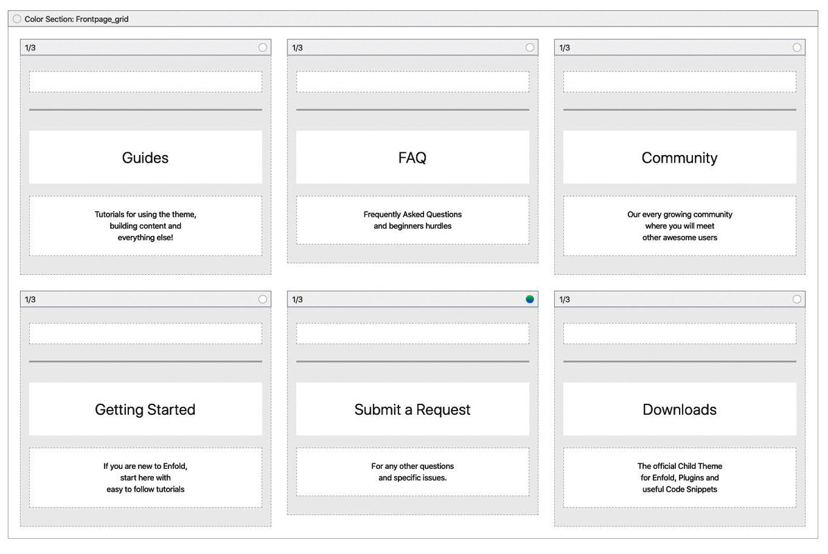
    by the way – this is not a flip grid element – it is a color-section with 1/3 columns in it (equal height) and no space between columns:
    the first one of them (guides) has set a negative margin of -300px

    #1159555

    Hi,

    Please try this instead:

    .main_menu .avia-menu-text {
      font-size: 20px !important;
    }

    Best regards,
    Rikard

    #1159527

    Hello,

    1. I’m trying to increase my Main Menu font size and nothing regarding the menu colors or size seem to be responding. I have tried General Styling, and Advanced. I have cleared cache and added the following CSS:

    #header_meta a, #header_meta span {
    font-size:20px !important;
    }

    2. I have also tried to change the background header color on mobile only as the menu does not show up on mobile.

    Is there a way for you to check it out on your mobile or a means to attach a screen-shot?
    Thank you for your assistance.

    Debra

    #1159489

    In reply to: Font styling and more

    it is the name / surname under full name on the link provided, but it doesn’t matter it’s not that important

    The image caption (added through article editing when adding image), i want it centered, as for color and font size i’ll se myself.

    Kindly provide me a code that applies to all the captions, where the text is centered and with a font size and font color edit.
    I’ll then adjust the size and the color code.

    Thank you.

    #1159482

    In reply to: Mobile dislpay

    Hey tbsimpianti,

    Here is the code you can put in Enfold > General Styling > Quick Css,  if it does not work, put into themes/enfold/css/custom.css

    
    @media only screen and (max-width: 767px) {
      .html_elegant-blog .avia-content-slider .slide-entry-title {
         font-size: 15px;
       }
       .html_elegant-blog #top .main_color .blog-categories a {
         font-size: 12px;
       }
       .responsive #top #wrap_all .slide-entry {
          width: 100%;
          margin-left: 0;
       }
    
    }
    

    If you need further assistance please let us know.
    Best regards,
    Victoria

    #1159400

    Hi,
    Sorry for the late reply, so for “sta-op stoel Arnhem” & “Thuisdemonstratie” on small mobile (320px) I was able to adjust them, on large mobile (425px) they showed correctly.

    @media only screen and (max-width: 424px) { 
    #top.home .cme {
    	width: 260px !important; 
        margin-left: -20px !important; 
    }
    #top.home .avia-builder-el-19 h2.kop-gradient {
    	margin-left: -28px !important; 
    }
    }

    But the “Wisselend assortiment” is too large to adjust this way. Is it possible that this one can have a shorter heading? If so we can duplicate the element and only show it on the small mobile screens. It may be better to do the same for the other elements instead of using the css above.
    Another option may be to make the font-size smaller only for the small mobile screens.

    Best regards,
    Mike

    #1159300
    dlambers
    Participant

    Hello,

    1. I’m trying to increase my Main Menu font size and nothing regarding the menu colors or size seem to be responding. I have tried General Styling, and Advanced. I have cleared cache and added the following CSS:

    #header_meta a, #header_meta span {
    font-size:20px !important;
    }

    2. I have also tried to change the background header color on mobile only as the menu does not show up on mobile.

    Is there a way for you to check it out on your mobile or a means to attach a screen-shot?
    Thank you for your assistance.

    Debra

    #1159242

    Hi micom6150,

    Here is the code you can put in Enfold > General Styling > Quick Css,  if it does not work, put into themes/enfold/css/custom.css

    
    @media only screen and (max-width: 479px) {
      .responsive #top .phone-info {
           text-align: left;
           font-size: 9px;
      }
      .responsive #top #wrap_all #header_meta .container {
        width: 95vw;
        max-width: 95vw;
        margin-left: 20px;
        
      }
    }
    

    If you need further assistance please let us know.

    Best regards,
    Victoria

Viewing 30 results - 4,471 through 4,500 (of 18,734 total)