Hello Mike,
I understand, I believe that the old version was different.
I had a menu already created in the menu function.
I just linked my menu to the “Products” widget.

Now my sidbar is showing. However, does it possible to hide the submenus and appear only to mouse hover state or when click on the menu?
Where I could change the alternate Background for menu hover to sidebar?
Where change the sidebar font color and size?
Best Regards
Wagner Henrique Rabelo
Hi Victoria
Thanks again, the code worked fine, the mobile social media icon issue is now settled!
As to my problem of the too large font size of the blog titles on the front page (in the feature content slider), could you please advise on a code how to make these titles smaller.
Thanks and best regards, Franziska
Hello I would like to make the burger menu smaller (and thinner) I tried these codes:
.av-hamburger-box {
    width: 25px;
}
#av-burger-menu-ul li a span {
    font-size: 20px !important;
}
but they don’t work for me.
I attach a link and a screenshot of what I am trying to achieve.
Thanks
Hi Enfold team,
I wanna reduce the font size and space between lines of all text elements and H2 elements on mobile screens.
how can I do that?
thank you
-
This topic was modified 6 years, 1 month ago by
 Rio1.
Rio1.
Hi mountaintopengraving,
The size of that is controlled by the css.
Here is the code you can put in Enfold > General Styling > Quick Css, if it does not work, put into themes/enfold/css/custom.css
#top .av-image-caption-overlay-center p {
    font-size: 22px;
}
If you need further assistance please let us know.
Best regards,
Victoria
Hi SurigliaStudio,
I could not get it to work with the icon, but I managed to get it to work with the html special char. You can find one that works for you here:
https://dev.w3.org/html5/html-author/charref
Here is the code you can put in Enfold > General Styling > Quick Css, if it does not work, put into themes/enfold/css/custom.css
.togglecontainer .toggler:before {
  content: "↦";
  display: inline-block;
  padding: 0 3px;
  font-size: 32px;
}
The result:

If you need further assistance please let us know.
Best regards,
Victoria
-
This reply was modified 6 years, 1 month ago by
 Victoria.
Hi Victoria,
Thanks, that worked fine! Could you provide an additional code so that the social media icons also appear in the footer, please!
Jordan indicated on codes for changing font sizes for blog titles on the front page and on the single page, which did not work but I managed to solve that myself. I still have an issue with the font size of blog titles, and this is in the featured image slider I have on the front page. Could you advise on a code how to change it, it has to be smaller. That would be great!
Many thanks!
Best regards, Franziska
Good morning, I’m writing again for some issues I just can’t solve despite several tests and attempts.
1.First of all Facebook and Instagram Issues: they do not appear correctly on the pages and in fact they do not work! That’s quite urgent now!
2. As for the home page, I would like the title link on the grid was quite attached to the “Continue reading”, that there was not all that white space between
3. H1 Font appears different on Home PC and mobile. I would like it was always Chelsea market, size 20. How can I fix it?
Many many thanks for your great support!
Hi,
Add this to quick css:
@media only screen and (max-width: 767px)  {
article .slide-entry-title.entry-title {
font-size:14px;
}

.post-title.entry-title{
font-size:18px!important;
}}
Which set of social icons do you want to remove?
Best regards,
Jordan Shannon
It’s me again, sorry …
I solved the problem with the social icons that are too dark, too large and separated with small bars (changed setting with advance styling, small bar above main menu, that I had set earlier …).
I still have the issue with the social icons on the mobile, i.e. they appear twice in the header …
And I still want the font size of the blog titles on the front page and the single page to be reduced.
Thanks for your kind attention!
Cheers, Franziska
Hello Mike
Thank you for your time.
Imagine I have 2 or 3 types of milestones/events on my timeline, and each of these types has its own style (background-color, size, fonts, etc.).
it would be convenient to just add a class on a milestone to style it according to the type of event.
Of course, I can target each milestone by its unique ID, but that would be nowhere near confortable, I would have to update CSS each time I add an event.
With classes, on the contrary, that would be a breeze (and non-tech end users could do that easily).
What do you think of this?
Hi again,
Don’t bother with the issue mentioned under P.S. I found the code for “back to the top” on the mobile and it works just fine.
Another problem occurred in the meantime. Could you please advise on the code for making the font size for the post titles smaller (slider and single page).
Thanks!
Cheers, Franziska
Hi!
First and foremost – LOVE the theme! It’s really great :)
Now onto the problem… I need to reduce the font size in a few text boxes separately, but no matter what I do – I cannot seem to get the settings to do anything.
In advanced styling settings I have the <p> tag size set to 16px, as I need bigger text all over the website. Hopefully this is the correct way of doing it.
Now I need 5 text boxes to have a small font size (10 or 12, maybe smaller – don’t know yet). Problem is – the “font size” option in the text box settings does nothing on any of the 5 boxes.
I tried the custom CSS approach, where I assigned a custom “rv-col-serv” class to the 5 text boxes and used an expression “.rv-col-serv { font-size: 100px; }” in the quick CSS. This did not do anything.
I also tried to change the text box type from <p> to maybe <h6> or whatever, leaving the custom CSS class – thinking that maybe the advanced styling for the <p> tag is overriding any changes – this did not work either.
I really need to make some text smaller and I’m lost as to why nothing works.
Hi Jessica,
Thanks for understanding.
I have added this in the CSS code, I apologize for missing it:
#top .dm_account .ncore_user_form .button {
    background-color: #e53039 !important;
    border: none !important;
    border-radius: 0 !important;
    color: #fff !important;
    font-size: 13px !important;
    line-height: normal !important;
    padding: 9px 22px !important;
    width: auto !important;
}

#top .dm_account .ncore_user_form .button:hover {
    background-color: #ffb0ad !important;
}
Best regards,
Nikko
Hi,
Thanks for the update.
1. Did you import Fontawesome to your site? If not then please try doing that first: https://fontawesome.com/start. After that you should be able to simply paste the markup above and your icons should appear.
2. Please try this in Quick CSS:
#header_meta li a:before {
  font-size: 20px;
}

#header_meta .phone-info a {
  font-size: 16px;
}
3. Please try this CSS as well:
#header_meta {
  background: red;
}
Best regards,
Rikard
HI
The tel and mailto links are working correctly on the sit ebelow – thanks.
Just need to know how to:
1. Add fontawesome icons before those links such as
<i class=”fas fa-phone-alt”></i>
2. How to increase size of social icons and phone/telephone font size and colours. I’ve tried this code but it doesn’t work….
/* Phone info font size */
.phone-info { font-size: 18px; }
3. How to change top bar background color
Thanks
Hey RickWaterson,
Please try the following in Quick CSS under Enfold->General Styling:
#top .av-horizontal-gallery-link {
    line-height: 50px;
    width: 50px;
}

#top .av-horizontal-gallery-link:before {
    font-size: 30px;
}
Best regards,
Rikard
Thanks Rikard
WIll give that a shot. Couple of other queries for you…
1. Was looking at using FontAwsome and an icon such as: <i class=”fas fa-phone-alt”></i>
2. Where do I control the font colour/size and the background color of the nav strip?
Thank you
Hey mborel,
Sorry for the late reply, you can get the codes for your icons by using the shortcode wand
Then for each icon menu item please try this code in the General Styling > Quick CSS field or in the WordPress > Customize > Additional CSS field:
#menu-item-115::before {
  content: "\e808";
  font-family: entypo-fontello;
  font-size: 40px;
  position: relative;
  display: inline-block;
}
#menu-item-115 a {
  height: 20px !important;
  line-height: 20px !important;
  padding-left: 0px;
}
This code is for your first item “menu-item-115”, so just copy this code a adjust the menu IDs and the icons.
Best regards,
Mike
Hi Jessica,
It’s possible though we need a lot of CSS code to do that because of the CSS conflict from Digimember and Enfold.
I have addeed this CSS code:
#top .ncore_form_table span, #top .ncore_form_table .ncore_form_input, #top .ncore_form_table label {
    font-size: 13px !important;
}

#top .ncore_form_table input {
    font-size: 13px !important;
    padding: 8px 6px !important;
}

.dm_account table {
    border-collapse: collapse !important;
    border-spacing: 0 !important;
}

tr.ncore_hidden {
    display: table-row !important;
}
Best regards,
Nikko
Hi Ismael, the font size in the h2 class was set incorrectly in the theme, so I have sorted that problem, but I am still struggling with the original issue with the search input placement, do you have any other suggestions?
Regards
Hi,
Yes, you can simply change the pixel values in the media queries:
@media only screen
and (max-device-width : 767px)
and (orientation : landscape) {
  .slideshow_align_caption h2 {
    font-size: 24px;
  }
  .avia-caption-content p {
    font-size: 18px;
  }
}

@media only screen
and (max-device-width : 767px)
and (orientation : portrait) {
  .slideshow_align_caption h2 {
    font-size: 20px;
  }
  .avia-caption-content p {
    font-size: 14px;
  }
}
Best regards,
Rikard
Hello,
In my Tab Section area, there is an image in each one. In the area Styling > Image Caption > custom font size I have it set to 30px and it is not accepting my changes. No matter what size I change it to, it stays small. Can you tell me how to control that font size? Is it then 30px for every device? Right now it’s not big enough but might get too big for phone but can’t test it since it doesn’t change.
Thanks
Hey bramblejam,
Here is the code you can put in Enfold > General Styling > Quick Css, if it does not work, put into themes/enfold/css/custom.css
/* Header in sidebar to turn to burger on iPad 768px */
@media only screen and (max-width: 990px) {

        .responsive #top .av_header_transparency.av_alternate_logo_active .logo a > img{opacity:1}
        .responsive #top .av_header_transparency .logo img.alternate{display:none;}

        .responsive #top #wrap_all #header {position: relative; width:100%; float:none; height:auto; margin:0 !important; opacity: 1; min-height:0;}
        .responsive #top #main {padding-top:0 !important; margin:0;}
        .responsive #top #main .container_wrap:first-child{ border-top:none; }
        .responsive.html_header_top.html_logo_center .logo { left: 0%; -webkit-transform: translate(0%, 0); -ms-transform: translate(0%, 0); transform: translate(0%, 0); margin:0; }
        .responsive .phone-info{float:none; width:100%; clear:both; text-align: center;}
        .responsive .phone-info span{margin:0;padding:0; border:none;}
        .responsive.html_header_top #header_main .social_bookmarks ,
        .responsive.html_top_nav_header #top .social_bookmarks { width:auto; margin-top:-16px; }

        .responsive #top .logo{position: static; display:table; height:80px !important; float:none; padding:0; border:none; width:80%; }
        .responsive .logo a{display:table-cell; vertical-align: middle;}
        .responsive .logo img{height:auto !important; width:auto; max-width: 100%; display: block;  max-height: 80px;}
        .responsive #header_main .container{height:auto !important; }
        .responsive #top .header_bg { opacity: 1; filter: alpha(opacity=1); }
        .responsive.social_header .phone-info {text-align: center; float:none; clear:both; margin:0; padding:0;}
        .responsive.social_header .phone-info span{border:none; width:100%; text-align: center; float:none; clear:both; margin:0; padding:0;}
        .responsive #header_meta .social_bookmarks li{ border-style:solid; border-width:1px; margin-bottom:-1px; margin-left:-1px;}
        .responsive #top #header_meta .social_bookmarks li:last-child{border-right-style: solid; border-right-width:  1px;}
        .responsive #header .sub_menu, .responsive #header_meta .sub_menu>ul{float:none; width:100%; text-align: center; margin:0 auto; position: static;}
        .responsive #header .social_bookmarks{padding-bottom:2px; width:100%; text-align: center; height:auto; line-height: 0.8em; margin:0;}
        .responsive #header_meta .sub_menu>ul>li{float:none; display: inline-block; padding: 0 10px;}
        .responsive #header .social_bookmarks li{float:none; display: inline-block;}
        .responsive.bottom_nav_header #header_main .social_bookmarks{ position: relative; top: 0; right: 0; margin: 10px auto; clear:both;}
        .responsive.bottom_nav_header.social_header .main_menu>div{height:auto;}
        .responsive .logo img{margin:0;}
        .responsive.html_header_sidebar #top #header .social_bookmarks{display:none;}
        .responsive body.boxed#top, .responsive.html_boxed.html_header_sticky #top #header{max-width: 100%;}

        .responsive.html_header_transparency #top .avia-builder-el-0 .container, .responsive.html_header_transparency #top .avia-builder-el-0 .slideshow_inner_caption{padding-top:0;}
        .responsive #top .av_phone_active_right .phone-info.with_nav span{border:none;}

        .responsive #top #wrap_all .av_header_transparency .main_menu ul:first-child > li > a,
        .responsive #top #wrap_all .av_header_transparency .sub_menu > ul > li > a,
        .responsive #top .av_header_transparency #header_main_alternate,
        .responsive .av_header_transparency #header_main .social_bookmarks li a,
        .responsive #top #wrap_all .av_header_transparency .phone-info.with_nav span,
        .responsive #top .av_header_transparency #header_meta,
        .responsive #top .av_header_transparency #header_meta li,
        .responsive #top #header_meta .social_bookmarks li a{ color:inherit; border-color: inherit; background: inherit;}
        .responsive.html_top_nav_header .av-logo-container{height:auto;}
        .responsive.html_top_nav_header .av-section-bottom-logo{border-bottom-style: solid; border-bottom-width: 1px;}


      /*new mobile*/
        .responsive .av-burger-menu-main{display: block;}
        .responsive #top #wrap_all .main_menu{top:0; height:80px; left:auto; right:0; display: block; position: absolute;}
        .responsive .main_menu ul:first-child > li a { height: 80px; line-height: 80px;}
        .responsive #top .av-main-nav .menu-item{display:none;}
        .responsive #top .av-main-nav .menu-item-avia-special{display:block;}
        .responsive #top #wrap_all .menu-item-search-dropdown > a { font-size: 24px; }
        .responsive #header_main_alternate{display:none;}
        .responsive #top #header .social_bookmarks{display:none;}
        .responsive #top #header .main_menu .social_bookmarks{display:block; position: relative; margin-top: -15px;}
        .responsive #top .av-logo-container .avia-menu{height:100%;}
        .responsive #top .av-logo-container .avia-menu > li > a{line-height: 80px;}
        .responsive #top #main .av-logo-container .main_menu{display:block;}
        .responsive #top #main .av-logo-container .social_bookmarks{display:none;}
        .responsive #top #main .av-logo-container .main_menu .social_bookmarks{display:block; position: relative;}
        .responsive #top #main .av-logo-container .main_menu{display:block;}
        .responsive #top #header_main > .container .main_menu  .av-main-nav > li > a,
        .responsive #top #wrap_all .av-logo-container {height:80px; line-height:80px; }
        .responsive #top #wrap_all .av-logo-container {padding:0;}
        .responsive #top #header_main > .container .main_menu  .av-main-nav > li > a{
            min-width: 0; padding:0 0 0 20px; margin:0; border-style: none; border-width: 0;
        }
        .responsive #top .av_seperator_big_border .avia-menu.av_menu_icon_beside{border-right-style: solid; border-right-width: 1px; padding-right: 25px;}
        .responsive #top #header .av-main-nav > li > a, .responsive #top #header .av-main-nav > li > a:hover{
        background:transparent;
        color: inherit;
        }

        .responsive.html_top_nav_header .av-logo-container .inner-container{overflow: visible;}
        .html_header_sidebar #header .container {
          width: 90%;
        }

}
If you need further assistance please let us know.
Best regards,
Victoria
Hi Ricardo,
Can you try adding this CSS code in Quick CSS, hope it helps a bit:
@media only screen and (max-width:479px) {
  .responsive.html_header_sidebar #header .avia-custom-sidebar-widget-area {
    position: absolute;
    left: 32%;
    width: 60%;
  }

  .responsive.html_header_sidebar #header .avia-custom-sidebar-widget-area .widget {
    padding: 0;
  }

  .responsive.html_header_sidebar #header .avia-custom-sidebar-widget-area .widget .textwidget {
    padding-top: 14px;
  }

  .responsive.html_header_sidebar #header .avia-custom-sidebar-widget-area .av_font_icon,
  .responsive.html_header_sidebar #header .avia-custom-sidebar-widget-area p {
    line-height: 32px;
    height: 32px;
  }

  .responsive.html_header_sidebar #header .avia-custom-sidebar-widget-area p {
    text-align: left;
    font-size: 13px;
  }
}
Best regards,
Nikko
Hi Ivana,
I see, I think the problem is with this code (missing a closing brace):
@media only screen and (max-width: 480px) {
h1 { font-size: 24px !important; }
It should be:
@media only screen and (max-width: 480px) {
  h1 { font-size: 24px !important; }
}
Hope it helps.
Best regards,
Nikko
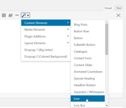
Hi there,
My coworker is experiencing menu overlapping on her computer.
Please see screen grab here
Where can I edit the font size?
Hi,
Please add the following CSS:
#top .av-sort-yes-tax .av-sort-by-term {
font-size: 20px;
}
And change 20 with the number you think appropriate.
Best regards,
Basilis
Hey darrenheld2,
Add this to quick css:
.iconbox_top .iconbox_icon {
font-size:30px!important;
}
Best regards,
Jordan Shannon
Hi,
Sorry for the delay. Unfortunately, there are no responsive options for the caption font size at the moment, so you’ll have to keep the css adjustments for now.
Best regards,
Ismael