Inside the animated numbers I would like to use the value [reportcount] of the plugin ‘Einsatzverwaltung‘.
I tried it as follows, unfortunately it does not work:
[av_animated_numbers number='[reportcount]' start_from='' icon_select='no' icon='ue800' font='entypo-fontello' number_format='' circle='' circle_custom='' circle_border_color='' circle_bg_color='' circle_border_width='' circle_size='' font_size='' font_size_description='' color='' custom_color='#444444' timer='' link='' linktarget='' id='' custom_class='' av_uid='av-kkjs5795' admin_preview_bg='']
Add your own text
[/av_animated_numbers]
-
This topic was modified 5 years, 1 month ago by
 MSchrauf.
Hey there,
I’m trying to change the font on my single product page. This is my custom CSS code:
.entry-summary .woocommerce-product-rating .woocommerce-review-link {
    position: relative;
    font-size: 16px;
font-family: 'Roboto', 'HelveticaNeue', 'Helvetica Neue', Helvetica, Arial, sans-serif;
font-weight: 400;
}
The CSS code works great because if I change the font-family to let’s say Bebas Neue, the font does change on my page.
However, if I choose Roboto the code automatically skips it and goes straight to Helvetica or Arial or “sans serif”.
I checked everywhere on the Internet to see if maybe I’m not using the right line, but I don’t see where my code is wrong…
Thank you!
This reply has been marked as private.
Hi Rikard,
would you please help me with … I can’t find the right one, so that it is responsive and I can choose different font and line colors
I thought that might be the right one and pasted it in Quick CSS but it doesn’t work.
h1 {
border-bottom: 1px solid #EEE;
color: #555;
font-size: 18px;
margin-bottom: 30px;
position: relative;
text-align: center;
}
h1 span {
background: #FFF;
padding: 0 15px;
position: relative;
top: 10px;
}
Thank you
Thina
Hi Victoria, could you look throught my custom css and see if you can spot something?
@media only screen and (max-width: 760px) {

.avia-team-member  .team-member-job-title {
       font-size: 11px !important;
}

 .avia-team-member .team-member-name {
    font-size: 15px !important;
}}

.avia-content-slider .slide-entry-title {
    font-size: 14px!important;
}
.html_elegant-blog .av-vertical-delimiter { display: none !important; }

.html_elegant-blog #top .post-entry .post-title, .html_elegant-blog .avia-content-slider .slide-entry-title {
    text-transform: none;
}

/*Team member text center*/
.avia-team-member {
text-align: center;
}

/*Farger på tab - listing av utstyr*/
div .main_color .tabcontainer .active_tab {
	background-color: #eb5a14;
	color: #ffffff !important;
	outline: none !important;
}
.tabcontainer .tab {
    outline: none !important;
    color: #707070 !important;
    font-size: 13px !important;
    font-weight: 1000; !important;

}

/*Fjerne dato i masonry*/
span.av-masonry-date {
display: none!important;
}

/*Sentrere logo i midten vertikalt*/
.header_color img {
	margin-top: 5%;
        margin-bottom: 5px;
}

#header.header_color.header-scrolled img {
	margin-top: 0px;
}
/*Farge på bakgrunn tabs*/
.av-tab-section-inner-container {
  background-color: #ffffff  !important;
}
/*Farge på pil i tabs*/
.av-tab-arrow-container span {
background-color: #eb743d !important;
}

/*Logo på mobil størrelse*/
@media only screen and (max-width: 1016px) {
.responsive #top #wrap_all .logo a img {
    max-width: 90%;
}
}

#layer_slider_2.avia-shadow {
padding-bottom: 0px;
    padding-top: 2px;
}

/*Skifte bakgrunn teammember*/
.avia-team-member .team-social {
    background: transparent;
    border: none;
}

/*Container width på referanser */
.page-id-2074 .container {
max-width: 1600px;
}

/*----------------------------------------
// CSS
// Toggle Columns
//--------------------------------------*/

@media only screen and (max-width:767px) {
 .page-id-74 .av_one_fifth  {
width:32%!important;
clear: none !important;
float: left;
min-height: 250px;
margin-left:1%!important;
height: 260px;
}
}

#top .avia-table td, #top .avia-table tr, #top .avia-table th, #top .avia-table tr th:first-child, #top .avia-table tr td:first-child {
border-left: none !important;
border-right: none !important;
}

/*
//Sentrere bilder i galleri
*/

#top div .avia-gallery img {
    left: 50%;
    float: none;
    position: relative;
    display: block;
    top: 50%;
    transform: translate(-50%, -50%);
}

#top .avia-gallery .avia-gallery-thumb a {
    position: relative;
}

/*Tabs meny på mobiler*/
@media only screen and (max-width: 760px) {
.av-layout-tab-inner .one_sixth #attachment_5233.wp-caption {
	width: 100% !important;
}
.av-tab-section-inner-container {
    width: 500vw;
    justify-content: space-between;
    display: flex !important;
}

.av-tab-section-outer-container:after {
    content: '\e879';
    font-family: 'entypo-fontello';
    font-size: 50px;
    position: absolute;
    top: 50px;
    z-index: 1000;
    right: 1px;
}
/*Fjernet venstre pil*/
/*
.av-tab-section-outer-container:before {
    content: '\e878';
    font-family: 'entypo-fontello';
    font-size: 50px;
    position: absolute;
    top: 50px;
    z-index: 1000;
    left: 1px;
}
*/
}

/*
// Animere tabs menyer
*/
.tab_content {
    opacity: 0;
    -webkit-transition: opacity 0.3s linear;
    -moz-transition: opacity 0.3s linear;
    transition: opacity 0.3s linear;
}
.tab_content.active_tab_content {
    opacity: 1;
}

/*
// Masonry på Salg/Produktleverandører - Størrelse på bilder
*/
@media only screen and (min-width: 767px) {
   .responsive.html_stretched #masonry_forhandlere .av-masonry-entry{
   width:11% !important;
   padding-left: 10px !important;
   }
 }
This reply has been marked as private.
Hi, I need help with some issues which are problematic for ADA compliance. Any assistance is appreciated:
1. Each a element must contain text or an img with an alt attribute. (Add text to the link, or alt text if the link contains an image. If there is no link text or the alt text is blank, screen readers have nothing to read, so read out the URL instead.) We are able to add global alt text to an image, but are not able to change the alt text based on the use….
2. Using alt text which duplicates link text in the same link or the following link results in screen readers stuttering as the same text is read out twice. Use alt=” when the image is part of a link containing text, or change the redundant alt text if the links are separate….
3. WooCommerce implementation in Enfold
Identify row and column headers in data tables using th elements, and mark layout tables with role=presentation. (Data tables allow screen reader users to understand column and row relationships. Layout tables read cells as a series of unrelated paragraphs with no tabular structure. Without TH or ROLE, screen readers apply heuristics to decide whether a table is a layout table or data table. These heuristics vary greatly between screen.)
• JAWS Reading: Treats tables without TH and ROLE as layout tables if the table contains cells above or below certain pixel sizes. This
measurement is affected by browser window size, browser font size, and the browser used.
• NVDA Reading: Applies a ‘layout table’ heuristic to tables without TH and ROLE which varies depending on the browser used and on the
window size in some circumstances.
• VoiceOver Reading: Uses a sophisticated heuristic on tables without TH and ROLE, which is similar (but not identical) to the heuristic used by NVDA with Firefox.
Thank you!
Hi!
I have added this to my site.
@media only screen and (max-width: 760px) {
 .avia-team-member .team-member-name {
    font-size: 15px !important;
}}
This only work on my desktop browser (Chrome) and is not adjusting on my moblie browsers (Chrome and safari)
What could be the problem?
-
This topic was modified 5 years, 1 month ago by
 stigrs87.
Still doesn’t move the captions or links on mobile. Its at the top and I’ve flushed cache a bunch of times. Here is my current CSS
@media only screen and (max-width: 767px) {
.home #full_slider_1 .slideshow_caption {
padding-top: 5px;
}
.home #full_slider_1 .avia-slideshow-button {
margin-top: 0;
}
}
@media only screen and (max-width:767px) {
.responsive #top #wrap_all #header {
position: fixed !important;
}
.responsive #top #main {
padding-top: 110px !important;
}
}
.phone-info {
font-size: 15px;
}
#top .av_header_glassy.av_header_transparency #header_main {
background-color: rgba(0,20,20,.8);
}
@media only screen and (max-width: 1260px) {
nav.main_menu {
display: block !important;
}
#avia-menu .menu-item {
display: none;
}
.av-burger-menu-main.menu-item-avia-special {
display: block;
}
}
Hi Nikko,
Just the names of the portfolio categories is in German. Everything else is on English. May you please confirm which of the texts on which screenshot you do not understand? When downloading you can zoom in in case it is a question of font size.
Regarding Caching: I use the ülugin WP Super Cache by Automattic. But also when turning the Plugin off and emptying cache the behaviour in the frontend remains unchanged.
Same when I disable also all other plugins + empty cache + refresh page.
Thanks!
Hello, can you please help me out with the main pic on pages? I’ve tried a lot in the Content section with all sort of h x w pics, with css, with and without paralax-setting, but cannot find what I want: a full width responsible picture that shows the whole pic, and not just a selection (which it does if you choose paralax). Due to other css rules, to find in theme>customizer> extra css and beneath this. I would very much like your help: Can I add something like
.av-parallax-inner { background-size: 1310px 220px !important; }
#av_product_description { height: 220px !important; }
CURRENT >customizer> extra css :
.av-tab-section-image {
filter: none!important;
}
/* CSS – Tabs with equal space*/
.js_active .av-tab-section-tab-title-container {
display: flex!important;
justify-content: space-around;
}
#top .fullsize .template-blog .post .entry-content-wrapper {
font-size: 14px;
}
.comment_meta_container, .comment_container {
display: none !important;
}
.bloglist-excerpt .more-link {
color: #816ccf;
}
.avia-cookie-consent {
background-color: #fff;
color: #444;
}
.avia-cookie-consent a.avia_cookie_infolink,
.avia-cookie-consent p,
.avia-cookie-consent .avia-cookie-consent-button {
color: #444;
border-color: #816ccf;
}
#top .avia-cookie-consent .avia-cookie-consent-button.av-extra-cookie-btn,
#top .avia-popup .avia-cookie-consent-button.av-extra-cookie-btn {
background-color: #816ccf;
color: #fff;
border-color: #816ccf;
}
#top #wrap_all .header_color #menu-item-1628.av-menu-button-colored > a .avia-menu-text,
#top #wrap_all .header_color #menu-item-1627.av-menu-button-colored > a .avia-menu-text {
background-color: #98d513;
color: #f8f8f8;
border-color: #98d513;
}
.html_elegant-blog #top .avia-content-slider .blog-categories {
display: none;
}
-
This topic was modified 5 years, 1 month ago by
 jgooiker.
Hi Victoria,
Thanks for your code.
I also added –> font-size: 13px ! <– to make it smaller and it’s almost perfect, But there seems to be too much space between the letters (if we compare with the texts of the products page). How I can reset that ?
Maybe I will want to hide the title and description, so what would be the code ? (I would like to see if it’s better with or without the text and price)
Tnaks again for your help,
Best regards,
Alain
————————
For the Questions #3, I reply in private too.
Hey annevoelkel,
Thank you for the inquiry.
The following css code should adjust the breakpoint of the mobile menu and of the left sidebar or header.
/* header sidebar and mobile menu breakpoint */
@media only screen and (max-width: 768px) {

        .responsive #top .av_header_transparency.av_alternate_logo_active .logo a > img{opacity:1}
        .responsive #top .av_header_transparency .logo img.alternate{display:none;}

        .responsive #top #wrap_all #header {position: relative; width:100%; float:none; height:auto; margin:0 !important; opacity: 1; min-height:0;}
        .responsive #top #main {padding-top:0 !important; margin:0;}
        .responsive #top #main .container_wrap:first-child{ border-top:none; }
        .responsive.html_header_top.html_logo_center .logo { left: 0%; -webkit-transform: translate(0%, 0); -ms-transform: translate(0%, 0); transform: translate(0%, 0); margin:0; }
        .responsive .phone-info{float:none; width:100%; clear:both; text-align: center;}
        .responsive .phone-info span{margin:0;padding:0; border:none;}
        .responsive.html_header_top #header_main .social_bookmarks ,
        .responsive.html_top_nav_header #top .social_bookmarks { width:auto; margin-top:-16px; }

        .responsive #top .logo{position: static; display:table; height:80px !important; float:none; padding:0; border:none; width:80%; }
        .responsive .logo a{display:table-cell; vertical-align: middle;}
        .responsive .logo img{height:auto !important; width:auto; max-width: 100%; display: block;  max-height: 80px;}
        .responsive #header_main .container{height:auto !important; }
        .responsive #top .header_bg { opacity: 1; filter: alpha(opacity=1); }
        .responsive.social_header .phone-info {text-align: center; float:none; clear:both; margin:0; padding:0;}
        .responsive.social_header .phone-info span{border:none; width:100%; text-align: center; float:none; clear:both; margin:0; padding:0;}
        .responsive #header_meta .social_bookmarks li{ border-style:solid; border-width:1px; margin-bottom:-1px; margin-left:-1px;}
        .responsive #top #header_meta .social_bookmarks li:last-child{border-right-style: solid; border-right-width:  1px;}
        .responsive #header .sub_menu, .responsive #header_meta .sub_menu>ul{float:none; width:100%; text-align: center; margin:0 auto; position: static;}
        .responsive #header .social_bookmarks{padding-bottom:2px; width:100%; text-align: center; height:auto; line-height: 0.8em; margin:0;}
        .responsive #header_meta .sub_menu>ul>li{float:none; display: inline-block; padding: 0 10px;}
        .responsive #header .social_bookmarks li{float:none; display: inline-block;}
        .responsive.bottom_nav_header #header_main .social_bookmarks{ position: relative; top: 0; right: 0; margin: 10px auto; clear:both;}
        .responsive.bottom_nav_header.social_header .main_menu>div{height:auto;}
        .responsive .logo img{margin:0;}
        .responsive.html_header_sidebar #top #header .social_bookmarks{display:none;}
        .responsive body.boxed#top, .responsive.html_boxed.html_header_sticky #top #header{max-width: 100%;}

        .responsive.html_header_transparency #top .avia-builder-el-0 .container, .responsive.html_header_transparency #top .avia-builder-el-0 .slideshow_inner_caption{padding-top:0;}
        .responsive #top .av_phone_active_right .phone-info.with_nav span{border:none;}

        .responsive #top #wrap_all .av_header_transparency .main_menu ul:first-child > li > a,
        .responsive #top #wrap_all .av_header_transparency .sub_menu > ul > li > a,
        .responsive #top .av_header_transparency #header_main_alternate,
        .responsive .av_header_transparency #header_main .social_bookmarks li a,
        .responsive #top #wrap_all .av_header_transparency .phone-info.with_nav span,
        .responsive #top .av_header_transparency #header_meta,
        .responsive #top .av_header_transparency #header_meta li,
        .responsive #top #header_meta .social_bookmarks li a{ color:inherit; border-color: inherit; background: inherit;}
        .responsive.html_top_nav_header .av-logo-container{height:auto;}
        .responsive.html_top_nav_header .av-section-bottom-logo{border-bottom-style: solid; border-bottom-width: 1px;}

      /*new mobile*/
        .responsive .av-burger-menu-main{display: block;}
        .responsive #top #wrap_all .main_menu{top:0; height:80px; left:auto; right:0; display: block; position: absolute;}
        .responsive .main_menu ul:first-child > li a { height: 80px; line-height: 80px;}
        .responsive #top .av-main-nav .menu-item{display:none;}
        .responsive #top .av-main-nav .menu-item-avia-special{display:block;}
        .responsive #top #wrap_all .menu-item-search-dropdown > a { font-size: 24px; }
        .responsive #header_main_alternate{display:none;}
        .responsive #top #header .social_bookmarks{display:none;}
        .responsive #top #header .main_menu .social_bookmarks{display:block; position: relative; margin-top: -15px;}
        .responsive #top .av-logo-container .avia-menu{height:100%;}
        .responsive #top .av-logo-container .avia-menu > li > a{line-height: 80px;}
        .responsive #top #main .av-logo-container .main_menu{display:block;}
        .responsive #top #main .av-logo-container .social_bookmarks{display:none;}
        .responsive #top #main .av-logo-container .main_menu .social_bookmarks{display:block; position: relative;}
        .responsive #top #main .av-logo-container .main_menu{display:block;}
        .responsive #top #header_main > .container .main_menu  .av-main-nav > li > a,
        .responsive #top #wrap_all .av-logo-container {height:80px; line-height:80px; }
        .responsive #top #wrap_all .av-logo-container {padding:0;}
        .responsive #top #header_main > .container .main_menu  .av-main-nav > li > a{
            min-width: 0; padding:0 0 0 20px; margin:0; border-style: none; border-width: 0;
        }
        .responsive #top .av_seperator_big_border .avia-menu.av_menu_icon_beside{border-right-style: solid; border-right-width: 1px; padding-right: 25px;}
        .responsive #top #header .av-main-nav > li > a, .responsive #top #header .av-main-nav > li > a:hover{
        background:transparent;
        color: inherit;
        }

        .responsive.html_top_nav_header .av-logo-container .inner-container{overflow: visible;}
        .html_header_sidebar #header .container {
          width: 90%;
        }

}
Best regards,
Ismael
Hey asapevictions,
Sorry for the very late reply and thanks for the link, this is due to this custom css in your Quick CSS or child theme stylesheet:
#top .avia-slideshow-arrows a {
    font-size: 100px !important;
}
Please remove this and clear your browser cache, and check again.
If you want the arrows larger please try this css instead:
#top .avia-slideshow-arrows a:before {
    font-size: 100px !important;
}
Then clear your browser cache and check.
Best regards,
Mike
I changed the icon from “musical note” to “information”
It shows the information icon
BUT WHY does the shortcode still says “ue800” instead of “ue81e”??
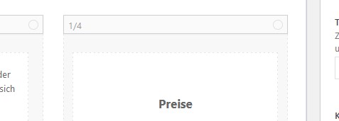
[av_button label='FAQ' link='manually,#tab-id-2' link_target='' size='x-large' position='left' icon_select='no' icon='ue800' font='entypo-fontello' color='theme-color' custom_bg='#444444' custom_font='#ffffff' av_uid='av-pwom0ms'][av_button label='Preise' link='manually,#tab-id-1' link_target='' size='x-large' position='right' icon_select='no' icon='ue800' font='entypo-fontello' color='theme-color' custom_bg='#444444' custom_font='#ffffff' av_uid='av-pdbb4xg']
And submitted later …
Is it also possible to style the font sizes of text and headings, colors etc. separately for each category / post list?
thanks
Grobi
Hi PIT,
Thanks, I have added this CSS code in your site:
#top .ar5 {
    width: 100% !important;
}

#top .ar5 .arformSUBSCR_1610900658304 {
    background-color: transparent;
}

#top .ar5 form {
    padding: 0 !important;
    margin: -15px 0 0 !important;
}

#top .ar5 form > .form-group:nth-child(5),
#top .ar5 form > .form-group:nth-child(6) {
    float: left;
    width: 49.5%;
}

#top .ar5 form > .form-group:nth-child(6) {
    margin-left: 1%;
}

#top .ar5 form > p:nth-child(7) {
    clear: both;
}

#top .ar5 label {
    color: #666666;
    font-size: 13px;
    display: block;
    float: none;
    margin-bottom: 7px;
    line-height: 1.7;
}

#top .ar5 .form-control {
    border: 1px solid #e1e1e1;
    padding: 13px;
    height: auto;
    line-height: normal;
    background-color: #fcfcfc !important;
    border-radius: 2px;
    font-size: 13px;
}

#top .ar5 .form-group .text-center {
    text-align: left;
}

#top .ar5 .form-group .btn {
    width: auto !important;
    margin: 0;
    padding: 16px 20px;
    border-radius: 2px;
    font-size: 12px !important;
    min-width: 142px;
    outline: none;
}
Best regards,
Nikko
Hi,
Sorry for the very late reply, first I would point out that you don’t have to have the current sort title showing on the left, changing to Yes, display sort options will remove this and only show the sort breadcrumbs on the right, but centered.

So assuming that you do want to keep the current sort title on the left, and change the “All” to “UFCW5” on the right, please try this code in the General Styling > Quick CSS field or in the WordPress > Customize > Additional CSS field:
#top.home #av-masonry-1 .ufcw5_sort_sep,
#top.home #av-masonry-1 .ufcw5_sort_button {
	display: none !important;
}
a.all_sort_button > span > span {
	font-size: 0 !important;
}
a.all_sort_button > span:before {
	content: "UFCW5" !important;
}
To change the “All” on the left when “UFCW5” is active we will need to add this custom script. Please try adding this code to the end of your functions.php file in Appearance > Editor:
function custom_script() { ?>
    <script>
(function($){
  $(document).ready(function(){
  	$("#top.home #av-masonry-1 .av-masonry-sort").each(function(){
  		if ($('.av-sort-by-term .all_sort_button').hasClass('active_sort')) {
 $('.av-current-sort-title > span > span').text(function(index, text) {
    	return text.replace('All', 'UFCW5');
 });
 } else {

 }
});
});
})(jQuery);
</script>
    <?php
}
add_action('wp_footer', 'custom_script');
Then clear your browser cache and check.
Best regards,
Mike
Hi,
I would like to change the font size in the small bar above the main menu. How can I do that?
Thanks for helping!
Kind regads
Hi Jordan
I have managed to add icons using the following code:
[av_font_icon icon='ue854' font='entypo-fontello' style='' caption='' size='12px' position='left' color='#FFFFFF' link='' linktarget='' animation='' id='' custom_class='' av_uid='' admin_preview_bg=''][/av_font_icon] +44 (0)121 285 0206 [av_font_icon icon='ue805' font='entypo-fontello' style='' caption='' size='12px' position='left' color='#FFFFFF' link='' linktarget='' animation='' id='' custom_class='' av_uid='' admin_preview_bg=''][/av_font_icon](Email address hidden if logged out) “> (Email address hidden if logged out)
In the Header, Extra Element section but email icon does not appear next to the email address. Can you help?
Also on the left hand side next to ‘Fraud Warning’ I would like to add an icon, is this possible?
Hey AlainTernet,
Here is the code you can put in Enfold > General Styling > Quick Css, if it does not work, put into themes/enfold/css/custom.css
div.product .product_title {
    font-size: 24px;
}
#top .single-product-summary .price .woocommerce-Price-currencySymbol {
  font-size: 20px;
}
As for the https you probably need to use a plugin like Forse SSL or the like.
If you need further assistance please let us know.
Best regards,
Victoria
hi @yigit (not Victoria, not Nikki please!!!)
the icon fonts are gone/hidden/invisible out of a sudden and it seems like a complete mess (the icon shown in the preview is definitely not the one i have choosen months ago. I am not so stupid to choose a musical note as a price symbol)
https://marcusjeroch.de/screens/icon-gone.jpg
https://marcusjeroch.de/screens/icon-preview.jpg
https://marcusjeroch.de/screens/icons-alb.jpg
So please let me know how i can fix this without beeing forced to edit more than 40 pages manually.
This is the ALB-code:
[av_button label='FAQ' link='manually,#tab-id-2' link_target='' size='x-large' position='left' icon_select='no' icon='ue800' font='entypo-fontello' color='theme-color' custom_bg='#444444' custom_font='#ffffff' av_uid='av-ybz4a07'][av_button label='Preise' link='manually,#tab-id-1' link_target='' size='x-large' position='right' icon_select='no' icon='ue800' font='entypo-fontello' color='theme-color' custom_bg='#444444' custom_font='#ffffff' av_uid='av-xo8gj47']
Marcus
Nein – ist leider nicht so trivial.
Am Mac ( ist ja ohnehin quasi “Linux-Basiert”) einige Terminal Tools die wunderbar diese ttf unter einhaltung der variable Fonts generieren.
Die Zukunft wird wohl dahin gehen – man sollte allerdings ein Fallback für die ewig gestrigen bereit stellen.
heißt man lädt schon auch die Schriftschnitte die man möchte ( zB: 300, 400, 700) und diese variablen Font als woff2
man macht dann sozusagen im quick css eine weiche ähnlich den media-querries.
wobei ich dann die Sachen via einer Klasse die ich einem Eltern Element zuweise setze z.B:
hiervor kommen die normalen Definitionen wie üblich dann jedoch :
lies zB: http://clagnut.com/blog/2390/
@supports (font-variation-settings: normal) {
  .raleway-var .av-special-heading-tag {
      font-family: 'Raleway Variable',sans-serif;
      font-variation-settings: "wght" 600;
      line-height: 2em;
      letter-spacing: 0.05em !important;
      font-style: normal;
      font-size: 3em;
  }
  .raleway-italic-var .av-special-heading-tag {
      font-family: 'Raleway Italic Variable',sans-serif;
      font-variation-settings: "wght" 600;
      line-height: 2em;
      letter-spacing: 0.05em !important;
      font-style: normal;  /*** da es ja am Schriftschnitt schon als italic gesetzt ist ***/
      font-size: 3em;
  }
}
eingebunden werden die normalen Fonts und die variablen via z.B:
@font-face{
  font-family:'Raleway Variable';
  font-weight:100 900;
  src:url(../fonts/Raleway-VariableFont_wght.woff2) format('woff2')
}
@font-face{
  font-family:'Raleway Italic Variable';
  font-weight:100 900;
  src:url(../fonts/Raleway-Italic-VariableFont_wght.woff2) format('woff2')
}
die 100 900 sind die Spanne mit der gesetzt werden kann.
nach dem Converter musst du mal Googlen variable ttf nach varialbe woff2 z.B
-
This reply was modified 5 years, 2 months ago by
 Guenni007.
Hi maxh_muc,
Thanks for giving us admin access.
It seems like the base size of 28px for h2 on your site is large enough since the font itself is larger than usual fonts and also in capital letters.
You can see this when you compare it here: https://kriesi.at/themes/enfold-2017/elements/text-block/
For that, I have added this CSS code in Enfold > General Styling > Quick CSS, to adjust h2 in mobile:
@media only screen and (max-width:767px) {
    #top h2 {
        font-size: 22px;
    }
}
Let us know if you need us to re-adjust it.
Best regards,
Nikko
Hey DeMamp,
Please try to add the following codes in Enfold > General Styling > Quick CSS.
For the Price:
#top .price span {
    font-size: 22px;
    font-weight: bold;
}
For the Add to Cart button:
#top .single_add_to_cart_button {
    font-size: 16px;
    font-weight: bold;
}
Hope it helps.
Best regards,
Nikko
Hi.
On the following website, I created, the responsiveness is not working.
In resolutions higher than mobile (Iphone 6/7/8) and smaller than Full HD the six blue cards in the second section don’t arrange well and the headers are cut off. I would assume when the screen gets smaller, they arrange in 2 columns instead of 3 columns as it is at the moment. The same arrangement would be nice in the contact section in the footer. For the cut off headers I already tried to change the h2 headings to smaller pixel font-sizes in the editor. This worked for Iphone resolutions but not for tablet resolutions.
On page_id=824 there is a similiar problem with the headings and the blue cards.
It would be great if you could help me out here.
-
This topic was modified 5 years, 2 months ago by
 crossline2.
Hi,
Sorry for the late response. You should be able to use this css code to adjust the font color and size of the post title.
#top h3.slide-entry-title a {
	color: #000000 !important;
	font-size: 16px !important;
}
The previous css code that Rikard provided above should change the color of the excerpt.
.page-id-1064 .avia-content-slider .slide-entry-excerpt {
     color: red !important;
}
We are not seeing the comment count info anymore.
If you have any additional questions at this time we kindly ask that you open them up in a separate thread. The longer threads get in the forum, they become more difficult to support as they tend to drift off topic and they also make it troublesome for users trying to search for solutions. Keeping threads relevant to their original inquiry ensures that we can keep better track of what has been resolved and that users can more effectively find answers to similar issues they might be experiencing.
Thanks!
Best regards,
Ismael
btw. just for info:
raleway is one of those google fonts that could be used with variable font option – if you are loading that font by yourself. Best would be to load it local.
Some nice info on that: https://web.dev/variable-fonts/
if you have done that – it will be possible to have styles like:
f.e.
h1 {
line-height: 1.7em;
font-size: 3.8em;
font-variation-settings: "wght" 443;
}
you can download this varialble font on google fonts: https://fonts.google.com/specimen/Raleway?query=Raleway – but these fonts are ttf fonts.
it is a little bit tricky to convert those downloadable files to woff2 fonts under preservation of those varialbe fonts options. But there are good converter tools in the net.
Vimeo Video
in Action: https://webers-testseite.de/pureinstall/oswald/
Hello,
I would like to change the “Add to cart” font and the font of the prices as well as their size and boldness so that they appear a little bit bigger.
I can’t give access to the website because I’m running it with XAMPP…
Any help would be very appreciated!
Thanks a lot
-
This topic was modified 5 years, 2 months ago by
 DeMamp.
Hello dear Support Team,
part of the problems I could figure out for myself:
1) I removed the background image in the “general styling settings” for the main content and set it for “#main” in my custom CSS. Now the semi-transparent background for the sections are working!!
2) Removing the “background-size: cover” for “.main_color” the background image for one of my sections also appears now!! Yay :-)
Now my online problem left are the font weights as shown in the avia settings and the browser “inspector” – would great to get help!!!
Thank you very much.
Antonie