Forum Replies Created
-
AuthorPosts
-
Hi Rikard
thanks a lot works fine.
cheers
you can close the ticket, thanks. Maybe this could be included in a future update.
Hi Ismael
thanks a lot works very nice.
cheers
done
-
This reply was modified 4 years, 12 months ago by
Siracher.
Hi Victoria
ah great, it works fine.
thanks a lot
Hi Rikard
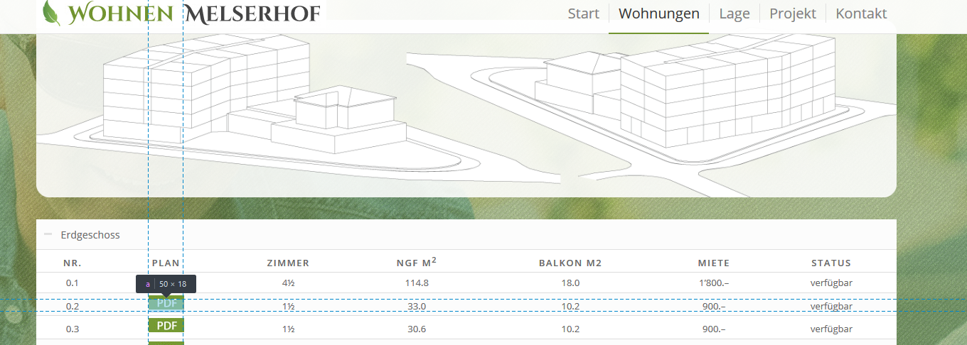
sure, the link around the image of the pdf button uses more height as the image itself or push up the image, not sure what’s going on. The image is pushed up a little and is not vertical aligned anymore like the other text in the row.

yes thanks, you can close the case
Hi Mike
thanks a lot, I replaced the JS File, deleted the custom code and made the original element visible again.
It seems to work fine! I tested with firefox, chrome and edge.Will this fix be in the next update or should I place it in the child theme?
thanks
Hi Mike
thanks a lot for your help, yes works fine this way!
I mentioned earlier that some of the elements seem to have some loading issues when placed insde a tab element.
Maybee the developers can have a look in this problem?thanks
This reply has been marked as private.same issue here, classic editor works fine for me
Hi Nikko
yes thank I also thought about this. The problem is: the content of the tables change ongoing and I don’t want to duplicate it always.
I just go with the top tabs.cheers
January 8, 2019 at 11:29 am in reply to: dotted line around tab section titles when clicked #1051333ja sicher :-)
ich hatte den Code im child-theme, aber dann wieder gelöscht.
Jetzt im Quick-CSS scheint es zu funktionieren. Die Linie blinkt kurz auf, aber verschwindet dann automatisch wieder.
Daher für mich tip-top. besten Dank
yes, unfortunately it doesn’t work
Hi all thanks for the replies!
here’s the page: https://freuler-verwaltungen.ch/dienstleistungen/
I just mentioned the same behaviour in the main menu. Really strange. Somewhere must be declared that the dotted lines appear on focus. But can’t find it.
July 19, 2018 at 3:54 pm in reply to: Fullscreen Lightbox messed up when using external content #987457Hi Ismael
thanks a lot. I’ll investigate with the developer of this external content.
cheers
Hi Victoria
thanks it’s fine now, the client just decided to delete all the extra descriptions.
I think the description and title is always the same if you use the same image.thanks anyway for your help!
HI Ismael
ok thanks I’ll give it a try.
cheers
Hi Basilis
ok thanks for the info.
It’s not really a big issue, it just doesn’t look nice on Tablets.
Maybee there’s a way to let the header shrink also on Tablets?
HI Basilis
thanks but I’m not that experienced in coding and afraid to mess something else up.
I thinks the issue on a tablet is the fact that the header is sticking to the top and not shrinking. Therefore it is overlapping the anchor point.
Do you see a chance to get this fixed in a next release?Hi
I just tested it and it is still the same behaviour. Does it work on your end?
regards
This reply has been marked as private.Hi Mike
I just tried the fix and it doesn’t work. Actually it makes it worst as the Masonry Portfolio doesn’t show up anymore on the same page.
According the last entry from 2014 this problem should be fixed in the next relese. So meanwhile it should be fixed long time ago.
Probably it was fixed for a couple of brwosers as it works on IE, Firefox and on my mobile (Samsung Galaxy S7).
But it’s still a problem on iPad.can you please check again?
Hi Jordan
great, thanks a lot!
cheers
Hey Basilis
of course I don’t want to hire a freelancer to improve the speed of something I paid money for…
Is this something you are aware of and plan to increase the speed for IE in a next update or is it for you a normal behavior and visitors with IE have to wait 6 seconds before they see the content?
regards-
This reply was modified 8 years, 9 months ago by
Siracher.
Hi, we have IE11
It takes 6 seconds to load the images. 2-3 seconds would be ok, but 6 is too long for a visitor to wait.
Is there anything to speed it up ?
thanks Andy
unfortunatley still no animation
cheers
Hi Ismael
thanks a lot. the icon shows up now!
But it ist not animated… do you have an idea what the reason could be?thanks
Hi, thanks for the investigation.
You can see the animation on the developer Website, when you select a date and it loads the available slots:
https://demo.bizzthemes.com/woocommerce-appointments/product/massage/I’m not sure about the css. According the developer it is scss and is located in the woocommerce plugin folder
and it is blocked by the theme. So I’m not sure if you see anything in source.cheers
sry, just solved
I had some bad custom css…. -
This reply was modified 4 years, 12 months ago by
-
AuthorPosts
