Forum Replies Created
-
AuthorPosts
-
Hi,
Your css was missing a “)” so the desktop rules was not working.
I fixed your css and tested “carmel5” homepage, your css rules say under 767px, font should be 44px & between 768px – 1023px, font should be 70px.
This is now working, please check.
I had to move the Instagram Feed css rules to the plugins Custom CSS tab, because it was overwriting it there, if you want to change it, please go there.

I also recommend removing your committed out css rules, as this could cause trouble for you someday.
Please clear your browser cache and check.Best regards,
MikeHi,
Great job on the site :)
Glad we were able to help, we will close this now. Thank you for using Enfold.For your information, you can take a look at Enfold documentation here
and the video tutorials here
And if there are features that you wish Enfold had, you can request them and vote the requested ones here
For any other questions or issues, feel free to start new threads under Enfold sub forum and we will gladly try to help you :)Best regards,
MikeHi,
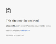
Please check the url, doesn’t seem to be valid, or your nameserver is not setup
also I see a password above but no user name.Best regards,
MikeHi,
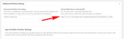
To open portfolio image in lightbox, please go to the portfolio item and near the bottom go to Additional Portfolio Settings > Overwrite Portfolio Link setting and choose custom link, then in the next box enter the url to the image:
Best regards,
MikeHi,
On https you are getting mixed content:Mixed Content: The page at 'https://your-site.com/' was loaded over HTTPS, but requested an insecure image 'http://your-site.com/wp-content/uploads/2017/08/pl-logo.png'. This content should also be served over HTTPS. (index):1 Mixed Content: The page at 'https://your-site.com/' was loaded over HTTPS, but requested an insecure favicon 'http://your-site.com/wp-content/uploads/2016/09/rm_favicon.png'. This content should also be served over HTTPS.The free version of the plugin works very well.
I’m seeing the icons on the home page and the Fontello social icons in the socket in IE11 & Edge for both http & https
and no errors about it above.
So I’m not sure why you are not seeing it in IE11Best regards,
MikeHey jelle,
Perhaps a plugin such as Last Modified TimestampBest regards,
MikeHi,
We will leave this open for now, let us know if you do need assistance installing the demo.Best regards,
MikeHey chrislim,
I was unable to login, please check login info.
I see you have a JetPack js error
Try disabling all of your plugins. If that resolves the issue, reactivate each one individually until you find the cause.Best regards,
MikeApril 22, 2018 at 6:34 pm in reply to: New Automatic Google Adsense Ads; want ads only in the post and no in pages. #945091Hi,
Glad we were able to help, we will close this now. Thank you for using Enfold.For your information, you can take a look at Enfold documentation here
and the video tutorials here
And if there are features that you wish Enfold had, you can request them and vote the requested ones here
For any other questions or issues, feel free to start new threads under Enfold sub forum and we will gladly try to help you :)Best regards,
MikeHi,
Sounds like you have a different error,
Can you please include a admin login in the private content area so we can take a closer look.Best regards,
MikeHey beauch66,
Your favicon is showing for me in Firefox, but I notice that the code of your page looks like you are using a caching plugin and/or minifying, I also see reference to Cloudflare.
If you are using a caching plugin, you will need to clear the cache after changing the favicon, or switching to or from a plugin. If you are using minifying it also will need to be cleared. If you are using a CDN, such as Cloudflare you will need to wait for it to update it’s own cache.
As a rule of thumb, browsers look for the favicon as “favicon.ico” in your root directory, I recommend using this online converter to upload your “favicon-32×32-1.png” and convert to “favicon.ico” and then upload to your root folder, the same place as your wordpress “index.php”
This, along with your theme options, will help all browsers find your favicon.Best regards,
MikeHi,
Glad we were able to help, we will close this now. Thank you for using Enfold.For your information, you can take a look at Enfold documentation here
and the video tutorials here
And if there are features that you wish Enfold had, you can request them and vote the requested ones here
For any other questions or issues, feel free to start new threads under Enfold sub forum and we will gladly try to help you :)Best regards,
MikeHi,
Thank you for sharing your solution, we will close this now. Thank you for using Enfold.For your information, you can take a look at Enfold documentation here
and the video tutorials here
And if there are features that you wish Enfold had, you can request them and vote the requested ones here
For any other questions or issues, feel free to start new threads under Enfold sub forum and we will gladly try to help you :)Best regards,
MikeHey CassieRamos,
Typically this is due to a older PHP version being used by your webhost, please ask them to update your PHP version to v7
Another solution could be to replace your header.php with this one.Best regards,
MikeHey DimaP,
Without seeing the site, I’m thinking that the Fontello font is loading from http and IE11 is not automatically switching to https, a easy solution is to use the plugin Really Simple SSL to correct the url.Best regards,
MikeHey bilgecelik,
Sometimes the dynamic elements don’t show correctly in a preview, please activate or save the page and then view.Best regards,
MikeHey werbeagenturlauf,
Please include the url to the page in question so we can assist.Best regards,
MikeHey Matthew Lautensack,
Thank you for contacting us, The Advanced Layout Builder is unique to Enfold, our most complete and advanced theme.
If you would like to see the ALB in action and the different elements included, please see this series of video tutorials contributed by Enfold community, please scroll to the bottom half of the page:Best regards,
MikeApril 22, 2018 at 5:27 pm in reply to: New Automatic Google Adsense Ads; want ads only in the post and no in pages. #945072Hey José Ramón,
This is the first time I’ve heard of Google Adsense automatic ads, but I believe that within your Adsense control panel you should be able to exclude pages of your site, I recommend looking for the correct way there.
But another method would be to use a conditionally function in WordPress to only post the header code on posts. First remove your Adsense header code, then add it to this function in your functions.php
*Hopefully you are using a child theme because when editing functions.php you should use the child theme, so your changes will not be lost with future theme updates Read about it & Get it here// adsense code only on single posts function add_custom_adsense(){ if ( is_single() ) { ?> <script> //ADD YOUR ADSENSE CODE HERE </script> <?php } } add_action('wp_head', 'add_custom_adsense');Best regards,
MikeApril 22, 2018 at 4:53 pm in reply to: Please read – Regarding Wordfence LayerSlider warning on Enfold 4.0.3 #945069Hi,
Is your speed test a plugin or a website like http://www.webpagetest.org/ ?
Please try the website and link the results here.Best regards,
MikeHey simonac,
I found that in Chrome your page looks the same logged in or out, most likely because I logged in with Chrome, but on first load with Firefox the wpfc-minified stylesheet couldn’t be loaded which was causing styling issues.
Clearing the wpfc minified cache and reloading in Firefox solved.
I also notice that the wpfc option panel doesn’t look right, and I believe there is a conflict from another plugin.
I also notice that you have not white listed /wp-content/uploads/dynamic_avia/ & /wp-content/cache/wpfc-minified/ in your firewall which is where some of your stylesheets are. Try white listing the whole /wp-content/
Please first disable the minifying of the cache plugin and clear the cache a few times.
Then disable your other plugins to fine the one conflicting with wpfcBest regards,
MikeHi,
The WordPress maintenance message is normal after such a change, it is only for a short time. I have checked and your site is now working correctly.
Please clear your browser cache and check.Best regards,
MikeHi,
If I’m understanding what you did correctly, the reason the new theme crashed was because you tried to “update” the theme folder, instead of “replacing” it.
We are making so major changes to the theme’s directory and file structure, trying to “update” the theme folder leaves old files behind that will brake the theme.Please try to do what Guenni007 suggested, rename the “enfold” folder in /wp-content/themes/ to “enfold-old” via FTP, then upload the new “enfold” folder, once you see the new “enfold” is working on the front end, you can delete the “enfold-old” folder via FTP.
Otherwise if it doesn’t work, rename the new enfold folder to “enfold-new” and rename the “enfold-old” back to “enfold” and let us know.Best regards,
MikeApril 22, 2018 at 3:45 pm in reply to: SSL-Umstellung, AVIA Java-Script lädt unsicheres Bild nach #945053Hi,
@Guenni007 thank you for helping.Best regards,
MikeApril 22, 2018 at 3:40 pm in reply to: Random text in footer of enfold construction theme – #ua-117526703-1" #945051Hi,
Glad we were able to help, we will close this now. Thank you for using Enfold.For your information, you can take a look at Enfold documentation here
and the video tutorials here
And if there are features that you wish Enfold had, you can request them and vote the requested ones here
For any other questions or issues, feel free to start new threads under Enfold sub forum and we will gladly try to help you :)Best regards,
MikeHi,
Glad we were able to help, we will close this now. Thank you for using Enfold.For your information, you can take a look at Enfold documentation here
and the video tutorials here
And if there are features that you wish Enfold had, you can request them and vote the requested ones here
For any other questions or issues, feel free to start new threads under Enfold sub forum and we will gladly try to help you :)Best regards,
Mike -
AuthorPosts