Forum Replies Created
-
AuthorPosts
-
Hi,
I have replied to that post.
Glad we were able to help with this one, we will close this now. Thank you for using Enfold.Best regards,
MikeHey DROR,
Do I need to login as the user? I don’t see the same screen, Please see screenshot in Private Content area.Best regards,
MikeHi,
I was able to install the demo, please login with the details in the Private Content area.
Please create your new users then delete the demo user.
Then go to WordPress > Settings > General and change the default site email address to your own, also check all other settings.
Please let us know if there is there anything else we can assist with on this.Best regards,
MikeHi,
Glad we were able to help, we will close this now. Thank you for using Enfold.For your information, you can take a look at Enfold documentation here
and the video tutorials here
And if there are features that you wish Enfold had, you can request them and vote the requested ones here
For any other questions or issues, feel free to start new threads under Enfold sub forum and we will gladly try to help you :)Best regards,
MikeHi,
I see the arrow next to the “we install” menu item, which is your only menu that has a drop down.

Please try clearing your browser cache.Best regards,
MikeHi,
I’m not sure what “mediathek” is, ” Media library”? I’m surprised that Better Search Replace for http > https didn’t solve this for you. Same with Really Simple SSL
Please check for a .htaccess file in the /wp-content/uploads/ folder and endure that any http is changed to https, also check your root .htaccess file.
I also found this function:function have_https_for_media( $url ) { if ( is_ssl() ) $url = str_replace( 'http://', 'https://', $url ); return $url; } add_filter( 'wp_get_attachment_url', 'have_https_for_media' );perhaps it will help.
Best regards,
MikeHi,
Glad we were able to help, we will close this now. Thank you for using Enfold.For your information, you can take a look at Enfold documentation here
and the video tutorials here
And if there are features that you wish Enfold had, you can request them and vote the requested ones here
For any other questions or issues, feel free to start new threads under Enfold sub forum and we will gladly try to help you :)Best regards,
MikeHi,
If you would like, we could try to assist with a manual demo import. We would need ftp access, please note that all content, settings, etc will be lost with the import.Best regards,
MikeMay 10, 2018 at 6:11 am in reply to: Buttons on mobile should be displayed one below the other #954332Hey J.,
This is because the buttons are set to display: inline-block;
Try this code in the General Styling > Quick CSS field:@media only screen and (max-width: 767px) { .avia-button-wrap { display: table-row !important; } }This will make them line up for mobile screens:
But this code is too general, it could affect other buttons on your site, please add a custom class or ID for this element and add it to the code. Let us know if you want some help with doing that.Best regards,
MikeMay 10, 2018 at 5:54 am in reply to: My Date Picker in a form isn't showing the date options #954322Hey johnosjourney,
I see you are getting this error:Uncaught ReferenceError: jQuery is not definedTry disabling your plugins. If that resolves the issue, reactivate each one individually until you find the cause.
Best regards,
MikeMay 10, 2018 at 5:50 am in reply to: Enfold Latest Version Update Not Available in Dashboard #954316Hi,
Glad we were able to help, we will close this now. Thank you for using Enfold.For your information, you can take a look at Enfold documentation here
and the video tutorials here
And if there are features that you wish Enfold had, you can request them and vote the requested ones here
For any other questions or issues, feel free to start new threads under Enfold sub forum and we will gladly try to help you :)Best regards,
MikeHi,
I was unable to login, has the login changed, or are you restricting by IP?
Can I ask which webhost are you using?Best regards,
MikeHey xyzb,
Please see the options at WordPress > Settings > General > Time Format:
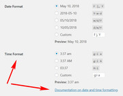
Best regards,
MikeHey SamCKayak,
Try disabling your plugins, disable js minifying, check for scripts in code blocks, and check for custom function in functions.php
Your error above with theavia-snippet-lightbox.js:129 Uncaught TypeError: links.not(...).addClass(...).magnificPopup is not a functionerror on your homepage points to a script error.
Best regards,
MikeHi,
If I understand correctly, you would like the body of your site transparent so the background image shows though the content, such as in the screenshot in Private Content area.
If so, Try this code in the General Styling > Quick CSS field:.container_wrap.main_color, #main.all_colors { background-color: transparent!important; }Best regards,
MikeHi,
I looked at your blog (newsroom) on both sites and it seems the pagination on the staging site is working correctly, while the pagination on the live site shows the same entries for each “page”, is this the correct issue?
I didn’t see anything in your functions.php that might cause this, that doesn’t rule out direct edits, as you said the other dev had done this. I assume you tested deactivating the pugins?
you may have to isolate all of the direct edits, I recommend trying something like https://www.devart.com/codecompare/ I have not tried it, but it seems the free version will do whole directories with sub-directories.Best regards,
MikeHi,
I see now, you are getting a java error:

This looks like a plugin error, Try disabling your plugins. If that resolves the issue, reactivate each one individually until you find the cause.Best regards,
MikeHi,
I see your code is a little off, try this instead:.menu li > a:after { content: ' ▾'; } .menu li > a:only-child:after { content: ''; }or this:
.menu li > a:after { content: ' ▾'!important;  }
.menu li > a:only-child:after { content: ''!important;  }
Best regards,
MikeHi,
You would need to use this code for that page:#top.page-id-1603 .flex_column.avia-builder-el-6 { margin-left: 30px !important; }but there is not enough room on the page for 30px margin, the sidebar will drop down.
so you nee to make the sidebar a little smaller:#top.page-id-1603 .no_margin.av_one_fourth { width: 20% !important; }or make the content a little smaller:
#top.page-id-1603 .no_margin.av_three_fourth {
    width: 70% !important;
}
Your choice, also feel free to try different sizes of each to see what you like best, or adjust the sidebar margin code above.
Best regards,
MikeHi,
Glad we were able to help, we will close this now. Thank you for using Enfold.For your information, you can take a look at Enfold documentation here
and the video tutorials here
And if there are features that you wish Enfold had, you can request them and vote the requested ones here
For any other questions or issues, feel free to start new threads under Enfold sub forum and we will gladly try to help you :)Best regards,
MikeHi,
I find this error odd:Mixed Content: The page at 'https://yoursite.de/' was loaded over HTTPS, but requested an insecure image 'http://yoursite.de/wp-login.php'. This content should also be served over HTTPS.I wonder why wp-login.php is considered an image?
I tested your site at whynopadlock.com and it says:Errors that are reported on line 1 are generally not part of the source code. This error may be caused by an external javascript file which is writing to the page
So it seems that there maybe a script that is writing to wp-login.php
Do you use wordfence or something seminar? I can’t think of any other scripts that would write to wp-login.phpBest regards,
MikeHi,
Sorry for the late reply, I have found that you are using this code in your functions.phpfunction defer_parsing_of_js ( $url ) { if ( FALSE === strpos( $url, '.js' ) ) return $url; if ( strpos( $url, 'jquery.js' ) ) return $url; return "$url' defer "; } add_filter( 'clean_url', 'defer_parsing_of_js', 11, 1 );when I add it to my localhost it brakes my widgets also, please remove and check.
Best regards,
MikeHi,
Sorry to hear that, what type of localhost did you try to use mamp, xampp, wamp?Best regards,
MikeHi,
Have you already found the solution for this? Because I seem to be seeing it that way, Please see screenshot in Private Content area.Best regards,
MikeHi,
Good, when you are ready please include the ftp access in the Private Content area.Best regards,
MikeHi,
To have less space between the image and meta info, first remove the bottom padding from the meta info by changing the above code like this:.html_modern-blog #top.single-post .post-entry .post-meta-infos { margin-top: 0px !important; padding: 0px !important; top: -22px !important; }Then add this css:
.html_elegant-blog #top.single-post .entry-content-wrapper .big-preview.single-big {
    margin-top: 0px !important;
    padding-bottom: 0px !important;
}
Best regards,
Mike -
AuthorPosts