Forum Replies Created
-
AuthorPosts
-
Hey obimedia2,
How about hiding the current menu item so it won’t be a choice, Try this code in the General Styling > Quick CSS field:#av-burger-menu-ul li.current-menu-item { display: none !important; }Please clear your browser cache and check.
Best regards,
MikeHey zizibe1,
Instead of using inline-styles, using a span class would give you more options.
On your homepage, I changed your code for the red dot to:<span class="red-dot">⬤</span>then I added this css to your Enfold Theme Options > General Styling > Quick CSS field
.red-dot {
font-size: 1em;
color: #ff0000;
}
I used “1em” because it will change it’s size automatically, you could adjust if you like using fractions such as “1.3em”
Please try using this method in the other places you have the red dot.
Please clear your browser cache and check.Best regards,
MikeJuly 6, 2018 at 11:57 am in reply to: Problem after install Enfold, there isn't menu config on the left #982001Hi,
Glad Rikard could help, we will close this now. Thank you for using Enfold.Best regards,
MikeHi,
Glad we were able to help, we will close this now. Thank you for using Enfold.For your information, you can take a look at Enfold documentation here
For any other questions or issues, feel free to start new threads under Enfold sub forum and we will gladly try to help you :)Best regards,
MikeJuly 6, 2018 at 11:53 am in reply to: Add Phone number in between logo and hamburger menu on mobile #981998Hi,
Glad we were able to help, we will close this now. Thank you for using Enfold.For your information, you can take a look at Enfold documentation here
For any other questions or issues, feel free to start new threads under Enfold sub forum and we will gladly try to help you :)Best regards,
MikeHi,
Which browser are you seeing this in? I’ve checked with Chrome, Firefox, & Edge and it doesn’t show.
Please see screenshot in Private Content area.Best regards,
MikeHey jchucary,
When I check your overlay has “opacity: 0.0510873;” which makes your white menu text very hard to see.
Typically by default this is set to “1” so it would be darker, If you would like that please try this code in the General Styling > Quick CSS field:.av-burger-overlay { opacity: 1 !important; }Best regards,
MikeHey Lara,
I took a look at your media files and only found one that was a gray icon, but opening the link worked fine.
I see that it was created with Acrobat 11, while the others were created with InDesign CC 2017
I would say that it’s the file properties, and the software used to create it.Best regards,
MikeJuly 6, 2018 at 3:36 am in reply to: How to Delete Enfold Logo on Site and Replace with Mine? #981807Hi,
There is an error in your Google Analytics code in your Google Analytics plugin “Custom Tracker Objects”, removing the code solves.
Please check your code and adjust.Best regards,
MikeHi,
@fashiontribe
Typically this occurs when the webhost doesn’t have the ZipArchive PHP extension is enabled. Please ask your webhost to check.
If this doesn’t help, Please open a new thread so we can assist, and include your admin login in the Private Content area, but as this is not your thread your login info will not be private.Best regards,
MikeHi,
I see your Enfold Theme Options > Performance > JS & CSS file merging and compression is turned on, so a activated your Swift cache plugin and cleared it’s cache, everything seems as it should.
Please try clearing your browser cache and checking again.Best regards,
MikeHi,
Thanks for the login, I added this css to your Quick CSS:@media only screen and (max-width: 767px) { .responsive #top.home .avia-builder-el-0 .slideshow_caption { padding-top: 0px!important; } .responsive #top.home #wrap_all .container { width: 95% !important; max-width: 95% !important; } .responsive.av-no-preview #top.home #wrap_all .av-mini-font-size-hidden { display: block !important; } .responsive #top.home .avia-slideshow-button { padding: 10px 10px !important; font-size: 10px !important; } }Please clear your browser cache and check.
Best regards,
MikeHi,
Please try changing the Background Attachment from parallax to scroll, if you still have some padding we can remove it and add a shadow.Best regards,
MikeHi,
Thanks @Guenni007Best regards,
MikeHi,
I have checked, and on the homepage the header shows only after scroll, just like the desktop view of the homepage, and this only happens on the homepage. On the other pages the header shows on page load and then moves up out of view on scroll.
Please see screenshot in Private Content area.
Is this what you wanted?Best regards,
MikeHi,
I took a look and found that the code for the mobile view of the slider was still in place at WordPress > Customize > Additional CSS
so I removed it. I then refreshed my browser and it seems that it is back to the way it was before.
Please see screenshot in Private Content area, is this correct and how it looks for you?
If not can you please post a screenshot.
Also please try using an incognito or private window.Best regards,
MikeHi,
Thank you, I understand now. Is this on one page only?
Please link to the page directly so we can check, I see you tried to do that above, but the link is to the page editor which we can’t see unless we are logged in.
If you also post a admin login in the Private Content area it may help our investigation.Best regards,
MikeHi,
Glad to hear, unless there is anything else we can help with on this issue, shall we close this then?Best regards,
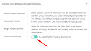
MikeJuly 6, 2018 at 12:46 am in reply to: Default Lightbox must be activated for this feature to work #981776Hi,
You won’t need to use that code because it is handled in the setting:
[av_privacy_google_tracking] – allows a user to disable google tracking in his or her browser.
I would recommend removing the code so it won’t conflict with the built in function.Best regards,
MikeHi,
Try adding this code to the end of your functions.php file in Appearance > Editor:function custom_comment_script(){ ?> <script> jQuery(window).load(function(){ // Replace coments title "Plaats een Reactie". jQuery(".single-post .miniheading").text("Let me know your thoughts"); // Replace sub-heading "Meepraten? Draag gerust bij!". jQuery(".single-post .minitext").text("leave a comment."); }); </script> <?php } add_action('wp_footer', 'custom_comment_script');Please adjust the text to suit
Best regards,
MikeJuly 5, 2018 at 1:33 pm in reply to: Problem with loosing page content and layout during page update #981586Hi,
Thank you for adding the debugger code, there seems to be a break in the shortcode at the first grid row “basics”, when adding the template, even though all of the elements show in the visual editor, the shortcode in the debugger, only shows up to that grid row, thus saving loses all of the other code. If I try to delete the grid row all other code is lost.
The error has been saved in the template, and even though the first save will save the page the error brakes the code for future saves.
I recommend creating a new product page from scratch and recreate without using any templates to correct.Best regards,
MikeJuly 5, 2018 at 12:32 pm in reply to: Add Phone number in between logo and hamburger menu on mobile #981557Hi,
Glad we could help,
the Quick CSS is a good place to add the css, it gets merged with the child theme style.css anyways.
Unless there is anything else we can help with on this issue, shall we close this then?Best regards,
MikeHi,
You could try editing the js/avia.js on line 550 and remove “youtube\.com”if(!url.match(/(jpg|gif|jpeg|png|\.tif|\.mov|\.swf|vimeo\.com|youtube\.com)/) ) span_class = "overlay-type-extern";or the easier solution is you use a link shortener, such as https://goo.gl/
I created a test link for you under the other one to demonstrate.<a href="https://goo.gl/67u9gx">YouTube Short Link</a>Best regards,
MikeJuly 4, 2018 at 10:41 pm in reply to: Problem with loosing page content and layout during page update #981361Hi,
I was able to login, thank you. I tried editing the page and most of the content was lost. I saw that you had this saved as a template, along with others. I tested some of the other templates that didn’t seem to have this issue. I wanted check with the debugger but couldn’t add the code to your functions.php, please try to do this for us.
Enable Avia Layout Builder DebugBest regards,
MikeJuly 4, 2018 at 10:21 pm in reply to: Saving Enfold Contact Form to Database (Finally Solved!!) #981357Hi,
@ChrisBards
Please try doing a test submission after the plugin is installed, by default no data is saved without the plugin, so you can’t retrieve old submissions.Best regards,
MikeHi,
I have taken a look and found that you are getting a js error for screen sizes 1440px and below:Uncaught Code.PhotoSwipe.createInstance: No images to passed. code.photoswipe.jquery-3.0.5.jsthis seems to be coming from: /wp-content/plugins/tablet-photography/photoswipe/code.photoswipe.jquery-3.0.5.js
Please try disabling the plugin tablet-photography and clear any site and browser cache, and check again.
Often the errors reported in the console begin with a different root cause, so if this doesn’t solve please try disabling your other plugins and check.Best regards,
MikeHi,
I have taken a look and I find that on first load or hard refresh the images are loading slowly because there are so many of them, after the element has been created, which gets it’s height from the images.
Try adding this code to the end of your functions.php file in Appearance > Editor:add_action('wp_footer', 'ava_auto_resize'); function ava_auto_resize(){ ?> <script> (function($){ var int = window.setInterval(function(){ $(window).trigger('resize'); }, 2000); $(window).load(function () { setTimeout(function() { clearInterval(int); }, 5000); }); })(jQuery); </script> <?php }Best regards,
MikeHi,
I have checked with a LG Android v5.1.1 with Chrome and the FaceBook widget shows.
Please see screenshot in Private Content area.
Do you have “data saver” turned on, which uses caching to view sites, and have you tried clearing your cache & history?Best regards,
MikeHi,
Thank you for explaining, I have tested with Android and find that I can add the number of people. Since you have said that this doesn’t work with iPhone I will ask the team to take a look with a iPhone.
Thanks for your patience.Best regards,
MikeJuly 4, 2018 at 8:03 pm in reply to: Default Lightbox must be activated for this feature to work #981335Hi,
I’m not sure I understand, as when I check your popup the google opt out is already visible as a button,
because of [av_privacy_google_tracking] which is a built in function,
and as I understand it there is no need to add any more code or radio buttons.
You can read more about this here: ENFOLD 4.4 AND THE GDPRBest regards,
Mike -
AuthorPosts