Forum Replies Created
-
AuthorPosts
-
Hi,
Glad we were able to help, we will close this now. Thank you for using Enfold.For your information, you can take a look at Enfold documentation here
For any other questions or issues, feel free to start new threads under Enfold sub forum and we will gladly try to help you :)Best regards,
MikeHi,
Try adding the info in the Private Content area, and also add some text in the main area, such as “Please see below”
Sorry but without seeing your site I can’t offer the correct solution.Best regards,
MikeHi,
Glad we could help, unless there is anything else we can help with on this issue, shall we close this then?Best regards,
MikeHi,
The demo doesn’t come with that slider, but you could “right-click > save-as” the two images from the demo site and add them to your easy slider.
As for the slider on your homepage, I’m not sure what white space you mean, but please check that when editing the page, in the editor sidebar named “Layout” see if the header is set to “transparency ” this would hide the white background of the main menu, if so, then chamge.
If this doesn’t help, then please include a screenshot of the issue.Best regards,
MikeHi,
Thanks, the issue was your string of dashs in your css, I commented it out like this/*--------*/and now the code I added works, Please clear your browser cache and check.
Best regards,
MikeHi,
Thank you for removing it. When testing this code:@media only screen and (min-width: 768px) { .html_header_sidebar #top #header.av_never_sticky { position: fixed!important; } }the mobile menu is not sticky, and at tablet and above the sidebar menu is sticky.
Perhaps when you tested it you needed to clear your cache, or there is an error in your css.
If you include a admin login we could take a look.Also with this code your logo shows on the mobile menu, did you want that?
Best regards,
MikeHi,
Please try removing your code above and use this code instead:@media only screen and (min-width: 768px) { .html_header_sidebar #top #header.av_never_sticky { position: fixed!important; } }If this doesn’t help, please leave your code removed so I can test without it.
Best regards,
MikeHi,
Glad we could help, unless there is anything else we can help with on this issue, shall we close this then?Best regards,
MikeHi,
Glad we could help, unless there is anything else we can help with on this issue, shall we close this then?Best regards,
MikeHi,
This should be possible with some css like this:#media_image-2 { top: -100px; }But I don’t see the image on your site anymore so I can’t adjust the code to the correct calculation, please add the image back and adjust the negative number to suit, or let us know and we can assist.
Best regards,
MikeHi,
Glad we were able to help, we will close this now. Thank you for using Enfold.For your information, you can take a look at Enfold documentation here
For any other questions or issues, feel free to start new threads under Enfold sub forum and we will gladly try to help you :)Best regards,
MikeSeptember 1, 2018 at 3:48 am in reply to: Burger/Mobile Menu / How can I get it bigger/thicker? #1004259Hi,
Yes the navigation works correctly on my mobile and desktop, because I am logged in to your WordPress site.
If I log out of your WordPress site then all of the navigation links are redirected to the homepage.
This is due to your settings at: Enfold Theme Options > Maintenance Mode.
Please un-check this option, or login to your WordPress admin page.Best regards,
MikeHi,
Ok, I will try again. But right, from the link above, now I’m only getting a landing page with a overlay menu instead of the flyout menu.Best regards,
MikeAugust 31, 2018 at 12:53 pm in reply to: Change woocommerce price position on single product page #1004071Hi,
Thank you for that, I adjusted the code and now it seems to work correctly, Please clear your browser cache and check.function move_price(){ ?> <script> jQuery(window).load(function(){ jQuery( '.single-product.woocommerce-page' ).each(function() { jQuery( this ).find( '.av-woo-purchase-button p.price' ).insertBefore( jQuery(this).find('.special-heading-border') ); }); }); </script> <?php } add_action('wp_footer', 'move_price');Best regards,
MikeHi,
Glad to hear, you can add a custom class to the column and css like this:.flex_column.customclass:hoverbut it should work as is, I added the page ID out of habit.
Is there is anything else we can help with on this issue, or shall we close this thread?Best regards,
MikeHey janton1,
Please try this code in the General Styling > Quick CSS field:.template-shop.avia-content-slider .inner_product_header_table { display: flex!important; justify-content: center!important; }Best regards,
MikeHey Zetrh,
Please try changing your code to this:@media only screen and (min-width: 768px) { .html_header_sidebar #top #header.av_always_sticky { right: 0; } .html_header_left #main { margin-left: auto; } .html_header_sidebar #header .av-main-nav { text-align: left; } .html_header_sidebar #top #header { position:fixed!important; width: 475px; position: absolute; min-height: 100%; border-bottom: none; } }Best regards,
MikeHey ejo14,
Please try this code in the General Styling > Quick CSS field:#media_image-2 { float: right; top: -50px; }Please see the screenshot in Private Content area for expected results.
Best regards,
MikeHi,
To make the text below the images on the homepage become underlined on mouse-over, please try this css:#top.home .flex_column:hover h6,#top.home article.inner-entry:hover > .grid-content h3 { text-decoration: underline !important; }Please clear your browser cache and check.
Best regards,
MikeHey SyberKnight,
This option is for language special characters as ë and é, which may be used more in some countries than others, and typically those email systems would support the special characters.Best regards,
MikeAugust 31, 2018 at 5:02 am in reply to: Burger/Mobile Menu / How can I get it bigger/thicker? #1003900Hi,
I have restored the line 2283 to as it was before, Please clear your browser cache and check.Best regards,
MikeHey Heathcliffe,
I tried to duplicate what you explained above, but I made my color sections have a background color so I could see the space in mobile. Here is my results with just the two color sections:
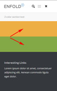
and here is when I added a a short separator between the color sections:
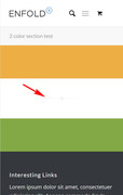
So as you see in the first screenshot the two color sections have no gap, and in the second screenshot the short separator has a top & bottom padding of 50px, giving a gap.
Is this what you mean?Best regards,
MikeHi,
I took a look at your footer widget titles and adjusted your css to:#footer h3.widgettitle { font-weight:bold; }and it is now showing as font-weight 700, which is bold.
I notice that your font, Raleway, doesn’t display the bold font-weight very well, so I added this rule:text-shadow: 1px 0 0 currentColor;To make it a little “bolder”
Please clear your browser cache and check.Best regards,
MikeHey accutherm,
Please try this css:.slide-entry h3.slide-entry-title.entry-title a { color: #ffffff !important; } .slide-content span.av-vertical-delimiter { border-color: #EF5A3E !important; } .slide-entry time.slide-meta-time.updated { color: #EF5A3E !important; } .slide-entry div.slide-meta { border-top-style: none !important; border-bottom-style: none !important; }Best regards,
MikeHey soundstrat,
The color of your text is the same as your button on mouse-over, Please try this code in the General Styling > Quick CSS field:#top #header .av-main-nav > li:hover > a .avia-menu-text { color: #fff !important; }This will change it to white, or feel free to adjust to suit.
Best regards,
MikeHi,
I took a look at your countdown and the color was set to white on white, I changed to black on white so it will show.
Please clear your browser cache and check.Best regards,
MikeAugust 31, 2018 at 3:01 am in reply to: How to make phone number tel link in team member block #1003859Hi,
I took a look at your page and found that you are using Enfold version 4.0.7, please update to v4.4.1
Please update the theme via FTP, look for the “enfold” folder at /wp-content/themes/enfold/ and rename to “enfold-old” then upload the new version as the folder “enfold”
Please don’t try to overwrite the theme folder, as this will leave old files behind and cause errors.
Once you have cleared your browser cache and tested that your site is working correctly, you can delete the old folder “enfold-old”.
If for some reason you want to go back to the old version, simply remove the new folder and change the name of “enfold-old” back to “enfold”Best regards,
Mike -
AuthorPosts