Forum Replies Created
-
AuthorPosts
-
October 24, 2018 at 6:48 am in reply to: Light Box on blog post not popping, Site not updating #1025804
Hey Shamey,
Theme Forest has changed their API for Token keys, v4.5 fixes this, it is recommend to update manually.
You can read more about it here.
This free plugin will allow you to manually update via the WordPress Theme panel by uploading the enfold.zip file, otherwise you can update via FTP, please remember to delete the current enfold folder and then upload the new one. Please don’t try to overwrite the theme folder, as this will leave old files behind and cause errors.
My recommendation is to go to your Theme Forest account and download the updated Enfold v4.5 and manually update it, then going forward it will use the new Token keys. All users will need to generate a new token for updates.Here are the steps to update with the plugin
1: please install the plugin: Update Theme and Plugins from Zip File

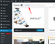
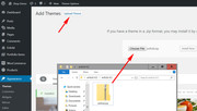
2: then go to WordPress > Themes > Add New > Upload
3: after the install, click “Return to Themes page” (NOT Activate)
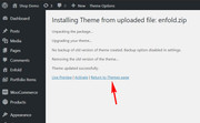
4: success:

Best regards,
MikeHey xuamox,
Theme Forest has changed their API for Token keys, v4.5 fixes this, it is recommend to update manually.
You can read more about it here.
This free plugin will allow you to manually update via the WordPress Theme panel by uploading the enfold.zip file, otherwise you can update via FTP, please remember to delete the current enfold folder and then upload the new one. Please don’t try to overwrite the theme folder, as this will leave old files behind and cause errors.
My recommendation is to go to your Theme Forest account and download the updated Enfold v4.5 and manually update it, then going forward it will use the new Token keys. All users will need to generate a new token for updates.Here are the steps to update with the plugin
1: please install the plugin: Update Theme and Plugins from Zip File
2: then go to WordPress > Themes > Add New > Upload
3: after the install, click “Return to Themes page” (NOT Activate)
4: success:
Best regards,
MikeOctober 24, 2018 at 6:21 am in reply to: Version 4.5 – Download fehlgeschlagen. Es wurde keine gültige URL übermittelt. #1025800Hi,
Glad we were able to help, we will close this now. Thank you for using Enfold.For your information, you can take a look at Enfold documentation here
For any other questions or issues, feel free to start new threads under Enfold sub forum and we will gladly try to help you :)Best regards,
MikeHi,
It looks like the best solution will be to replace you links to the iframe pages to the images directly and then replace you images with smaller ones so they are not so huge.
Please see the links in the Private Content area.Best regards,
MikeOctober 24, 2018 at 5:48 am in reply to: Version 4.5 – Download fehlgeschlagen. Es wurde keine gültige URL übermittelt. #1025792Hi,
Schön, dass wir helfen konnten, sollen wir diesen Thread dann schließen?Glad we were able to help, shall we close this thread then?
Best regards,
MikeHi,
I took a look at your “Park” menu item and found it allowed the next item to fit there also.
So in your css I changed the width from 90px to 100px, and now the next item goes below it.
Please clear your browser cache and check.This is the css to adjust if you wish to make any changes
.avia-menu.av-main-nav-wrap li#menu-item-4081 {max-width: 100px !important;}Best regards,
MikeOctober 24, 2018 at 5:20 am in reply to: Product description and image disappeared after latest theme update #1025783Hi,
I believe there was an error in your merged css file, I disabled the merged css in Enfold Theme Options > Performance > JS & CSS file merging and compression and then enabled it again and now your shop images are working again.
Please clear your browser cache and check.Best regards,
MikeOctober 24, 2018 at 5:00 am in reply to: Enfold 4.5 Theme Update "Update Failed: Download failed. A valid URL was not pro #1025780Hi,
It doesn’t sound good, but it seems to be working for you. I would recommend this method:
Here are the steps to update with the plugin to assist.
1: please install the plugin: Update Theme and Plugins from Zip File
2: then go to WordPress > Themes > Add New > Upload
3: after the install, click “Return to Themes page” (NOT Activate)
4: success:
Best regards,
MikeOctober 24, 2018 at 4:53 am in reply to: How can i set equal height to the icon boxes of a same row ? Fix background colo #1025778Hi,
You could remove the page id from the css and add the same classes to the elements on the other pages, if you take a look at the back end for those two classes on that page, you’ll see how to model it for your other pages. Let us know if you have any trouble, and I’ll try to explain better with screenshots.Best regards,
MikeOctober 24, 2018 at 4:35 am in reply to: How can i set equal height to the icon boxes of a same row ? Fix background colo #1025775Hi,
I took a look at your page and a found a interesting problem, you are using equal height columns, but you are adding a background color only to the icon-box element inside of the columns.
If you look at your columns closely you will see a 1px black border drawn around the icon-boxes, which is equal height.
If we give the columns a background color this would be solved, but it seems you like the way the icon sticks out of the box on top.
So I added a custom class to the grid row with the 3 columns “equal-icon-box” and a custom class to the cell above them “top-height” and then this css:@media only screen and (min-width: 767px) { #top.page-id-312 .equal-icon-box .av_one_third { padding-top: 0px !important; background-color: #f8f8f8 !important; } #top.page-id-312 .top-height { margin-bottom: 100px !important; } }
Please clear your browser cache and check.Best regards,
MikeHi,
Glad we were able to help, we will close this now. Thank you for using Enfold.For your information, you can take a look at Enfold documentation here
For any other questions or issues, feel free to start new threads under Enfold sub forum and we will gladly try to help you :)Best regards,
MikeHi,
No this is not correct,
Sorry that I have caused any confusion, after you explained your skill level I wanted to make this easy for you.
So you don’t need to add the header.php to your child theme, it will not offer a benefit. Please just upload the functions.php file to your child theme that I linked to and leave it named functions.phpI added your customization to this file, and going forward you will not need a child theme header.php
Best regards,
MikeHi,
@lrobbins303 after updating to v4.5 you should be able to update normally in the future, please try to follow these steps to update or open a new thread with your admin login & FTP access in the Private Content area and I will update for you.
As this is not your thread your login info will not be private. Thanks for your patience and understanding.Here are the steps to update with the plugin to assist.
1: please install the plugin: Update Theme and Plugins from Zip File
2: then go to WordPress > Themes > Add New > Upload
3: after the install, click “Return to Themes page” (NOT Activate)
4: success:
Best regards,
MikeHi,
I took a look at your site and renamed the theme folders so that the update was “enfold” and as you said, it crashed. I looked into the file & line number that was printed on the screen via the error message, and the file was missing about 100 lines of code. So I renamed the directories back and uploaded my own enfold theme to test.
This time enabling the update was successful, at least on the front end, I don’t have backend access, so please check it out and let us know.
If this is successful can you let us know how you ftp the files up?
I’m on Windows 10 using Filezilla with a explicit FTP over TLS connection.Best regards,
MikeOctober 24, 2018 at 2:13 am in reply to: Version 4.5 – Download fehlgeschlagen. Es wurde keine gültige URL übermittelt. #1025711Hi,
Ich habe Berichte über die Verwendung eines Inkognito-Browsers oder eines InPrivate-Browsers beim Überprüfen des Tokens gesehen, wenn Sie aufgrund von Cookies mehr als ein Token haben. Ich habe dein Token ausprobiert und es scheint erfolgreich zu sein. Bitte sehen Sie den Screenshot im Bereich Privater Inhalt.— Translated with Google —
I have seen reports about using a incognito browser, or inPrivate browser when checking the token if you have more than one token because of cookies, perhaps this would help. I tried your token, and it seems successful.
Please see the screenshot in Private Content area.Best regards,
MikeHi,
The social icons are hidden on the mobile view, you can enable them by including this css in your Quick CSS:@media only screen and (max-width: 479px) { .responsive #top #wrap_all #header .social_bookmarks { display: block !important; } .responsive #top #wrap_all #header_main .av-logo-container .main_menu .noLightbox.social_bookmarks { display: block !important; } }The social icons in the footer looks like they were adjusted to be a little larger, but the adjustment seems to be a little off. Try to use this css for the footer icons instead:
/* larger socket social icons */
#socket .social_bookmarks li a {
width: 50px!important;
line-height: 50px!important;
min-height: 50px!important;
font-size: 30px;
}

#socket .social_bookmarks li {
height: 50px!important;
width: 50px!important;
}

#socket .social_bookmarks {
    height: 60px!important;
}
To move your mobile menu up a little, Please try this code in the General Styling > Quick CSS field:
@media only screen and (max-width: 767px) {
.responsive #top .av-logo-container .avia-menu {
    top: -20px !important;
}
}
Best regards,
MikeHi,
I took a look at your blog posts and it looks like you have used the advanced layout editor on the posts. The full post will be displayed when using the default editor but not for the advanced layout editor. Instead you will need to create a custom excerpt when editing your post. If you do not see the excerpt field then click on “Screen Options” in the top right hand corner of your screen and check it to display.Best regards,
MikeOctober 23, 2018 at 6:40 am in reply to: Portfolio grid isn’t affected by any quick CSS changes anymore #1025246Hi,
I took another look at the gallery link in the Private Content area, to see why you were not seeing any changes with your css above.
For the sector, “.grid-entry .inner-entry” the images already have a 20px all around, so your 20px on the right side doesn’t add anything.Best regards,
MikeHi,
You can change the image on hover to any image you wish by linking to the image in the css, in this example you will see that I targeted the one thumbnail by it’s post number, then I choose a link to a different image:li.post-816 .thumbnail_container:hover { background: url(https://127.0.0.1/2017demo1/wp-content/uploads/2017/02/people-1-6.jpg) !important; background-repeat: no-repeat !important; background-size: cover !important; background-position: 50% 50% !important; } li.post-816 .thumbnail_container:hover img.attachment-shop_catalog { opacity: 0 !important; }Please see the screenshot in Private Content area of before hover & hover.
Please try this code in the General Styling > Quick CSS field & change the url to the image you wish use.Best regards,
MikeHi,
I took another look at your child theme and see that you don’t have a functions.php in it, so I have linked to one in the Private Content area and added your “google site verification” meta tag from your header in to it. This was the only customization that I could find in your header.php.
So with the “file manager” tool from your webhost, or with ftp, please add the functions.php I linked to, into your child theme, and then rename your header.php to “header.php.old”
This way you won’t be using this file, and the parent theme’s header.php will be used.Best regards,
MikeHi,
You can remove the remaining padding with this css:#top.page-id-4168 .mmvippackagescolumnspacing .post-entry-4168 .av_one_third { padding: 0px !important; }Best regards,
MikeHi,
Sorry for the late reply, I found that disabling “Autoptimize” fixes the jQuery errors and allows the function above to work correctly.
Please clear your browser cache and check, then try changing the settings inside “Autoptimize” to find the setting that was causing the issue for you.Best regards,
MikeHi,
Platzhalter für den Gutscheincode: Fügen Sie diesen Code am Ende Ihrer Datei “functions.php” unter “Darstellung> Editor” hinzu:function woo_coupon_code_placeholder(){ ?> <script> jQuery(window).load(function(){ jQuery('#top.woocommerce-cart input#coupon_code').attr('placeholder','Händlercode'); }); </script> <?php } add_action('wp_footer', 'woo_coupon_code_placeholder');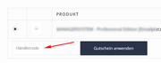
Für den Hinweis auf den Gutschein-Code auf der Check-out-Seite, bitte versuchen Sie diesen Code im Bereich General Styling> Quick CSS:#top.woocommerce-checkout .woocommerce-form-coupon-toggle { display: none !important; }— Translated with Google —
For the Coupon Code placeholder, Try adding this code to the end of your functions.php file in Appearance > Editor:
function woo_coupon_code_placeholder(){
  ?>
  <script>
jQuery(window).load(function(){
  jQuery('#top.woocommerce-cart input#coupon_code').attr('placeholder','Händlercode');
  });
</script>
  <?php
  }
  add_action('wp_footer', 'woo_coupon_code_placeholder');
For the notice about the Coupon Code on the check out page, Please try this code in the General Styling > Quick CSS field:#top.woocommerce-checkout .woocommerce-form-coupon-toggle { display: none !important; }Best regards,
MikeOctober 21, 2018 at 6:01 pm in reply to: Product description and image disappeared after latest theme update #1024538Hey aa117,
I took a look at your page and I found that your product tabs were hidden with this css in your merged css file:.js_active .woocommerce-tabs .panel { display:none; }and your product image with a inline opacity: 0
Please include a admin login in the Private Content area so we can take a closer look at why this is happening.Best regards,
MikeHey Bruno,
I took a look at your page and found that your gallery is not opening in the lightbox, the images are opening directly.
I believe this is because your child theme has a old header.php file in it.
Please copy the new header.php to your child theme and add any customizations from the old header.php to it.Best regards,
MikeOctober 21, 2018 at 5:12 pm in reply to: How can i set equal height to the icon boxes of a same row ? Fix background colo #1024527Hey Deanna,
I tried to take a look, but I could only see the maintenance page, please provide a login in the Private Content area.Best regards,
MikeHey skayy,
Wenn ich das richtig verstanden habe, möchten Sie das Gutschein – Code – Eingabefeld auf der Checkout – Seite ausblenden und Sie möchten das ändern
“Gutschein-Code” und “Gutschein einlösen” im Warenkorb?
Bitte fügen Sie die URL zu der betreffenden Seite hinzu, damit wir genauer hinschauen und den gewünschten Text für die beiden Felder einfügen können.— Translated with Google —
If I understand correctly, you would like to hide the coupon code input field in the checkout page and you would like to change the
“Coupon Code” and “Apply Coupon” in the shopping cart?
Please include the url to the page in question so we can take a closer look, and include the text you would like for the two fields.Best regards,
MikeHey ProTravelGolf,
I took a look at both pages and found that the columns have the same width, the reason the second one looks larger is because the padding on each side of the column content is white, instead of light gray as in the first page. So it appears that the space is larger. If you are going to leave the second page with no column colors, then try this css which will set the space between the columns to zero:#top.page-id-4168 .mmvippackagescolumnspacing .av-flex-placeholder { width: 0% !important; }Best regards,
MikeHey robertruedam,
I took a look at your site and found that when creating a page I got this error:Failed to load resource: the server responded with a status of 500 (Internal Server Error) /wp-admin/admin-ajax.phpPlease check that your file permissions are set correctly and that your .htaccess file is not blocking access to the wp-admin directory
if this doesn’t help ask your webhost to check the server log for the cause of the Internal Server Error.I also noticed that your webhost doesn’t have PHP ZipArchive Extension enabled, you will need this for the layerslider to import the slides and for the Iconfont Manager to install the Fontello icons.
Best regards,
MikeHey idvisionme,
Theme Forest has changed their API for Token keys, v4.5 fixes this, it is recommend to update manually.
This free plugin will allow you to manually update via the WordPress Theme panel by uploading the enfold.zip file, otherwise you can update via FTP, please remember to delete the current enfold folder and then upload the new one. Please don’t try to overwrite the theme folder, as this will leave old files behind and cause errors.
My recommendation is to go to your Theme Forest account and download the updated Enfold v4.5 and manually update it, then going forward it will use the new Token keys. All users will need to generate a new token for updates.
Please let us know if you would like some help updating.
Here are the steps to update with the plugin to assist.
1: please install the plugin: Update Theme and Plugins from Zip File
2: then go to WordPress > Themes > Add New > Upload
3: after the install, click “Return to Themes page” (NOT Activate)
4: success:
Best regards,
Mike -
AuthorPosts