Forum Replies Created
-
AuthorPosts
-
Hey crossroadsabc,
Sorry for the late reply, I believe you have rolled your update back to resolve these errors that occurred.
When you updated via FTP did you delete the old theme folder before uploading the updated theme folder, or did you overwrite the old theme folder with the new?
I ask because overwriting the theme folder will leave old files behind and cause errors.Since we can’t see the errors to investigate, does your webhost offer staging sites? That is typically a option in your cPanel to clone your site to a temporary address for testing, Here are some screenshots of what it would look like:

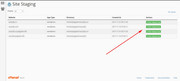
If your webhost does offer this, could you create this and give us ftp and admin access so we can try to recreate your issue?Best regards,
MikeNovember 9, 2018 at 6:45 am in reply to: Convertplus Plugin – CSS Classes for Avia Builders Buttons #1031571Hey So Evolve,
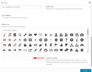
Sorry for the late reply, the button element has a custom class field at the bottom of the editor, to enable please go to Enfold Theme Options > Layout Builder > Show element options for developers
Then you should see the custom class option
Best regards,
MikeHey ballindigital,
Sorry for the late reply, I have taken a look at your posts and I see that your posts written with the Advanced Layout Builder all display the author information, where the excerpt should be. Typically ALB post don’t display the excerpt unless you manually enter it in the “excerpt” field at the bottom of the page. To see this field click “screen option” at the top of your page, then check the excerpt box.
The posts written with the default editor creates the excerpt from the content of the post automatically.I see that your author information box is created with a plugin, so I assume that the plugin is using the same excerpt field, or there is a conflict with the plugin and the excerpt field. Please try to manually enter a excerpt for the ALB posts and hopefully that will show instead of the plugin content.
Best regards,
MikeNovember 9, 2018 at 6:10 am in reply to: Exclude categories from post navigation in portfolio items #1031541Hey calebcuster,
Sorry for the late reply, I believe this solution will helpBest regards,
MikeHi,
Sorry for the late reply, I read though your posts, but your image links didn’t work, but if I understand correctly, you wanted the next / previous links for the events as in the church demo:

but when I look at your page, (url in the Private Content area) I see that you already have these links:
I also see that your posts have the next / previous links:
I must have missed something.If you are using a child theme and you add custom css to the style.css, it will not be overwritten on the next update. If you are using the main theme and you add custom css to the custom.css, it will be overwritten on the next update. If you use the main theme and you add your custom css to the Enfold Theme Options > General Styling > Quick CSS field it will not be overwritten on the next update.
Best regards,
MikeHi,
Thank you, I didn’t know that about your post. I confirmed though testing, that advanced layout builder posts won’t show using this method.
But the “Page Content” element, will allow you to display a advanced layout builder page within another page. It will keep the format and the advanced layout builder elements.
You could copy your post to a new blank page by Enabling the Avia Layout Builder Debugger and copy the debugging code to the new page.
Or you could create the shortcode like you originally wanted to with the info in the pages I linked to earlier.Best regards,
MikeHi,
Glad we could help, unless there is anything else we can help with on this issue, shall we close this then?Best regards,
MikeHi,
Glad we could help, unless there is anything else we can help with on this issue, shall we close this then?Best regards,
MikeHey fishkdo,
Try adding this code to the end of your functions.php file in Appearance > Editor:function custom_product_layout(){ ?> <script> jQuery(window).load(function(){ jQuery( "#top.single-product .product .summary.entry-summary" ).appendTo( "#top.single-product .single-product-main-image" ); }); </script> <?php } add_action('wp_footer', 'custom_product_layout');If this doesn’t help, please include a admin login in the private content area so we can take a closer look.
Best regards,
MikeHi,
Please try removing the rule from your Quick CSS then go to your “CSS file merging and compression” and at the bottom of that page your see the option “Delete old CSS and JS files” check that box then click “save all settings”
Then go back to Quick CSS and add a blank space and click “save all settings” again.
Then clear your browser cache and check.
You should not have any cache plugin active.If this doesn’t help, please include a admin login in the private content area so we can take a closer look.
Best regards,
MikeHey zoltom,
Sorry for the late reply, please enter your billing info to Google maps, it use to only be needed for large traffic, but Google has changed this. This is the first place to start to correct this issue.Best regards,
MikeHi,
I took a look at the 6 items, but they are set to display:none for screens under 767px
If this is just temporary, then try this code in the General Styling > Quick CSS field:@media only screen and (max-width: 767px) { #av_section_2 .av-image-caption-overlay-center p { font-size: 12px !important; } #av_section_2 .av-image-caption-overlay-center { padding: 50px 10px 0px 5px !important; } }Please see the screenshot in Private Content area.
I recommend adding a custom ID to the section to replace the #av_section_2, which has been automatically generated and could change in the future as you add more elements to the page. To add custom IDs & classes go to Enfold Theme Options > Layout Builder > Show element options for developers and enable the option, then in your element create a unique ID such as “smallportthumbnails”
Best regards,
MikeNovember 8, 2018 at 10:48 pm in reply to: Enfold Post Slider – Remove image, "News" title, etc. #1031434Hi,
Glad we were able to help, we will close this now. Thank you for using Enfold.For your information, you can take a look at Enfold documentation here
For any other questions or issues, feel free to start new threads under Enfold sub forum and we will gladly try to help you :)Best regards,
MikeNovember 8, 2018 at 10:36 pm in reply to: Enfold Post Slider – Remove image, "News" title, etc. #1031424Hi,
That is great news, unless there is anything else we can help with on this issue, shall we close this then?Best regards,
MikeHi,
Sorry, try adding it to the Enfold Theme Options > General Styling > Quick CSS fieldBest regards,
MikeHi,
Sorry I can’t read the settings very well because it’s not English, but they seem to right. Is your post using the advanced layout builder? That might be the issue, try using the default editor for the post.
I tested this method on my localhost and it worked for a default editor post.
Can you try adding this text as a text block element to your homepage?Best regards,
MikeNovember 8, 2018 at 10:05 pm in reply to: Enfold Post Slider – Remove image, "News" title, etc. #1031401Hi,
This is because each element is given a class automatically, such as “avia-builder-el-20” but when you add another element this may change the number in the auto class.
To correct please enable custom IDs and classes by going to Enfold Theme Options > Layout Builder > Show element options for developers
Then go to your two post sliders and give them each a unique class, such as “firstpostslider” & “secondpostslider” then replace the auto class with your custom one, like this:.secondpostslider span.blog-categories.minor-meta, .secondpostslider span.av-vertical-delimiter, .secondpostslider .slide-image { display: none !important; }Please note that classes begin with a dot and IDs begin with a hash mark. If you have any troubles then go ahead and add your special heading, and we will look and post the updated css.
Best regards,
MikeNovember 8, 2018 at 8:30 pm in reply to: Enfold Post Slider – Remove image, "News" title, etc. #1031365Hi,
For your slider issue, please replace your css with this:#top.home .avia-builder-el-14 .avia-content-slider-inner { height: 320px !important; }For the second issue, I see now that I was looking at the wrong element, please use this css instead:
.avia-content-slider1.avia-builder-el-20 span.blog-categories.minor-meta,
.avia-content-slider1.avia-builder-el-20 span.av-vertical-delimiter,
.avia-content-slider1.avia-builder-el-20 .slide-image {
display: none !important;
}
Best regards,
MikeHi,
Glad we were able to help, we will close this now. Thank you for using Enfold.For your information, you can take a look at Enfold documentation here
For any other questions or issues, feel free to start new threads under Enfold sub forum and we will gladly try to help you :)Best regards,
MikeNovember 8, 2018 at 2:44 pm in reply to: Cannot translate text label "Read more" on buttons on Blog posts #1031280Hi,
Thanks, we close the topics, but I like to confirm before I do :)
Glad we were able to help, we will close this now. Thank you for using Enfold.For your information, you can take a look at Enfold documentation here
For any other questions or issues, feel free to start new threads under Enfold sub forum and we will gladly try to help you :)Best regards,
MikeHi,
To reduce the spacing between the 5 blue columns (CATEGORIES AND OTHER EVENTS) and also allow them to go full width for mobile, Please try this code in the General Styling > Quick CSS field:@media only screen and (min-width: 768px) { #top.home #av_section_4 .flex_column.av_one_fifth { margin-left: 1% !important; width: 19% !important; } }please feel free to adjust to suit, notice the width & margin equals a total of 20%, these two must equal this.
For the 3 columns “services”, try this css:
@media only screen and (min-width: 768px) {
#top.home #services .flex_column.av_one_third {
      margin-left: 1% !important;
    width: 32% !important;
}
}
please feel free to adjust to suit, notice the width & margin equals a total of 33%, these two must equal this.
Best regards,
MikeHi,
Please check the setting at Enfold Theme Options > Main Menu > Menu Items for mobile > Activate only for Smartphones (browser width below 768px)
Then clear your browser cache.
Your brake point seems to be set to 990px
If this doesn’t help, please include a admin login in the private content area so we can take a closer look.Best regards,
MikeNovember 8, 2018 at 1:48 pm in reply to: blogpage, moving the content from the sidebar from bottom to the top #1031251Hi,
Glad we were able to help, we will close this now. Thank you for using Enfold.For your information, you can take a look at Enfold documentation here
For any other questions or issues, feel free to start new threads under Enfold sub forum and we will gladly try to help you :)Best regards,
MikeNovember 8, 2018 at 1:47 pm in reply to: Cannot translate text label "Read more" on buttons on Blog posts #1031250Hi,
I took a look at your page, and believe this is the css to center your single posts.single-format-standard .template-page .post-entry { right: 0px !important; }Best regards,
MikeHey duletzki,
— Translated with Google —
Um das Suchsymbol zu vergrößern, versuchen Sie diesen Code im Feld General Styling> Quick CSS:.responsive #top #wrap_all .menu-item-search-dropdown > a { font-size: 48px !important; }Wenn dies nicht hilft, klicken Sie bitte auf Ihre Seite, damit wir Ihnen weiterhelfen können.
Best regards,
MikeHey duletzki,
— question Translated with Google —
how can I hide the burger menu? In the desktop version it is not displayed, in the mobile version I always see the burger menu icon without navigation content.
Thanks + best regards
———-
If I understand correctly you want to hide the burger menu from the mobile version, in this case Please try this code in the General Styling > Quick CSS field:.av-burger-menu-main.menu-item-avia-special.av-small-burger-icon { display: none !important; }— answer Translated with Google —
Wenn ich richtig verstanden habe, dass Sie das Burger-Menü vor der mobilen Version ausblenden möchten, versuchen Sie es in diesem Fall mit dem folgenden Code im Feld General Styling> Quick CSS:.av-burger-menu-main.menu-item-avia-special.av-small-burger-icon { display: none !important; }Best regards,
MikeNovember 8, 2018 at 1:01 pm in reply to: Enfold Post Slider – Remove image, "News" title, etc. #1031218Hey HostageMedia,
To remove everything from the posts except the title, please try this code in the General Styling > Quick CSS field:.entry-content-header span.blog-categories.minor-meta,.entry-content-header div.entry-content,.entry-content-header span.av-vertical-delimiter,.entry-content-header span.post-meta-infos,.post-entry div.blog-meta,.post-entry div.post_delimiter,.post-entry .post_author_timeline { display: none !important; }Best regards,
MikeHey web6s,
Thank you for the link, I took a look at your page, but it seems the product description tab is below the product image already.
Unless you mean that you would like the product description tab in the same column as the images, and below, in which case it looks like the columns will also need to be adjusted for width.
Please advise.Best regards,
Mike -
AuthorPosts