Forum Replies Created
-
AuthorPosts
-
Hey KaISBC,
Please refer to these options when trying to set the Token: Envato private token
Also try adding the “View your account profile details”Best regards,
MikeHey B,
Please try this code in the General Styling > Quick CSS field:@media screen and (min-width: 960px) { #top .gform_wrapper .gform_body li>.gfield_label { width: 55% !important; } }Best regards,
MikeHey Claudio,
To remove the sidebar from the search results pages, please try this solution
I’m not sure what you mean by “add image item”, do you mean display the images with each search result? Please see this solution
To remove the dates, Please try this code in the General Styling > Quick CSS field:
time.date-container {display:none !important;}Best regards,
MikeHi,
I tried researching your error message but didn’t find anything helpful, I also tried viewing your error first hand
at https://crossroadsabc.com/women/ but didn’t receive the same error.
Is this still happening for you?
To include a screenshot please upload your images to PostImage.org and post the link into your post.Best regards,
MikeHi,
Please include a admin login & FTP access in the Private Content area so we can investigate further.Best regards,
MikeHi,
We are glad to help, did you delete the old theme, or did you want me to to that for you?
Unless there is anything else we can assist with on this issue, shall we close this then?Best regards,
MikeNovember 14, 2018 at 2:29 pm in reply to: Change Text on search result pages and headline related entries on blog pages #1033507Hi,
Sorry for the late reply, if I understand correctly, you have found that “de_DE_formal” has the language text that you want, except for a couple of words. To edit please try the tool at Poedit
This is recommend by Polylang:Note: The strings hardcoded in PHP files are not handled by the Strings translations list table. These strings are stored in .po/.mo files and you can translate them with tools like Poedit or the Loco translate plugin.
This is because the PO & MO files work together, but the MO file requires a special tool to edit.
Best regards,
MikeHi,
Glad we were able to help, we will close this now. Thank you for using Enfold.For your information, you can take a look at Enfold documentation here
For any other questions or issues, feel free to start new threads under Enfold sub forum and we will gladly try to help you :)Best regards,
MikeHi,
That is good news, are you going to try updating again?
When you updated did you delete the old enfold folder first, or did you try to overwrite the old enfold folder?Best regards,
MikeHey corefocusgroup,
You can move the GDPR bar below the socket, and it does disappear when clicked, but the socket doesn’t go back down.
Please try this code in the General Styling > Quick CSS field:.avia-cookie-consent { bottom: 0px !important; } #socket { bottom: 71px !important; }You may be able to fix this with some javascript by applying the socket 71px only if there is no “.cookiebar-hidden” class, but I didn’t find some javascript that would do this.
Best regards,
MikeHey tankerhq,
Sorry there is not a option within Enfold to do this, but you could try a plugin such as Recently Purchased Products [Just Sold Products for – WooCommerce]
There are probably more available, this was just one that I found.Best regards,
MikeHey samkastor,
I tried to look at your site but it seems down right now.
When it is back up, please try disabling the Enfold Theme Options > Performance > JS & CSS file merging and compression & save your theme options.
Then please clear any cache plugin and your browser cache and check again.Best regards,
MikeHi,
I have attached v4.0.7
but please check your PHP version to ensure you are using at least v5.6*Please note that if you update via FTP, you will need to remove the old theme folder “enfold” first (via FTP) then upload the new “enfold” folder at /wp-content/themes/enfold/
Please don’t try to overwrite the theme folder, as this will leave old files behind and cause errors.Best regards,
MikeHi,
Thank you for the login, I see that you are using v4.0.2
this is quite old now and your issue could be a known issue for that version, to rule this out please update to v4.5
This could be the easiest way to update:
*Please ensure your “PHP Max Upload Size” is at least 20mb, because Enfold is 16.7mb.I checked this for you, and you are all set with this step.
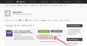
First go to your Theme Forest account and download the “Installable WordPress file only”.
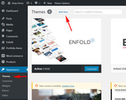
1: please install the plugin: Update Theme and Plugins from Zip File

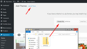
2: then go to WordPress > Themes > Add New > Upload
3: after the install, click “Return to Themes page” (NOT Activate)
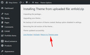
4: success:

*Please note that if you update via FTP, you will need to remove the old theme folder “enfold” first (via FTP) then upload the new “enfold” folder at /wp-content/themes/enfold/
Please don’t try to overwrite the theme folder, as this will leave old files behind and cause errors.Once you update please let us know if this solved the issue.
Best regards,
MikeHi,
Sorry for the late reply, to do this for all of the pages on your site, please replace the css with this:#av_section_1.container_wrap div.container { padding-left: 60px !important; } #top.page-id-1122 #av-layout-grid-1.container_wrap .flex_cell.av_two_third.avia-builder-el-first { padding-left: 60px !important; }The first rule seemed to work for every page except for the top section of one page, please see link in the Private Content area.
So the second rule solves that page.
Please let us know if you find any other issues and we can addend the css.Best regards,
MikeHi,
That is good news, thanks for sharing I will let the rest of the team know.Best regards,
MikeHi,
Thank you for the FTP access, I uploaded the v4.5 enfold files to your site and saved your old files to a folder name “enfold-old”
I didn’t find any errors, but please check for yourself.
If it seems fine then please delete the folder “enfold-old” via FTP, if you want to roll-back then simply delete the folder “enfold” and change the name of “enfold-old” to “enfold”.Best regards,
MikeHi,
@crossroadsabc glad that you were able to find out that it was the “Series Engine” plugin.
I took a look at this by activating it and tried to examine the options and settings of the Series Engine plugin to see if I could find a solution, but I was booted out of the site, probably your WordFence.
Have you tried asking the Series Engine author if they have any other reports like this for any sliders? There is a good chance that they already have a solution for this.Best regards,
MikeNovember 14, 2018 at 5:19 am in reply to: Adding Loader/Spinner during WooCommerce Checkout #1033323Hi,
@canadianllama That’s great news, thanks again @perfectwordBest regards,
MikeNovember 14, 2018 at 5:13 am in reply to: Instagram and Invalid Data error, some new questions #1033321Hi,
This is typically when uploading the wrong zip file.
Please go to your Theme Forest account and download the “Installable WordPress file only”.
Or open your current zip file that has the name “themeforest-4519990-enfold-responsive-multipurpose-theme-wordpress-theme.zip”
and inside it is another zip file named “enfold.zip” this is the one to upload.If this doesn’t help, please include a admin login and ftp access in the private content area so we can assist and update for you.
Please note that whenever updating it is a good practice to backup your site with your webhost’s full backup tool, I would not expect any troubles, but it’s easy to do and a good plan.Best regards,
MikeNovember 14, 2018 at 5:12 am in reply to: Instagram and Invalid Data error, some new questions #1033320Hi,
This is typically when uploading the wrong zip file.
Here are the steps to update with the pluginPlease go to your Theme Forest account and download the “Installable WordPress file only”.
Or open your current zip file that has the name “themeforest-4519990-enfold-responsive-multipurpose-theme-wordpress-theme.zip”
and inside it is another zip file named “enfold.zip” this is the one to upload.If this doesn’t help, please include a admin login and ftp access in the private content area so we can assist and update for you.
Please note that whenever updating it is a good practice to backup your site with your webhost’s full backup tool, I would not expect any troubles, but it’s easy to do and a good plan.Best regards,
MikeHi,
Please include this css rule:div.avia-popup .mfp-close:hover { border: 2px solid red !important; }Best regards,
MikeNovember 14, 2018 at 4:35 am in reply to: Exclude categories from post navigation in portfolio items #1033307Hi,
Thank you for your patience, I’m sure a senior member will assist with this soon. I tried to research this some more and have tried a few solutions on my localhost, without success.Best regards,
MikeNovember 14, 2018 at 4:15 am in reply to: Convertplus Plugin – CSS Classes for Avia Builders Buttons #1033296Hi,
Glad we were able to help, we will close this now. Thank you for using Enfold.For your information, you can take a look at Enfold documentation here
For any other questions or issues, feel free to start new threads under Enfold sub forum and we will gladly try to help you :)Best regards,
MikeHi,
Ich empfehle die Aktualisierung des Designs über FTP . Suchen Sie nach “enfold” -Ordner unter / wp-content / themes / enfold / und umbenennen in “enfold-old”, dann die neue Version als Ordner “enfold” hochladen. Bitte versuchen Sie nicht, den Designordner zu überschreiben, da dies die alten Dateien belässt hinter und Fehler verursachen. Wenn Sie Ihren Browser-Cache gelöscht haben und getestet haben, dass Ihre Website ordnungsgemäß funktioniert, können Sie den alten Ordner “enfold-old” löschen. Wenn Sie aus irgendeinem Grund zur alten Version zurückkehren möchten, entfernen Sie einfach den neuen Ordner und ändern Sie den Namen von “enfold-old” wieder in “enfold”. Wenn Sie Hilfe benötigen, fügen Sie bitte einen Administrator-Login & FTP hinzu Zugriff im Bereich Private Inhalte.— Translated with Google —
I recommend updating the theme via FTP, look for the “enfold” folder at /wp-content/themes/enfold/ and rename to “enfold-old” then upload the new version as the folder “enfold”
Please don’t try to overwrite the theme folder, as this will leave old files behind and cause errors.
Once you have cleared your browser cache and tested that your site is working correctly, you can delete the old folder “enfold-old”.
If for some reason you want to go back to the old version, simply remove the new folder and change the name of “enfold-old” back to “enfold”
If you would like some help with this, please include a admin login & FTP access in the Private Content area.Best regards,
MikeHi,
Glad we were able to help, we will close this now. Thank you for using Enfold.For your information, you can take a look at Enfold documentation here
For any other questions or issues, feel free to start new threads under Enfold sub forum and we will gladly try to help you :)Best regards,
MikeHey svu,
I suspect that the footer IDs & classes are a little different when adding the footer this way. Please include the url to the page in question so we can take a closer look.
Also, please include some of the css that you are have this issue with.Best regards,
MikeNovember 13, 2018 at 5:12 am in reply to: Problem with the highlighting of the mainmenu with onpage links (Anchor) #1032869Hi,
My thought was to try editing the “scrollspy” function in your js/avia.js to correct the difference.
But I’m not able to reproduce the error on my localhost. So I will try some alternative ideas.
I will also ask the rest of the team for any other ideas.Best regards,
MikeNovember 13, 2018 at 4:37 am in reply to: Reverse the Next/Previous navigation tabs for Portfolio Items #1032860Hi,
I took a look and found that the code was slightly different, so I made the changes.
Please try the element out.Best regards,
MikeHi,
Glad we were able to help, we will close this now. Thank you for using Enfold.For your information, you can take a look at Enfold documentation here
For any other questions or issues, feel free to start new threads under Enfold sub forum and we will gladly try to help you :)Best regards,
Mike -
AuthorPosts